Introduction to Sunburst Charts
A Sunburst chart is a powerful visualization tool for displaying hierarchical data in a circular format. It resembles the sun’s rays or the rings of a tree. Each ring of the chart represents a level in the hierarchy. Here’s what you need to know about Sunburst Charts:
- Purpose: Sunburst charts help visualize the proportionate distribution of data categories using color and size.
- Hierarchy: The innermost circle represents the main categories, while outer segments represent subcategories or levels within those main categories.
- Ordering: Data in a Sunburst chart is sorted from largest to smallest amount clockwise by default.
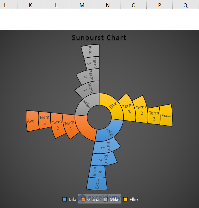
Click here to see the full image.
Steps
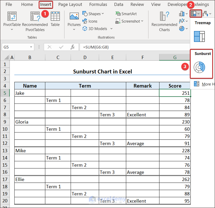
- Data Preparation:
- Ensure your data is organized hierarchically.
- For example, consider term final results of students, where each student has scores distributed across different terms.
- Calculate Total Students:
- To find the total number of students combining all term final results, insert the formula:
=SUM(G6:G8)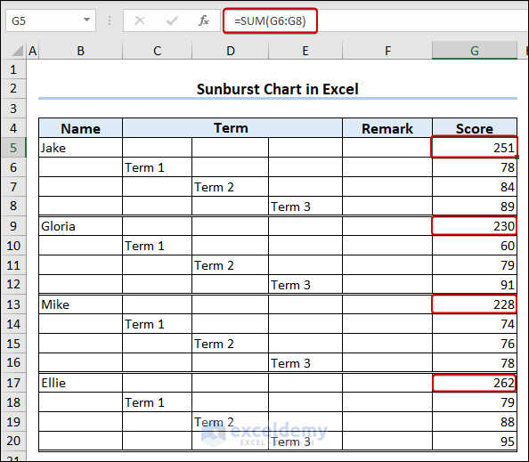
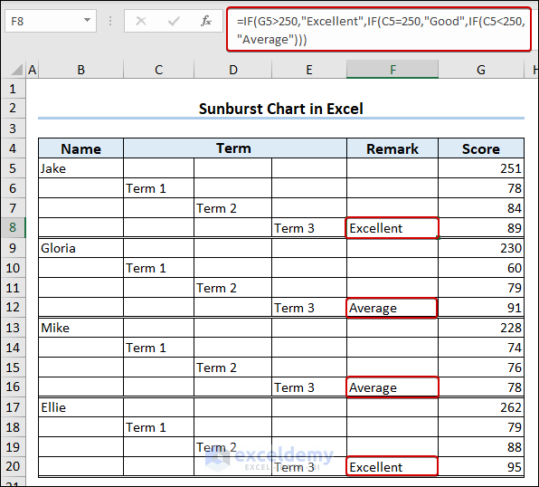
- Remark on Performance:
- Insert the following formula to remark on student performance:
=IF(G5>250,"Excellent",IF(C5=250,"Good",IF(C5<250,"Average")))-
- Press Enter.
- Insert the Sunburst Chart:
- Click on the Sunburst option under the Insert tab (available in Excel 2016 and later versions).
- The Sunburst chart will appear in your worksheet.
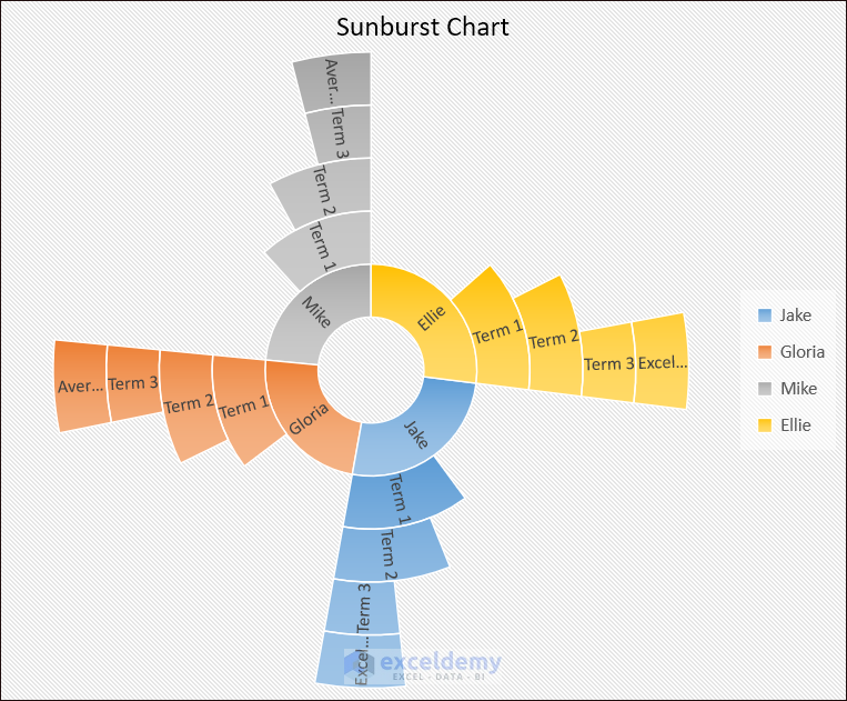
Click here to see the full image.
- Customize Appearance:
- Go to the Chart Design tab and select your preferred design from the ribbon.
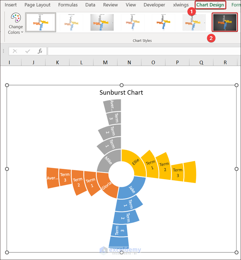
Click here to see the full image.
- We created a Sunburst Chart quite easily.
Read More: How to Insert Sunburst Chart in Excel
Important Notes
- Selection:
- Keep a cell selected inside the table while generating the Sunburst Chart.
- If you don’t select the generated chart, the Chart Design tab won’t appear for design changes.
- Manual Data Update:
- If chart data doesn’t update automatically with underlying data changes, right-click on the chart and select Edit Data to redirect it manually.
Download Practice Workbook
You can download the practice workbook from here:
Frequently Asked Questions
- Difference Between Sunburst and Treemap Charts:
- Both explain hierarchical patterns.
- Sunburst: Central circle with concentric rings.
- Treemap: Divides area into nested rectangles.
- Use of Sunburst Diagram in Excel:
- Display hierarchical data relationships (e.g., population across cities, states, countries, continents).
- Useful for analyzing industry firm details.
- Components of a Sunburst Chart:
- Inner circle (main categories) surrounded by outer rings (subcategories).
Sunburst Chart in Excel: Knowledge Hub
- Create Sunburst Chart with Percentage in Excel
- How to Sort Excel Sunburst Chart Order
- How to Rotate Sunburst Chart in Excel
- How to Insert Sunburst Chart with Conditional Formatting in Excel
<< Go Back to Excel Charts | Learn Excel
Get FREE Advanced Excel Exercises with Solutions!
