Are you looking for a better way to Plot Time Series Frequency in Excel? Well, I will try to explain two simple ways to plot time series frequency in Excel. I hope it will be helpful for you.
Excel Plot Time Series Frequency: 2 Simple Ways
In times of plotting time series frequency, Time Series Frequency is considered as the frequency of collecting data based on tie interval. The time interval of Excel Plot Time Series Frequency could be daily, weekly, monthly, quarterly, or yearly, depending on how often the data was collected.
1. Plot Time Series Frequency with Date in Excel
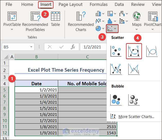
One of the most frequently used methods is to consider dates as time series. Here, I have collected data on the number of mobiles sold on different dates.

For Excel Plot Time Series Frequency, select all the data first. Then, go to the Insert tab and select Insert Scatter (X, Y) or Bubble Chart from the Charts group.
Afterward, pick the option named Scatter with Smooth Lines and Markers.
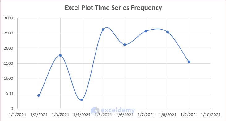
Finally, we will have the output.
Read More: How to Make a Time Series Graph in Excel
2. Draw Time Series Frequency Graph with Continuity in X-axis
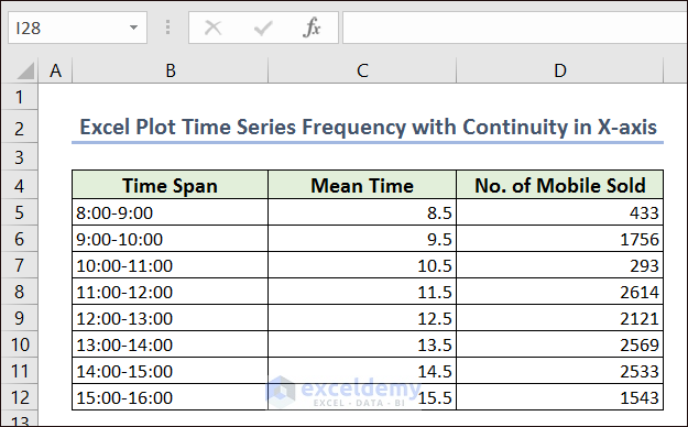
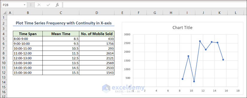
It can be generated with related datasets. For this purpose, frequency should be collected on a continuous time series. Here, I have collected the number of mobiles sold in each hour between 8:00 to 16:00. Excel can’t consider the time interval mentioned with a dash (-). For this purpose, we need to create another column (i.e. Mean Time) with the mean value between the time range.
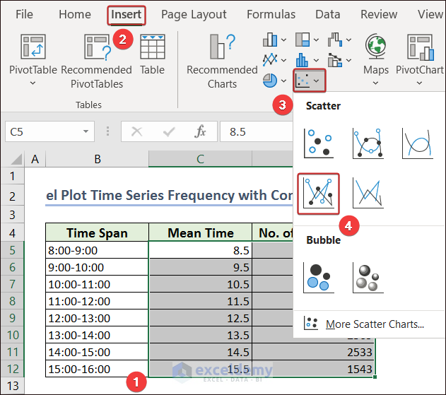
Then, select the Mean Time and No. of Mobile Sold columns and go to the Insert tab.
Followingly, click on the Scatter with Smooth Lines and Markers option from the Insert Scatter (X, Y) or Bubble Chart group.
Thus, a graph will be plotted with time series frequency. But there is a discontinuity in the X-axis.
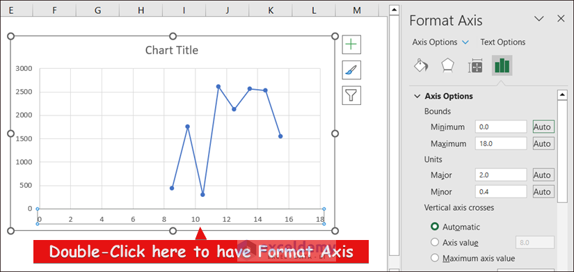
To make the graph continuous in the X-axis, click or double-click on the value of the X-axis. We will have a Format Axis on the right side of the window.
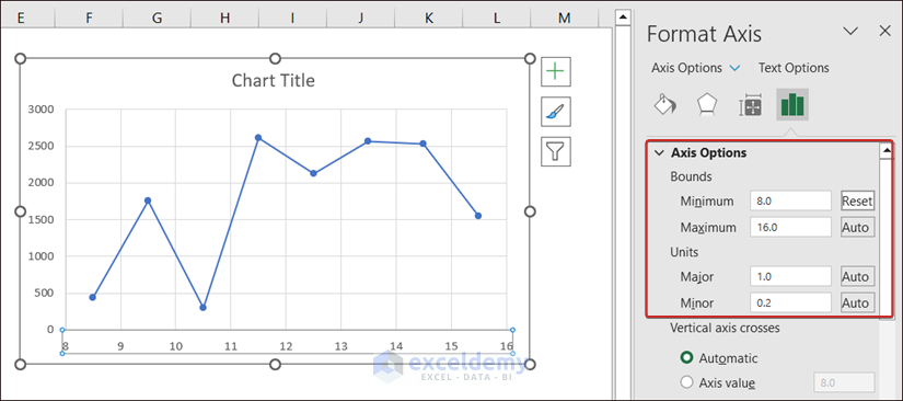
Then, make the necessary adjustment based on your maximum and minimum values. For this case, I have set 8.0 as Minimum and 16.0 as Maximum.
Read More: How to Plot Semi Log Graph in Excel
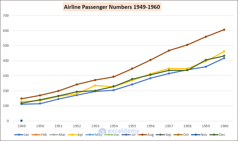
How to Plot Multiple Time Series Frequency in Excel
With the help of Excel, we can also plot multiple time series frequencies. For this, we need to select all the data and go in the following sequence.
Select —> Insert —> Insert Line or Area Chart —> Stacked Line with Markers

As a result, we will have a generated chart.
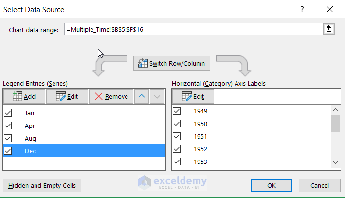
Then, click on the Chart Filters and followingly click on Select Data to do further data modification.

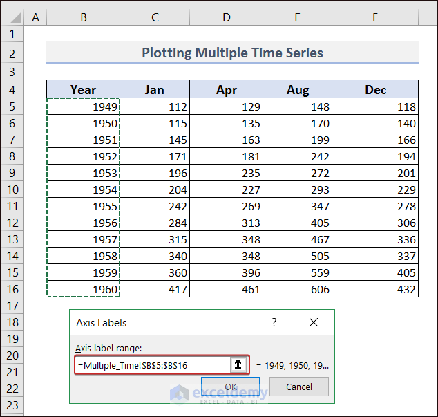
As I want to add years in the X-axis instead of numerical value, I clicked on the Edit option in Horizontal (Category) Axis Labels.
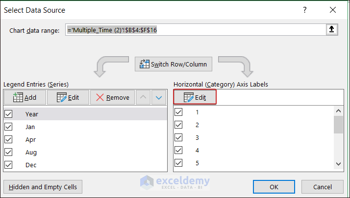
Then, I have selected all the years to have them on the X-axis.
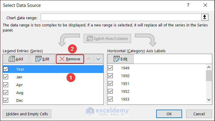
As I have set the year values in the X-axis, I need to remove them from the Y-axis. So, select the Year series and click on Remove.
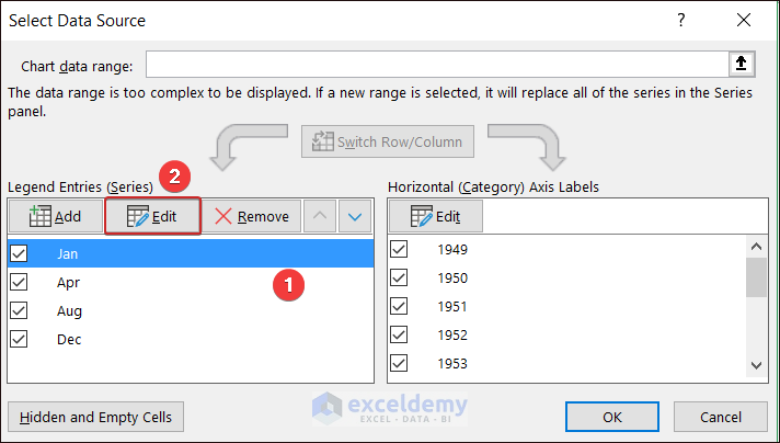
Now, adjust the series values. For this, click on each series (i.e. Jan) and select the Edit option.
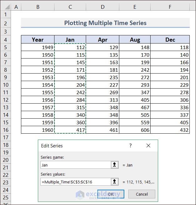
Then, set the related data in that series.
With a similar process, modify all the series and click on OK.
Thus, we can have a multiple time series frequency plotted in Excel.
Read More: How to Plot Sieve Analysis Graph in Excel
Download Practice Workbook
You can download the practice workbook from here.
Conclusion
In the above article, I have explained Excel Plot Time Series Frequency with the date and continuous time series frequency. I have also added multiple time series frequency charts. Based on your necessity you can choose any of the processes to pot time series frequency. I hope this article will be helpful for you. For further queries, comment below.
Related Articles
<< Go Back To How to Create a Chart in Excel | Excel Charts | Learn Excel
Get FREE Advanced Excel Exercises with Solutions!
