What Is a Sieve Analysis Graph?
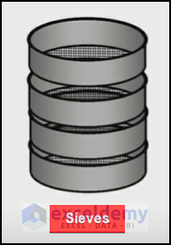
Sieve Analysis is the particle size analysis method to determine the ratio of particles of different sizes present in a soil sample.
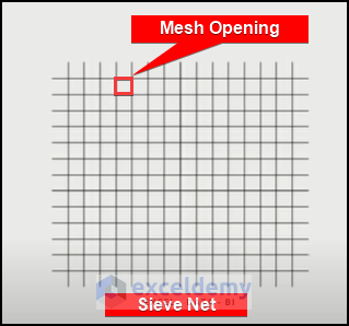
This is done by passing the soil sample through several Sieves, each with a smaller mesh opening than the last.
We named the sieves based on the size of their mesh openings. So, a sieve plate named 60mm filters the elements up to 60mm through that sieve.
Types of Coarse-Grained Soils:
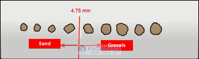
We can divide the soil grains into two types depending on their size.
- Gravels: The soil grains that are greater than 75 mm in diameter are called gravels. They can be filtered through Dry Sieve Analysis. For filtering gravels, the available sizes of sieves include 4.75mm, 10mm, 20mm, 40mm, and 80mm.
- Sand: The soil grains that are less than 75 mm are called Sand. To separate sand grains, you have to use the Wet Analysis Method. For filtering sands, the most common available sizes of sieves are 2mm, 1mm, 600 microns, 425 microns, 150 microns, and 75 microns.
Types of Sieve Analysis:
- Dry Sand Analysis: Dome by hammering the lumps of soil to make them smaller, then filtering it through various sieve plates.
- Wet Sand Analysis: When grain size is less than 5 mm in diameter, the sand remains attached to gravel and the effect of gravity on them is poor. For a wet sand analysis, water is added into the soil to flush the soil particles with it and get filtered through the sieves. A microwave will remove the water from the soil and allow for a weight measurement to plot the sieve graph.
How to Plot a Sieve Analysis Graph in Excel
Step 1 – Create the Sieve Analysis Template
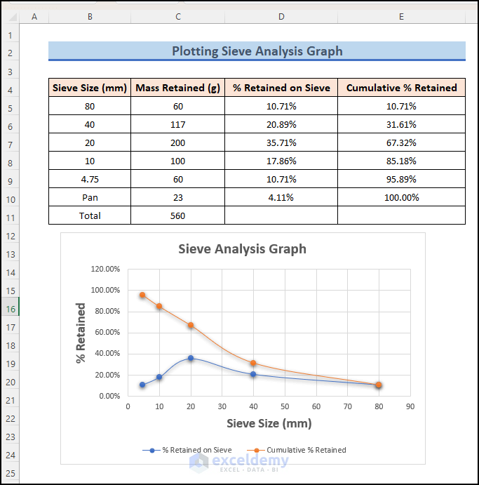
- Create four columns to create a sieve analysis template.
- We have named the first column “Sieve Size” to input of the size of the sieves used in the process.
- The column named “Mass Retained” will contain the mass retained in the sieve through the process.
- We will calculate the percentage and the cumulative percentage in the 3rd and 4th columns.
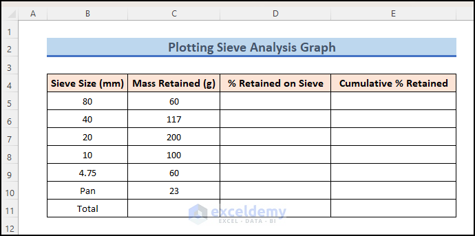
- Insert sieve and mass data manually.
- Insert this formula into cell C11:
=SUM(C5:C10)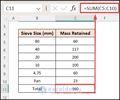
- Insert the following formula into cell D5:
=C5/$C$11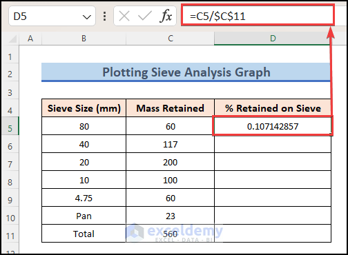
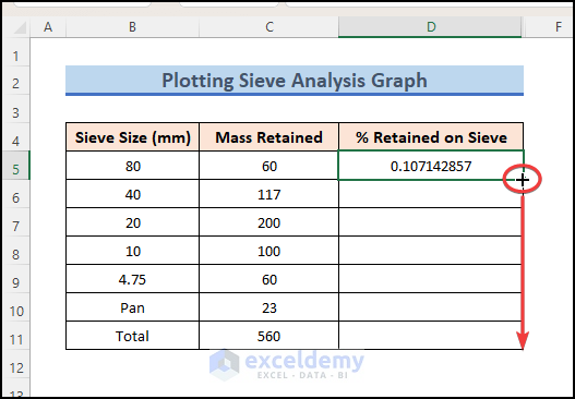
- Drag the Fill Handle icon down to paste the used formula respectively to the other cells of the column.
- You will get the percentage of the retained mass on each sieve, but in numerical format.
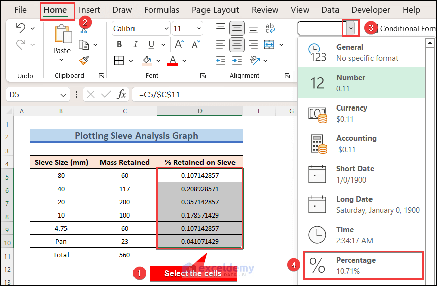
- Go to the Home tab in the top ribbon.
- Click on the dropdown menu in the Number format box.
- Select Percentage. Alternatively, you can click the % icon.
- Insert this formula in cell E5:
=SUM($D$5:D5)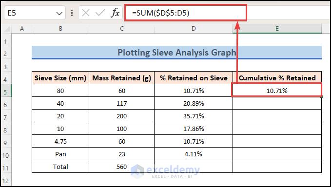
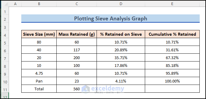
- Drag the Fill Handle icon down.
- Apply the percentage format if needed.
Read More: How to Plot Semi Log Graph in Excel
Step 2 – Plot the Sieve Analysis Graph
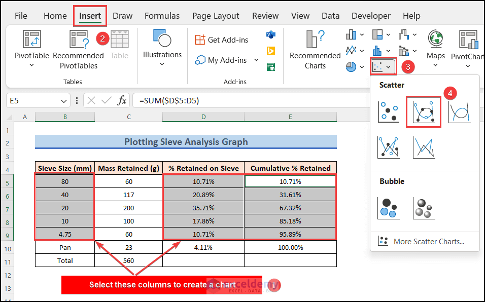
- Select the cells B5:B9, D5:D9, and E5:E9. You can use Ctrl while selecting to select multiple non-adjacent cells.
- Go to the Insert tab in the top ribbon.
- Click on the Scatter Chart icon and select Scatter with smooth line and markers.
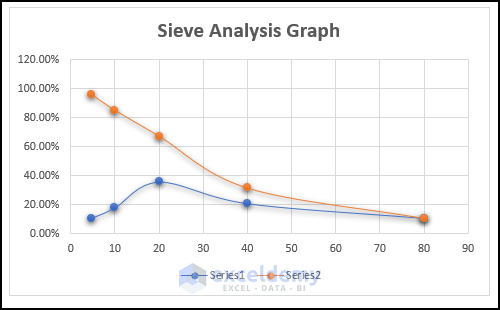
- A scatter graph will be created as shown below.
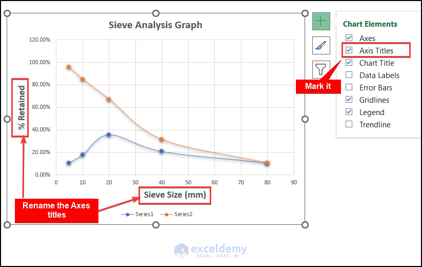
- Double-click on the title of the chart and rename it.
- Click on the chart and you will get a Plus (+) icon on the top-right corner of the chart.
- Click on the Plus icon and you will see the list of Chart Elements.
- Mark the checkbox for Axis Titles. The axis titles will now be visible in the chart.
- Double–click on each axis title and rename it.
- Click on the chart and go to the Chart Design tab.
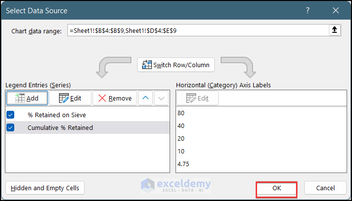
- Click on Select Data Source.
- A pop-up window named Select Data Source will appear.
- Select Series1 in the list and click on the Edit button above.
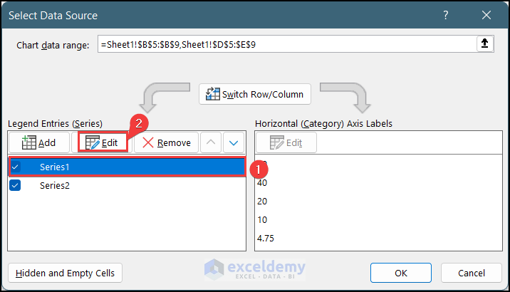
- A new pop-up window named Edit Series will appear.
- As series1 is the graph of % Retained on Sieve vs. Sieve Size, select cell D5 as the Series Name.
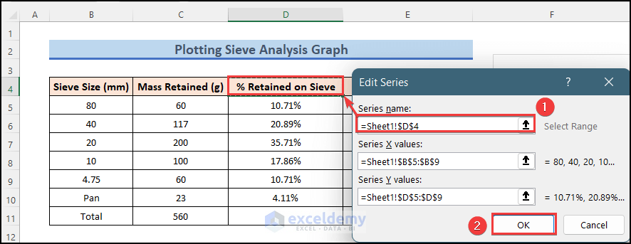
- For Series2, select cell E4 as the Series Name.
- The Legend Entries are changed and show the proper meaning of the graph.
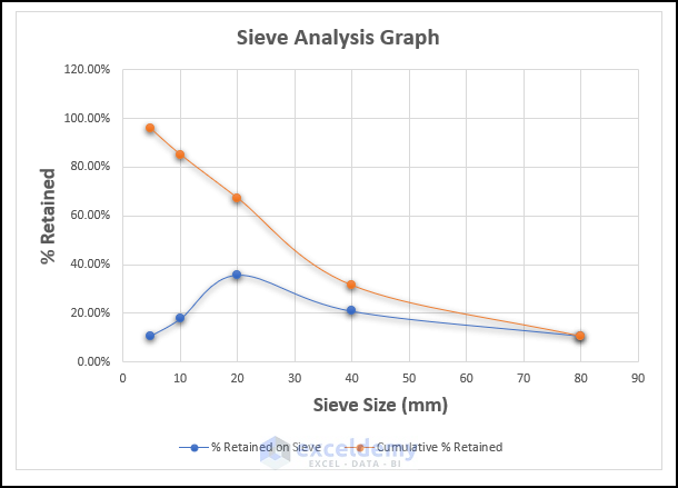
- The Sieve Analysis Graph is complete.
Read More: How to Plot Time Series Frequency in Excel
How to Interpret the Sieve Analysis Graph
The Blue curve shows the percentage value of mass retained in each sieve of the total sample mass. The Orange curve is technically reversed since the analysis starts from the largest sieve and goes down.
Download the Practice Workbook
Related Articles
- How to Make a Time Series Graph in Excel
- How to Plot Michaelis Menten Graph in Excel
- How to Make a Lineweaver Burk Plot in Excel
<< Go Back To How to Create a Chart in Excel | Excel Charts | Learn Excel
Get FREE Advanced Excel Exercises with Solutions!

would it be possible to get a download of this graph rather that have to build it myself?
Hello Craig,
Yes. It is possible to download the graph. We always provide a ready to use Excel file in our Download section.
Please download the chart from here: Plot Sieve Analysis Graph.xlsx
Regards
ExcelDemy