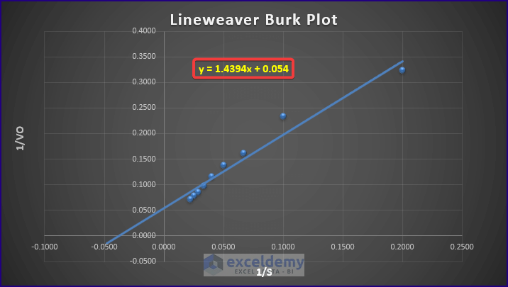
In biochemistry, the Michaelis-Menten Equation of enzyme kinetics results in a Lineweaver-Burk Plot, also known as a Double Reciprocal Plot. Here’s an example of one such chart.
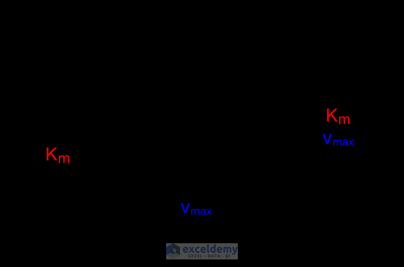
Lineweaver Burk Plot and Its Components
What Is a Lineweaver-Burk Plot?
A Lineweaver-Burk Plot is the graphical representation of the Michaelis-Menten Equation. The plot is used to determine different types of inhibitions.
Substrate Concentration
Substrate Concentration, S. X-axis of the Lineweaver Burk plot that is reciprocal of substrate concentration, [1/S].
Initial Velocity
Initial Velocity during an enzyme-inhibited reaction, V or Vo. Y-axis of the Lineweaver Burk plot that is reciprocal of velocity, [1/Vo].
Maximum Velocity
Maximum Velocity of the enzyme-inhibited reaction, Vmax. Y-axis interception of the plot is reciprocal of maximum velocity, [1/Vmax].
Michaelis Constant
Michaelis Constant, Km is the measurement of enzyme affinity. X-axis interception of the plot is reciprocal of Michaelis Constant, [-1/Km].
How to Make a Lineweaver-Burk Plot in Excel: Step-by-Step Procedure
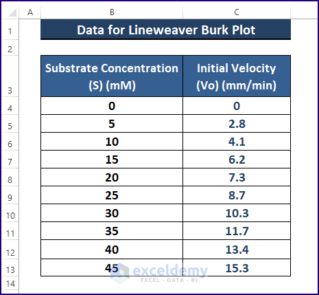
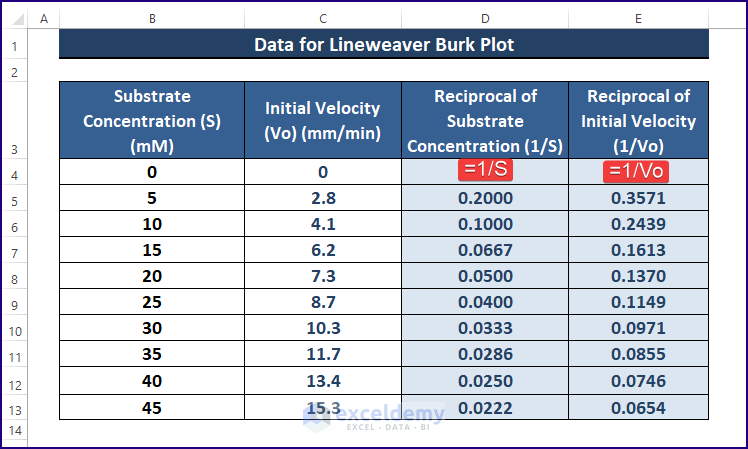
Making a Lineweaver-Burk plot requires data on Substrate Concentration (S) and Initial Velocity (Vo).
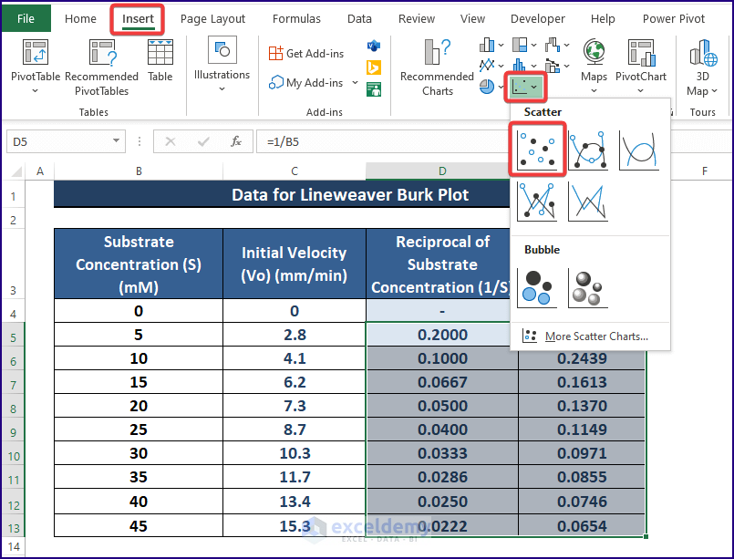
Step 1 – Setting Up the Data
- Compile the raw substrate concentration and initial velocity data as depicted in the picture below.
- Find the reciprocals of both points (i.e., S and Vo) as shown.
Read More: How to Plot Semi Log Graph in Excel
Step 2 – Inserting a Scatter Plot
- Highlight the reciprocals, leaving the first non-value entries, and then go to Insert Scatter (inside Charts section).
- Click Scatter.
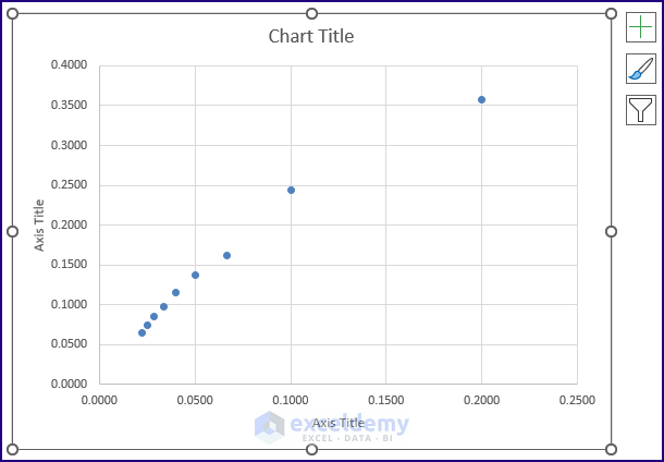
- Excel inserts a Scatter Plot as shown below.
Read More: How to Plot Time Series Frequency in Excel
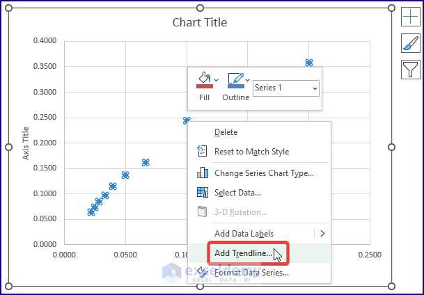
Step 3 – Modifying the Scatter Plot to Make a Lineweaver-Burk Plot in Excel
Stretching the Trendline Backward results in a Lineweaver-Burk plot.
- Click on a point in the plot, then right-click on it. The Context Menu appears.
- Select Add Trendline.
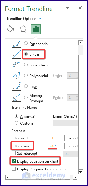
- Excel brings up the Format Trendline side window.
- Select Linear (Under Trendline Options)
- Enter the Backward value 0.07 or any suitable value.
- Check Display Equation on Chart.
- Choose a plot design. Here’s an example.

Read More: How to Make a Time Series Graph in Excel
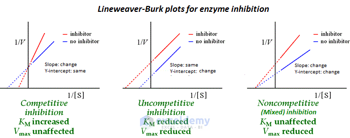
⧭ Notes: The Lineweaver-Burk Plot may have a different depiction depending on the intensity of its components. Therefore, the following image displays multiple Lineweaver-Burk plots distinguishing between different inhibition reactions.
Download the Excel Workbook
Related Articles
<< Go Back To How to Create a Chart in Excel | Excel Charts | Learn Excel
Get FREE Advanced Excel Exercises with Solutions!
