Method 1 – Create a Graph from an Excel Table
Steps:
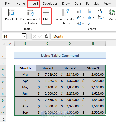
- Define the data range. For the sake of simplicity, we will choose B4 through E11 from our dataset. Under the Insert tab, select the Table command.
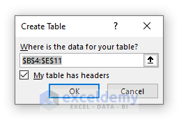
- Create Table dialog box appears. Click OK in the Create Table dialog box.
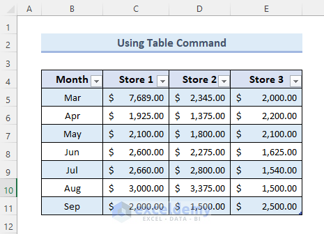
- You will be able to build the table seen in the picture below, after clicking OK.
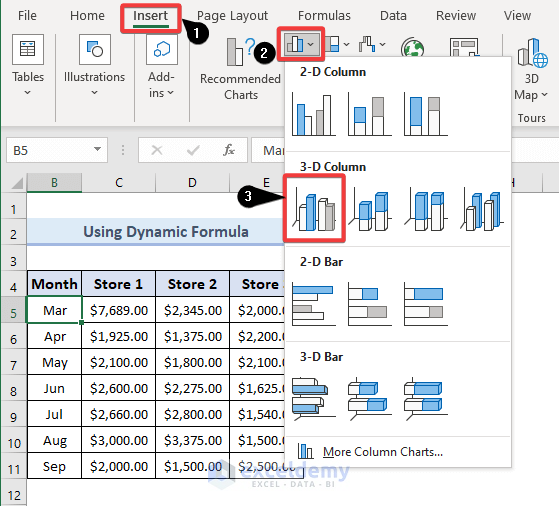
- Create a refreshed chart. First, choose a cell from the table. From the Insert tab, navigate to Charts and select any graph styles that best convey your work. We chose 3-D Column.
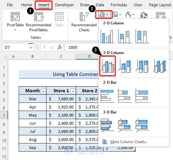
- We were able to make a 3-D Column.
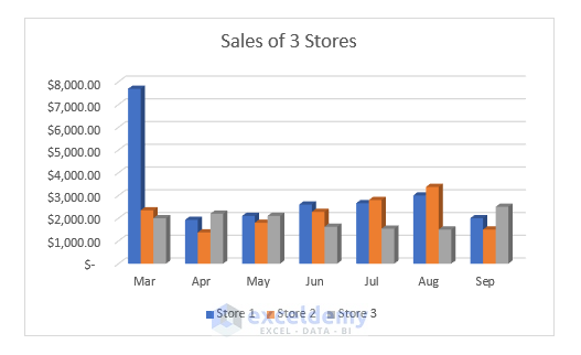
- Add data to the table, the graph will update accordingly.
Method 2 – Set a Dynamic Formula to Each Data Column of Graph in Excel
Steps:
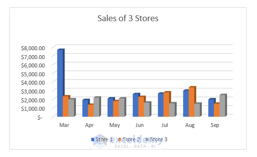
- Insert a chart from a range rather than a table. Just follow the steps in the image below:
- The previous method’s chart updates itself, this one does not refresh itself automatically.
- Make the Named Ranges and the dynamic formula for every column. From the Formulas tab, go to Define Name.
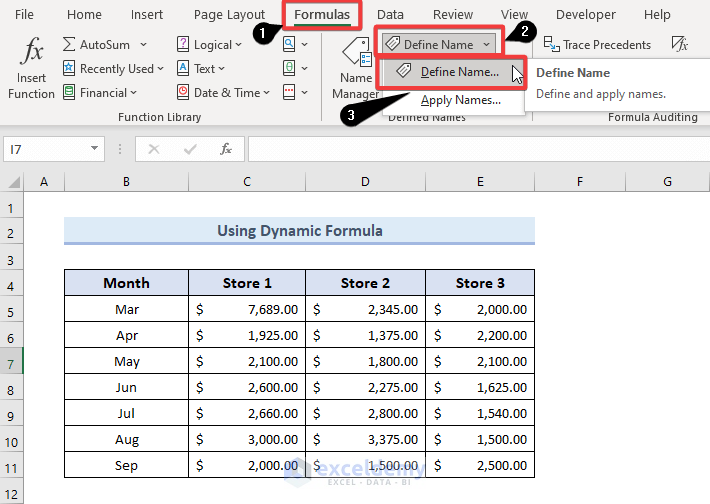
- A New Name dialog box will appear. From the New Name dialog box, type STORE1 in the Name typing box. Select the current worksheet named Dynamic Formula from the Scope drop-down box. Type the below formulas in the Refers to typing box. The formulas are:
=OFFSET($C$5,0,0,COUNTA($C:$C)-1)- The OFFSET function indicates the first data and the COUNTA function indicates the entire column data.
- Press OK.

- Repeat Step 1 for columns C, D, and E. The formula for the STORE2 column is,
=OFFSET($D$5,0,0,COUNTA($D:$D)-1)- The formula for the STORE3 column is,
=OFFSET($E$5,0,0,COUNTA($E:$E)-1)- Press right-click on the chart and click Select Data.
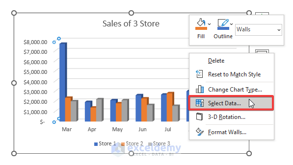
- Select the Edit option under the Legend Entries (Series).
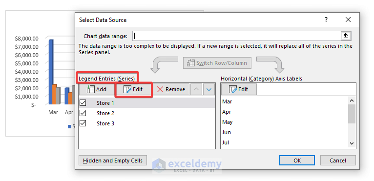
- A window named Edit Series pops up. From the Edit Series dialog box, type the following formula in the Series values typing box. Press OK.
='dynamic formula'!STORE1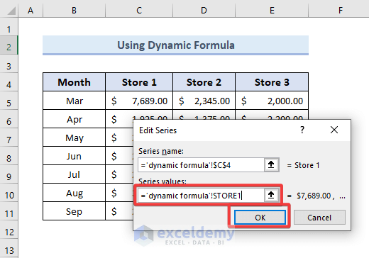
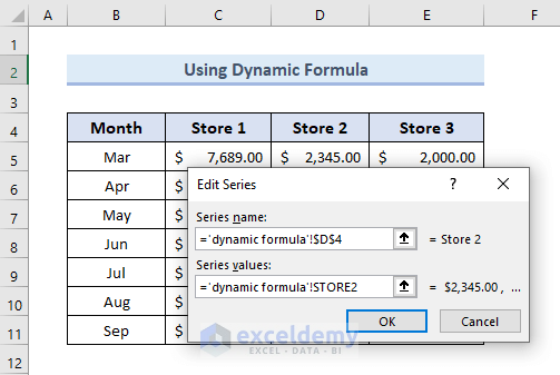
- Do the same for STORE 2 like the below image and for STORE 3.
- Under the Horizontal (Category) Axis Labels option, click the Edit button.
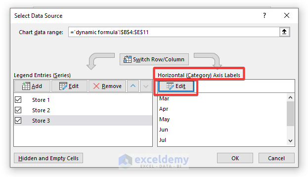
- Axis Labels dialog box appears as a consequence. Enter the following formula in the Axis label range typing box from the Axis Labels dialog box and press OK twice.
='dynamic formula'! MONTHS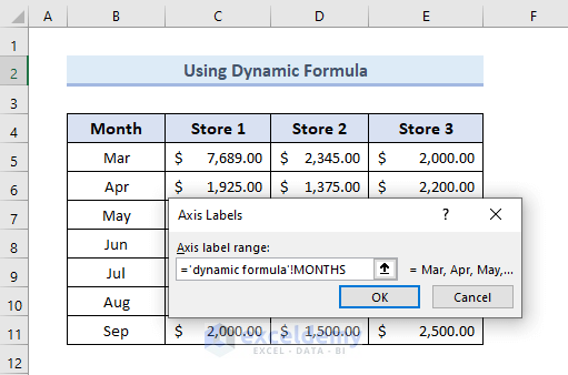
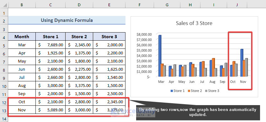
- Add two rows to our range to refresh the chart. Assume we aggregate the sales from the three stores in October and November and update our range accordingly. Our chart will instantly refresh, as shown in the picture below.
Download Practice Workbook
You can download the practice workbook from the following download button.
Related Articles
<< Go Back To How to Create a Chart in Excel | Excel Charts | Learn Excel
Get FREE Advanced Excel Exercises with Solutions!
