We will set up a dataset in columns B and C and then using the X-Y graph we will display, modify, and format our X and Y plots.
Step 1 – Collect Data
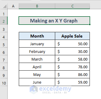
Suppose we have the Apple Sale vs Month data of a small seller as shown below and we want to plot this information in an X Y Graph with smooth lines chart.
Step 2 – Select Data
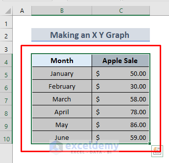
- Select both columns, including the column titles. In our case, the range is from B4 to C10.
Step 3 – Input in Correlation
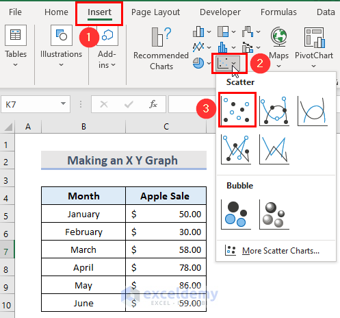
- Go to the Insert tab.
- In the Chart group, click on the Insert Scatter Chart icon.
- Choose any Scatter chart from the drop-down.
Final Output
- Excel will insert an X Y Graph in the worksheet as shown below.
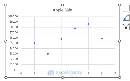
Here, the column on the left which is the Number of Months in our example would be plotted on the X-Axis and the Apple Sale would be plotted on the Y-Axis.
Note: It’s best to have the independent metric in the left column and the one for which you need to find the correlation in the column on the right.
How to Customize an X Y Graph in Excel
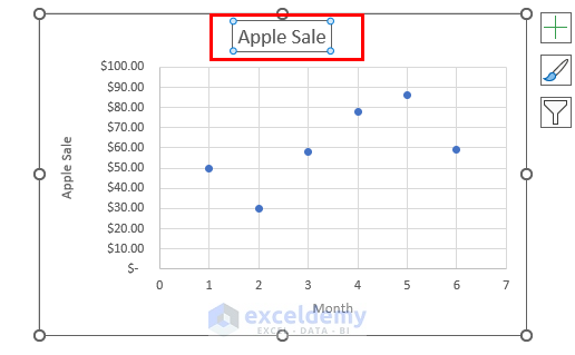
Method 1 – Add Chart Title
Double-click on the chart title to give it a new title (e.g., Apple Sales vs. Number of Months).
Read More: Create a Chart from Selected Range of Cells in Excel
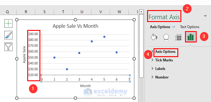
Method 2 – Horizontal & Vertical Axis Format
For example, in this graph, 30 is the first value along the Y-axis, but the chart starts from zero. We can change some of the formatting:
- Click on the chart area and go to the Format tab.
- Click on the Y-axis.
- From the Format Axis window, click on the Axis Options button and then click on the Axis Options drop-down menu.
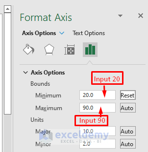
- In the Bounds section, input 20 in the Minimum box and 90 in the Maximum box (as the maximum value in the range is 86).
- Press Enter.
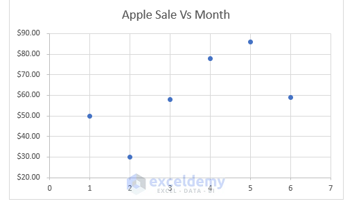
- The graph looks much better now than before.
Read More: How to Plot Graph in Excel with Multiple Y Axis
Method 3 – Add Data Labels
- Select the graph.
- Click on the plus icon on the right.
- Check the Data Labels option.
- This will add the data labels showing the Y-axis value for each data point in the scatter graph.
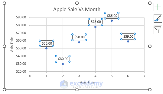
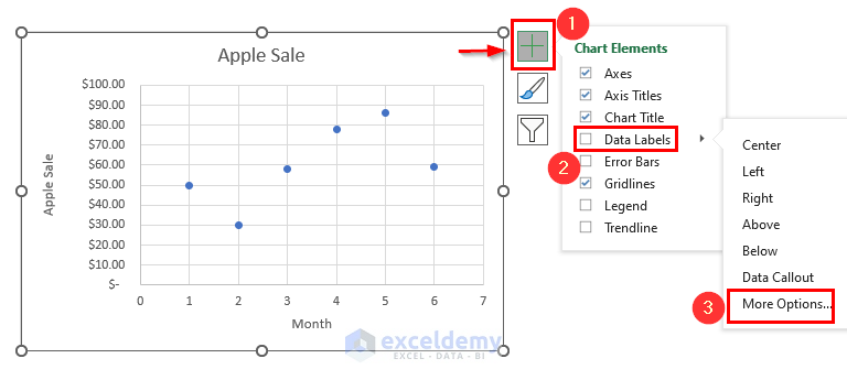
We can also add data labels on our X-Y graph in the following way:
- Click on the scatter plot and then click on the Chart Elements button.
- Click on the Data Labels drop-down and go to More Options.
Here, we can add more formatting with the options in the following window.
Note: Data labels are good only for scatter plots that have fewer data points. For graphs with many data points, they will make the points congested and less presentable.
Read More: How to Make a Graph in Excel That Updates Automatically
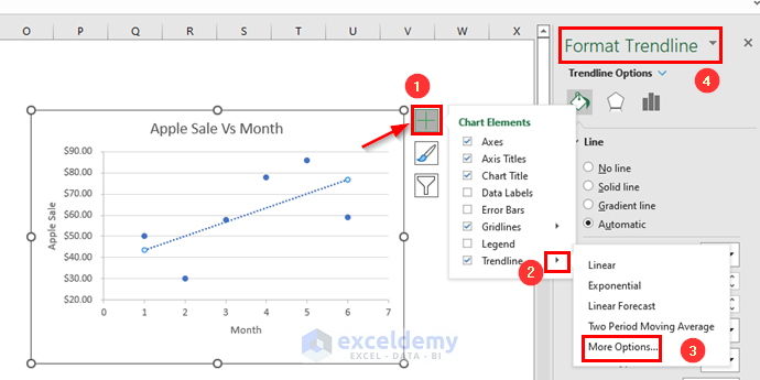
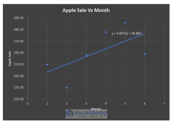
Method 4 – Input a Trendline and Equation
For the trendline:
- Click on the chart area and then on the Chart Elements (Plus) button.
- Check the Trendline box.
- From the Trendline drop-down, select More Options to add formatting to the Trendline.
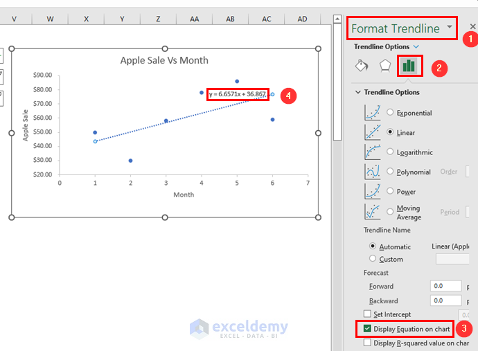
Further, to add a Correlation Equation to the graph:
- Go to the Format Trendline window as described above and mark the Display Equation on the chart box from the Trendline Options section.
Read More: How to Make a Graph from a Table in Excel
Method 5 – Change Chart Style
- Click anywhere in the chart area.
- Go to the Chart Design tab.
- Go to the Chart Styles group.
- Select a chart style from the available formats.
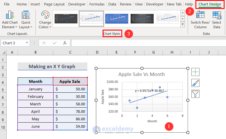
- The X-Y graph can change to look like the below image.
Read More: How to Display Percentage in an Excel Graph
Download Practice Workbook
Download the practice workbook from here
<< Go Back To How to Create a Chart in Excel | Excel Charts | Learn Excel
Get FREE Advanced Excel Exercises with Solutions!

thank you . it is very clear. it has been very helpful
Hello Mohamed Sufi,
You are most welcome.
Regards
ExcelDemy