What Is a Semi Log Graph?
Semi-logarithmic or semi-log graphs have one axis on the logarithmic scale and the other on the linear scale: if the Y-axis is in logarithmic scale then the X-axis must be in linear scale and vice versa.
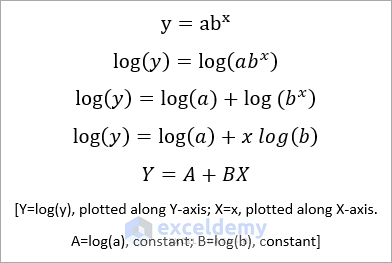
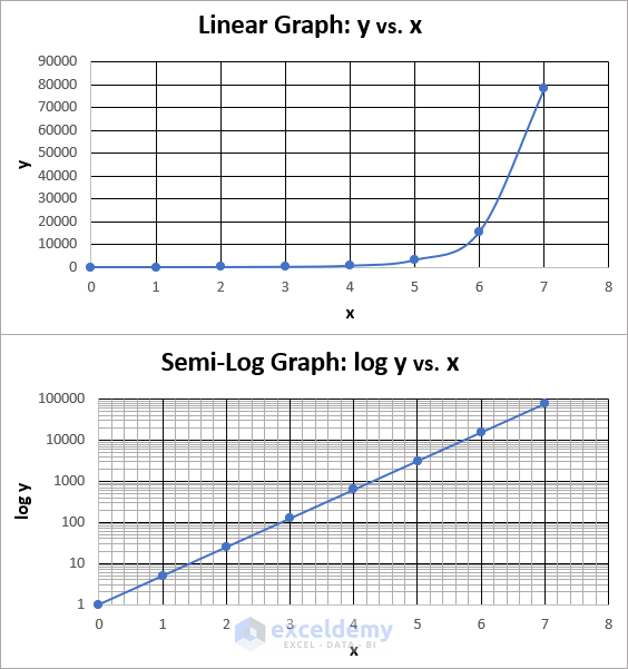
Consider the transformation of the above equation. If you plot y vs. x, you will get an exponential trendline, as y is exponentially proportional to x. But if you plot Y vs. X, you will get a straight trendline, as the deduced equation indicates a straight-line equation. Here, the graph will be a semi-log graph: you plot log(y) vs x.
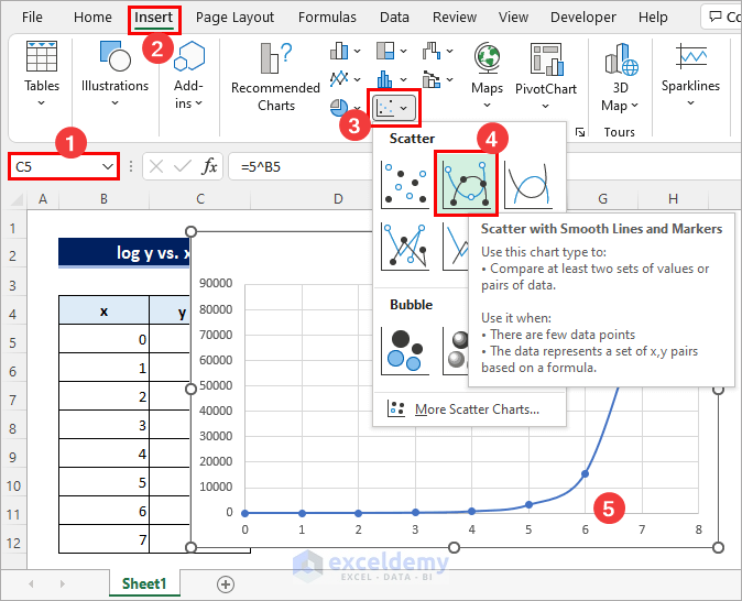
Step 1 – Prepare the Dataset
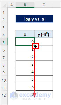
- To apply this method to an existing dataset, go to Step 2. Otherwise, enter 0 in B5, hold CTRL and drag the Fill Handle icon below to create a data series.
- Enter the following formula in C5 and copy the formula down using the Fill Handle:
=5^B5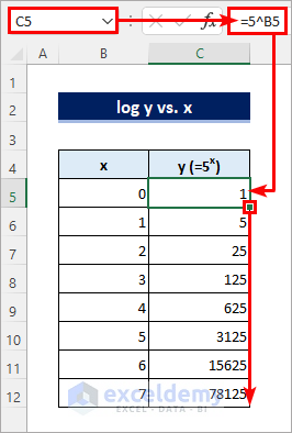
Read More: How to Plot Time Series Frequency in Excel
Step 2 – Insert a Scatter Chart
- Click anywhere in the dataset and go to Insert >> Insert Scatter (X, Y) or Bubble Chart >> Scatter with Smooth Lines and Markers.
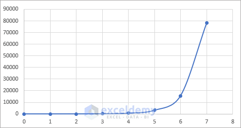
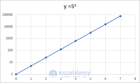
You will see the following chart.
Read More: How to Make a Time Series Graph in Excel
Step 3 – Format the Axis
- Right-click the y-axis and select Format Axis.
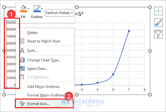
- Check Logarithmic scale and keep the Base to 10.
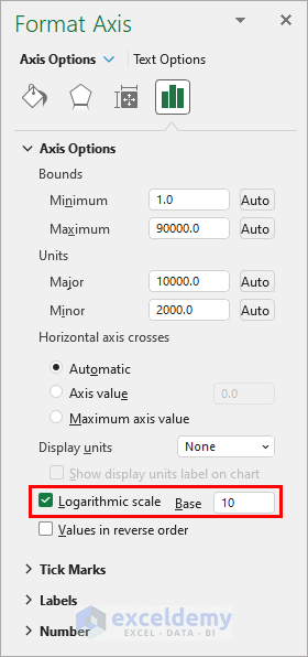
The graph is displayed. The trendline changed from an exponential to a straight-line.
Read More: How to Plot Sieve Analysis Graph in Excel
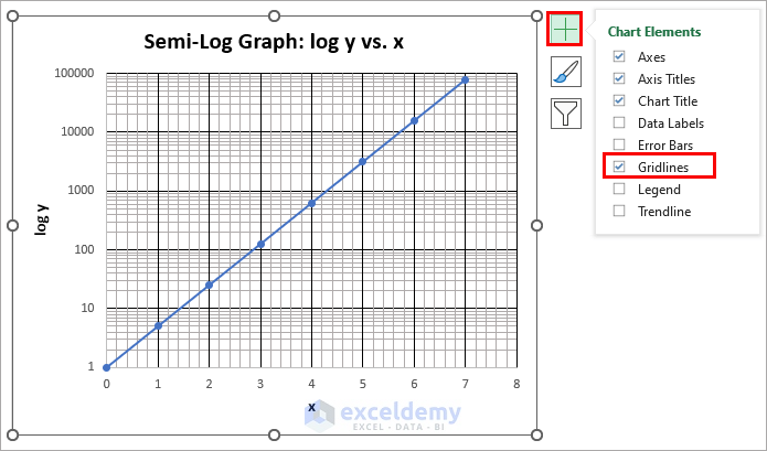
Step 4 – Add Gridlines
- Select the graph, click Chart Element and check Gridlines. If you keep the cursor on the Gridlines element, you will see options to add minor gridlines. You can also do thisin the Chart Design tab.
Read More: How to Plot Michaelis Menten Graph in Excel
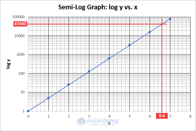
How to Read a Semi-Log Graph in Excel
- The vertical minor gridlines are uniformly distributed. As each unit along the x-axis is divided into 5 parts, you can read the values corresponding to the minor vertical gridlines as 0, 0.2, 0.4, 0.6, 0.8, 1.0, 1.2, 1.4, 1.6, and so on.
- On the other hand, the horizontal minor gridlines get closer to each other when they approach the major gridline above them. Notice that each section along the y-axis is divided into 10 parts. So you must read the values corresponding to the horizontal gridlines as 1, 2, 3, 4, 5, 6, 7, 8, 9, 10, 20, 30, 40, 50, 60, 70, 80, 90, 100, 200, 300, 400, 500, 600, 700, 800, 900, 1000,2000, 3000, and so on.
Read More: How to Make a Lineweaver Burk Plot in Excel
Things to Remember
- You can format the X-axis instead of plotting log(x) vs y.
Download Practice Workbook
Download the practice workbook.
<< Go Back To How to Create a Chart in Excel | Excel Charts | Learn Excel
Get FREE Advanced Excel Exercises with Solutions!
