How to Create a Chart in Excel
Nov 11, 2025
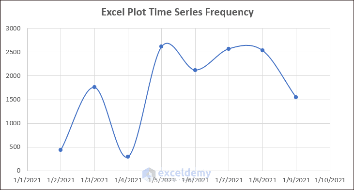
Are you looking for a better way to Plot Time Series Frequency in Excel? Well, I will try to explain two simple ways to plot time series frequency in ...
Apr 29, 2024
Here's an overview of making a time series graph in Excel.
How to Make a Time Series Graph in Excel: 3 Useful Methods
Method 1 ...
May 27, 2024
Method 1 - Create a Graph from an Excel Table
Steps:
Define the data range. For the sake of simplicity, we will choose B4 through E11 from our ...
Aug 12, 2024
What Is a Semi Log Graph?
Semi-logarithmic or semi-log graphs have one axis on the logarithmic scale and the other on the linear scale: if the ...
Jun 15, 2024
What Is a Sieve Analysis Graph?
Sieve Analysis is the particle size analysis method to determine the ratio of particles of different sizes present ...
Apr 16, 2024
We will set up a dataset in columns B and C and then using the X-Y graph we will display, modify, and format our X and Y plots.
Step 1 - Collect ...
May 22, 2024
In this article, we will plot a Michaelis Menten graph in Excel using the Michaelis Menten equation. Generally, this equation is used to analyze the ...
Jul 4, 2024
In biochemistry, the Michaelis-Menten Equation of enzyme kinetics results in a Lineweaver-Burk Plot, also known as a Double Reciprocal Plot. Here's ...
Apr 30, 2024
Consider the following dataset, which contains sales and salary information for several salespeople. We'll use it to demonstrate how to create an ...
Apr 30, 2024
Let’s consider a dataset of Yearly Sales of XYZ Traders. The data table has three columns, B, C, and D, indicating the data of No. of Year, Cost, and ...
Jul 3, 2024
Method 1 - Show Percentages in a Stacked Column Chart in Excel
Select the range of cells that you want to consider while plotting a stacked ...
Aug 12, 2024
The dataset below showcases a Sales Report of electric products in January, February, and March.
Method 1 - Create a Chart from the ...