Method 1 – Show Percentages in a Stacked Column Chart in Excel
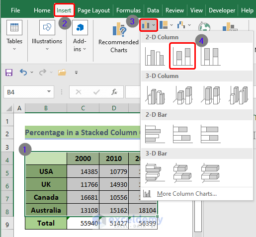
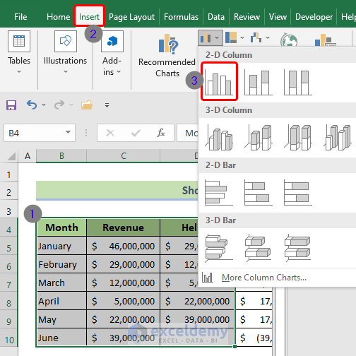
- Select the range of cells that you want to consider while plotting a stacked column chart.
- Go to the Insert ribbon.
- From the Charts group, select a stacked column chart as shown in the screenshot below:
- Navigate to Chart Design, then select Add Chart Element.
- Choose Data Labels and select Center.
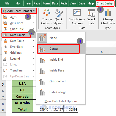
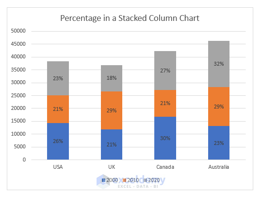
- You will have data labeled in the stacked column chart.
- Create one secondary data table and convert all the general numerical values into percentages.
- Click one of the data labels of the stacked column chart, go to the formula bar, type equal (=), and then click on the cell of its percentage equivalent.
- Hit the Enter button.
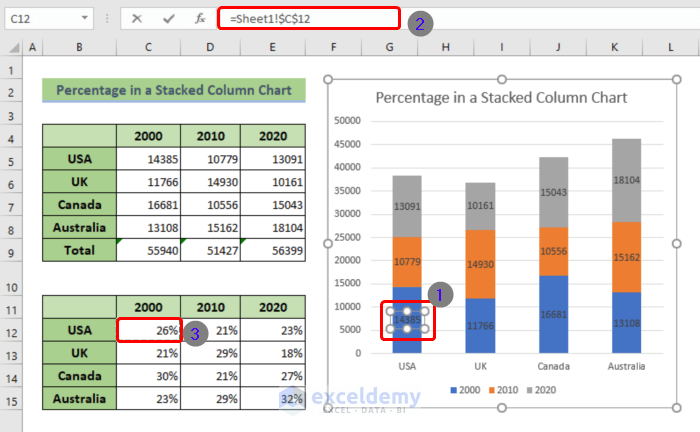
- Repeat the same process to convert all of the numbers into their corresponding percentages.
Read More: How to Make an X-Y Graph in Excel
Method 2 – Format Graph Axis to Percentages in Excel
- Select the cell ranges.
- Go to the Insert tab from the main ribbon.
- From the Charts group, select any one of the graph samples.
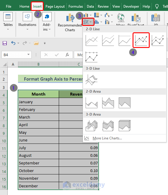
- Double-click on the chart axis that you want to change to percentages.
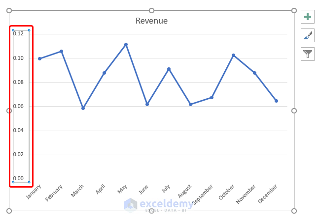
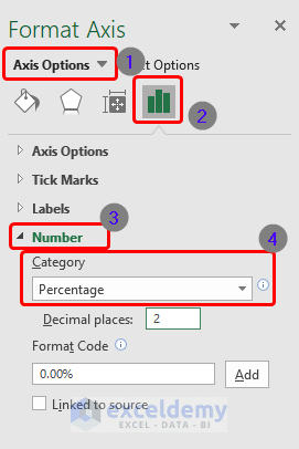
- You will see a dialog box appear on the right.
- Select Axis Options.
- Go to Chart.
- Navigate to Number.
- From the Category box, select Percentage.
- If you want to adjust the decimal places, tweak it from the next box below.
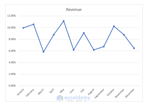
- Here’s the result.
Read More: How to Create a Chart from Selected Range of Cells in Excel
Method 3 – Show the Percentage Change in Excel Graph
Part 1 – Create the Data Table
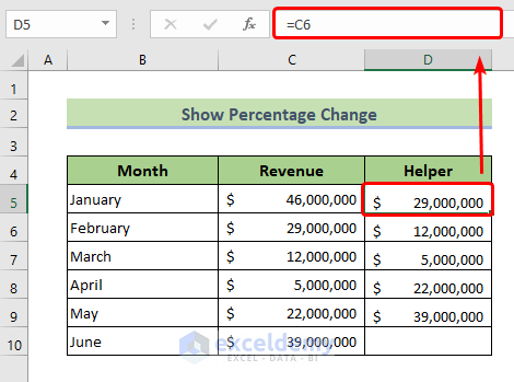
The Month and the Revenue are the main columns. We need to create another column, the Helper column.
- Use the following formula in cell D5.
=C6- Press Enter.
- Drag the Fill Handle icon to the end of the Helper column.
- Create another column called Difference using the following formula:
=C6-C5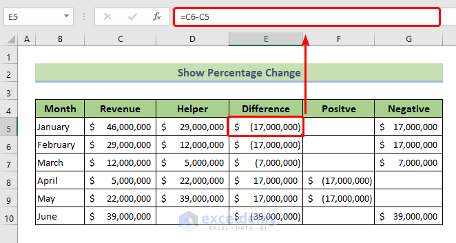
- Use the following formula to create the Positive column. This column will contain only the positive difference values.
=IF(E5>0,-E5,"")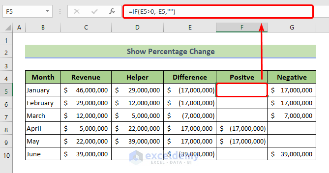
- Create another column, called the Negative, using the following formula:
=IF(E5<0,-E5,"")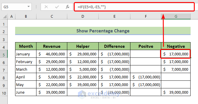
Part 2 – Generate a Graph
- Select the Month, Revenue, and Helper columns.
- Go to Insert and select the Clustered Column command to insert a column graph.
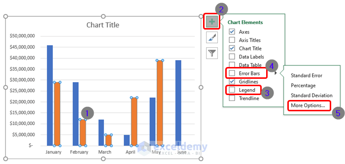
- Double-click on the Helper columns in the graph.
- Click on the plus icon and uncheck the Legend option.
- Go to More Options from the Error Bars option.
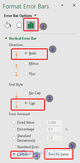
- The Format Error Bars dialog box will appear.
- Make sure that the direction is set to Both and the End Style is Cap.
- From the Error Amount options, select Custom and click on Specify Value.
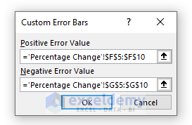
- The Custom Error Bars box will appear. Select the whole Positive column cell ranges in the Positive Error Value box.
- Select the whole Negative column cell ranges in the Negative Error Value box.
- Hit the OK button.
- Right-click on the Blue columns in the graph, which are originally the Revenue column series.
- From the pop-up list, select Format Data Series.
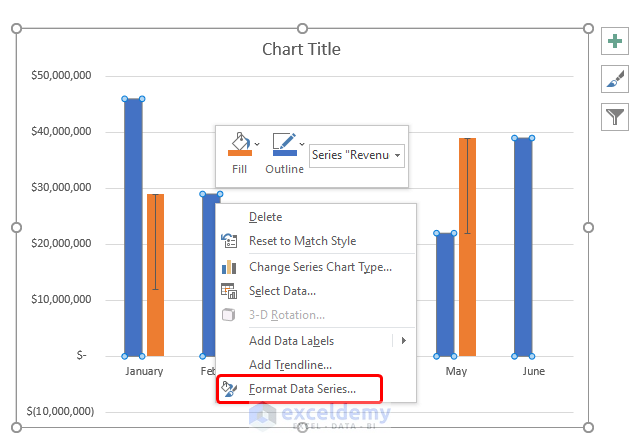
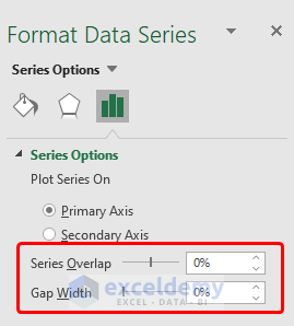
- Select the Graph in the Format Data Series dialog box.
- Put the Series Overlap to 0% and Gap Width also to 0%.
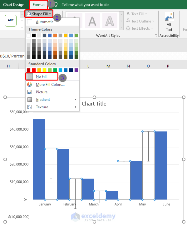
- Select all the Helper columns in the graph.
- Go to the Format tab.
- Navigate to Shape Fill and choose No Fill.
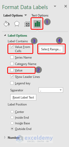
Part 3 – Display Percentage in Graph
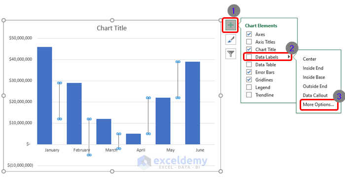
- Select the Helper columns and click on the plus icon.
- Go to More Options via Data Labels.
- Select Chart on the Format Data Labels dialog box.
- Uncheck the Value option.
- Check the Value From Cells option.
- Select the cell ranges to extract percentage values.
- Create a column called Percentage using the following formula:
=E5/C5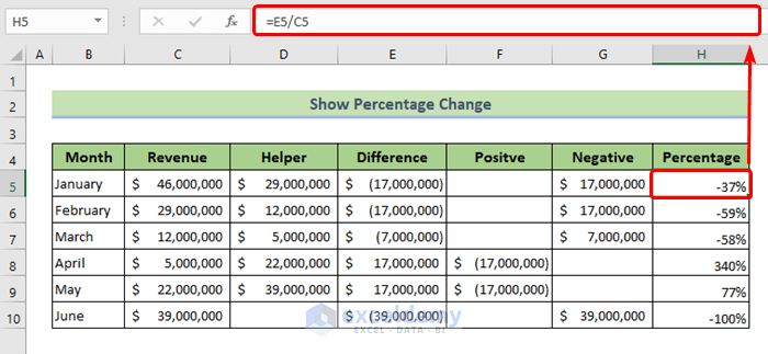
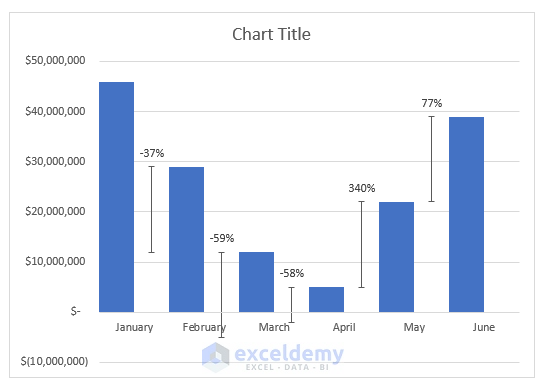
Part 4 – The Final Graph with Percentage Change
- You will see a graph with percentage change as in the picture below:
Read More: How to Make a Graph from a Table in Excel
Download the Practice Workbook
Related Articles
- How to Make a Graph in Excel That Updates Automatically
- How to Plot Graph in Excel with Multiple Y Axis
<< Go Back To How to Create a Chart in Excel | Excel Charts | Learn Excel
Get FREE Advanced Excel Exercises with Solutions!
