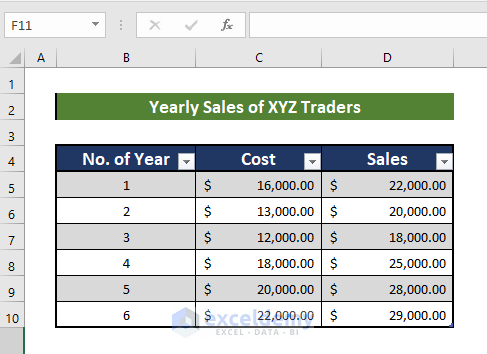
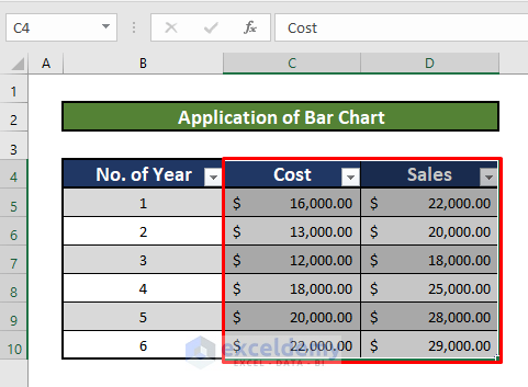
Let’s consider a dataset of Yearly Sales of XYZ Traders. The data table has three columns, B, C, and D, indicating the data of No. of Year, Cost, and Sales, respectively. The data table starts from the B4 cell and ends with the D10 cell.
Method 1 – Introducing a Line Chart to Make a Graph From a Table
Steps:
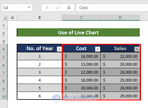
- Select the columns of data you want to show in your graph.
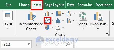
- Go to the Insert tab on your Toolbar and click on the Line Chart option.
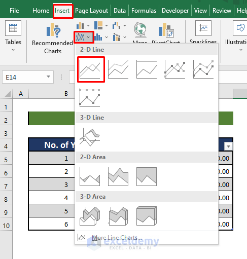
- Select the first option on the dropdown menu.
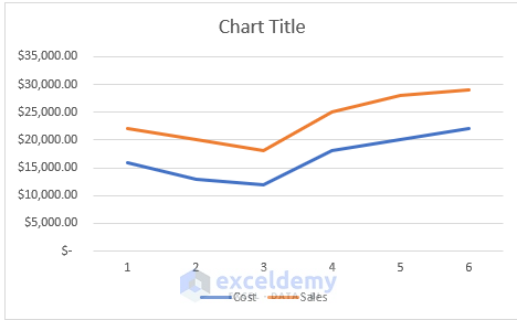
- A graph just like the one pictured below will appear.
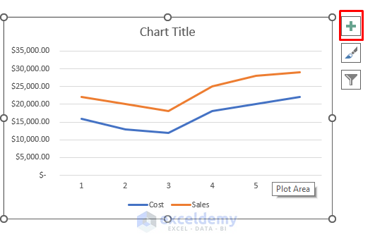
- To get other the options to edit the graph, click on the indicated icon:
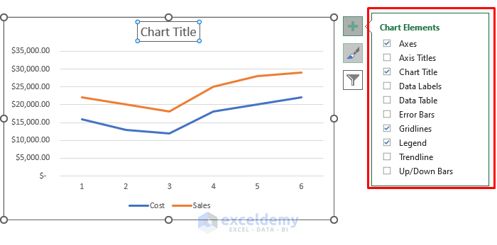
- Use the options to edit the chart according to your preferences. For instance, you can edit chart title.
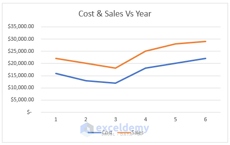
- After all the edits, your graph should look like the one below.
Read More: How to Make an X-Y Graph in Excel
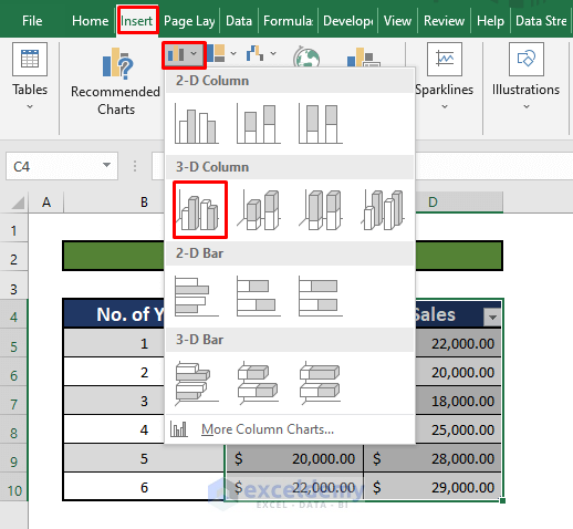
Method 2 – Inserting a Bar Chart to Make a Graph From a Table
Steps:
- Select the data ranging from C4 to D10.
- Go to the Insert tab on your Toolbar.
- Select the Bar Chart option.
- Choose the first option under the 3-D Column section.
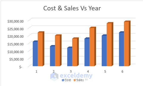
- You should see a Bar Chart just like the one pictured below.
Read More: How to Create a Chart from Selected Range of Cells in Excel
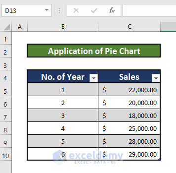
Method 3 – Applying a Pie Chart to Make a Graph From a Table
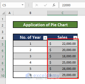
For this method, we need a new dataset table. In this table, there are two columns, B and C, which indicate the No. of Year and Sales, respectively.
Steps:
- Select the data ranging from C5 to C10.
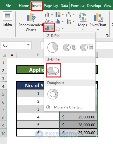
- Go to the Insert tab on your Toolbar.
- Click on the Pie Chart button.
- Choose the first 3-D Pie option.
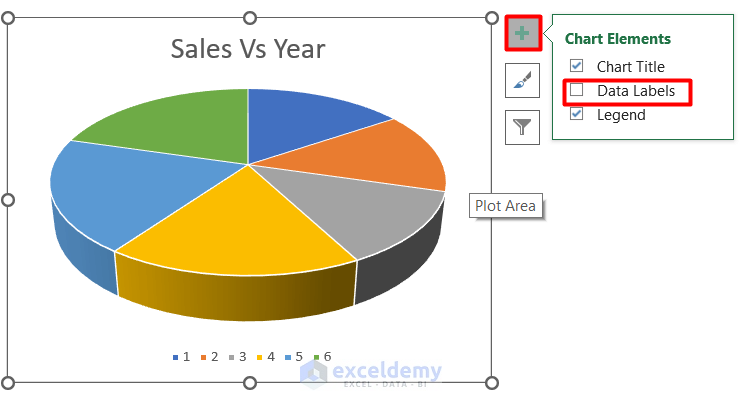
- To insert data labels, click on the Plus icon in the top-right corner of the chart and select the Data Labels option.
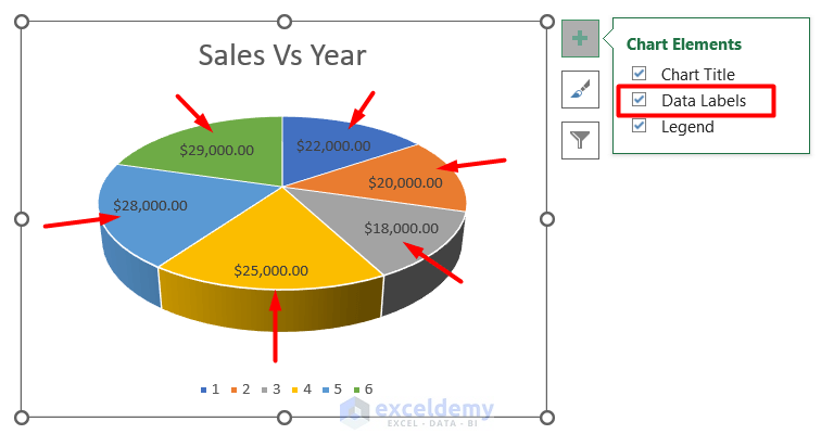
- Data labels will appear on your pie chart, as pictured below.
Read More: How to Make a Graph in Excel That Updates Automatically
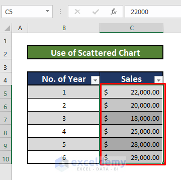
Method 4 – Using a Scattered Chart to Make a Graph From a Table
Steps:
- Select the data ranging from C5 to C10.
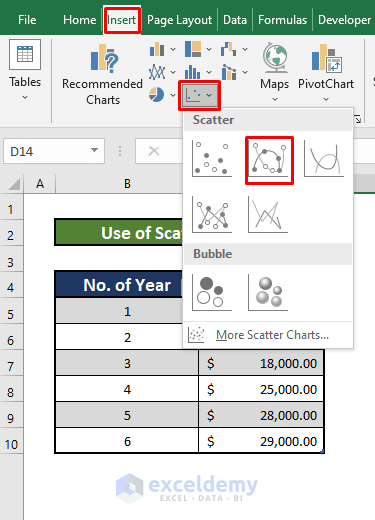
- Go to the Insert tab on your Toolbar.
- Select the Scattered Chart option from the Ribbon.
- Choose the second option from the dropdown menu.
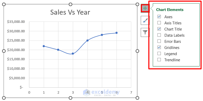
- To edit the graph, click on the Plus icon in the top-right corner of the graph.
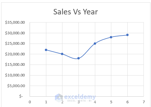
- After making the necessary changes, your graph should look like the graph below.
Read More: How to Plot Graph in Excel with Multiple Y Axis
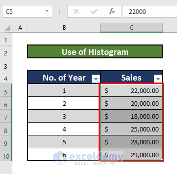
Method 5 – Using a Histogram to Make a Graph From a Table
Steps:
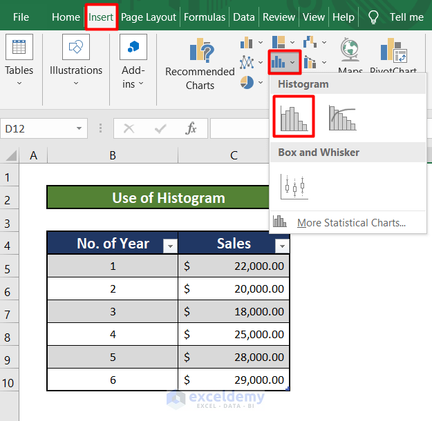
- Select the data ranging from C5 to C10.
- Go to the Insert tab of your Toolbar.
- Click on the Scattered Chart option in the Ribbon.
- Select the first option from the dropdown menu.
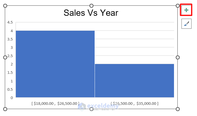
- Navigate to the Plus icon in the upper-right corner of the graph to edit it.
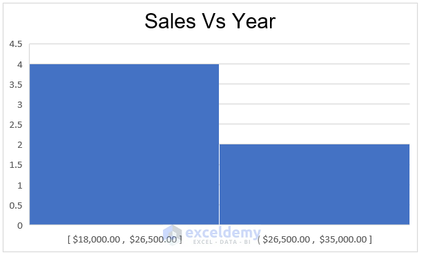
- You should end up with a Histogram graph like the one pictured below.
Read More: How to Display Percentage in an Excel Graph
Things to Remember
- For every method described in this article, you must select the data you want to show in your graph first.
Download Practice Workbook
Feel free to download the workbook below to practice on your own.
<< Go Back To How to Create a Chart in Excel | Excel Charts | Learn Excel
Get FREE Advanced Excel Exercises with Solutions!
