In this article, we will plot a Michaelis Menten graph in Excel using the Michaelis Menten equation. Generally, this equation is used to analyze the kinetic data of enzymes, as it explains the effect of substrate concentration on enzymes. in addition to plotting a graph from the equation, we’ll demonstrate how to extract the value of the Michaelis Menten constant.
What Is Michaelis Menten Graph?
In the Michaelis Menten graph, we plot the Reaction Velocity (V) on the Y-axis and the Substrate Concentration ([S]) on the X-axis. The graph follows the equation below:
V = (Vmax*[S])/([S]+Km)It is a zero-order equation.
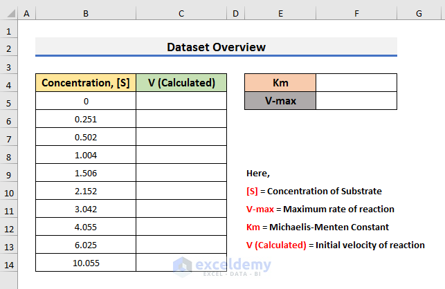
Here,
V = Initial velocity of reaction
Vmax = Maximum velocity of reaction
[S] = Concentration of Substrate
Km = Michaelis Menten Constant
At low substrate concentration, the equation becomes:
V = (Vmax*[S])/KmIt is a first-order equation.
Plotting a Michaelis Menten Graph in Excel
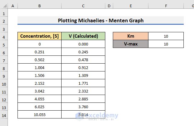
To explain the steps, we will use a dataset that contains Substrate Concentration, [S]. We will calculate the Reaction Velocity (V) with the Michaelis Menten equation. We will use educated values of Km and V-max, then find the value of Km and V-max using the observed and calculated Velocity.
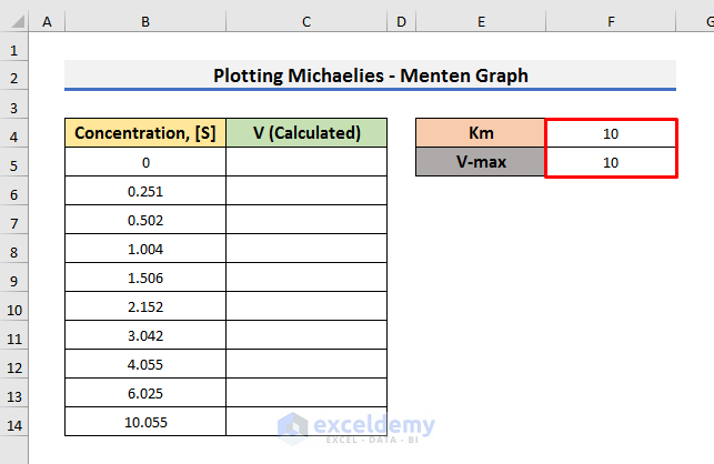
STEP 1 – Insert Michaelis Menten’s Constant and V-max Values
Let’s insert educated values of Km and V-max.
- Let the values of Km and V-max be 10.
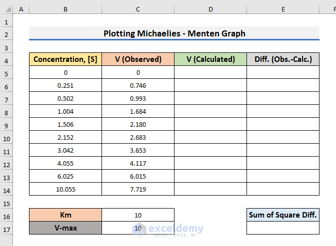
- Here, we have inserted 10 in both Cell F4 and Cell F5.
Read More: How to Plot Time Series Frequency in Excel
STEP 2 – Calculate Value of Initial Velocity
Now we can calculate the value of the initial velocity, using the Michaelis Menten’s equation.
- Select Cell C5 and type the formula below:
=($F$5*B5)/(B5+$F$4)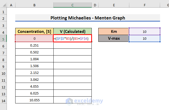
Here, Cell F5 contains Km, Cell F4 stores V-max, and Cell B5 stores the Substrate Concentration [S].
- Press Enter and drag the Fill Handle down.
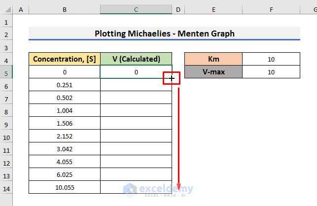
As a result, you will see the Velocity corresponding to the Concentration.
Read More: How to Make a Time Series Graph in Excel
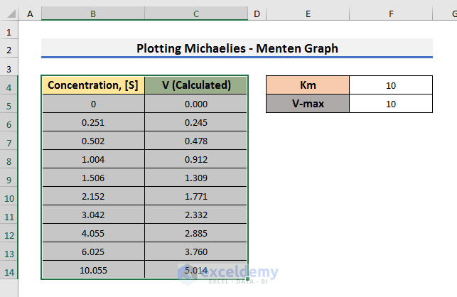
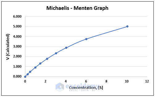
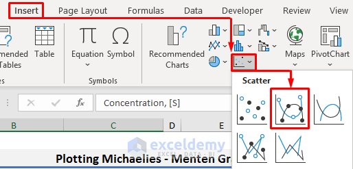
STEP 3 – Plot Michaelis Menten Graph with Calculated Velocity
To plot the graph, you need to select the values of Concentration and corresponding Velocity.
- Select the range B4:C14.
- Go to the Insert tab and click on the Insert Scatter icon.
A drop-down menu will appear.
- Select Scatter with Smooth Lines and Markers option from the drop-down menu.

As a result, you will see the plot on the sheet.
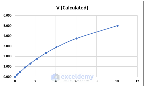
After changing the axis and chart titles, the graph will look like the picture below.
Read More: How to Plot Semi Log Graph in Excel
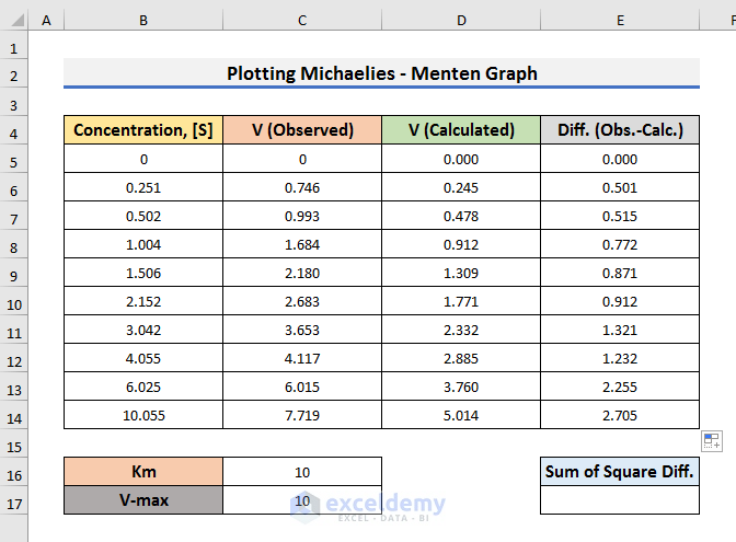
STEP 4 – Determine Initial Velocity Along with Observed Velocity
- In STEP 2, we calculated the initial velocity with a formula. In that case, we didn’t have absolute values of Km and V-max. Also, there was no observed velocity.
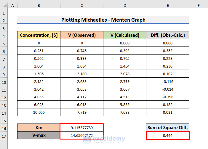
- If you have Observed Velocity like in the dataset below, you can calculate the initial velocity as well as the values of Km and V-max.
- Select Cell D5 and type the formula below:
=($C$17*B5)/(B5+$C$16)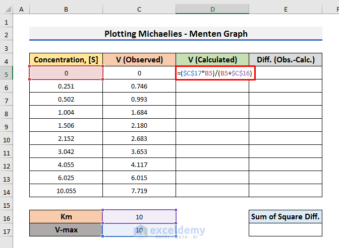
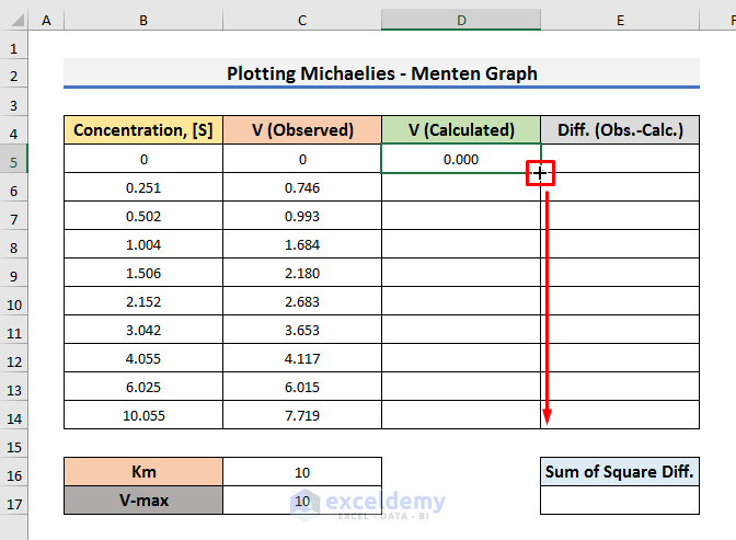
- Press Enter and drag the Fill Handle down.
STEP 5 – Find the Difference Between Observed and Calculated Velocities
Having calculated velocity with the Michaelis Menten equation, let’s find the difference between the observed and calculated velocities.
- Select Cell E5 and enter the formula below:
=C5-D5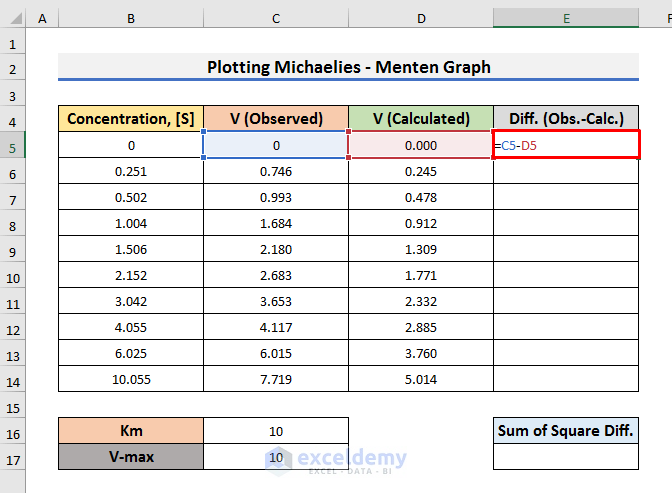
- Press Enter and drag down the Fill Handle to see the results.
Read More: How to Plot Sieve Analysis Graph in Excel
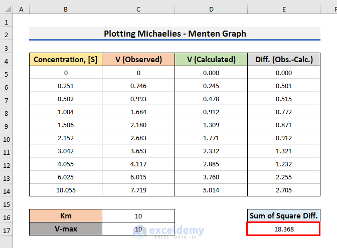
STEP 6 – Find the Sum of Squares of the Differences
To find the best values for Km and V-max, we need to determine the sum of squares of the differences.
- Select Cell E17 and enter the formula below:
=SUMSQ(E5:E14)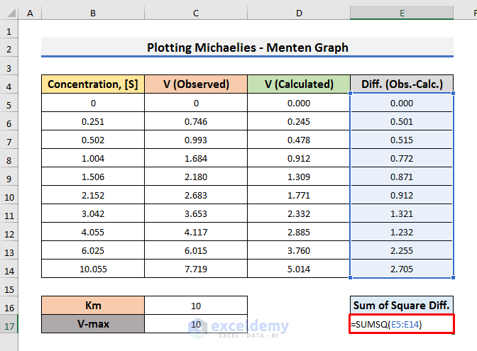
Here, we have used the SUMSQ function to calculate the summation of squares of the differences.
- Press Enter to see the result.
To obtain the best values for Km and V-max, the Sum of Squares of Differences must be the minimum.
Read More: Make a Lineweaver Burk Plot in Excel
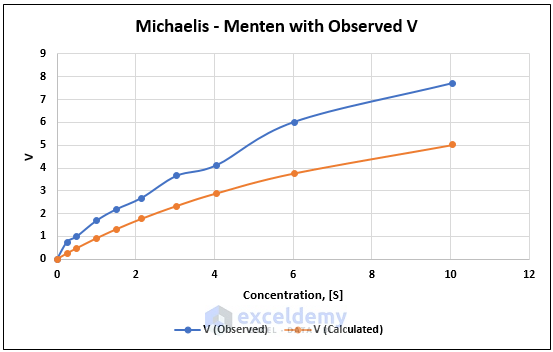
STEP 7 – Plot Michaelis Menten Graph with Both Observed & Calculated Velocities
- Select the range B4:D14.
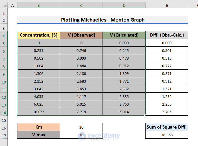
- Go to the Insert tab and click on the Insert Scatter icon.
A drop-down menu will appear.
- Select the Scatter with Smooth Lines and Markers option from the drop-down menu.
As a result, you will see the graph of both Observed and Calculated velocities.
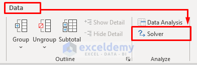
STEP 8 – Find Michaelis Menten’s Constant and V-max
To find Km and V-max for the observed values, we need to calculate the minimum value of the sum of squares of the differences.
For that purpose, we’ll use the Solver Add-in.
- Go to the Data tab and click on the Solver option from the Analysis section.
- In the Solver Parameters box, enter the cell that contains the value of Sum of Squares of Differences in the Set Objective field. In our case, that is Cell E17.
- Select Min.
- Enter the cells that contain the values of Km and V-max in the “By Changing Variable Cells” field.
- Here, we have typed $C$16:$C$17.
- Click Solve to proceed.

- Click OK to proceed.
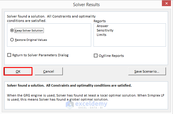
The desired results will be returned like in the picture below.
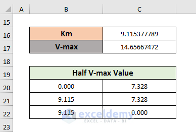
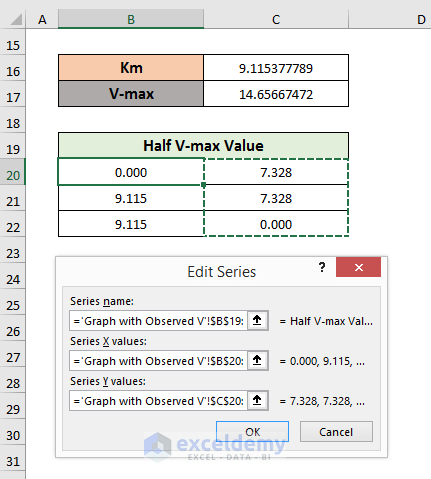
STEP 9 – Insert Half V-max Value in Graph
- To insert the Half V-max value, you need to create a chart like the picture below.
- Here, Cell B20 stores 0, while Cell B21 and Cell B22 store the value of Km.
- Cell C20 and Cell C21 contain the Half V-max value. That means, C17/2 and Cell C22 stores 0.
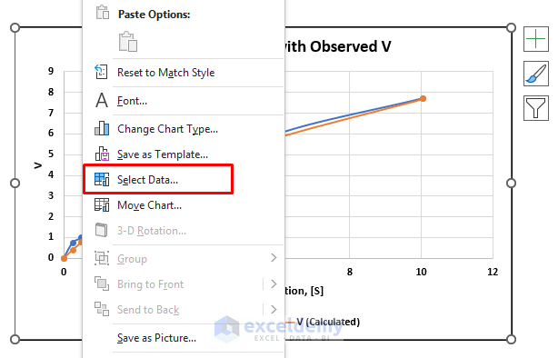
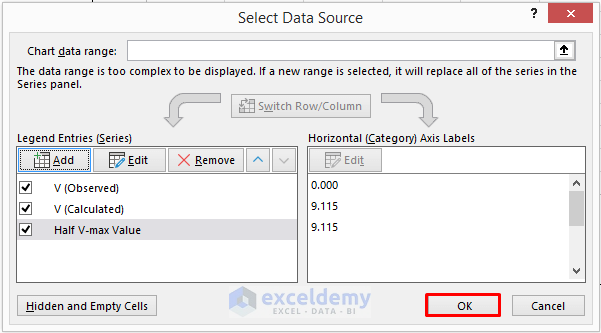
- After creating the Half V-max table, select the graph and right–click on it.
A menu will appear.
- Click on the Select Data option from this menu.
- Select Add from the Select Data Source box.
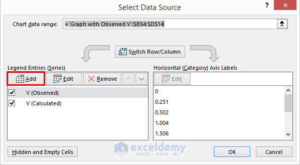
- Select the Series Name, X-values, and Y-values.
- Here, Cell 19 is the Series Name, the range B20:B22 is the X-values, and the range C20:C22 is the Y–values.
- Click OK.
- Click OK in the Select Data Source box.
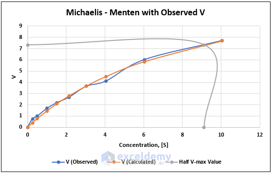
As a result, you will see a graph like the picture below.
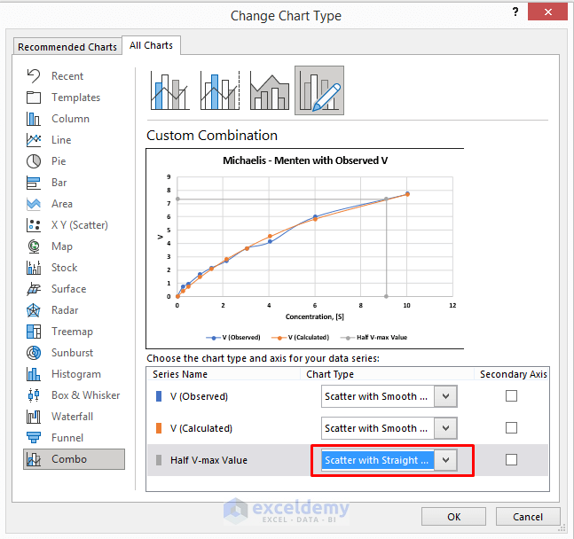
STEP 10 – Change Series Chart Type
Let’s change the chart type for the Half V-max value graph.
- Select the Half V-max value graph first and right–click on it.
A menu will appear.
- Select Change Series Chart Type.
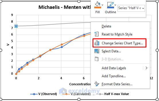
- In the Change Chart Type box, change the Chart Type to Scatter with Straight Lines and Markers.
- Click OK.
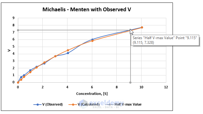
Final Output
At the end of this process, you will get the desired point where Km is 9.115 and V-max is 7.328.
Download Practice Workbook
<< Go Back To How to Create a Chart in Excel | Excel Charts | Learn Excel
Get FREE Advanced Excel Exercises with Solutions!
