Here’s an overview of making a time series graph in Excel.
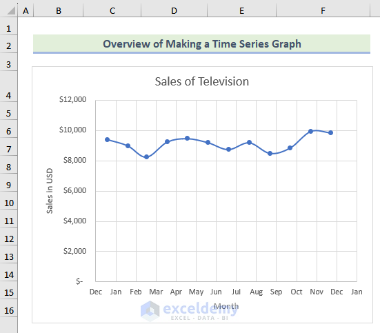
How to Make a Time Series Graph in Excel: 3 Useful Methods
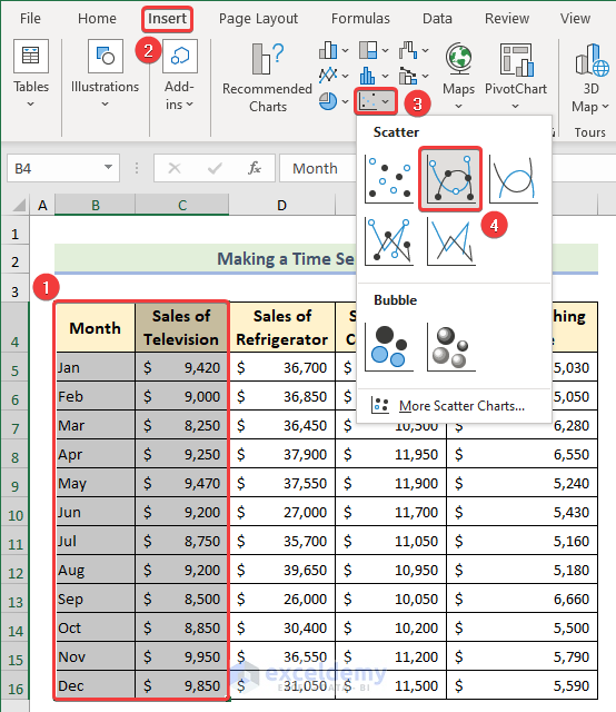
Method 1 – Making a Time Series Graph Using a Scatter Chart
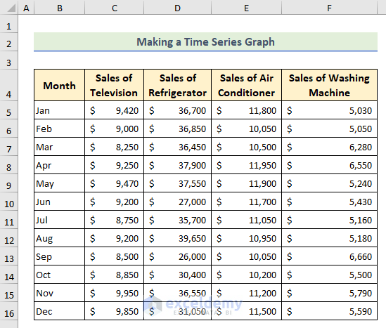
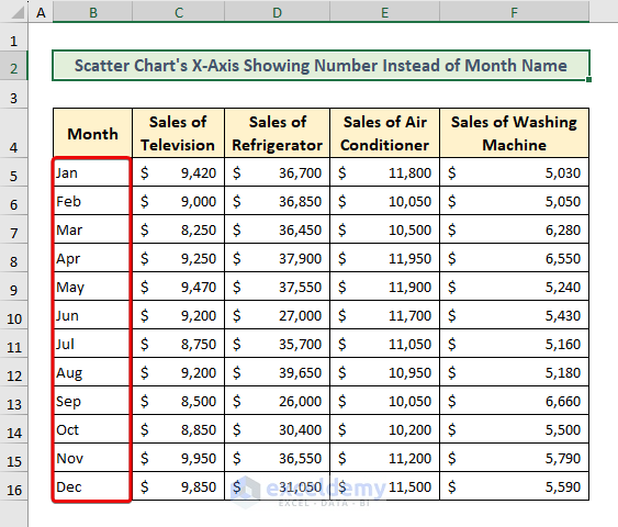
Suppose we have a dataset of monthly Sales of Television, Sales of Refrigerator, Sales of Air Conditioner, and Sales of Washing Machine. We will make a time graph using this data table.
- Select the columns and choose Scatter Chart from the Insert tab.
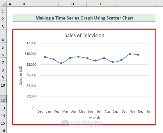
- You will get a time series graph in your worksheet.
Note: Sometimes you will get numbers instead of month names on the X or Y-axis of the graph. You can change the format of the cells by following the below instructions.
- Put the first dates of months e.g. 1/1/2023 instead of the month name, then press Ctrl + 1 to open the Format Cells window.
- Choose the Custom option, type “mmm”, and hit OK.
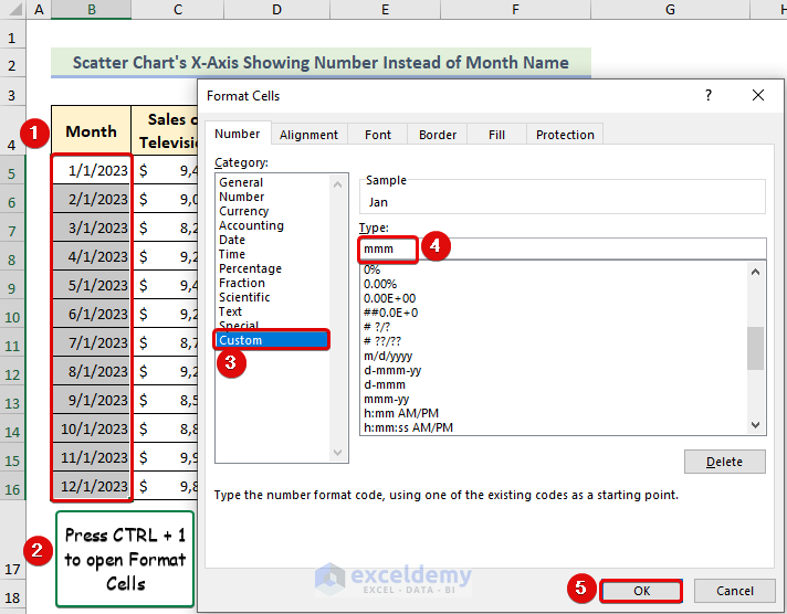
- You will get the month name shown inside a chart instead of numbers.
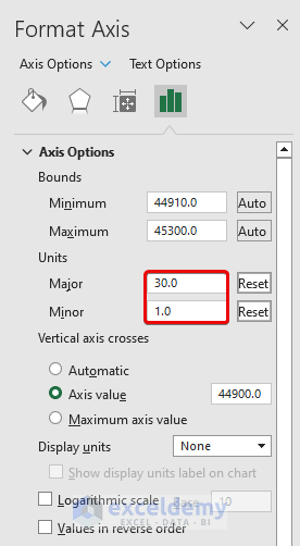
- You can also change the Units from the Format Axis feature to display all month names in the horizontal axis.
Read More: How to Plot Semi Log Graph in Excel
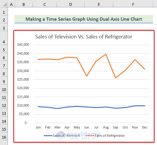
Method 2 – Using a Dual Axis Line Chart to Make a Time Series Graph
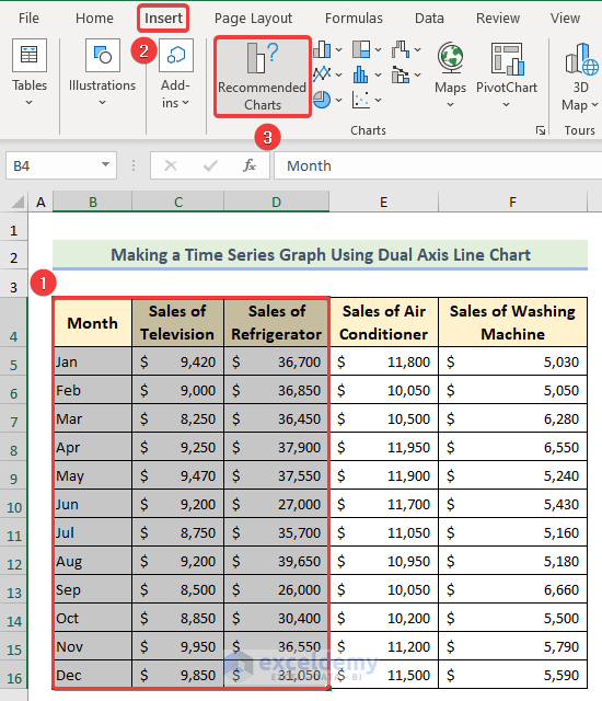
- Choose your desired cell ranges and click the Recommended Charts option from the Insert tab.
- Select a line chart from the list and hit OK.
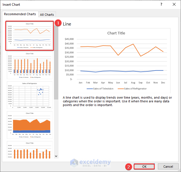
- You will get a time series graph.
Read More: How to Plot Time Series Frequency in Excel
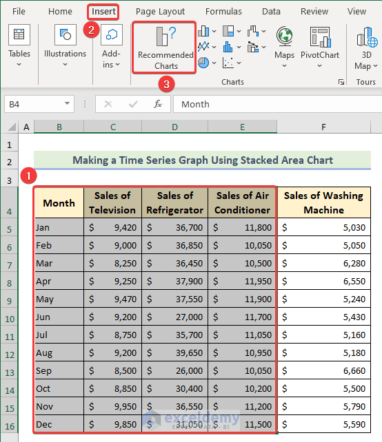
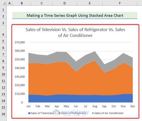
Method 3 – Making a Time Series Graph Using a Stacked Area Chart
- Select your columns and click Recommended Charts from the Insert tab.
- Choose a Stacked Area chart from the list and hit OK.
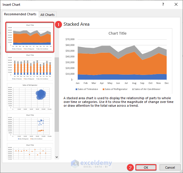
- This creates a time graph using a stacked area chart in Excel.
Read More: How to Plot Sieve Analysis Graph in Excel
Things to Remember
- While creating a time series graph, ensure the dates and times are properly formatted and displayed on the horizontal axis. Excel has a built-in feature for formatting dates, which can be found under the Format Axis option.
- After creating a chart, you can format it by adding titles, labels, and other elements.
- If you want to modify your chart, you can alter the chart type, add trendlines or error bars, and apply different colors and styles to your data points.
Frequently Asked Questions
What types of data are suitable for a time series graph in Excel?
Any data that changes over time can be displayed in a time series graph in Excel. This includes sales figures, stock prices, website traffic, and more.
Can we add multiple data series to a time series graph in Excel?
Yes, you can add multiple data series to a time series graph in Excel. This allows you to compare trends or patterns between different sets of data. To add multiple data series, simply select the additional data range and add it to the chart.
Download the Practice Workbook
You can download our practice workbook from here for free!
Related Articles
<< Go Back To How to Create a Chart in Excel | Excel Charts | Learn Excel
Get FREE Advanced Excel Exercises with Solutions!
