


Step 1: Prepare Your Source Data
Convert the Data into an Excel Table:
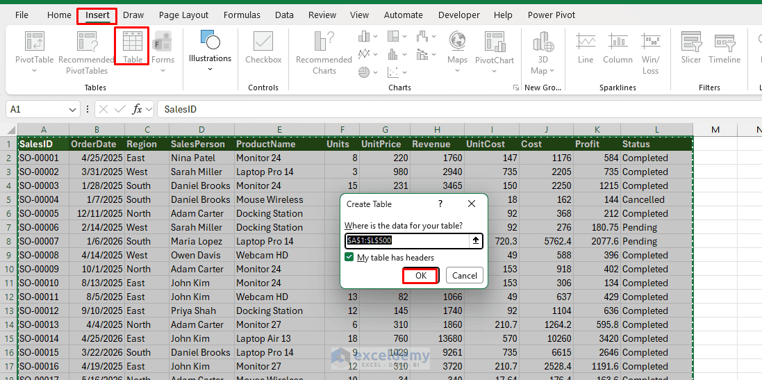
- Select your data range
- Go to the Insert tab >> select Table or press Ctrl + T
- Check My table has headers
- Click OK
- Go to the Table Design tab >> change the table name to: SalesData
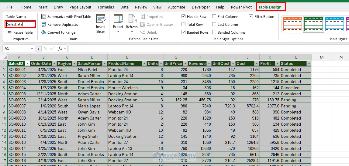
Using an Excel Table is important because rows added to the table are included in the PivotTable source when the PivotTable is refreshed. New columns also appear in the PivotTable Fields list after refreshing.
Add a Rolling 12-Month Column:
This helper column identifies records from the last 12 calendar months in the dataset.
- Add a new column to the right side of the table
- Name it Rolling Period
- Enter the following formula in the first data row:
=IF(AND([@OrderDate]>=EOMONTH(MAX([OrderDate]),-12)+1,[@OrderDate]<=EOMONTH(MAX([OrderDate]),0)),"Last 12 Months","Older")
MAX(SalesData[Date])finds the latest date in the datasetEOMONTH(...,-12)+1returns the first day of the 12-month rolling period- Records inside that period receive the label Last 12 Months
- All earlier records are labeled Older
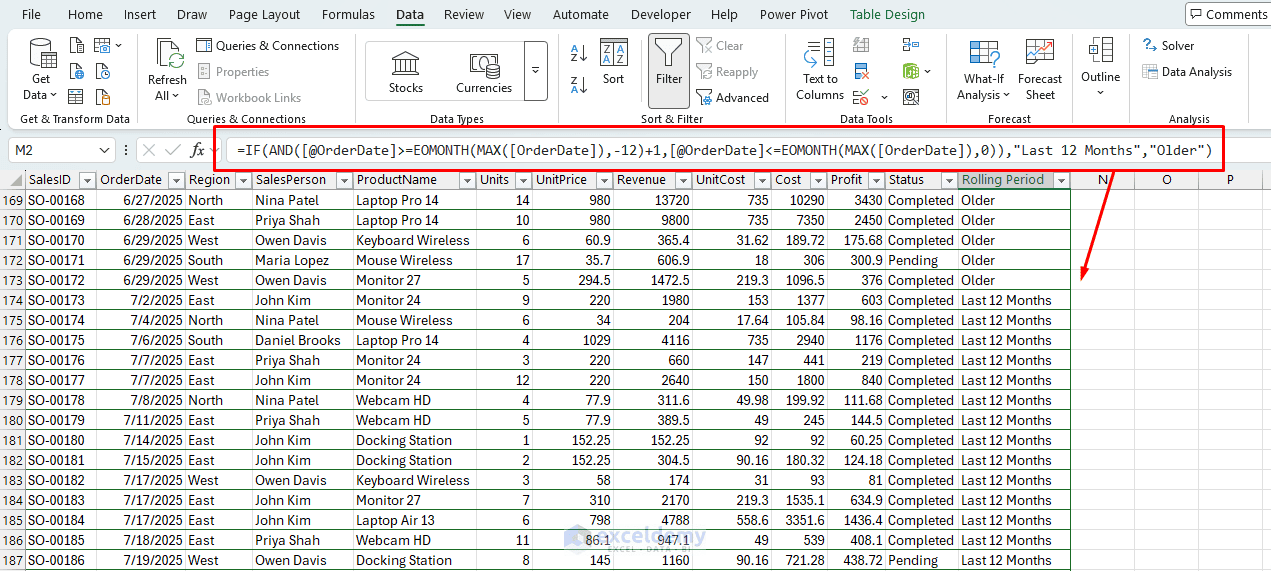
For example, if the latest date is July 18, 2026, the rolling period includes August 1, 2025, through July 31, 2026.
Step 2: Create the PivotTables
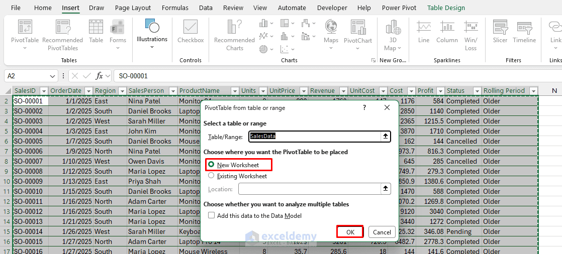
- Select a cell inside SalesData
- Go to the Insert tab >> select PivotTable >> select From Table/Range
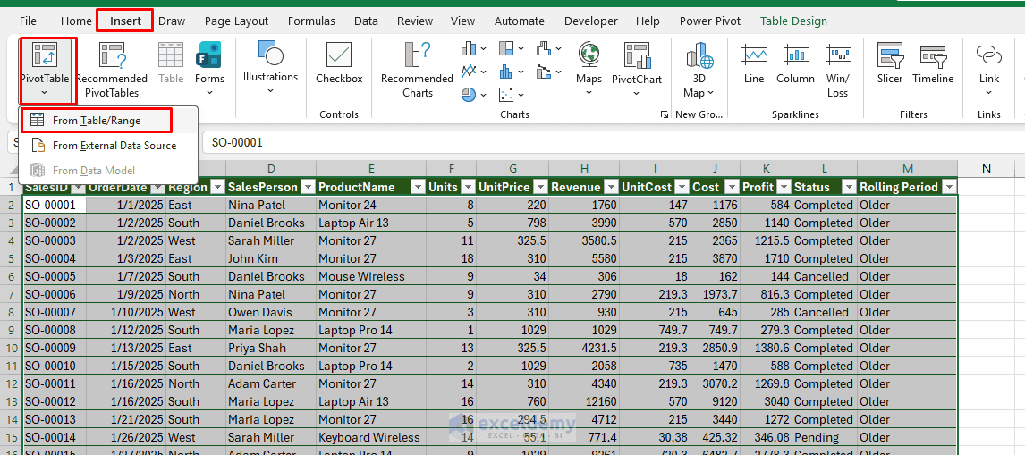
- Select New Worksheet >> click OK
Build several PivotTables:
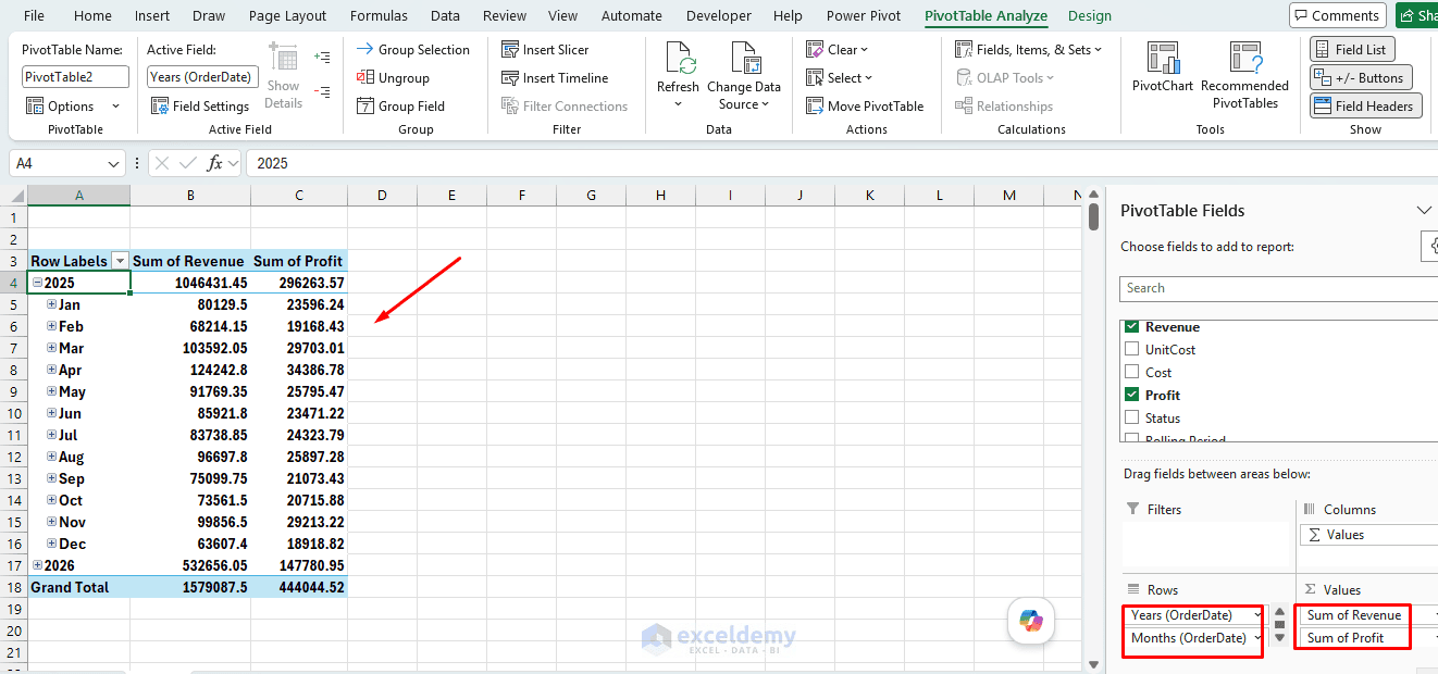
- Monthly Trend:
- Drag OrderDate (grouped by Month/Year) to Rows
- Drag Revenue to Values
- Drag Profit to Values
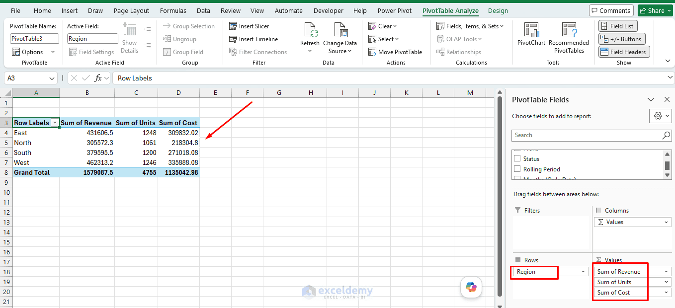
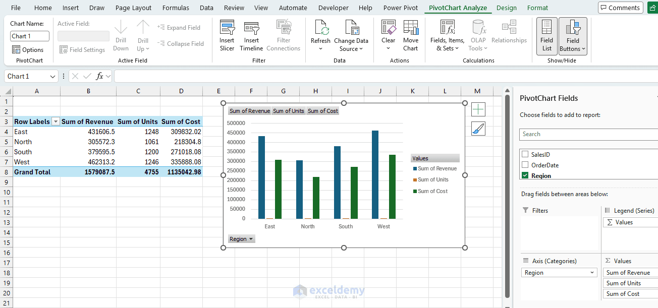
- Summary Pivot:
- Drag Region to Rows
- Drag Revenue, Units, and Cost to Values
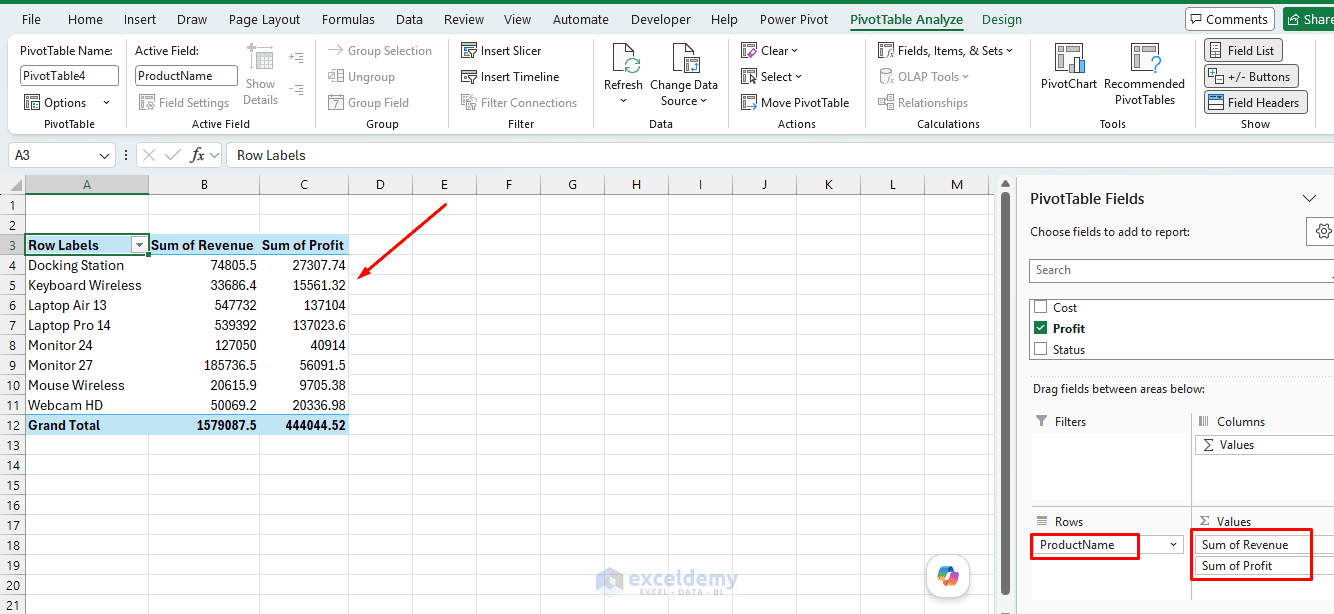
- Product Pivot:
- Drag ProductName to Rows
- Drag Revenue and Profit to Values
- Top Performers:
- Drag SalesPerson to Rows
- Drag Revenue to Values
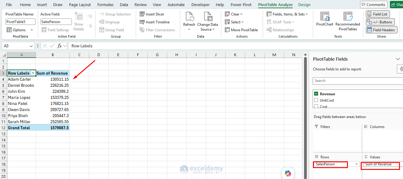
Repeat for additional views as needed.
Step 3: Create the PivotCharts for the Dashboard
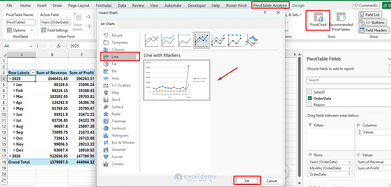
Monthly Revenue and Profit Trend:
- Select the Monthly Trend PivotTable
- Go to the PivotTable Analyze tab >> select PivotChart
- Select Line with Markers
- Click OK
- Change the title to Monthly Revenue and Profit Trend
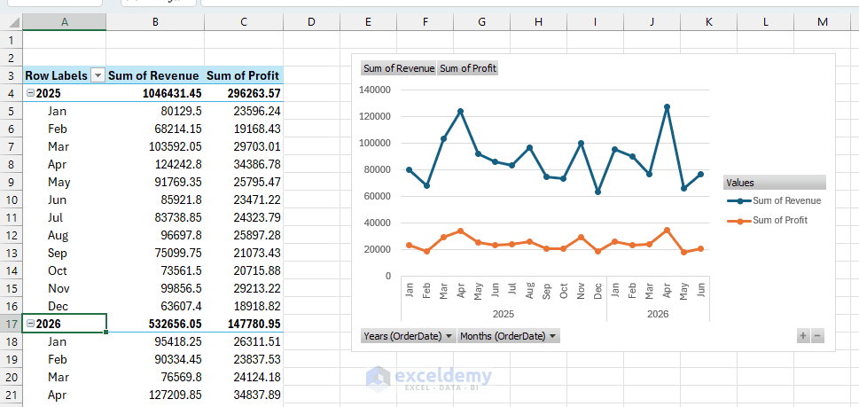
PivotCharts use the data source and filtering behavior of their associated PivotTables.
Revenue by Region:
- Select the Summary Pivot
- Go to the PivotTable Analyze tab >> select PivotChart
- Select Clustered Column Chart
- Title: Revenue by Region
Revenue by Product:
- Select the Product Pivot
- Go to the PivotTable Analyze tab >> select PivotChart
- Select Bar Chart
- Title: Revenue by Product
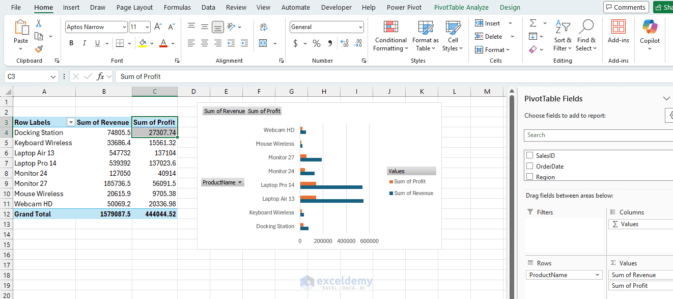
Keeping all PivotTables based on the same table is important because it allows a single slicer or timeline to control multiple PivotTables.
Create KPI Values:
Create another PivotTable containing:
- Drag Revenue to Values
- Drag Profit to Values
- Drag Units to Values
- Drag Cost to Values
Because no field is placed in Rows, the PivotTable displays only grand totals.
Step 4: Add Slicers
- Select any PivotTable
- Go to the PivotTable Analyze tab >> select Insert Slicer
- Select fields such as Region, ProductName, Rolling Period, and Status
- Click OK
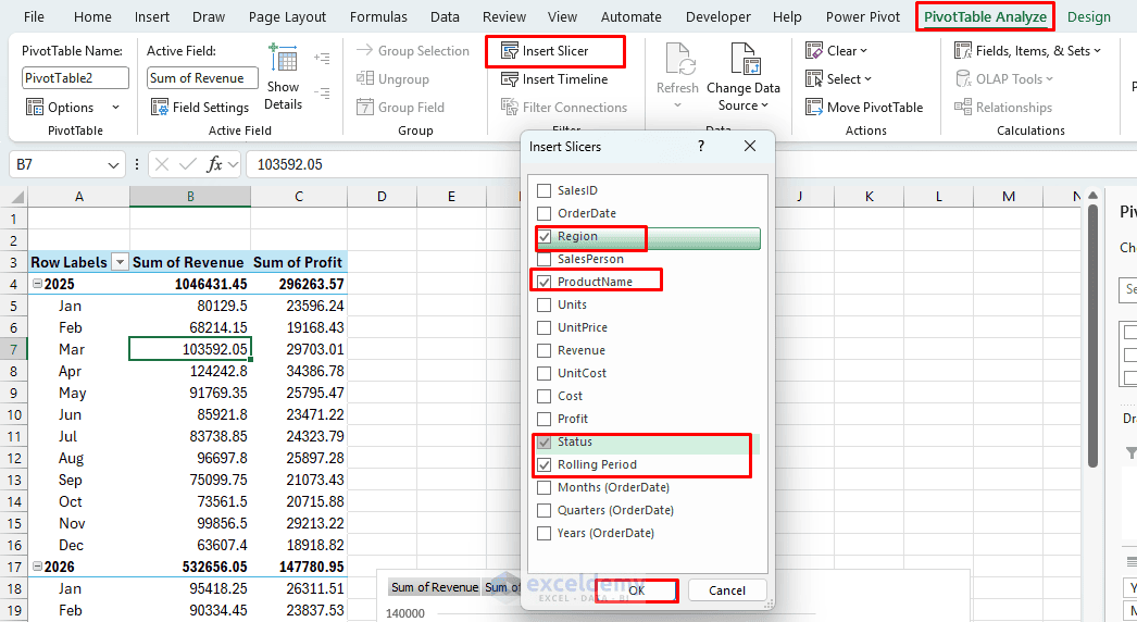
Slicers provide clickable buttons that filter PivotTables and clearly indicate which values are currently selected.
Configure the Rolling Period Slicer:
- Select Last 12 Months in the Rolling Period slicer
- The dashboard will focus on the latest 12 calendar months
- When newer data is added, the helper formula recalculates which records belong to the latest 12-month period
Format the Slicers:
- Select a slicer
- Open the Slicer tab >> select a slicer style
- Adjust the number of columns if needed
- Resize the slicer so all buttons are visible
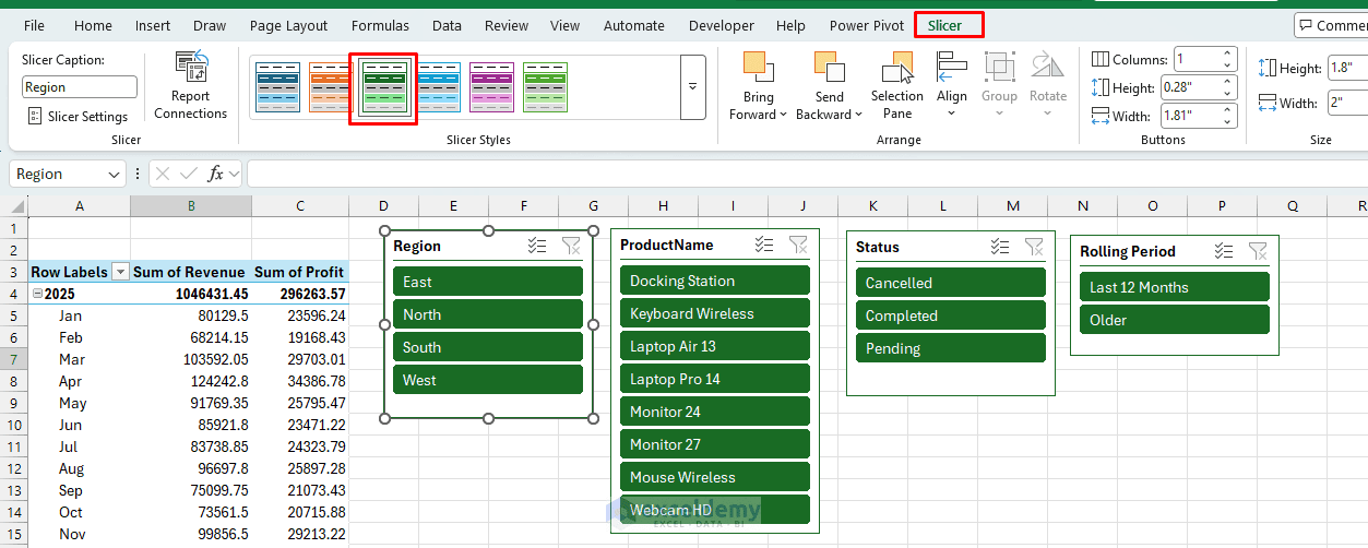
Hold Ctrl while clicking slicer buttons to select multiple items. Use the Clear Filter button in the slicer header to restore all items.
Step 5: Add a Timeline
A timeline requires a genuine date field in the PivotTable source.
- Select any PivotTable
- Go to PivotTable Analyze >> select Insert Timeline
- Select OrderDate >> click OK
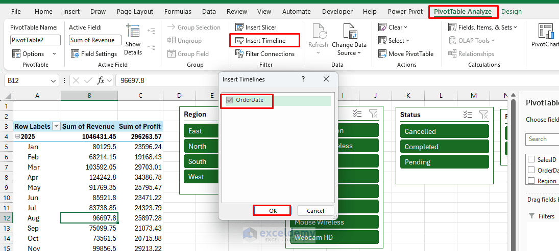
Use the drop-down menu in the upper-right corner of the timeline to switch between:
- Years
- Quarters
- Months
- Days
- For a monthly rolling dashboard, select Months
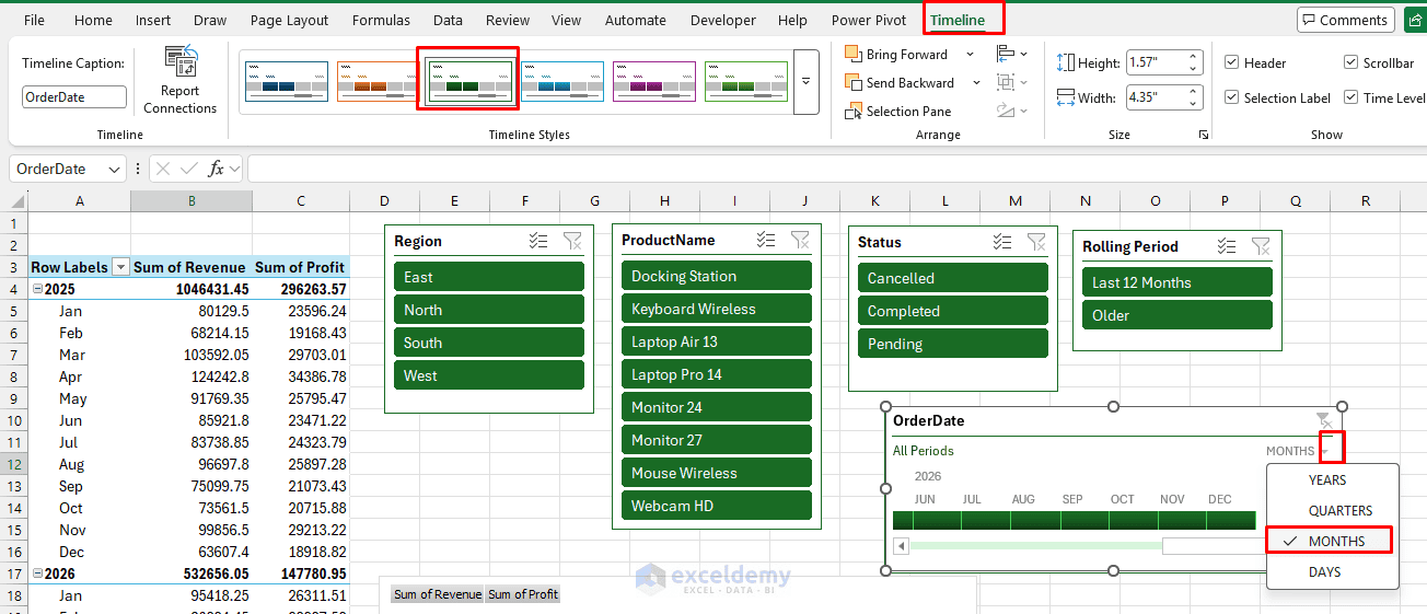
Drag across the timeline to display a particular range of months. A single timeline can control multiple PivotTables when they share the same data source.
Step 6: Connect the Slicers to Every PivotTable
Initially, a slicer may control only the PivotTable from which it was created.
For each slicer:
- Select the slicer.
- Open the Slicer tab >> click Report Connections
- Select every PivotTable used by the dashboard
- Click OK
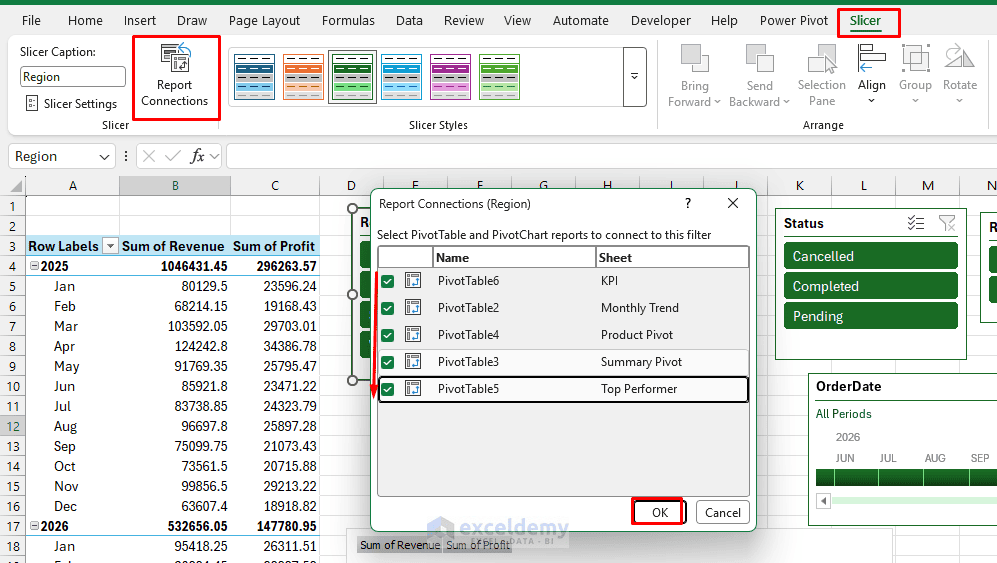
- Repeat the process for every slicer
Slicers can only be shared by PivotTables that use the same data source.
Connect the Timeline:
- Select the timeline
- Open the Timeline tab >> click Report Connections
- Select all dashboard PivotTables
- Click OK
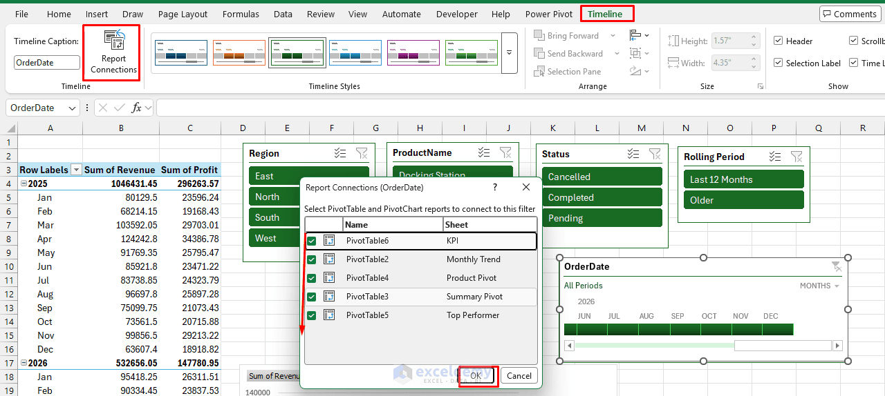
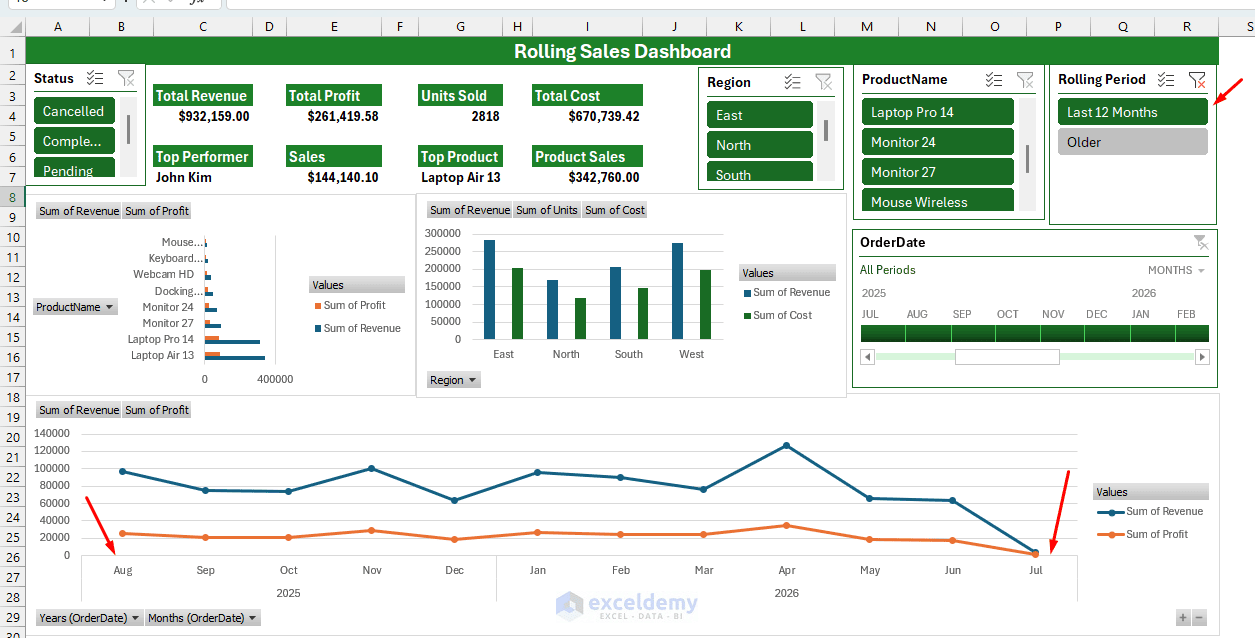
Test the connections by selecting one region and confirming that every KPI and chart updates accordingly.
Step 7: Arrange the Dashboard
Move the PivotCharts from the PivotData sheet to the Dashboard worksheet.
- Create a new sheet named Dashboard
- Remove gridlines:
- Go to the View tab >> uncheck Gridlines
- Place KPI cards at the top: Total Revenue, Total Profit, Units Sold, Total Cost
For Total Revenue, use:
=GETPIVOTDATA("Sum of Revenue",KPI!$A$3)
- Format Revenue and Profit as currency, and Units Sold as a whole number
- Place the Timeline prominently near the top — it is the primary rolling control
- Place Slicers along the left or top as a filter panel
- Copy and paste your PivotCharts onto this sheet as linked objects (not images — keep them live)
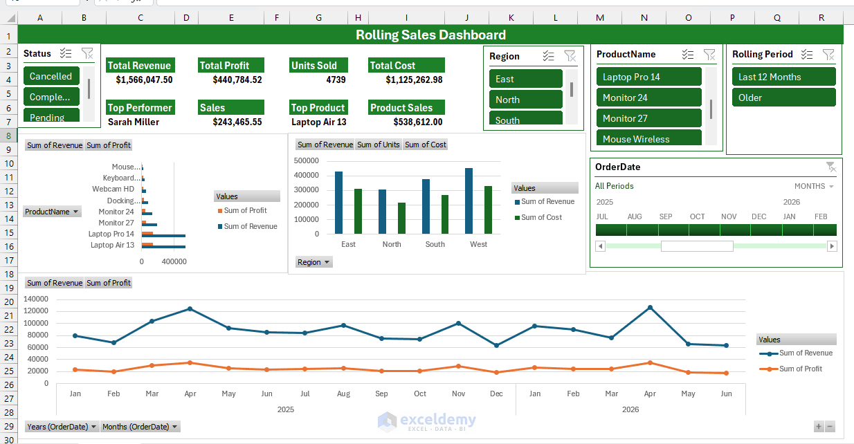
- Select Last 12 Months from the slicer
- The rolling dashboard updates automatically
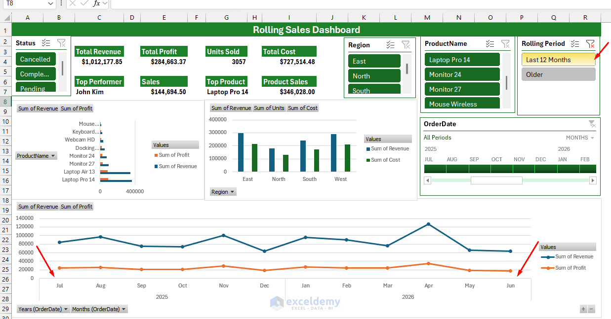
Step 8: Update the Rolling Dashboard
Manual Refresh:
- Go to the Data tab >> select Refresh All
Because the source is an Excel Table, new rows are included when the PivotTables refresh.
The Rolling Period formula will identify the new latest 12-month window, and the PivotTables, charts, slicers, and timeline will update accordingly.
Refresh Automatically When Opening the File:
- Right-click a PivotTable >> select PivotTable Options
- Click the Data tab >> check Refresh data when opening the file
- Click OK
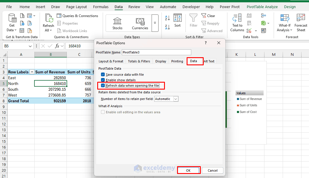
Excel also provides manual Refresh and Refresh All commands, and newer versions may offer automatic refreshing for PivotTables connected to local workbook data.
Final Test
Perform the following test before distributing the dashboard:
- Add several records with dates in a new month
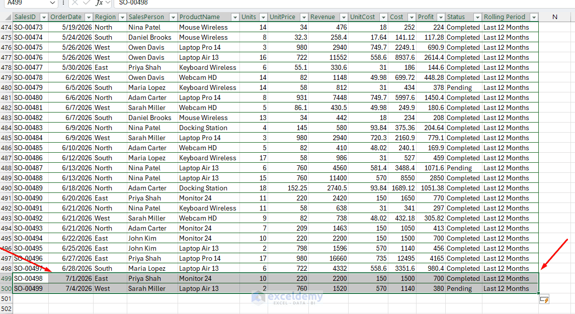
- Go to the Data tab >> click Refresh All
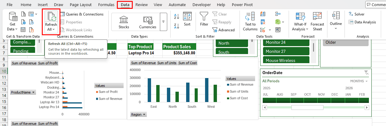
- Confirm that the new month appears in the timeline
- Confirm that all charts and KPI values have changed
- Select Last 12 Months in the Rolling Period slicer
- Confirm that older records are excluded
Common Pitfalls
- Timeline greyed out / won’t insert: This happens when your date field is not in a proper Date format, or when there are duplicate or blank dates breaking the date table relationship. Fix the source data first.
- Slicers not filtering all charts: This is almost always a missed Report Connection — recheck Step 6.
- New rows do not appear: Check that the new records were entered inside the SalesData table, then go to Data >> Refresh All.
- PivotTable shows Count of Revenue: One or more Revenue cells probably contain text or blanks. Correct the source values, refresh the PivotTable, and change Value Field Settings to Sum.
Conclusion
By following the steps above, you can build a rolling dashboard with slicers and timelines. This setup creates a professional, low-maintenance dashboard that scales as your data grows. You only need PivotTables, charts, slicers, and a timeline to make it roll. If you need further customizations or more advanced features, you can also explore VBA. Start practicing on sample data, and you will master it quickly.
Get FREE Advanced Excel Exercises with Solutions!


hi can i have a copy of the sample data for above dashboard practice. to allow me to follow the steps. tq
Hello Theresa,
Hope you are doing well. I am attaching the sample salesdata here. Download and start practicing dashboards by following the given steps.
Sample SalesData to Build a Rolling Dashboard with Slicers and Timelines.xlsx
Regards,
ExcelDemy