Excel Charts

Excel Waterfall Chart Change Colors: 3 Methods

Method 1 - Format Data Structure for Waterfall Chart We will use a financial dataset that includes two products (A & B), each with quarterly ...

Excel Standard Curve

Excel Standard Curve: Knowledge Hub Calculate Unknown Concentration from Standard Curve in Excel How to Determine Protein Concentration from ...

How to Make a Waterfall Chart with Multiple Series in Excel

The default waterfall chart feature in Excel 2016 and later versions can be used to create a waterfall chart with just one series. However, it is ...

How to Make Graph Paper in Excel

In this tutorial, we will guide you through the step-by-step process of how to make graph paper in Excel. Microsoft Excel provides the flexibility to ...

Trendline Equation Excel

Trendline Equation Excel: Knowledge Hub Add Trendline Equation Find the Equation of a Line in Excel Find the Equation of a Trendline ...

Add a Trendline in Excel

Add a Trendline in Excel: Knowledge Hub Visualize Trends in Excel Add a Trendline to a Stacked Bar Chart Add Multiple Trendlines ...

Excel Control Chart

Excel Control Chart: Knowledge Hub How to Make a Control Chart in Excel How to Calculate Upper Control Limit with Formula in Excel ...

Excel Pie Chart: 10 Methods

Method 1 - Create 2-D Pie Chart Select any cell of the dataset >> go to the Insert tab >> select the Insert Pie or Doughnut Chart ...

Progress Chart in Excel

Progress Chart in Excel: Knowledge Hub How to Make a Progress Chart in Excel Progress Circle Chart in Excel as Never Seen Before How to ...

How to Plot Time Series Frequency in Excel (2 Simple Ways)

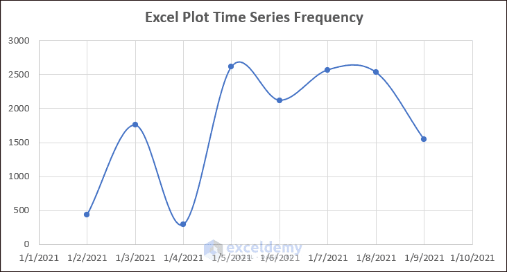
Are you looking for a better way to Plot Time Series Frequency in Excel? Well, I will try to explain two simple ways to plot time series frequency in ...

How to Move Excel Chart X Axis to Bottom (2 Simple Methods)

Are you trying to move the X-axis of your Excel chart to the bottom? There are so many cases where you need to place the X-axis or horizontal axis at ...

Back to Back Stem and Leaf Plot Excel (Create with Easy Steps)

A back-to-back stem and leaf plot in Excel is a type of data visualization tool that helps you compare two sets of data on the same graph. It shows ...

Stem and Leaf Plot in Excel: A Robust Tool to Visualize Data

Stem and leaf plots are useful tools for organizing and displaying numerical data. They provide a simple way to visually represent data without ...

How to Use a Pareto Chart in Excel (2 Suitable Examples)

Introduction to Excel Pareto Chart The Pareto chart, sometimes referred to as a sorted histogram chart, comprises columns arranged in descending ...

How to Create Half Doughnut Chart in Excel (with Easy Steps)

A half-doughnut chart, also known as a half-donut chart or a semicircle donut chart, is a circular chart that displays data in a half-circle shape ...

Advanced Excel Exercises with Solutions PDF


ExcelDemy
Logo