The age pyramid, an especially useful tool for population statistics, helps to analyze the population with respect to age. In Microsoft Excel, we can ...
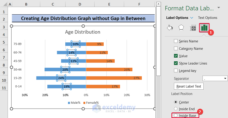
The Population Pyramid is a very useful tool for population statistics. It helps to analyze the population data of age and gender. In this article, ...
Typical Excel Charts depict a two-dimensional (X and Y) representation of data. Working with three-dimensions (or 3 variables) requires the insertion ...
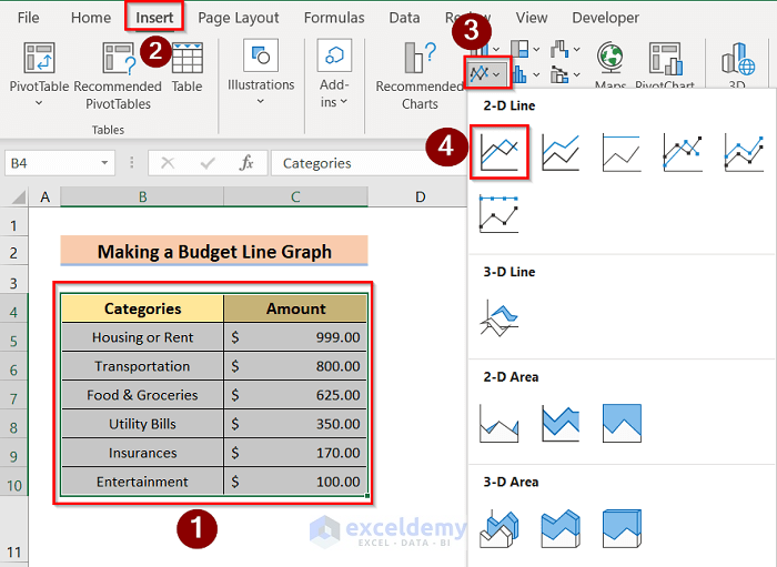
Microsoft Excel has a powerful graphing feature that can add visual depth and even make it easy to understand the most boring datasets. Now, what if ...
You have come to the right place if you are looking for the answer or some unique tips to create a project portfolio Bubble Chart in Excel. There are ...