Multidimensional Scaling is a way to visually present the similarity between objects (brands, product attributes, etc.) in a 2-dimensional scale, i.e. a perpetual graph. Multidimensional Scaling can reduce data in an XY plot. In this article, I will show how to perform Multidimensional Scaling in Excel.
What Is Multidimensional Scaling?
Multidimensional Scaling is a visual display of similarities or dissimilarities between objects. Here, an object can refer to many things. In business, object refers to brands, product attributes, etc.
Whichever field (politics, science, media, etc.) you are from, the basic idea of Multidimensional Scaling is the same. If you consider similarities, the more similar objects will be in closer positions on a graph. Not only that, you can use Multidimensional Scaling to reduce the dimensions for data that have a huge number of dimensions.
Steps to Perform Multidimensional Scaling in Excel
To perform multidimensional scaling in Excel, follow the steps below.
1st Step: Conduct a Survey and Create Initial Data
- Suppose, we are going to do Multidimensional Scaling for 5 brands considering their 6 attributes.
- Before we start, we need to perform a customer survey on these brands and gather the ratings (1 to 9) in an Excel spreadsheet.
- Here is an example.

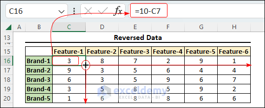
2nd Step: Reverse Data
- Well, this is an optional step. You can now reverse the ratings by subtracting them from 10. The formula will be as follows.
=10-C7
C7= Old rating
Read More: How to Scale Data from 1 to 10 in Excel
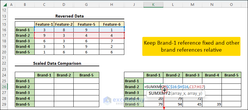
3rd Step: Find Distances Between Objects and Apply a Suitable Scale
- Now, create another section named “Scaled Data Comparison”.
- Here, in cell K26, apply the following formula where we have used the SUMXMY2 function.
=SUMXMY2($C$16:$H$16,C17:H17)
- This formula will return the distance between brands 1 and 2.
- Drag this formula down.
- In a similar manner, write the following formula in cell L27.
=SUMXMY2($C$17:$H$17,C18:H18)
- In cell M28, write the formula below.
=SUMXMY2($C$18:$H$18,C19:H19)
- And finally, the following formula will be in cell N29.
=SUMXMY2(C19:H19,C20:H20)
- After all, go to cell C25 and write the following formula.
=IF(K25="","",K25*9/MAX($K$25:$O$29))
- This formula will scale the distances between the brands with respect to the maximum distance.
- The multiplier 9 is not mandatory, choose any suitable number.
- Drag the formula down and right.

- In a similar fashion, find the scaled distances between the 6 attributes. The formulas are in the workbook, check them out.

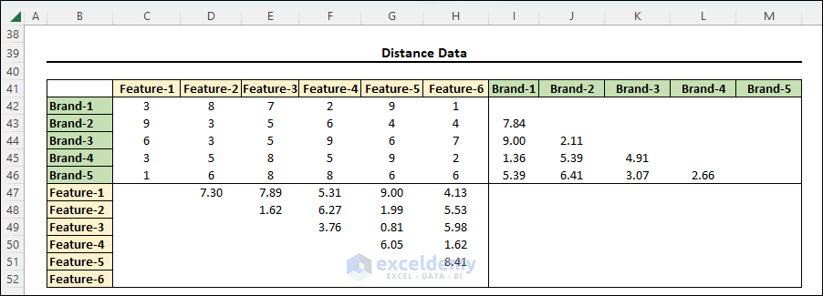
4th Step: Gather All the Distances Together
- Now, accumulate the distances in a separate table like the following image.
5th Step: Set Starting Map Points and Copy Them to Another Location
- Look at the following image. Here we have set some starting points. These distances are considered with respect to Brand-1.
- For example, Brand-2 is 7.84 units far from Brand-1. So we set it as (7.84,0).
- Similar approaches go to the other points.
- The 0 ordinates are alternating so that the data are scattered in a regular fashion.
- We have set (0,0) to Brand-1. We could specify any numbers instead since we will rectify these ordinates using Excel Solver.
- Finally, copy these values (if there are any referenced cells, make sure that there is no referenced cell in the copied region).

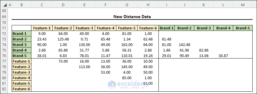
6th Step: Find New Distance Data
- From these map points, find new distances between brands and attributes at this step. The formulas to find these distances are in the workbook.
Read More: How to Do Data Scaling in Excel
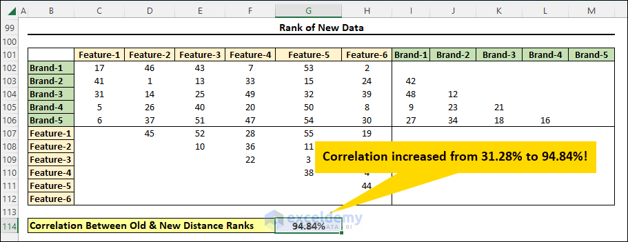
7th Step: Apply the RANK.EQ Function to Old and New Distances
- Now, find the ranks of these distances using RANK.EQ function.
- Apply the following formula in cell C87 and copy the formula all over the data table.
=IF(C42="","",RANK.EQ(C42,$C$42:$M$52,1))
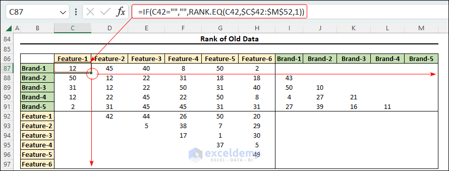
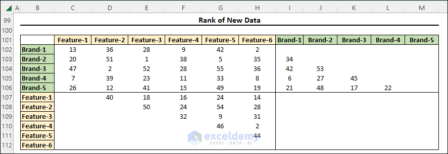
- Similarly, rank the new distances.
8th Step: Find the Correlation Between Old and New Distances Ranks
- Now, we will find the correlation between the old and newly generated distances using the CORREL function.
- Apply the following formula in cell G114.
=CORREL(C87:M97,C102:M112)
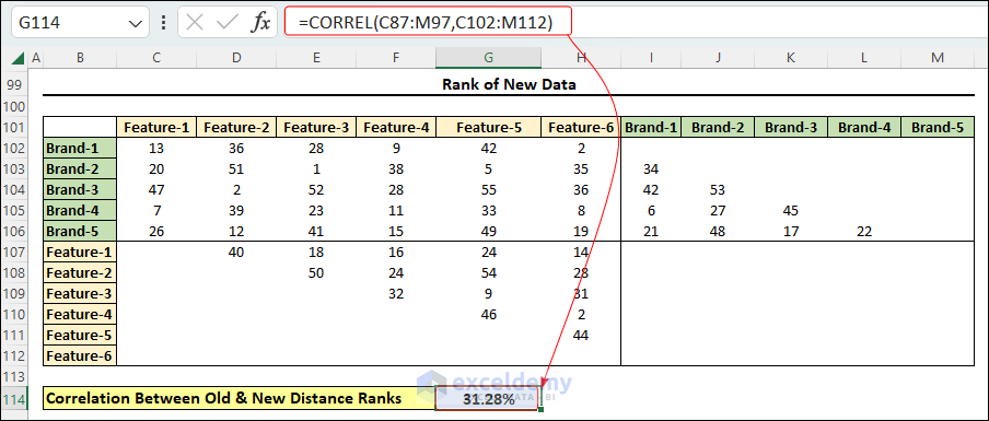
- The correlation is only 31.28%, this means, the existing distances are not representing the actual distances quite well. So in the next steps, we will maximize the correlation using the Solver add-in and make changes to Final Map Points according to it.
9th Step: Enable Solver Add-In
- This is another optional step if you don’t have the Solver add-in already.
- Press Alt+F+T and the following window will appear.
- Go to the Add-ins section and find the Excel Add-insand press Go.

- Now, select Solver Add-in and press OK.

- The solver add-in will be added now.
10th Step: Maximize Correlation Using Solver
- Now, go to the Data tab and click on the Solver command.
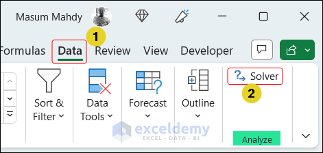
- In the Solver Parameters dialog box, set the objective as the correlation cell, here the cell G114.
- Click on the Max button.
- Then select the Final Map Points reference cells, G57:H67.
- Set the constraints.
- Mark the Make Unconstrained Variables Non-Negative box and select the Evolutionary Moving method.
- Then press the Solve button.
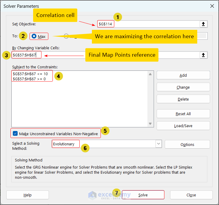
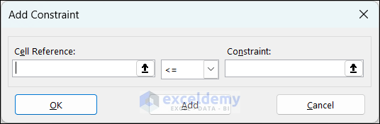
- To add constraints, press on Add, and the following window will appear and set suitable constraints.
- After the solving is complete, keep the solver solution and press OK.

- Look at the correlation value, now it’s 94.84% way higher than the previous one.
- The following image shows the changed Final Map Points after you run the Excel Solver successfully.

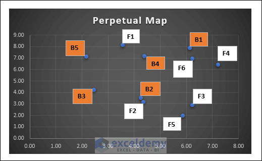
11th Step: Create a Perpetual Map
- Finally, to plot a perpetual map, select the Final Map Points and go to the Insert tab, then click on Scatter Charts and then press More Scatter Charts.

- Now, go to XY (Scatter) and select the 2nd type, and press OK.
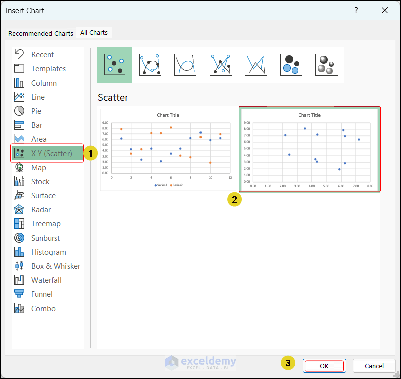
- After applying formatting to the scatter chart generated, we will get a perpetual map like the following image.
Download Practice Workbook
Conclusion
Doing Multidimensional Scaling using Excel is never an easy task! So, if you have any questions regarding this topic, please leave us a comment below.
<< Go Back to Scaling Formula in Excel | Excel for Statistics | Learn Excel
Get FREE Advanced Excel Exercises with Solutions!
