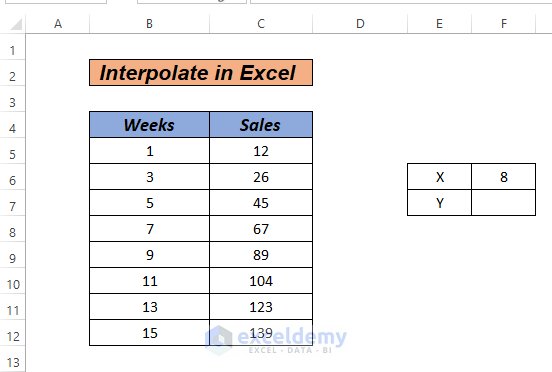
In Excel, interpolation allows us to determine the value between two points on a graph or curve. It helps us anticipate future values that lie between existing data points. Let’s explore six methods for interpolation in an Excel graph using the below dataset.
Method 1 – Mathematical Equation for Linear Interpolation
Steps
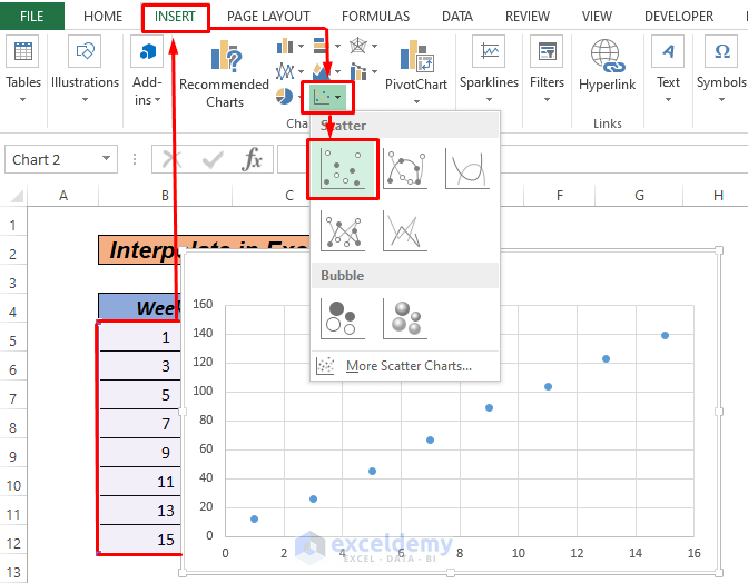
- Create a chart from your dataset (Go to INSERT and select Scatter).
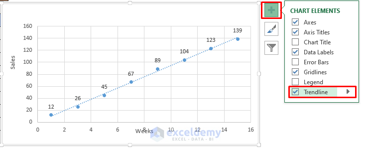
- Add a trendline to the graph (assuming linear growth data).
- Select the x-values (x1 and x2) and corresponding y-values (y1 and y2) around the desired point (e.g., week 8).
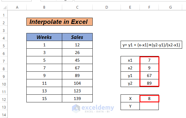
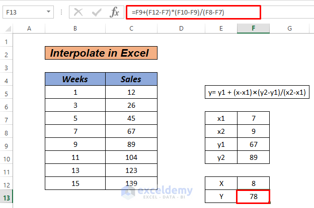
- Enter the following formula in cell F13 to interpolate the value for week 8:
=F9+(F12-F7)*(F10-F9)/(F8-F7)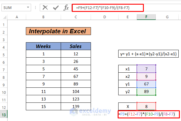
- Press ENTER.
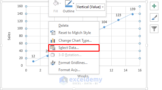
- Right-click on the graph, choose Select Data.
- Click Add from the popped-up dialogue box.
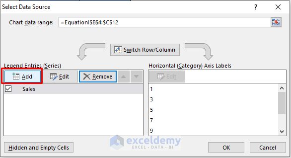
- Add the interpolated value. Select the X and Y cells.
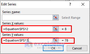
- Click OK.
Method 2 – Interpolation Using a Trendline
Steps
- Add a trendline to the graph (similar to Method 1).
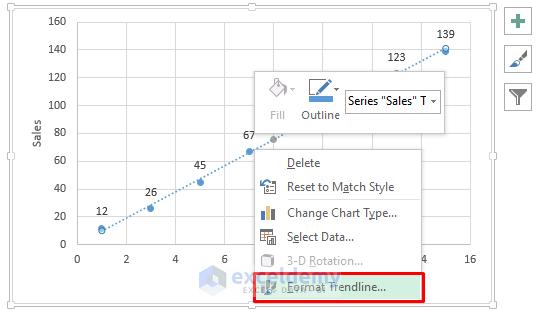
- Right-click the trendline, select Format Trendline, and enable Display Equation on Chart.
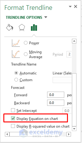
- The equation displayed represents the interpolated linear relationship.
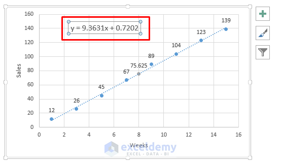
- Calculate the interpolated value for week 8 using the equation.
- Enter the following formula in F7:
=9.3631*F6 + 0.7202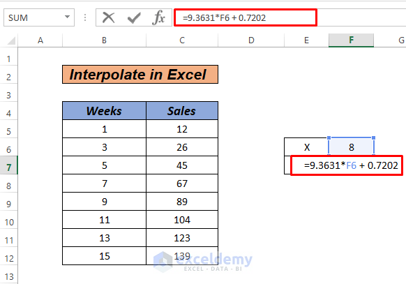
- Press ENTER.
- Follow Method 1, to add interpolate data in the graph.
Method 3 – Interpolation Using SLOPE and INTERCEPT Functions
Steps
- Insert a graph and add a trendline (as in Method 1).
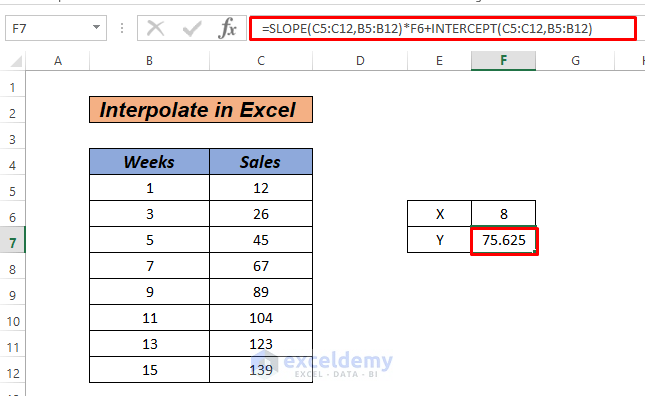
- In cell F7, enter the following formula:
=SLOPE(C5:C12,B5:B12)*F6+INTERCEPT(C5:C12,B5:B12)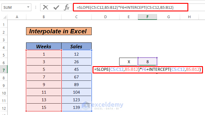
- Press ENTER to calculate the interpolated value.
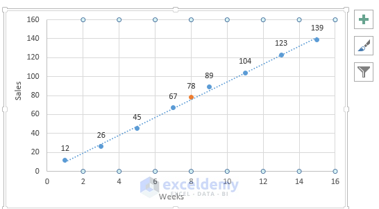
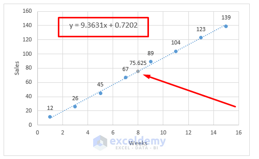
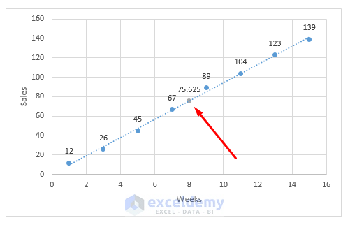
- The final graph chart, after adding the interpolate value, will appear.
- Follow Method 1, for adding interpolate values in an Excel chart.
Method 4 – Using FORECAST Function
Steps
- Create a chart and add a trendline (similar to Method 1).
- In cell F7, enter the following formula:
=FORECAST(F6,C5:C12,B5:B12)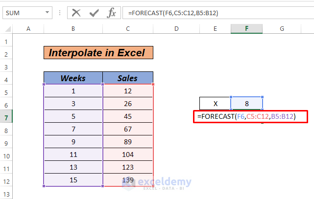
- Press ENTER to obtain the interpolated value.
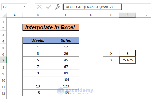
- The final graph chart, after adding the interpolate value, will be displayed.
Method 5 – Interpolation Using TREND Function
Steps
- Add a chart and trendline as in Method 1.
- In cell F7, enter the following formula:
=TREND(C5:C12,B5:B12,F6,1)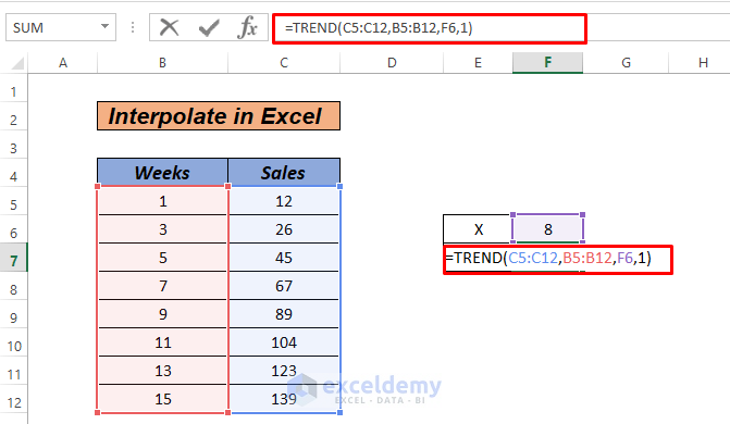
- Press ENTER to calculate the interpolated value.
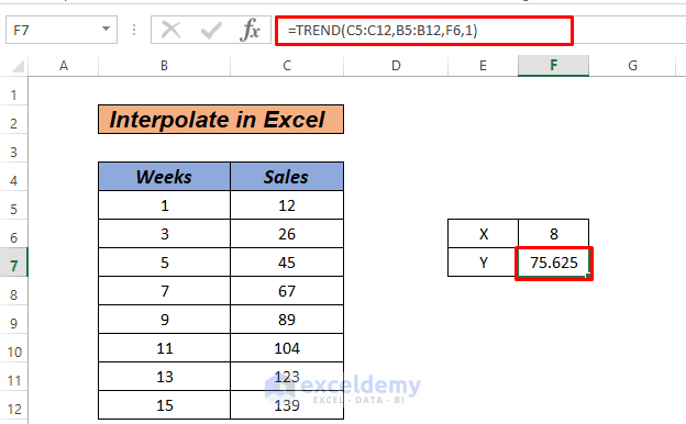
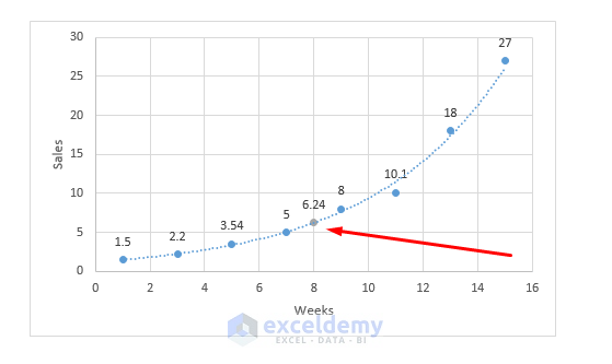
Add the interpolation value in the chart as we did in Method 1.
Method 6 – Interpolation Using GROWTH Functions
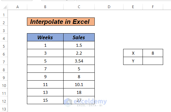
Steps
- Insert a chart and add an exponential trendline (similar to Method 1).
- In cell F7, enter the following formula:
=GROWTH(C5:C12,B5:B12,F6,2)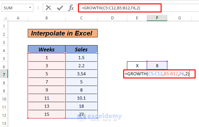
- Press ENTER to find the interpolated value.
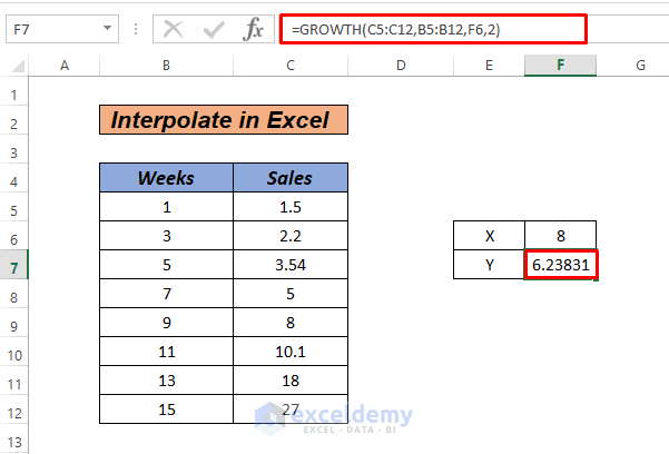
- Add the interpolation value in the chart.
Read More: How to Do Interpolation with GROWTH & TREND Functions in Excel
Practice Section
We’ve attached a practice workbook so that you can practice these methods.
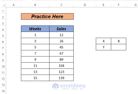
Download Practice Workbook
You can download the practice workbook from here:
Related Articles
- How to Interpolate Missing Data in Excel
- How to Do Linear Interpolation in Excel
- How to Do VLOOKUP and Interpolate in Excel
- How to Interpolate Between Two Values in Excel
- How to Perform Bilinear Interpolation in Excel
- How to Use Non Linear Interpolation in Excel
- How to Do Linear Interpolation Excel VBA
<< Go Back to Excel Interpolation | Excel for Statistics | Learn Excel
Get FREE Advanced Excel Exercises with Solutions!
