Generally a graph in Excel is used to create a trend and make the data more understandable to the readers. You may have added axis titles in a graph and edited the legends of it. But, sometimes you may need to change significant figures in a graph in Excel. In this article, I will show you how to change significant figures in a graph in Excel.
How to Change Significant Figures in a Graph in Excel: 3 Simple Ways
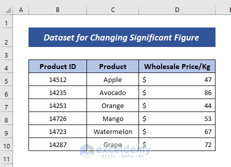
Let’s say, we have got a dataset of different products and their corresponding wholesale price per kg for a fruit selling shop.
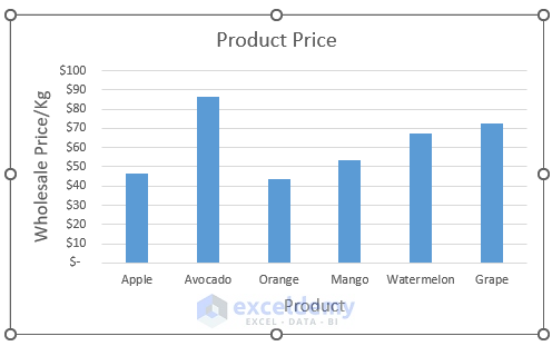
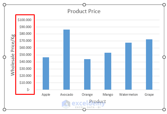
We have created a column chart based on the dataset. You may proceed with your created graph/chart (i.e. Stacked Bar Chart/ Pie Chart etc.)
Now, Our aim is to change significant figures in this graph.
In this section, I will show you 3 simple and effective ways to change significant figures in a graph in Excel. Let’s check them now!
1. Adding Decimal Points to Graph Data
Let’s say, in our dataset, the wholesale price of the products has decimal points, but we have not shown that in a data table.
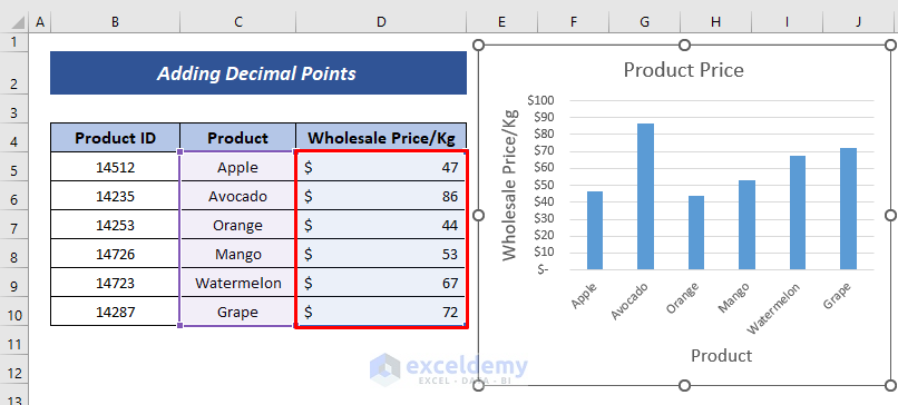
If you want to add these decimal points to this data, just proceed with the following steps.
Steps:
- Here, all you have to do is to select the data range> go to the Home tab> click the icon describing the Increase Decimal point.
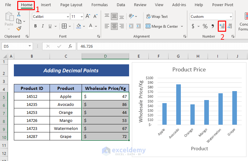
- As a result, you will get the decimal points of your data increased.
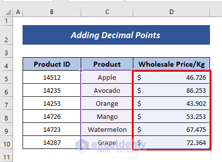
- Hence, you will also see the axis label changed. That means the vertical axis has been changed to decimal points.
Note: As the change is so small, it may not be significantly noticeable.
Read More: How to Change Significant Figures in Excel
2. Changing Data in Excel Graph
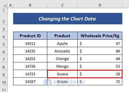
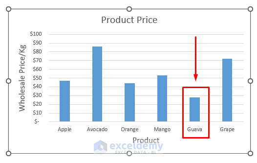
Let’s say, in the previous case, the owner of the shop decided to purchase Guava instead of Watermelon. So, the significant column in the graph for Watermelon will be changed.
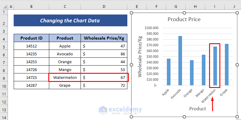
So, we have to replace the product and the corresponding price of Guava in the place of Watermelon. In order to change this data, follow the steps below.
Steps:
- You have just one task to do here. Input the product name (i.e. Guava) and the price ($28) in the relevant cells of the previous value (i.e. Watermelon)
- Hence, you will find that the corresponding figure of the column and its shape has been changed due to the replacement of the previous value.
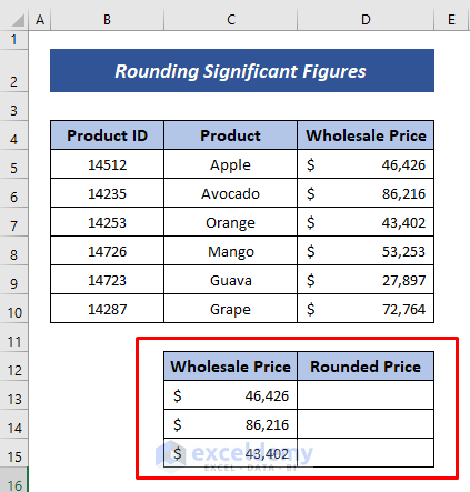
3. Rounding Significant Figures
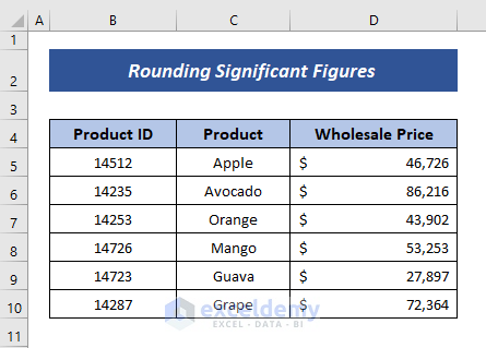
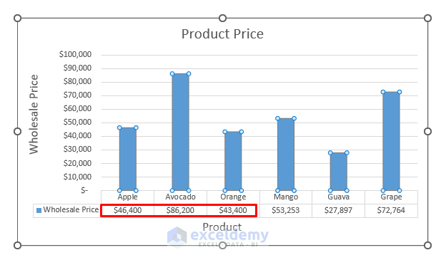
For our previous set of data, we have shown the wholesale price per kg of the individual products. Now, let’s say, the owner of the shop has bought 1000kg of each of the products. Here, I have shown the total price for each of the products.
And the corresponding graph has been shown below. You will notice that each column shows the products’ corresponding value.
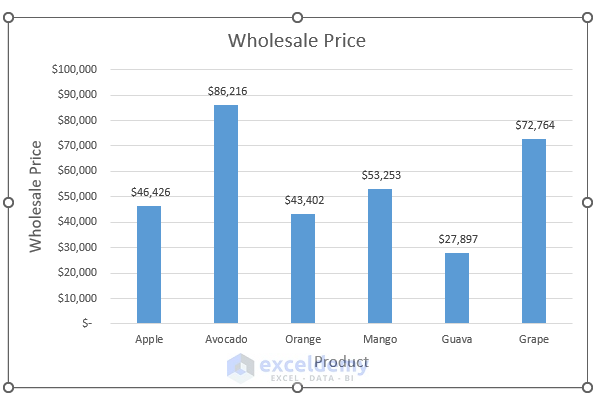
Now, let’s say, the wholesale seller has given consent to keep the round figure price for the first three products (i.e. Apple, Avocado, Orange ). So, we have to round these significant figures of the prices of these 3 products to change the corresponding figures in the graph.
In order to do so, just proceed with the steps below.
Steps:
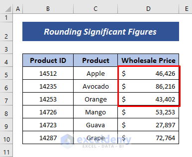
- First, create a separate table with headings (i.e. Wholesale price and Rounded price). Copy the three data that you want to make round figures in that table.
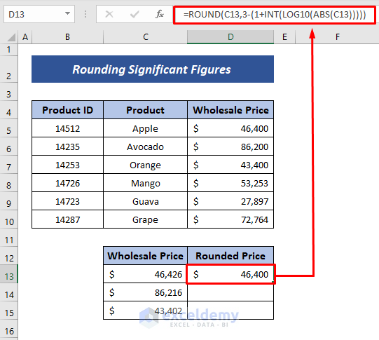
- Here, we will use the ABS, LOG10, INT, and ROUND functions. Enter the following formula to the cell where you want the round price.
=ROUND(C13,3-(1+INT(LOG10(ABS(C13)))))Here,
C13= Original Wholesale Price
Formula Breakdown
- ABS(C13)= The ABSOLUTE function returns positive value. So it returns 46426.
- LOG10(ABS(C13))= LOG10(46426)= 4.6667
- INT(LOG10(ABS(C13)))= INT function returns nearest lower integer of 4.6667= 4
- 3-(1+INT(LOG10(ABS(C13))) = 3-(1+4) = -2: It gives the remaining digits of the number excluding the first 3 digits.
- ROUND(C13,3-(1+INT(LOG10(ABS(C13)))))=ROUND(46426,-2)=46400
- Now, drag the Fill Handle tool down to Autofill the formula.
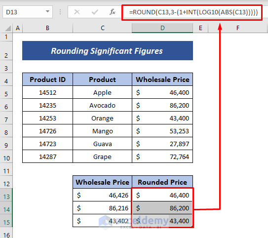
- Now, copy only the cell values of the rounded price and paste them to the previously made whole price column from which the graph was created.
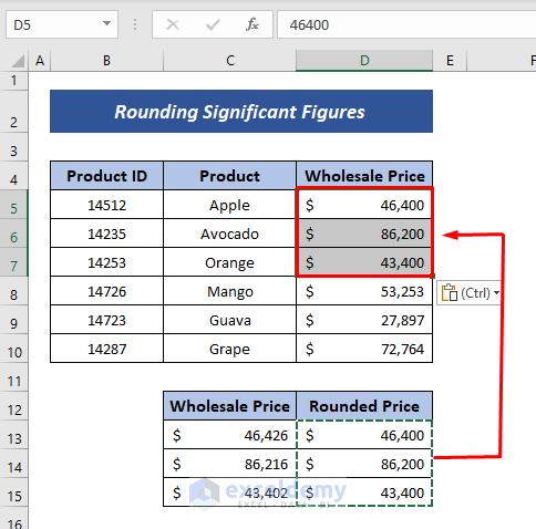
- As a result, you will see that the graph has changed the corresponding columns by changing the data into the round figure.
So, these are the ways you can follow to change significant figures in a graph in Excel.
Read More: How to Keep Significant Figures in Excel
Download Practice Workbook
You can download the practice book from the link below.
Conclusion
In this article, I have tried to show you some methods of changing significant figures in a graph in Excel. I hope this article has shed some light on your way of altering significant figures in an Excel graph. If you have better methods, questions, or feedback regarding this article, please don’t forget to share them in the comment box. This will help me enrich my upcoming articles. Have a great day!
Related Articles
<< Go Back to Significant Figures | Rounding in Excel | Number Format | Learn Excel
Get FREE Advanced Excel Exercises with Solutions!
