Method 1 – Comparison of Two Tables with Conditional Formatting
Steps:
- Select Table 2 (B14:E18).
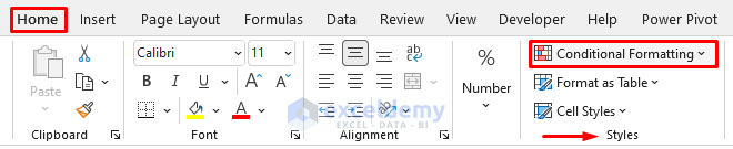
- From Excel Ribbon, go Home > Conditional Formatting.
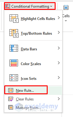
- Select the New Rule option from the Conditional Formatting drop-down.
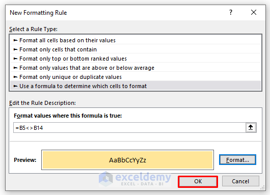
- The New Formatting Rule dialog appears. Select the rule type: Use a formula to determine which cells to format. Type the formula below in the field: Format values where this formula is true. Press Format.
=B6<>B14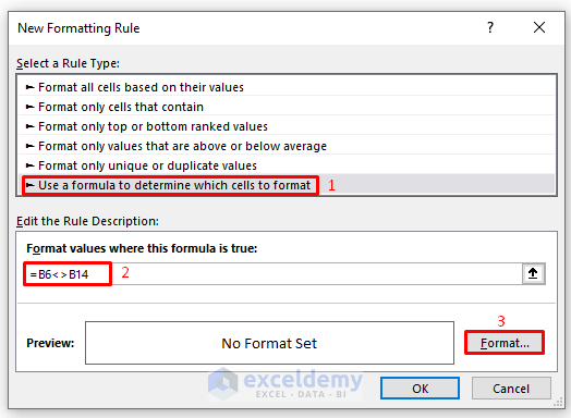
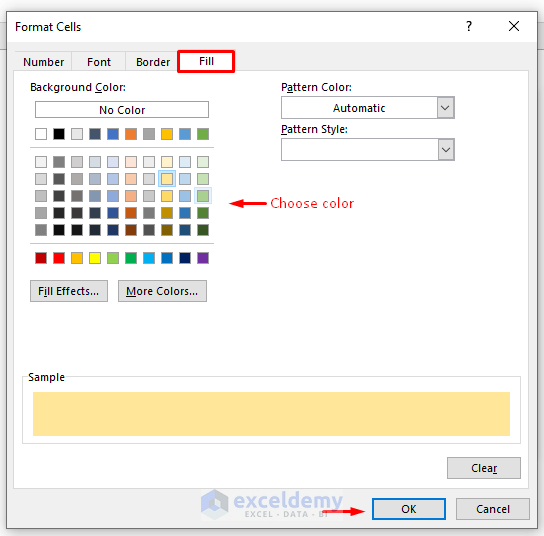
- The Format Cells dialog shows up. Go to the Fill tab, choose the color, and press OK to close the Format Cells dialog.
- Press OK.
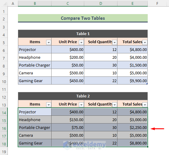
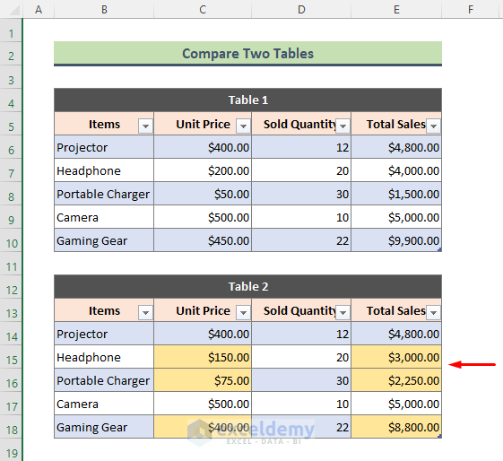
- We will get the output below. Table 2 highlights all the items with different unit prices and total sales.
Method 2 – Comparison between Columns of Two Tables in Excel
Steps:
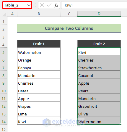
- Name both lists as tables. To name the list of column B, select the range B5:B14 and type Table_1 in the Name Box (left to the Formula Bar).
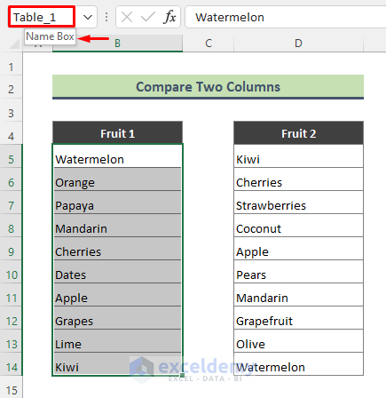
- Name the other range (D5:D15) as Table_2.
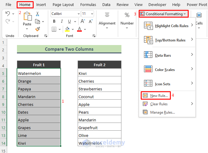
- Highlight the fruits of Table_2 that are not present in Table_1. To do that, select Table_1, and go to Home > Conditional Formatting > New Rule.
- When the New Formatting Rule window shows up, select the below Rule Type and type the below formula in the Edit Rule Description box. Choose the format color and press OK.
=COUNTIF(Table_2,B5)=0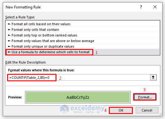
The COUNTIF function counts the number of cells in Table_2 that is equal to the value of cell B5.
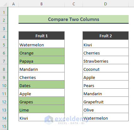
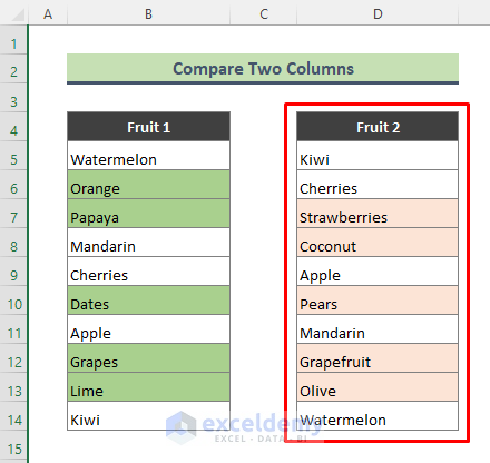
- All the fruits of Table_1 which are not in Table_2 are highlighted in green.
- Highlight the fruits of Table 1 that are not present in Table 2. Select Table_2, go to Home > Conditional Formatting > New Rule.
- Type the following formula in the Edit Rule Description box of the New Formatting Rule dialog, choose the format color, and press OK.
=COUNTIF(Table_1,D5)=0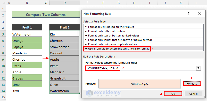
- All the fruits in Table_1 that are not in Table_2 are highlighted in pink.
⏩ Note:
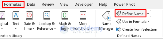
You can name a data range following the path Formulas > Define Name.
Make a Comparison Chart from Table in Excel
Steps:
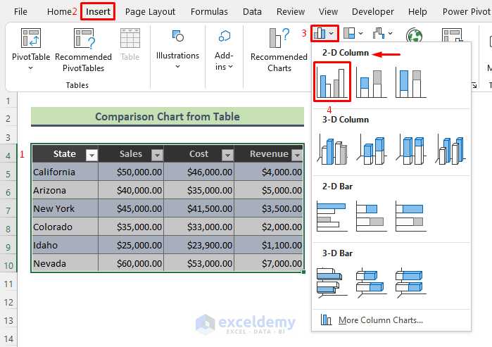
- Select the table, and go to the Insert tab. Go to the Charts section. From the Bar Chart drop-down, click Clustered Column option from the 2-D Column (see screenshot).
- You will get the chart below. Now click on the chart area and go to the Chart Design section.
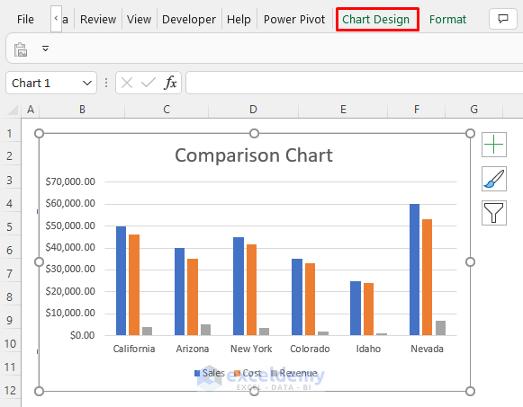
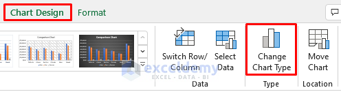
- Go to Chart Design > Change Chart Type.
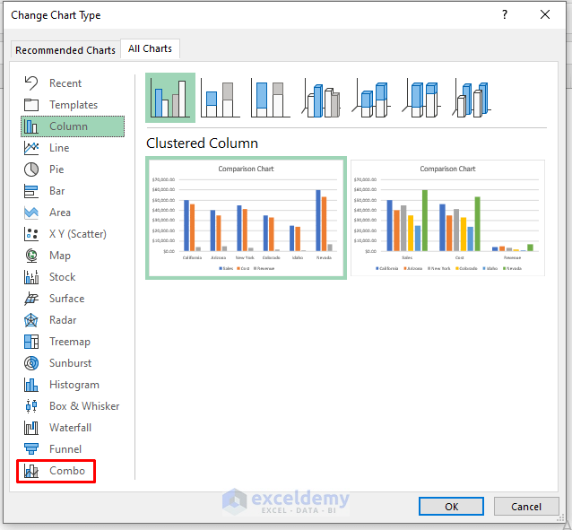
- The Change Chart Type dialog appears. From the All Charts tab, click on the Combo option.
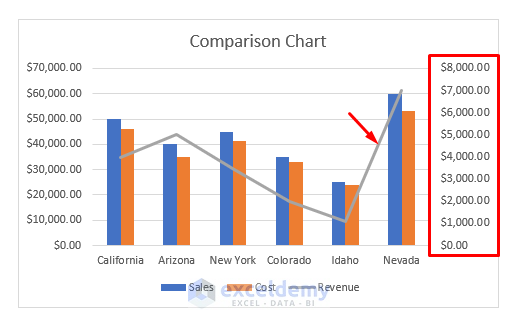
- You will see a combination of chart types. Select Chart Type: Line for Revenue column and make it a Secondary Axis. Press OK.
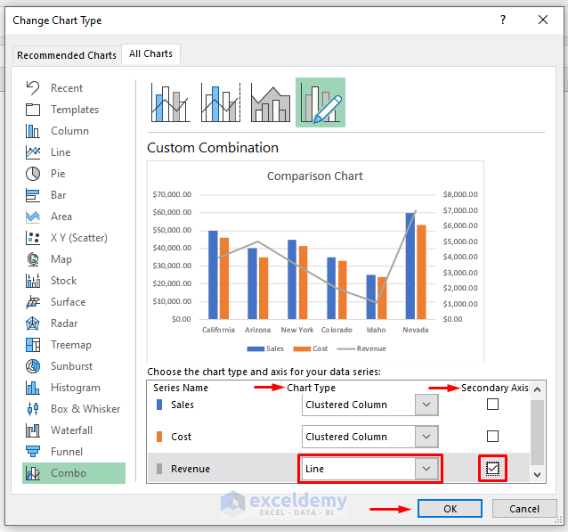
- See that revenue for each state is displayed in a line chart along with a secondary axis on the right side of our chart. You can analyze which state has less revenue and what measures you can take to improve revenue.
Download Practice Workbook
You can download the practice workbook that we have used to prepare this article.
Related Articles
- How to Convert Range to Table in Excel
- Navigating Excel Table
- How to Make Excel Tables Look Good
- How to Convert Table to List in Excel
- Table Name in Excel: All You Need to Know
- How to Create a Table Array in Excel
- How to Provide Table Reference in Another Sheet in Excel
- How to Insert Floating Table in Excel
<< Go Back to Excel Table | Learn Excel
Get FREE Advanced Excel Exercises with Solutions!
