The balance sheet is a crucial accounting tool. This allows businesses to keep track of their assets and liabilities. But often a balance sheet is presented with monotonous numbers. A graphical presentation of the balance sheet not only breaks the monotony but also makes it more presentable and easier to interpret. In this article, we will show how to add a balance sheet graph in Excel in an exhaustive way.
What Is a Balance Sheet?
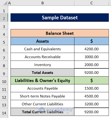
A balance sheet is a financial statement of a company. It shows the assets and liabilities of a company for a particular period in a comprehensive way. It also shows the total assets and liabilities. After the period ends, the assets and liabilities should be equal.
How to Add Balance Sheet Graph in Excel
The balance sheet is a powerful financial tool. However, it can be more powerful if the data in the balance sheets can be presented in a graph. This will make the balance sheet easier to interpret and more appealing as well. So, in this article, we will show how to add a balance sheet graph in Excel with detailed steps. This is a sample balance sheet that we will use to plot a graph.
Read More: How to Create Tally Debit Note Format in Excel
Step 1: Separating Data from Balance Sheet to Plot
The balance sheet contains all the information regarding the assets, liabilities, and equities of a company. However, we cannot directly plot data from the balance sheet. The data need to be arranged in a certain way in order to plot them in the graph. So, we need to separate the data from the balance sheet and order them in a certain way.
Follow the steps to do that.
- Firstly, make a separate table where we will have three columns one denoting the gains and expenses and the other two for Assets, Liabilities & Equities respectively.
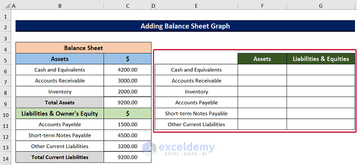
- Then, write the amount of the assets and liabilities in the respective cells to complete the table. Keep the cell blanks if there is no value for that cell.

Read More: Revised Schedule 3 Balance Sheet Format in Excel with Formula
Step 2: Inserting Chart
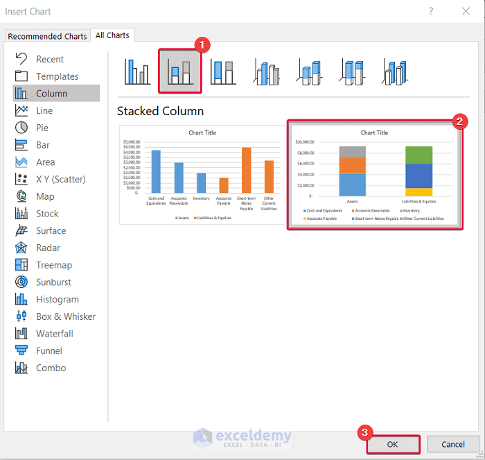
This is the most important step. There are many types of charts. But before inserting the chart we need to decide which chart will be suitable to represent the data in the balance sheet. And there is no better chart than the Stacked Column chart. This chart allows us to see which subfield is costing or gaining how much money for a particular field.
Follow the steps below to do so.
- Firstly, select any data from our newly created table.
- Secondly, go to the Insert tab.
- Thirdly, from the Charts option select Insert Column or Bar Chart.
- Finally, from the drop-down options select the More Column Charts option.
- Consequently, a new prompt will be on the screen.

- From the prompt, first, select the Stacked Column chart.
- Then, select the chart to the right.
- Finally, click OK.
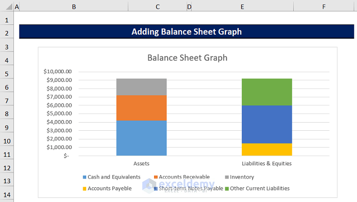
- Consequently, we will have a stacked column chart for our data.
Read More: Balance Sheet Format in Excel with Formulas
Step 3: Enabling Data Labels
This may look like a secondary step. However, this step will make the graph more readable and relevant. From the label on the data, we will be able to discern which fields of the balance sheet have how much money.
Follow the ensuing steps.
- To begin with, select any data from the graph.
- Then, select the “Plus” sign to the right of the graph.
- Finally, mark the rectangle beside the option called “Data Labels”.
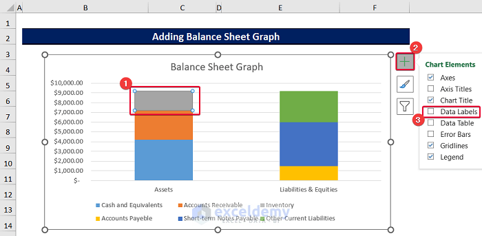
- As a result, all the data will have labels. This will make the graph easier to read.

Read More: Schedule 6 Balance Sheet Format in Excel
Download Practice Workbook
You can download the practice book here.
Conclusion
In this article, we had a step-by-step discussion on adding a graph to a balance sheet in Excel. This will make the balance sheet more relevant to the users, especially those who are new to the accounting field. This will also make the balance sheet presentation more appealing. Please let us know in the comment section if you have any questions, suggestions, or feedback.
Related Articles
- How to Create Vertical Balance Sheet Format in Excel
- How to Make Hotel Balance Sheet Format in Excel
- Create Horizontal Balance Sheet Format in Excel
- How to Perform Balance Sheet Ratio Analysis in Excel
<< Go Back to Balance Sheet | Finance Template | Excel Templates
Get FREE Advanced Excel Exercises with Solutions!
