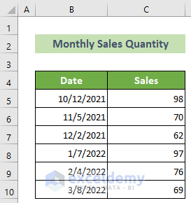
Below is a dataset for the Monthly Sales Quantity of 6 months, consisting of Date and Sales columns.
Method 1 – Using a Single Legend Entry
Steps:
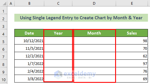
- Create two columns named Year and Month between the Date and Sales columns.
- Click on cell C5 and enter the following formula:
=YEAR(B5)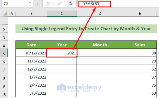
- Press Enter.
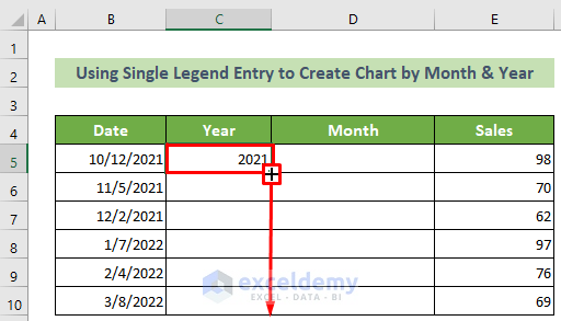
- Place your cursor in the bottom right of the cell and drag the fill handle downward.
- Click cell D5 and enter the following formula to extract the month of the following date.
=TEXT(B5,"mmm")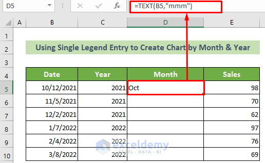
- Press Enter.
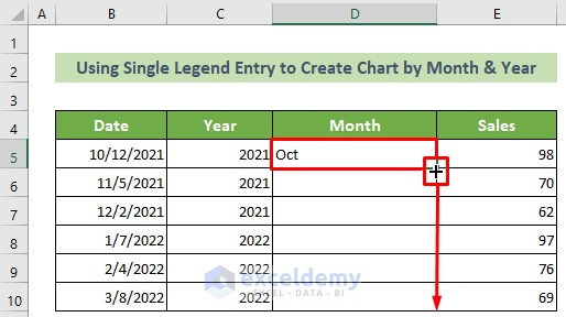
- Place your cursor at the bottom right of this cell. When the fill handle appears, drag it below to copy the same formula.
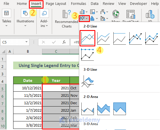
- Select cells C5:E10.
- Go to the Insert tab >> Insert Line or Area Chart tool >> Line option.
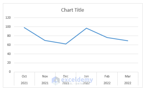
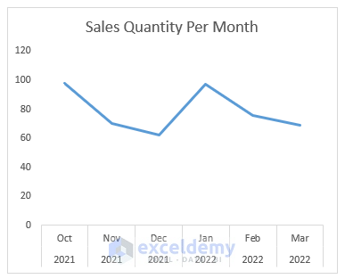
- A line chart will appear based on the sales data, keeping the month and year on the X-axis.
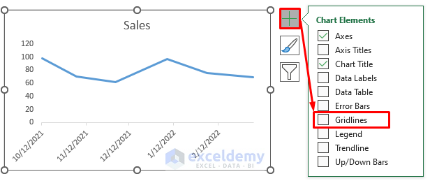
- For a cleaner look, click on the chart >> click on the Chart Elements icon >> untick the Gridlines option.
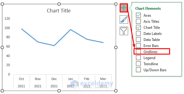
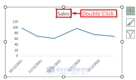
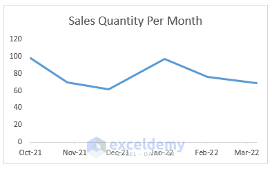
- For a better understanding of the chart, double-click on the Chart Title and write Sales Quantity Per Month.
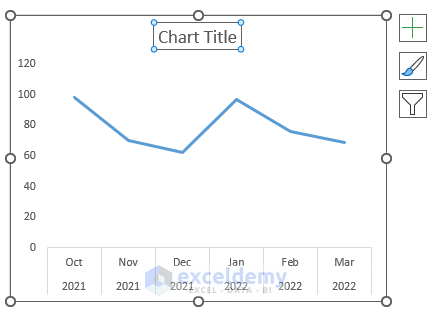
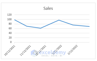
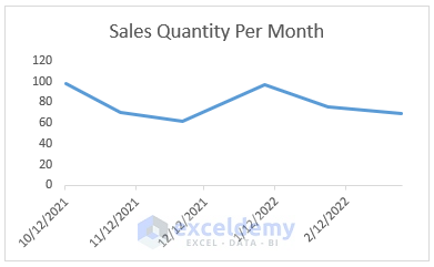
There will be an Excel chart with months and years according to your data. The outcome should look like this.
Read More: How to Combine Daily and Monthly Data in Excel Chart
Method 2 – Adding a Secondary Axis to an Excel Chart by Month and Year
Steps:
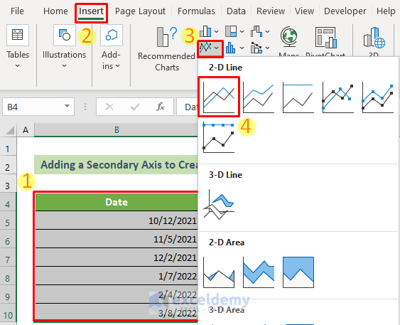
- Select cells B5:C10 >> go to the Insert tab >> Insert Line or Area Chart tool >> Line option.
- You will have a line chart for the selected data range.
- For a simplified look, click on the Chart >> Chart Elements icon >> Untick the Gridlines option.
- For a better understanding of the chart, double-click on the Chart Title and enter Sales Quantity Per Month.
Your chart will look like this.
- The X-axis has dates, but you want only the month and number. Now, double-click on the X-axis.
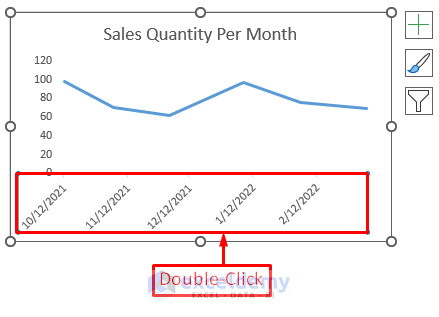
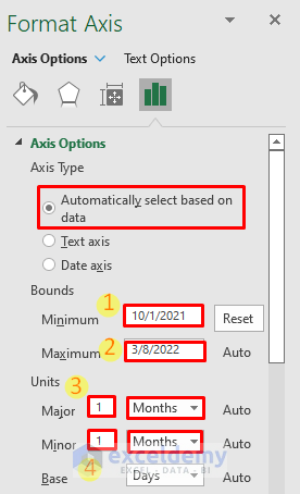
- The Format Axis pane window will appear on the right side. At the Axis Options group, mark the Axis Type as Automatically select based on data.
- Enter 10/1/2021 at the Minimum Bound and the last data’s date at the Maximum Bound. Keep the Units as 1 month for both Major and Minor axes.
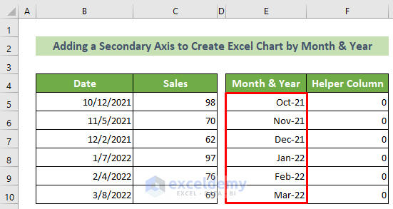
- Create two columns named Month & Year and Helper Column.
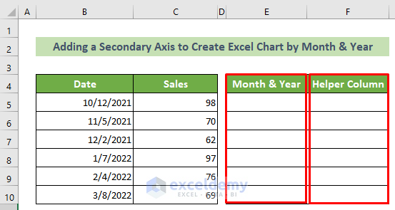
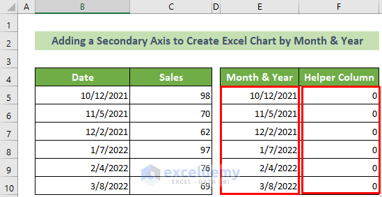
- In the Month & Year column, copy and paste all the given dates.
- Enter 0 in the Helper Column cells.
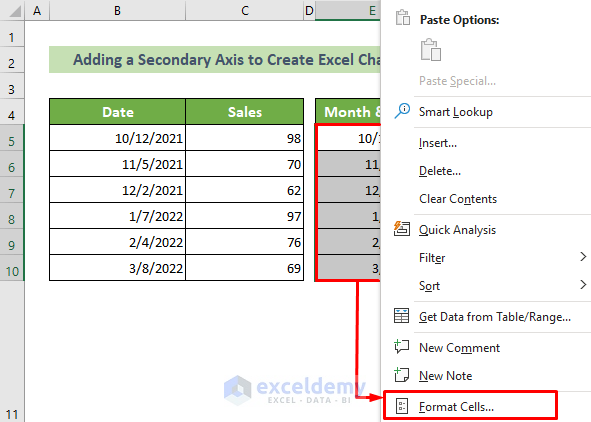
- Select the cells of the Month & Year column and right-click.
- Select the Format Cells option from the context menu.
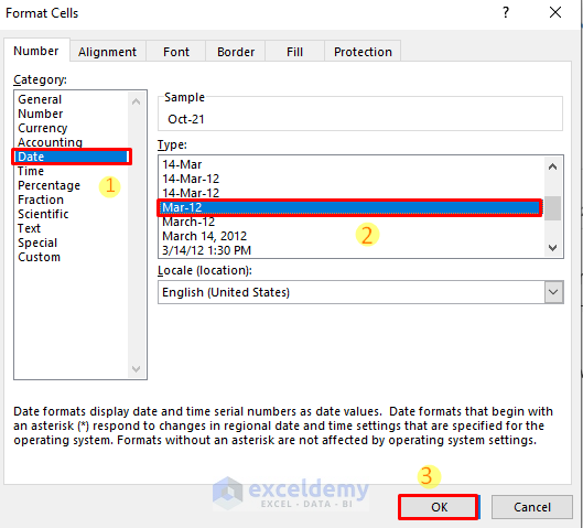
- The Format Cells window will appear. Select the Category: as Date and the Type: as Mar-12.
- Click OK.
- You will see the dates are in month and year.
- Go to the chart again. Right-click on the chart area and choose the Select Data option from the context menu.

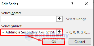
- The Select Data Source window will appear. Click on the Add button.
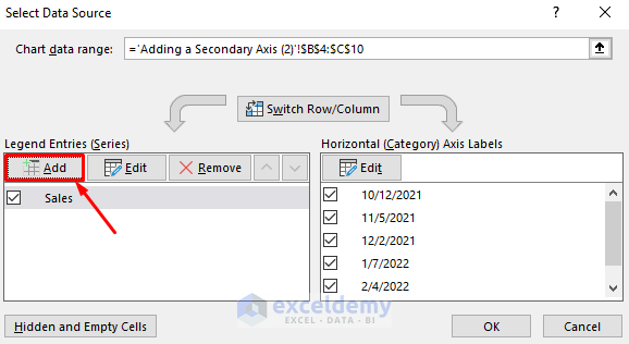
- The Edit Series window will appear. In the Series values: text box, refer to the F5:F10 cells.
- Click OK.
- You will be back at the Select Data Source window again. Click OK.
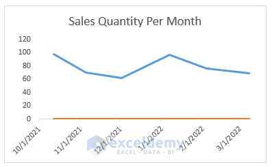
- Another data series is added to the chart – the orange line.
- Double-click on the blue line. The Format Data Series task pane will arrive on the right side.
- Under the Format Data Series task pane, go to the Series Options group.
- Under the Plot Series On options, click on the Secondary Axis option.
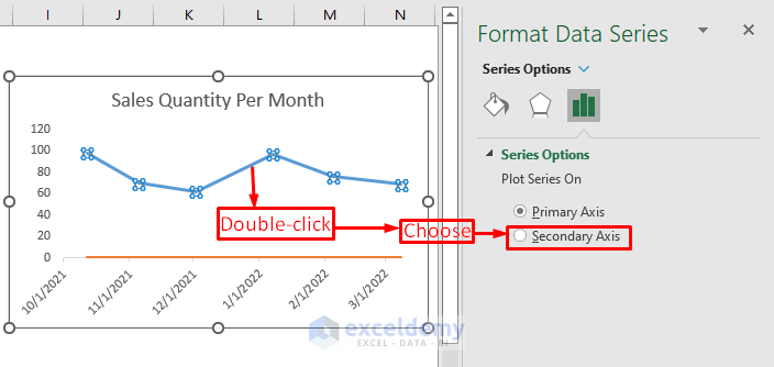
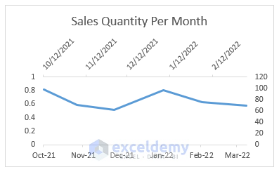
You will have a chart like the following figure.
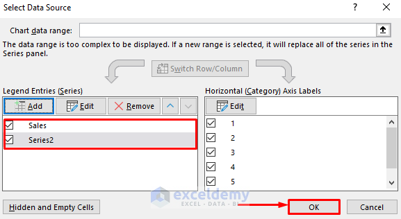
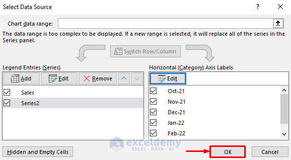
- Right-click on the chart area again and select the Select Data option from the context menu.
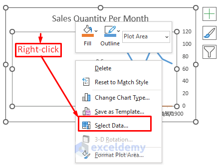
- The Select Data Source window will appear.
- Select the Series 2 entry and click the Edit button under the Horizontal Axis Labels option.
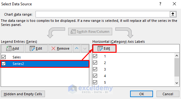
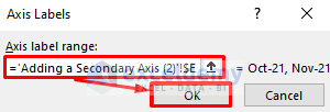
- The Axis Labels window will appear. At the Axis label range, select the E5:E10 cells.
- Click OK.
- The Select Data Source window will appear again. Click OK.
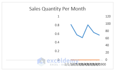
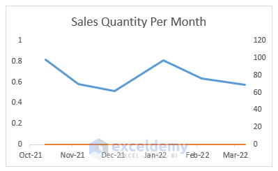
- The chart will now look like this.
- Select the chart >> go to the Chart Design tab >> Add Chart Element tool >> Axes options >> Secondary Horizontal option.
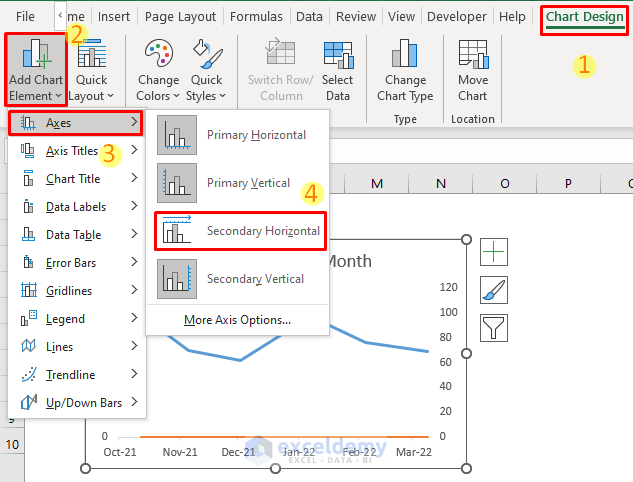
You will have a chart with two horizontal axes.
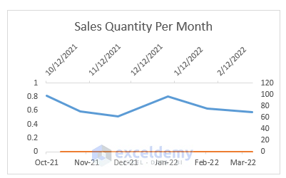
You don’t need the orange line anymore.
- Double-click on the orange line. The Format Data Series task pane will appear on the right side.
- Under the Series Options group, go to the Fill & Line group.
- Under the Line group, select the No line option.
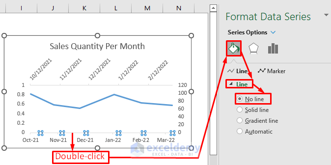
- The orange line is gone.
You don’t need the left vertical axis anymore.
- select it and press the Delete button.
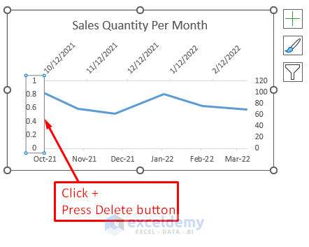
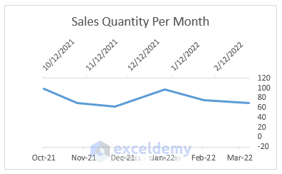
- The chart will now look like this.
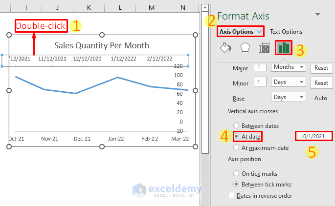
- To move the right vertical axis to the left, double-click on the upper horizontal axis. The Format Axis task pane will appear on the right side.
- Go to the Axis Options group >> Vertical axis crosses option >> Select the At date option >> Enter the date as 10/1/2021 inside the text box.
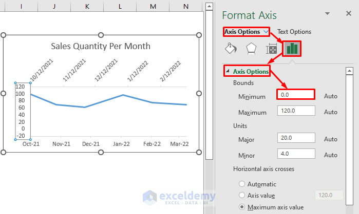
- Double-click on the vertical axis and go to the Axis Options group.
- Enter the minimum bound as 0.0 inside the Minimum text box under the Bounds group.
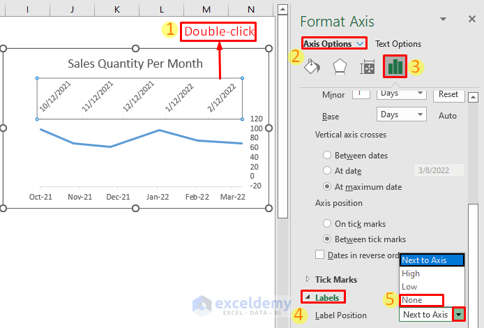
- Remove the upper horizontal axis, and double-click on the axis. The Format Axis task pane will appear.
- Go to the Axis Options group >> Labels group >> Label Position option >> choose the option as None.
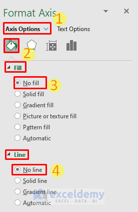
- Go to the Fill & Line group from the Axis Options group >> Fill group >> No line option >> Line group >> No line option
You have created an Excel chart by month and year. It should look like this.
Read More: How to Create Graph from List of Dates in Excel
Download the Practice Workbook
You can download our practice workbook from here for free.
Related Articles
- How to Show Only Dates with Data in Excel Chart
- How to Change Date Range in Excel Chart
- How to Ignore Blank Cells with Formulas in Excel Chart
- How to Plot Time over Multiple Days in Excel
<< Go Back to Data for Excel Charts | Excel Charts | Learn Excel
Get FREE Advanced Excel Exercises with Solutions!
