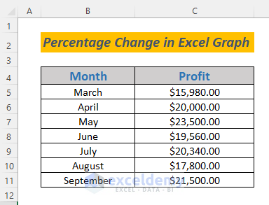
Dataset Overview
In the following dataset, we have a company’s Profit during the period March to September that we will use to illustrate the two methods.
Method 1 – Using a Column Chart
- Create a New Column for Profits:
- In your dataset, add a new column where you’ll calculate the profits for each month.
- In cell D5, enter the following formula:
=C6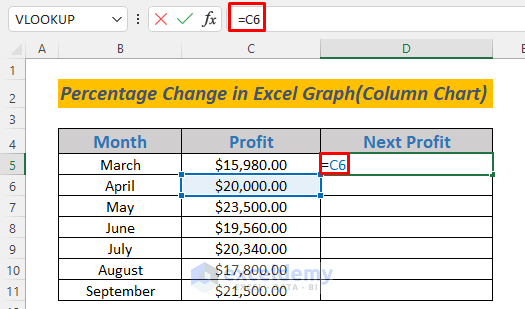
-
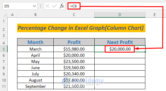
- Press ENTER, and you’ll see the profit for April appear in cell D5.
-
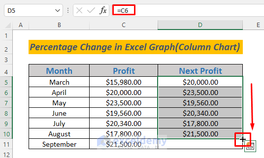
- Use the Fill Handle to Autofill this formula for the remaining months.
- Calculate Variance in Profits:
- Create additional columns for variance in profits, positive variance, negative variance, and percentage change.
- In cell E5, enter the following formula:
=D5-C5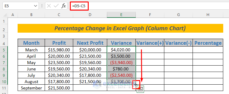
-
- Press ENTER and Autofill this formula for the other months.
- Positive and Negative Variance:
- In cell F5, enter the following formula:
=IF(E5>0,-E5,"")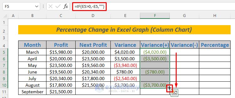
-
- This formula calculates the decrease in profits (if any) and stores it in column G.
- Autofill this formula for the other months.
- Storing Decrease in Profits (Column G):
- The IF function will now store the decrease in profits in column G.
- In cell G5, enter the following formula:
=IF(E5<0,-E5,"")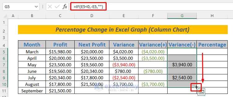
-
- Press ENTER and use the Fill Handle to Autofill this formula for the other months.
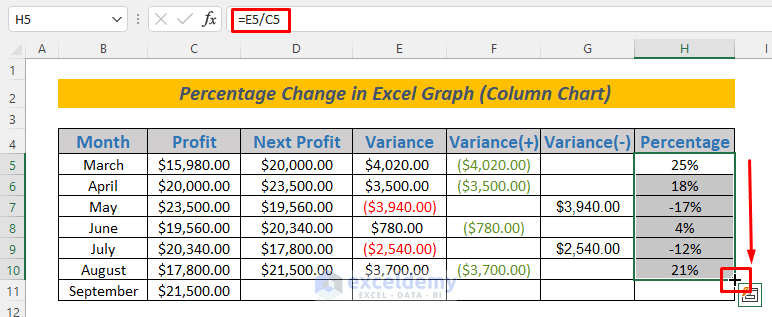
- Calculating Percentage Change (Column H):
- In cell H5, enter the following formula:
=E5/C5
- Press ENTER and use the Fill Handle to Autofill this formula for the remaining cells.
- In cell H5, enter the following formula:
- Creating a Chart to Visualize Percentage Change:
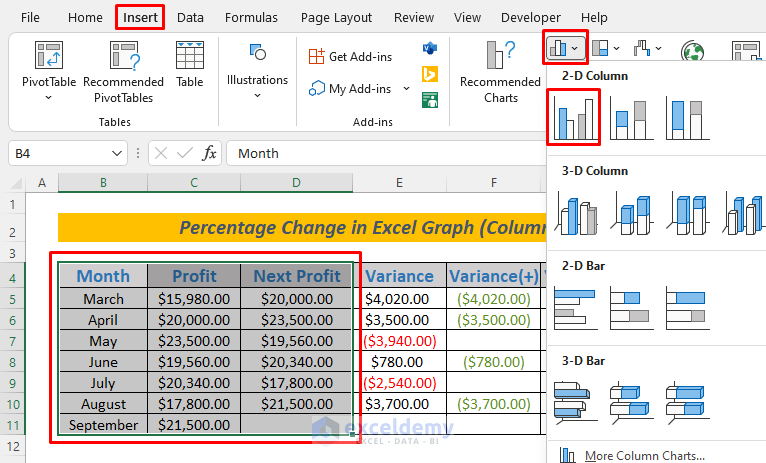
- Select the range B4:D11 (Month, Profit, and Next Profit columns).
- Go to Insert and select Clustered Column Chart.
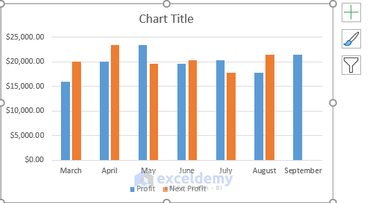
-
- A chart will appear.
-
- Double-click on the Next Profit column (orange-colored bars) in the graph.
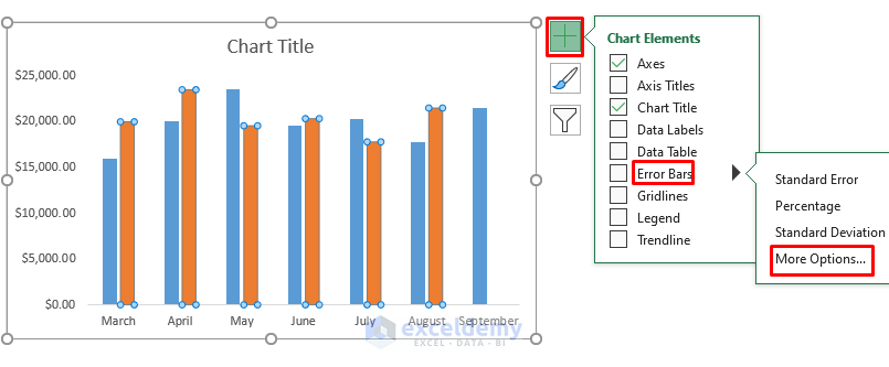
- Click on the Plus (+) icon and uncheck the Legend and Gridlines option (optional for better visibility).
- Select Error Bars and select More Options….
-
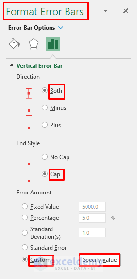
- In the Format Error Bars window, ensure the Direction is set to Both and the End Style is Cap.
- From the Error Amount options, select Custom and click on Specify Value.
-
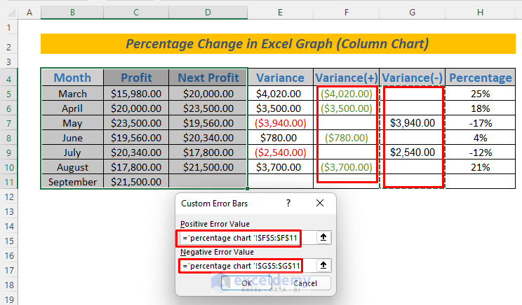
- A dialog box will appear.
- Select range F5:F11 for the Positive Error Value and G5:G11 for the Negative Error Value sections.
- Click OK.
-
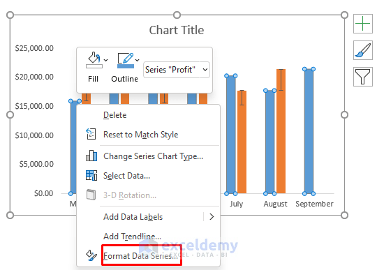
- Right-click on any of the Profit Column Bars (blue-colored bars) and select Format Data Series….
-
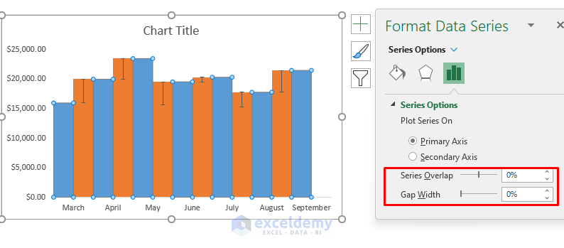
- Set Series Overlap and Gap Width to 0% in the Format Data Series window.
- Make sure that Plot Series remains on Primary Axis.
-
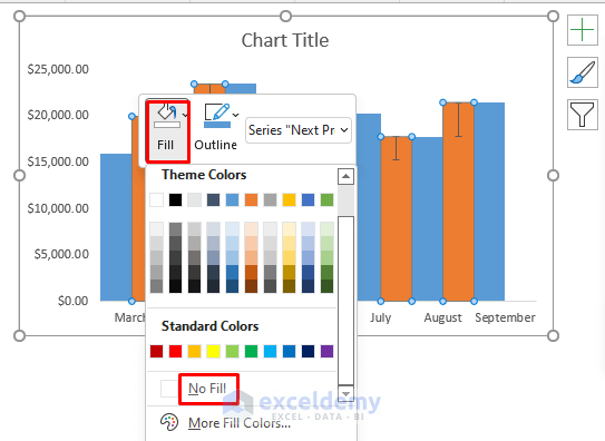
- To change the Fill Color of Next Profit Bars to no Fill, right-click on any of the orange bars after selecting the chart.
- Click on the drop-down list of the Fill for the Next Profit Bars and choose No Fill.
-
- This will make the Next Profit Bars appear neat and clean.
- Click on the Plus (+) symbol of the chart.
- Select Data Labels and select More Options….
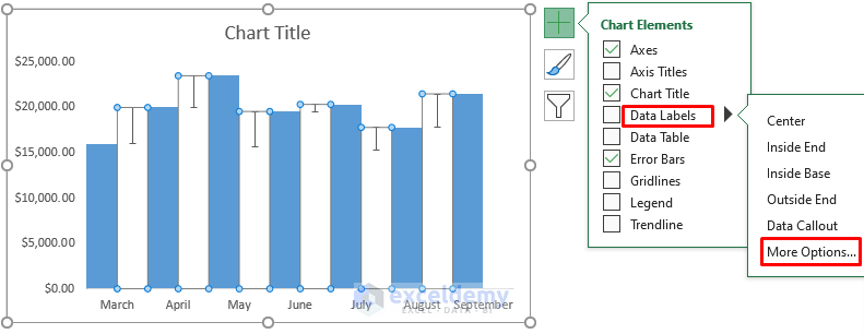
-
- The Format Data Labels window will appear.
- Uncheck Value and check Value From Cells.
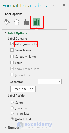
-
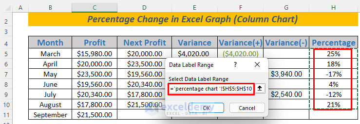
- In the dialog box that appears, select the range H5:H10 (Percentage column) for the Select Data Label Range section and click OK.
-
- After completing the above steps, you’ll see the increase and decrease in monthly profits displayed as percentages in the chart.
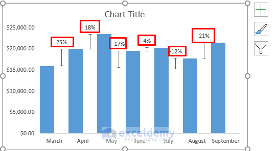
This method provides a clear and effective way to visualize the percentage change in an Excel graph.
Read More: Calculate Percentage Difference Between Two Numbers in Excel
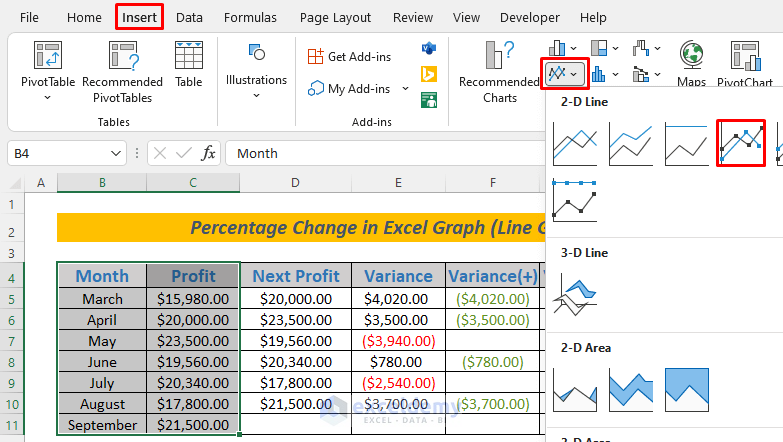
Method 2 – Using a Line Chart
You can also visualize percentage change using a line diagram. Follow these steps:
- Select the Data Range:
- Highlight the range B4:C11 in your Excel sheet.
- Create a Line Chart with Markers:
- Go to the Insert tab.
- Choose Line With Markers from the chart options.
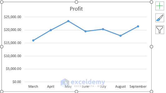
-
- A line chart will appear, but it won’t display the percentage change.
- Display Percentage Change:
- To show the percentage change, follow the steps from Method 1 of this article (the same steps used for the column chart method).
- The process is similar to the first section, but this time, we won’t use error bars. Uncheck the Error Bars option.
- After repeating these steps, you’ll have a Line Diagram that represents the percentage change.
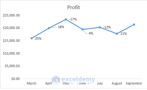
Using a line chart is another straightforward way to visualize percentage change in an Excel graph.
Read More: How to Calculate Percentage Change with Negative Numbers in Excel
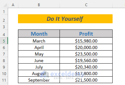
Practice Section
Below, I’ve provided the dataset that we used to demonstrate percentage change in an Excel graph. Feel free to practice with it on your own.
Download Practice Workbook
You can download the practice workbook from here:
Related Articles
- Percentage Difference Between Two Percentages in Excel
- How to Calculate Year over Year Percentage Change in Excel
- How to Calculate Average Percentage Change in Excel
- How to Calculate Percentage Increase Between Three Numbers in Excel
<< Go Back to Percentage Change | Calculating Percentages | Calculate in Excel | Learn Excel
Get FREE Advanced Excel Exercises with Solutions!
