A timeline is a representation of events in chronological order.
Download Practice Workbook
How to Create a Timeline in Excel?
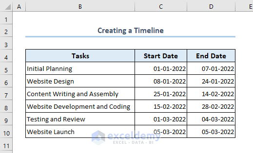
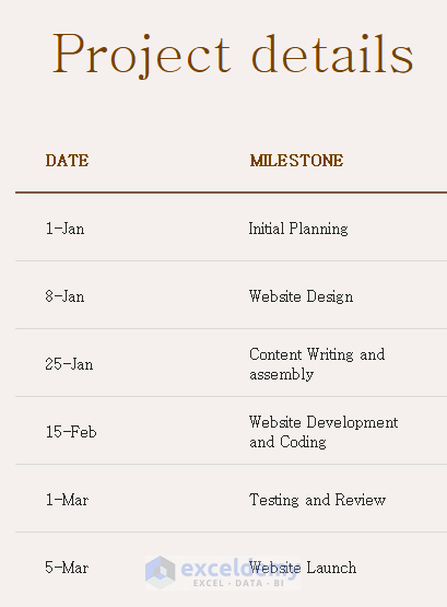
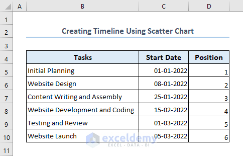
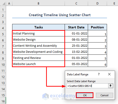
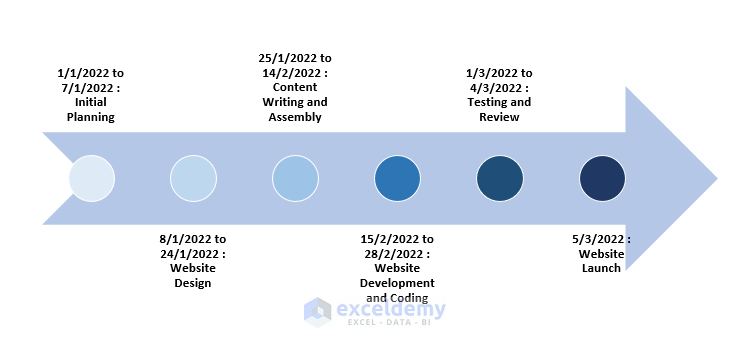
In the following dataset the plan of company to develop a website is showcased.
1. How to Create a Timeline Using a Template
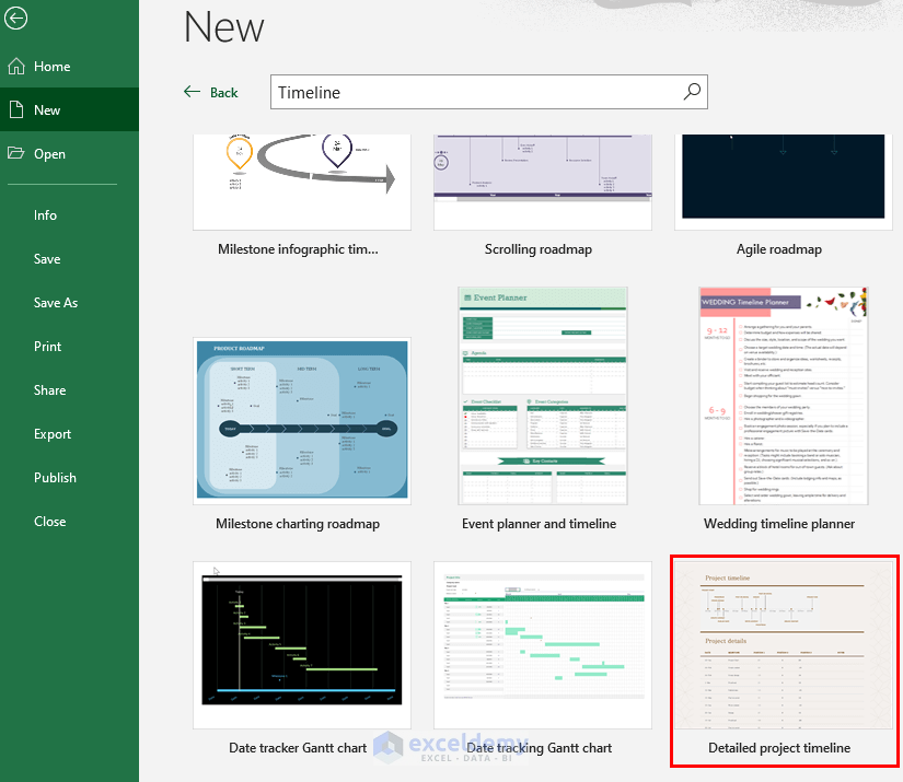
- Click File.
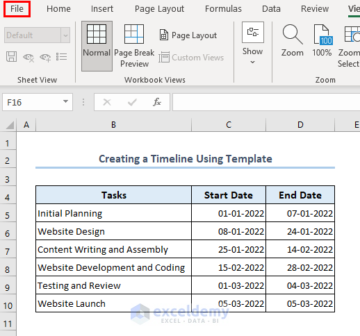
- Go to New.
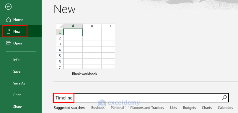
- In Search for online templates, choose Timeline, and press Enter.
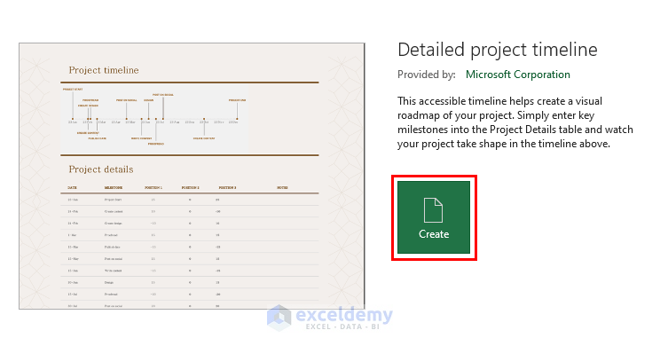
- The Detailed project timeline template was selected here.
- Click Create.
- The template will be displayed in a new workbook.
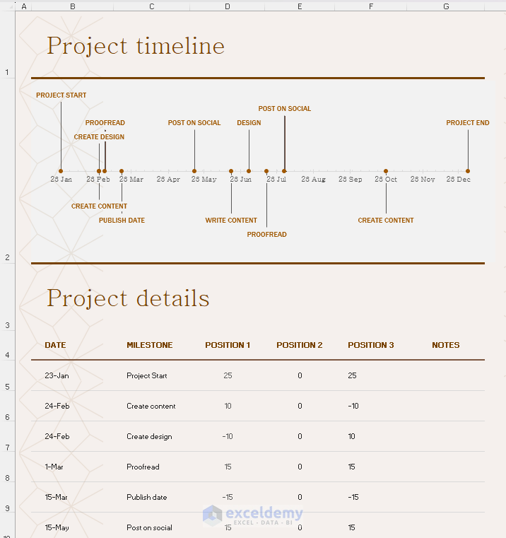
- Modify the Project details.
- The Start Date was inserted in the DATE column and the Tasks in the MILESTONE column.
- The timeline is created.
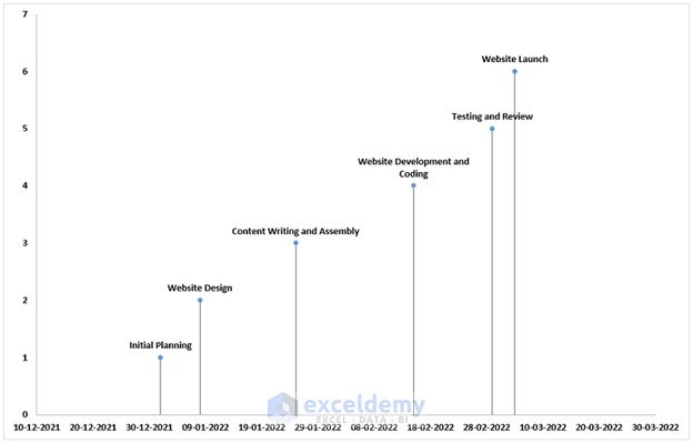
Method 2 – How to Use a Scatter Chart to Create a Timeline
- Add a Position column.
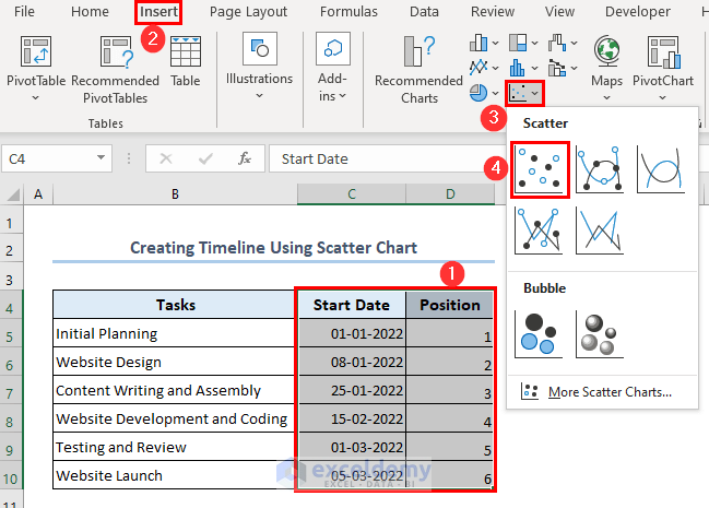
- Select C4:D10.
- Go to Insert >> Insert Scatter (X, Y) or Bubble Chart >> Scatter.
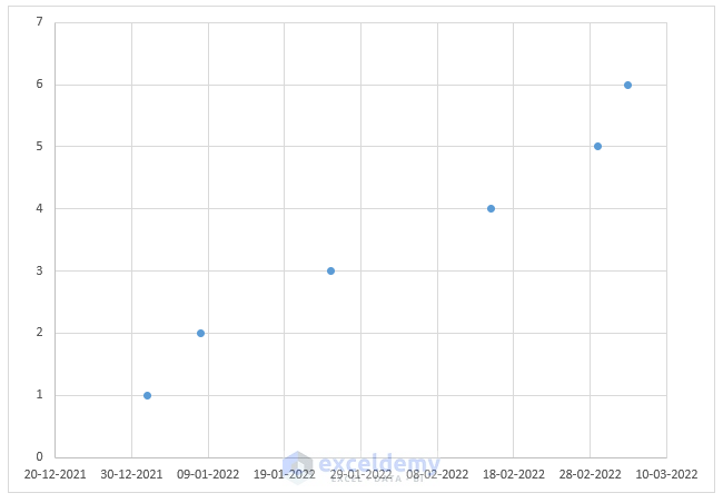
- A chart will be created.
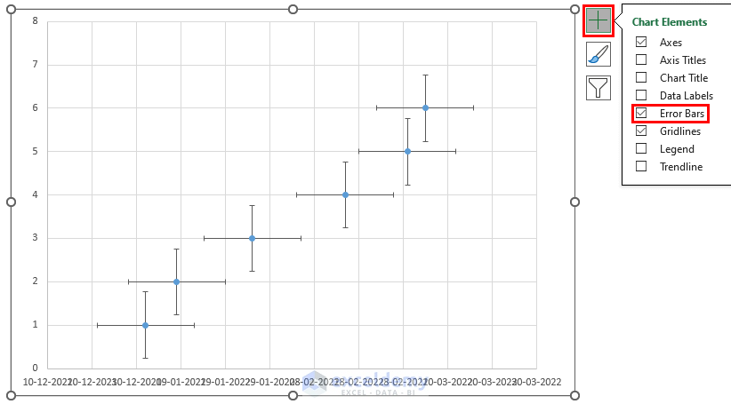
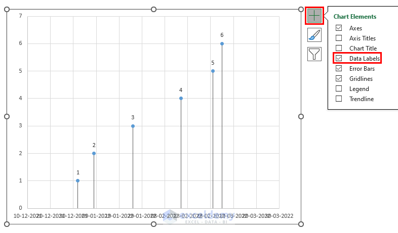
- At the top-rightmost of the chart, click the Plus (+) icon.
- Check Error Bars.
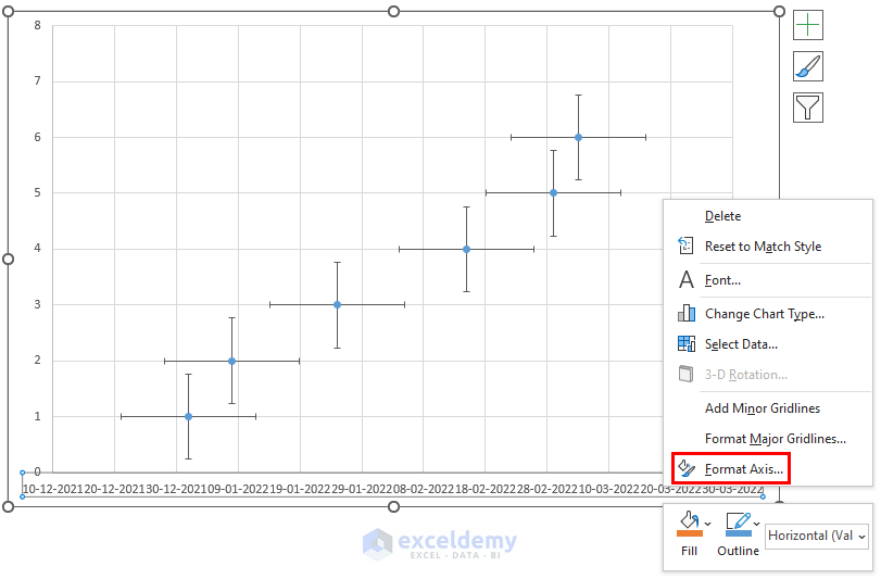
- Right-click the dates along the horizontal axis.
- Select Format Axis.
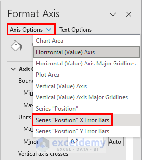
- The Format Axis sidebar will be displayed.
- Click Axis Options.
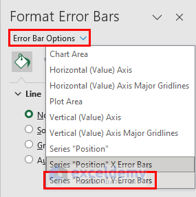
- Select Series “Position” X Error Bars.
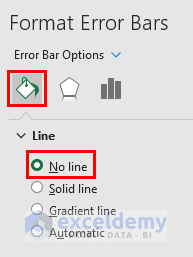
- Go to Fill & Line.
- Select No line.
- Click Error Bar Options.
- Select Series “Position” Y Errors Bars.
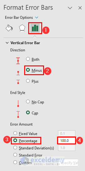
- Go to Error Bars Options.
- Check Minus.
- In Error Amount, check Percentage and set the percentage to 100.
- Your chart will be displayed.
- Click the Plus (+) icon again.
- Check Data Labels.
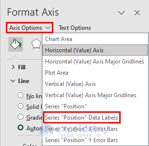
- Go to the Format Axis sidebar.
- Click Axis Options.
- Select Series “Position” Data Labels.
- Go to the Label Options.
- Uncheck Y Value.
- Check Value From Cells.
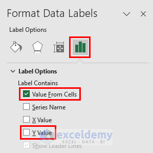
- Select range B5:B10.
- Click OK.
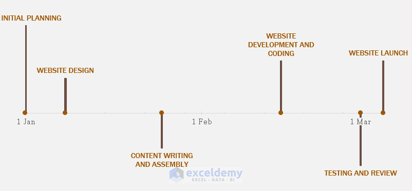
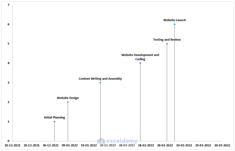
- The timeline using the scatter chart feature will be displayed.
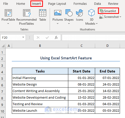
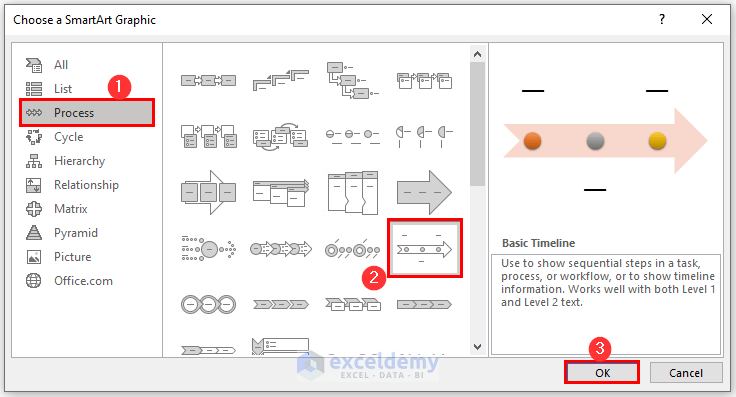
Method 3 – How to Use the Excel SmartArt Feature to Create a Timeline.
- Go to the Insert tab.
- Click SmartArt.
- The Choose a SmartArt Graphic dialog box will be displayed.
- Go to Process.
- Select Basic Timeline and click OK.
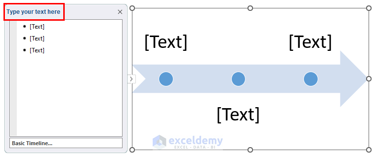
- This is the output.
- Enter your data in Type your text here.
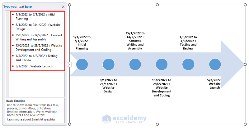
- This is the output.
- You can customize your timeline.
- Right-click your timeline and you will see customize options.
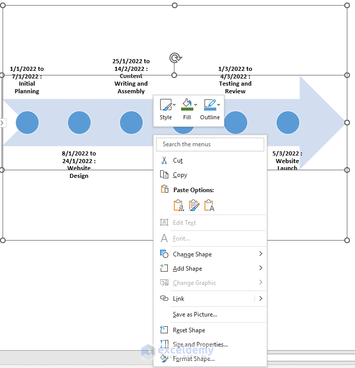
- This is the customized timeline.
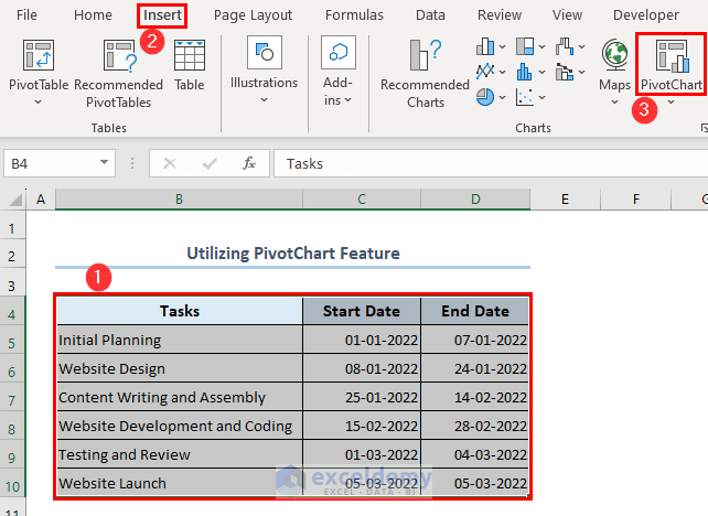
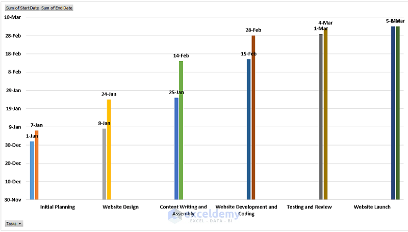
Method 4 – How to Utilize the PivotChart Feature to create a Timeline
The PivotChart allows us to sum values based on dates.
- Select B4:D10.
- Go to the Insert tab.
- Click PivotChart.
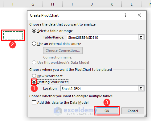
- In the Create PivotChart dialog-box, select Existing Worksheet.
- Select any cell, here F4, as the location and click OK.
- The PivotChart Field will be displayed.
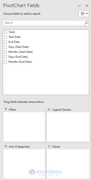
- Drag Tasks to the Axis (Categories).
- Drag Start Date and End Date to Values.
- Drag Days (Start Date), Months (Start Date), Days (End Date) & Months (End Date) to Legend (Series).
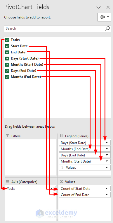
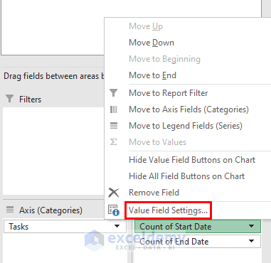
- In Values, click Count of Start Date.
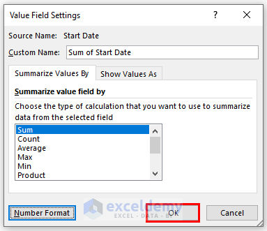
- Select Value Field Settings.
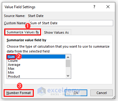
- In Summarize values By, select Sum.
- Click Number Format.
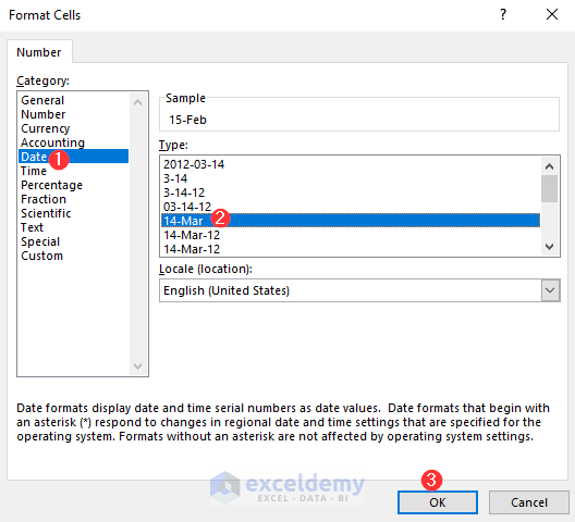
- In the Format Cells dialog box, go to Date.
- Select a date format.
- Click OK.
- Click OK in Value Field Settings.
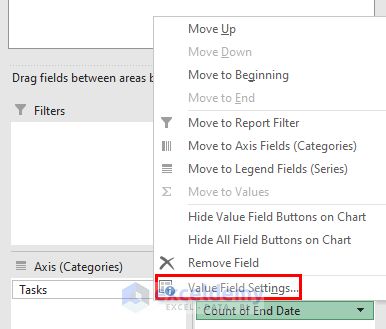
- Click Count of End Date in Values.
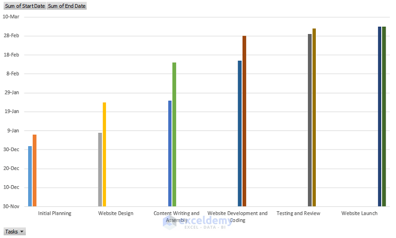
- Your timeline will be displayed.
- To add labels:
- Click the Plus (+) icon.
- Check Data Labels.
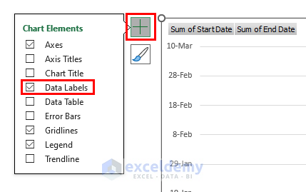
- This is the final output.
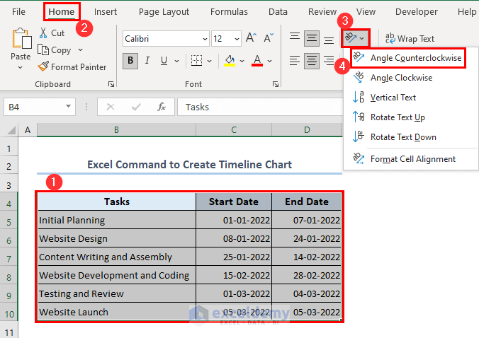
Method 5 – How to Use the Excel Command to Create a Timeline Chart
- Select B4:D10.
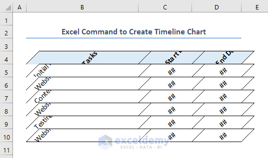
- Go to Home >> Orientation >> Angle Counterclockwise.
- This is the output.
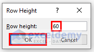
- Select B4:D10.
- Go to: Home >> Cells >> Format >> Row Height.
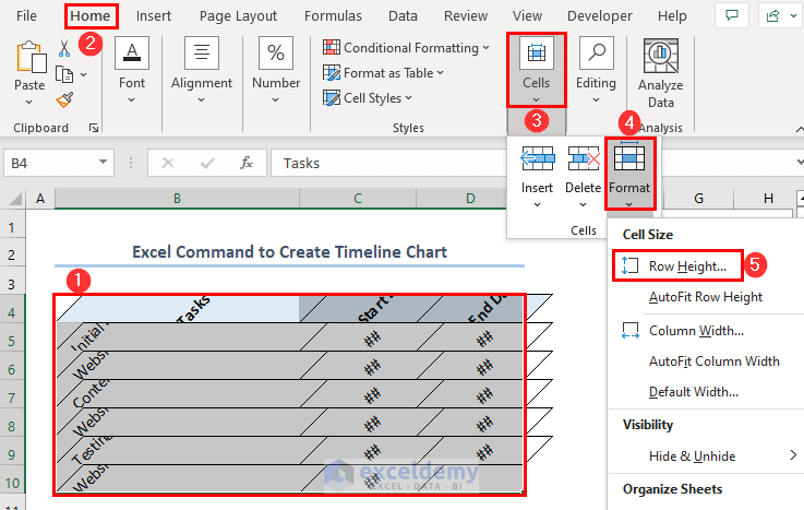
- Set Row Height to 60.
- Click OK.
- Go to Home >> Alignment >> Wrap Text.
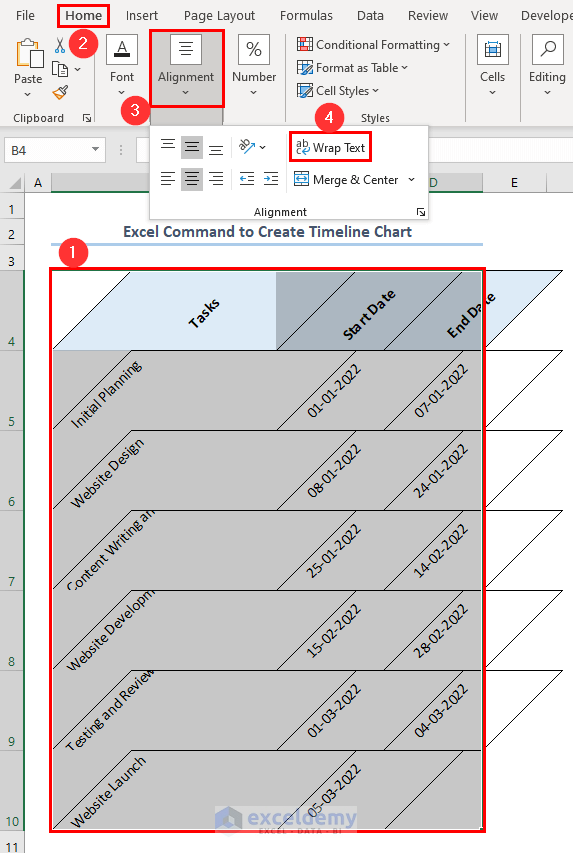
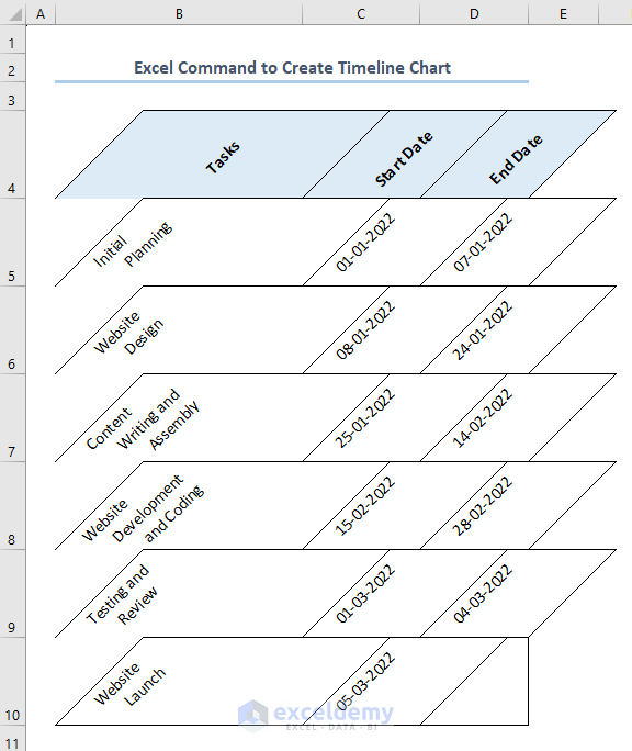
- This is the output.
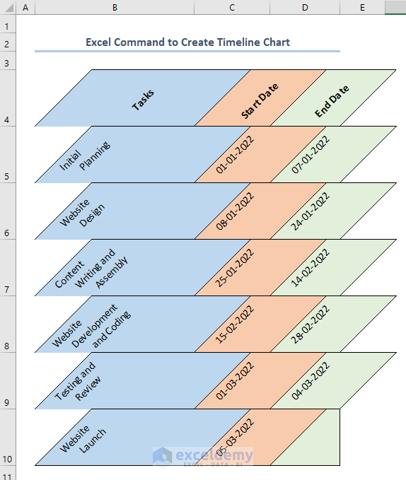
- Add color to your timeline.
What Are the Built-in Timeline Templates Available in Excel?
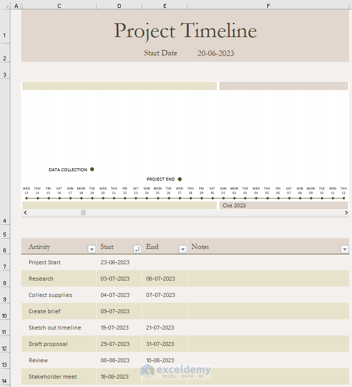
Project Timeline
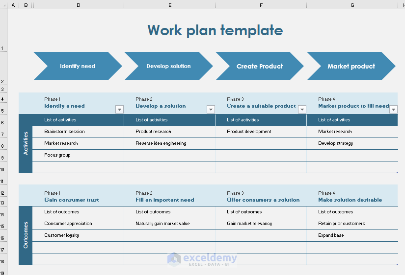
Work Plan Timeline
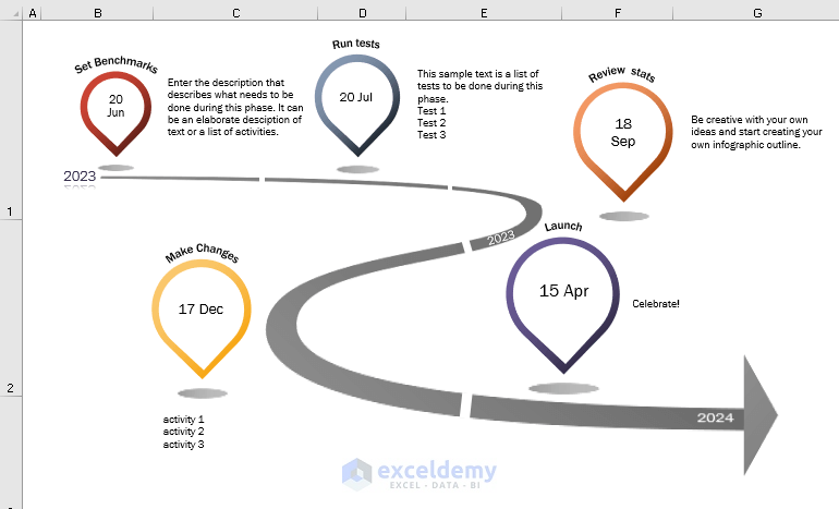
Milestone Infographic Timeline
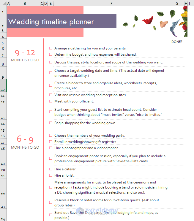
Wedding Planning Timeline
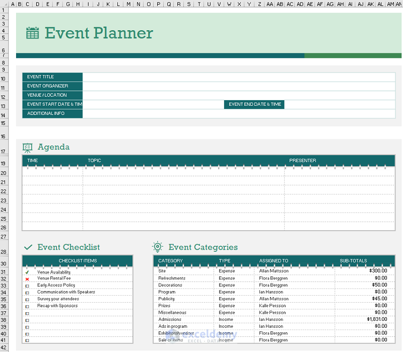
Event Planner Timeline
Frequently Asked Questions
1. What is the difference between a slicer and a timeline in Excel?
A slicer is an Excel visual control element that enables users to filter data in a pivot table or pivot chart by choosing values from a predefined list.
A timeline is a visual control element in Excel that enables users to filter data in a PivotTable or PivotChart based on a specified date or time range.
2. What is a project timeline?
A project timeline is a diagram that gives a comprehensive overview of the project’s schedule, including start and finish dates, significant outcomes, and project dependencies.
3. What is a timeline spreadsheet?
A timeline spreadsheet gives you an organized visual representation to arrange and present data systematically.
Timeline in Excel: Knowledge Hub
- Create a Timeline Chart
- Create a Timeline With Milestones
- Create a Timeline with Dates
- Create a Project Timeline
<< Go Back to Learn Excel
Get FREE Advanced Excel Exercises with Solutions!
