Timeline Charts are charts or graphs that depict the chronological execution of partial events of a much bigger event.
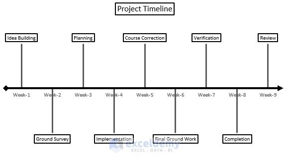
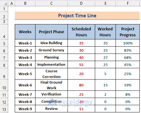
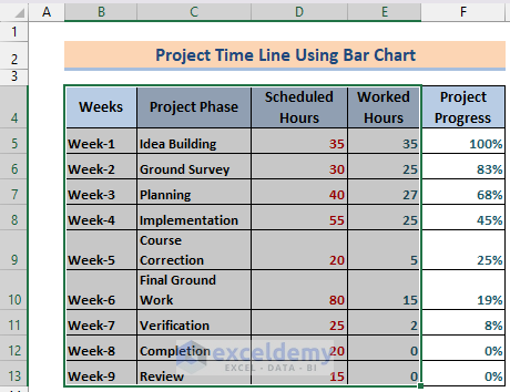
We have tasks of a Project Timeline divided into weeks, required Working Hours as well as ongoing Progress. We want to create a timeline chart using the following data.
How to Create a Timeline Chart in Excel: 3 Easy Ways
Method 1 – Using a 2D Line to Create a Timeline Chart in Excel
Steps:
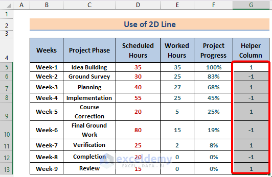
- Insert a new field after project progress called Helper Column.
- Insert altering 1 and -1 values into the cells of the column.
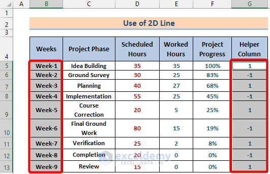
- Select the Weeks column data (cell range B5–B13) and Helper Column data (cell range G5–G13) together while holding Ctrl on the keyboard.
- Go to the Insert tab in the ribbon and select Insert Column or Bar Chart under the Charts section.
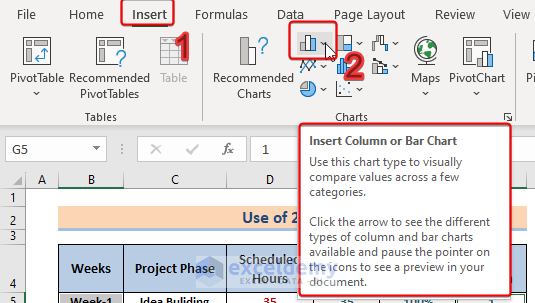
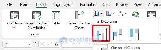
- Select the Clustered Column chart type among the chart types.
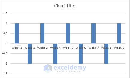
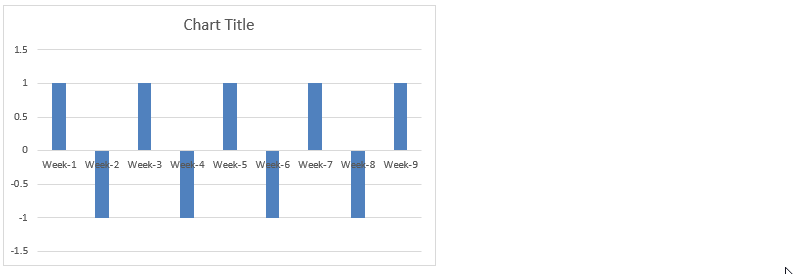
- A chart will appear.
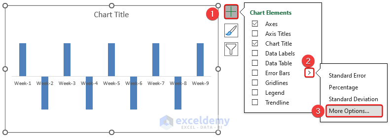
- Click on the bar chart to get a ‘+’ sign in the corner the chart. It’s called the Chart Elements.
- Click on Chart Elements and disable Gridlines.
- In the Axes option, disable Primary Vertical.
- Click on the Chart Elements button and select the arrow beside Error Bars.
- Select More Options.
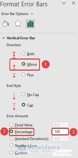
The Format Error Bars side panel will appear on the right.
- Change the Direction to Minus, change Error Amount to Percentage, and set Percentage to 100.
- Close the panel by clicking the (x) in the top right side of the panel.
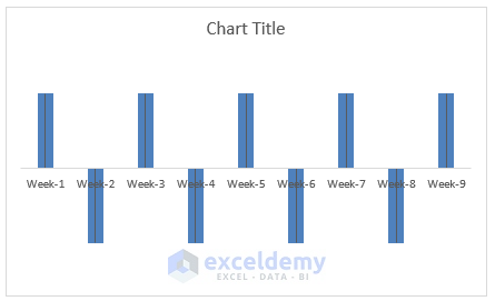
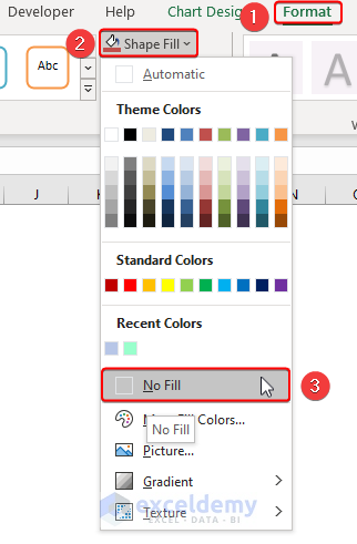
- Select the bars and go to the Format tab in the Ribbon.
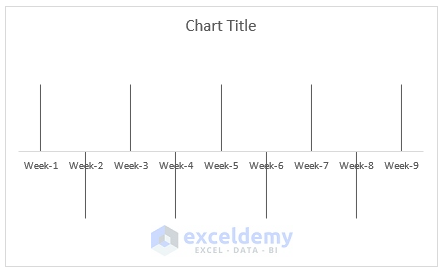
- In the Format tab, click on Shape Fill under the Shape Styles section and select No Fill.
.
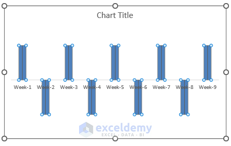
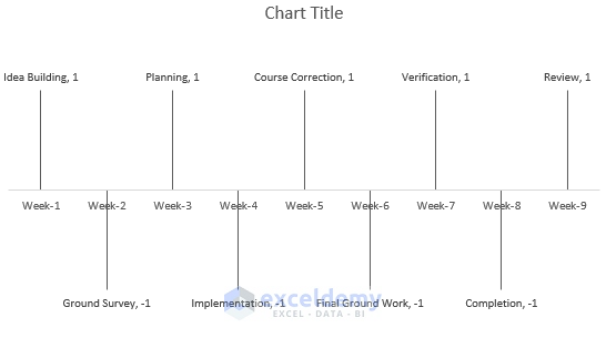
- Our chart will look something like this image below.
- Select the lines and, from the Chart Elements, select More Options under the Data Labels option arrow.
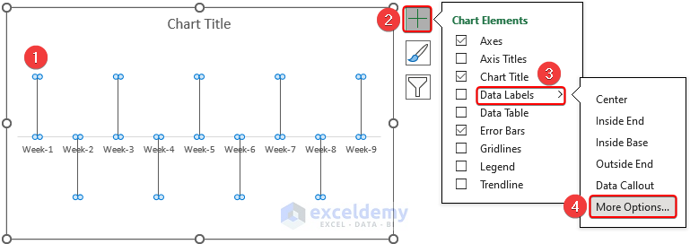
The Format Data Labels side panel will appear at the right side of the workbook.
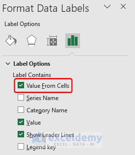
- In the Label Option, select the Value From Cells in the Label Contains.
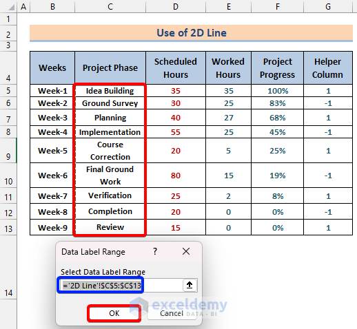
- A small box will appear asking for ranges of values for the data labels.
- Click in the box and select all the Project Phase cell range (C5–C13) from the table, then click on OK.
- The project phases will be inserted into the chart along with the helper column data.
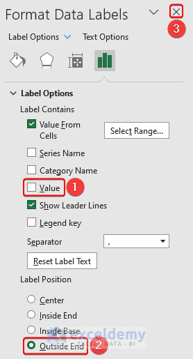
- To remove the helper column data, untick the Value option under the Label Contains section in the Format Data Label panel on the right side.
- Select the Label Position as Outside End and exit the panel by clicking on the (x) button in the top right area of the panel.
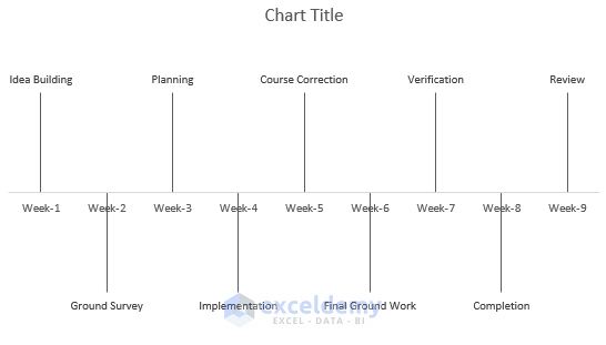
- Here’s the resulting chart.
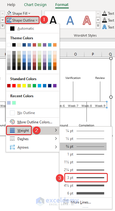
- Add an axis arrow in the horizontal axis just to show the workflow. Select the horizontal axis and go to the Format tab in the ribbon.
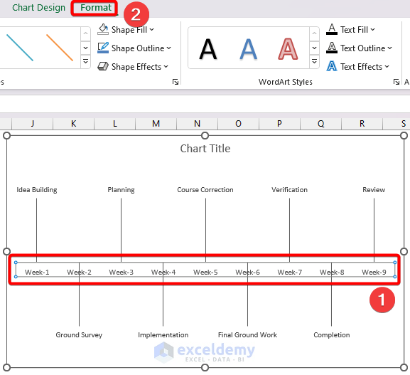
- Select the Shape Outline option under the Shape Styles section and click on Weight.
- Change the Weight to 3 pt.
- Go to the Shape Outline option and select Black color for better visibility of the axis while keeping the horizontal axis selected.
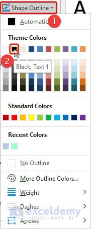
- Go to the Shape Styles section and select Shape Outline.
- Click on Arrows and select an arrow to show the workflow.
![]()
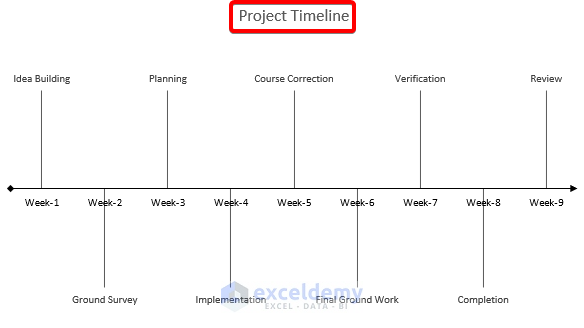
- Here’s the chart ready with 2D lines like the image below.
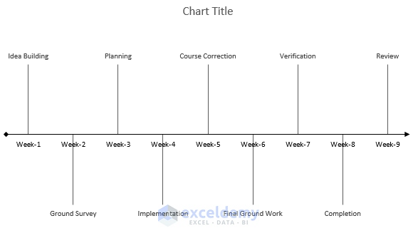
- Add a suitable chart title by clicking on it to finish creating a timeline chart in Excel.
Read More: Create a Timeline in Excel with Milestones
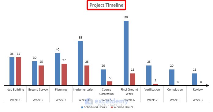
Method 2 – Creating a Timeline Chart Using a Bar Chart
Here’s an overview of the output we can expect from this method.
Steps:
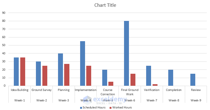
- Select the cells containing Weeks, Project Phases, Scheduled Hours, and Worked Hours (cell range from B4–E13).
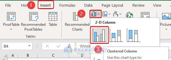
- Go to the Insert tab and, in the Charts area, select Insert Column or Bar Charts.
- Select the first chart type, Clustered Columns.
- We will get a chart like the following.
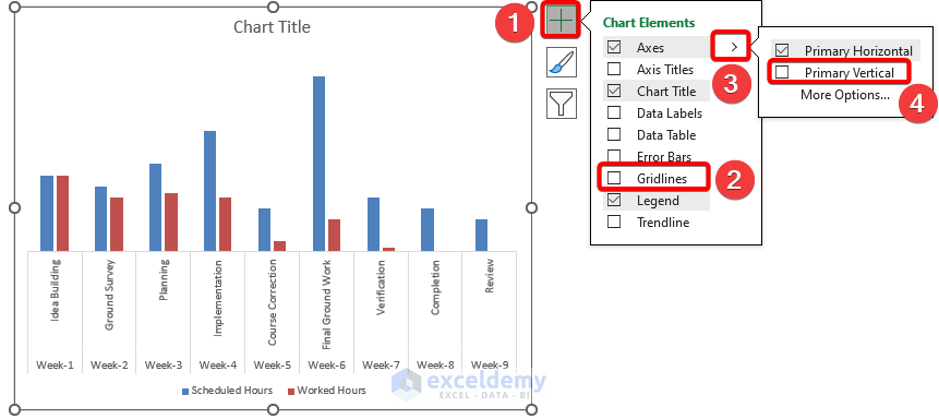
- Click on the chart, select the Chart Elements, and then disable the Primary Vertical and Gridlines.
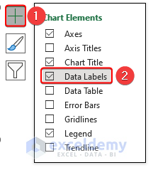
- Click on the chart, select Chart Elements, and enable Data Labels.
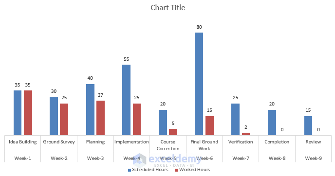
- We will have a chart as follows.
- Select the horizontal axis and go to the Format tab in the Ribbon.
- Select Line Arrow from the Insert Shape section.
![]()
- Draw an arrow line in the chart.
![]()
- Select the arrow and go to the Shape Format tab in the Ribbon.
- Select Shape Outline under the Shape Styles.
- Select the Black color for better visibility.
![]()
- Select the arrow and, in the Shape Format tab in the ribbon, select Shape Outline and click on Weight.
- Change the weight to 3 pt. This will make the arrow more visible.
![]()
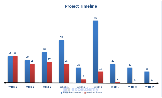
- Our chart will look something like the image below.
![]()
- We will add a suitable chart title by selecting and editing it to create the timeline chart in Excel.
Read More: How to Create a Project Timeline in Excel
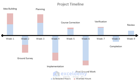
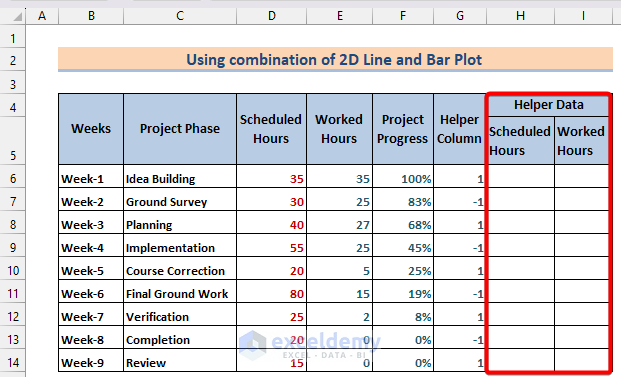
Method 3 – Using a Combination of 2D Line and Bar Plot
We will use both the bar plots and the 2D line plot to show a line chart and additional information with it.
Steps:
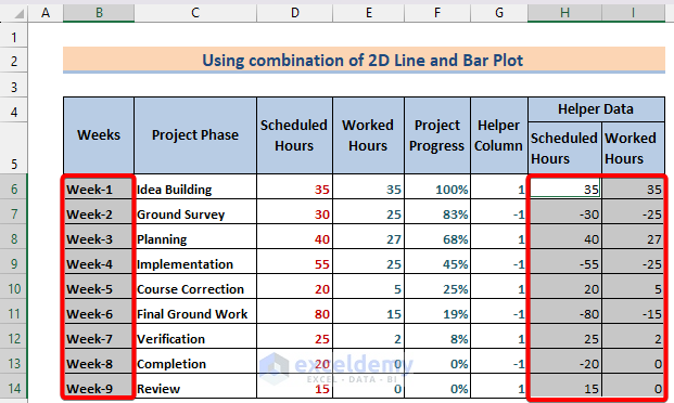
- Insert a helper column with 1 and -1 values as in Method 1.
- Insert two new sub-columns named Scheduled Hours and Worked Hours under a new column named Helper Data.
- Click on cell H6, use the following formula in the formula bar, and press Enter.
=D6*G6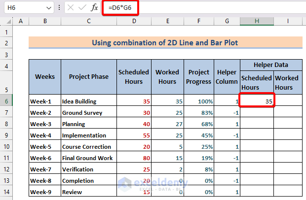
- Drag the Fill Handle from cell H6 vertically to fill up the rest of the cells.
- Insert this formula in cell I6 and press Enter.
=E6*G6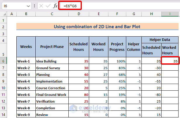
- Drag the Fill Handle vertically to fill the rest of the cells as well.
- Select the Weeks data (cell range B6-B14) and Helper Data (cell range H6-I14) while holding the Ctrl button.
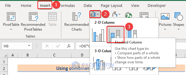
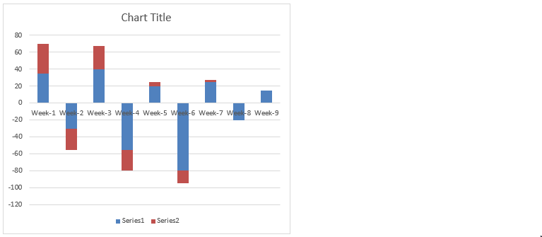
- Go to the Insert tab in the ribbon and, in the Charts section, select Insert Column or Bar Charts and click on the Stacked Columns chart type.
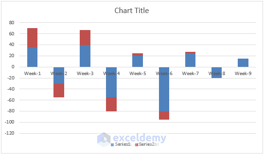
- We will get a chart like in the below image.
- Disable the Gridlines and Primary Vertical axis (under Axes) from the Chart Elements.
- Click on the horizontal axis and go to the Format tab in the ribbon.
- Click on Shape Outline under the Shape Styles section and select Black color for better visibility.
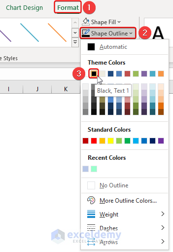
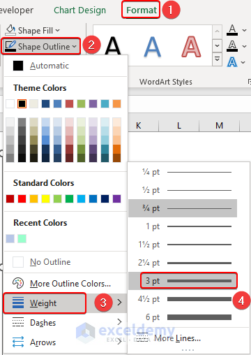
- Go to the Shape Outline option in the Format tab and select Weight.
- Change the Weight to 3pt.
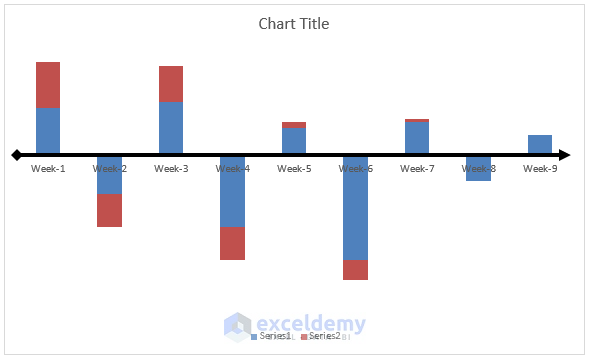
- Go to the Shape Outline in the Format tab in the ribbon and select Arrows.
- Select any type of arrow that you want to show your workflow.
![]()
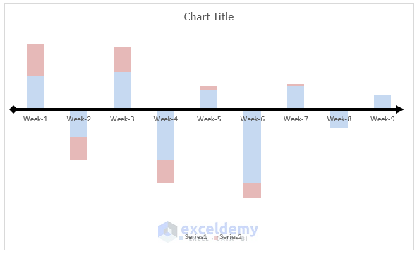
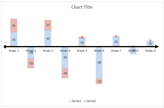
- Our chart will look like the below image after adding the arrow line.
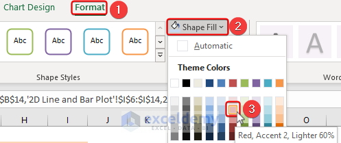
- Select the blue bars and then go to the Format tab in the ribbon.
- In the Shape Fill option, select a lighter color to clearly visualize the writing.
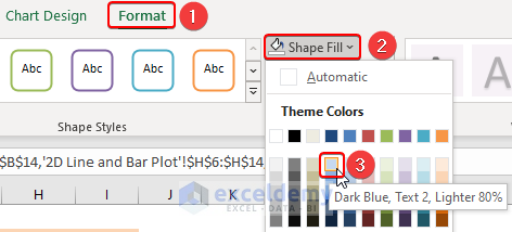
- Select the red color and repeat the same with the bar as well.
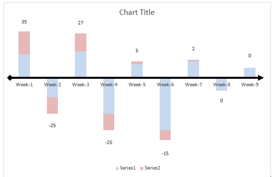
- The chart will look like the following.
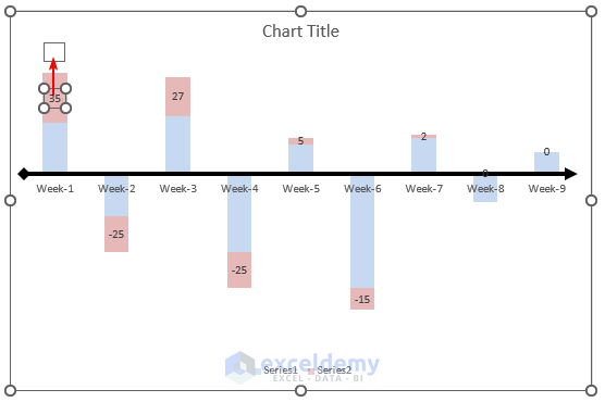
- Click on the chart and select Chart Elements or the ‘+’ button beside the chart.
- Enable the Data Labels.
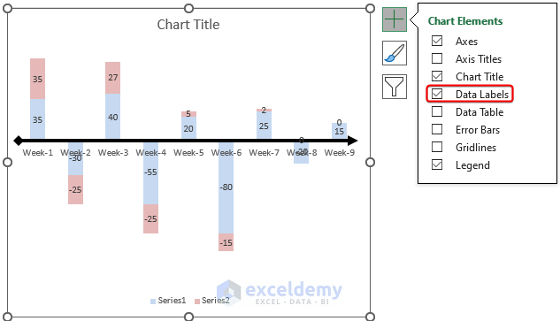
- Select the labels for blue bars, right-click on them, and delete them.
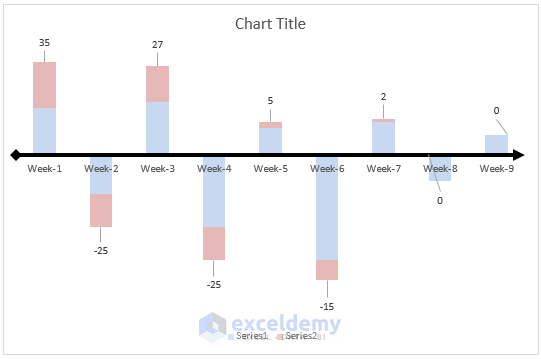
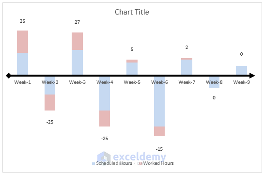
- Select the data labels in the red bars and drag them on the top of the bar one by one.
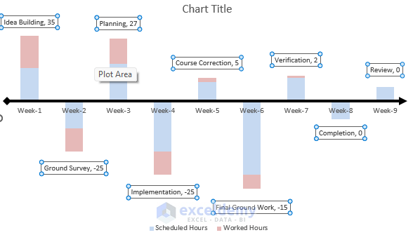
After dragging all the labels out, the chart will look like the following.
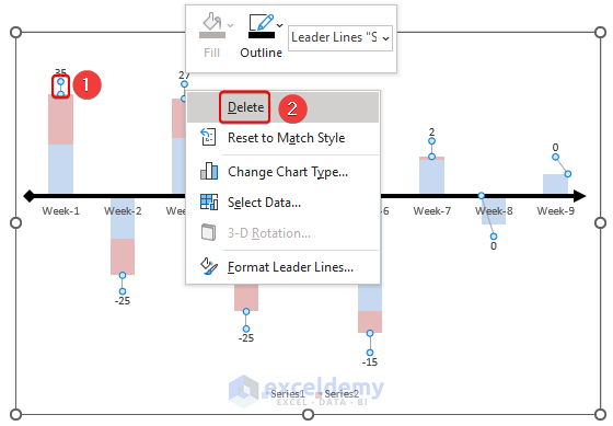
- Select all the connecting lines between the bars and the values by clicking on one of them.
- Right-click on the selection and then click on Delete. This will remove all the connectors.
- Select the legend and right-click on it.
- Click on the Select Data option.
The Select Data Source box will appear.
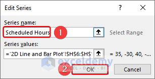
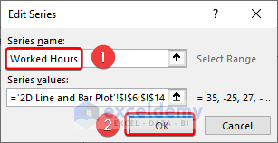
- Click on Series 1 in the box and click on Edit. The Edit Series box will appear.
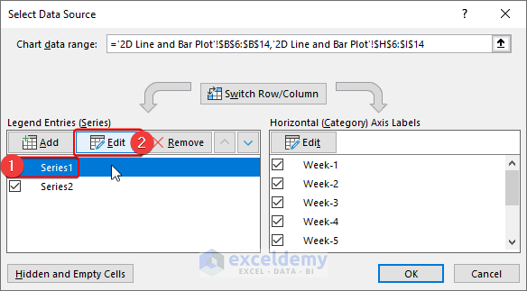
- Give the series name Scheduled Hours as series 1 or the blue bars represent Scheduled Hours in the Helper Data.
- Click on OK.
- Repeat the same procedure with Series 2 as well.
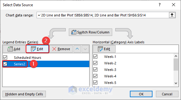
- Change the series name to Worked Hours.
- We will see if the legend is updated now.
- Click on the Chart Elements sign and select More Options under the Data Labels command.
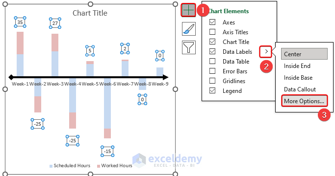
- This will open the side panel named Format Data Labels on the right side of the workbook.
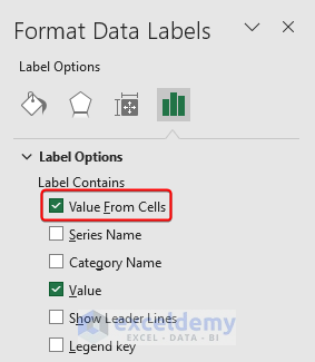
- Select Values From Cells in the Label Contains section.
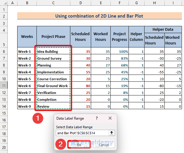
Excel will ask us to input the data label range cells in the Select Label Range section.
- Select the cell range C6–C14 as they contain the Project Phase names and click on OK.
The project phase has been written on the bar plots on relevant weeks.
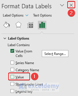
- In the Format Data Label panel, untick the Values in the Label Contains section and exit the side panel.
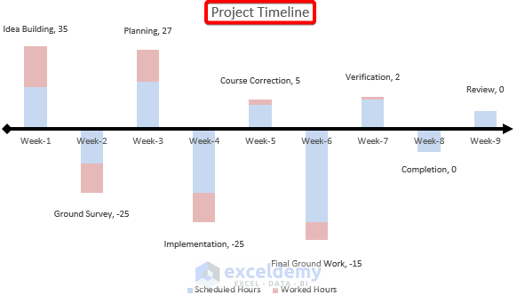
- We will give the chart title by clicking on it and editing it to finish creating the timeline chart in Excel.
- The values below the line are negative. You can use various methods to correct that.
Read More: How to Create a Timeline with Dates in Excel
Things to Remember
- Always try to make the chart big enough to visualize all data labels and legends.
- You can further beautify the chart by adding a glow effect from the Format tab in the Ribbon.
- Keep the chart coloring light enough to see or understand the labels.
Download the Excel Workbook
<< Go Back to Timeline in Excel | Learn Excel
Get FREE Advanced Excel Exercises with Solutions!
