In the world of data analysis and visualization, Microsoft Excel is a powerful tool that enables users to organize, manipulate, and present data in a visually appealing manner. Excel charts are a fantastic tool for displaying data. This article will show you how does Excel save chart style.
Excel charts can easily represent complex data and provide users with useful information. However, the majority of the time the user needs to alter the charts. Sometimes because they must adhere to the presentation’s or dashboard’s theme, and other times because the basic Excel charts fall short of what is needed. Here, we come up with a solution to this matter.
In this reference, we’ll demonstrate step-by-step procedures on how does Excel save chart style with proper explanations and illustrations.
What Is Chart Template in Excel
In Excel, a chart template is a ready-made format or layout that you can use to make charts that look the same and are visually appealing. It acts like a design plan and includes things like the type of chart, colors, fonts, labels, and other formatting choices.
When you make and use chart templates, it saves you time and effort because you can quickly apply the same format to many charts without having to adjust each part separately. Chart templates in Excel help keep things consistent and make it easier to create and format charts, especially when you’re working with lots of data or making complex presentations.
Excel Save Chart Style: Explained with Easy Steps
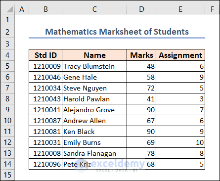
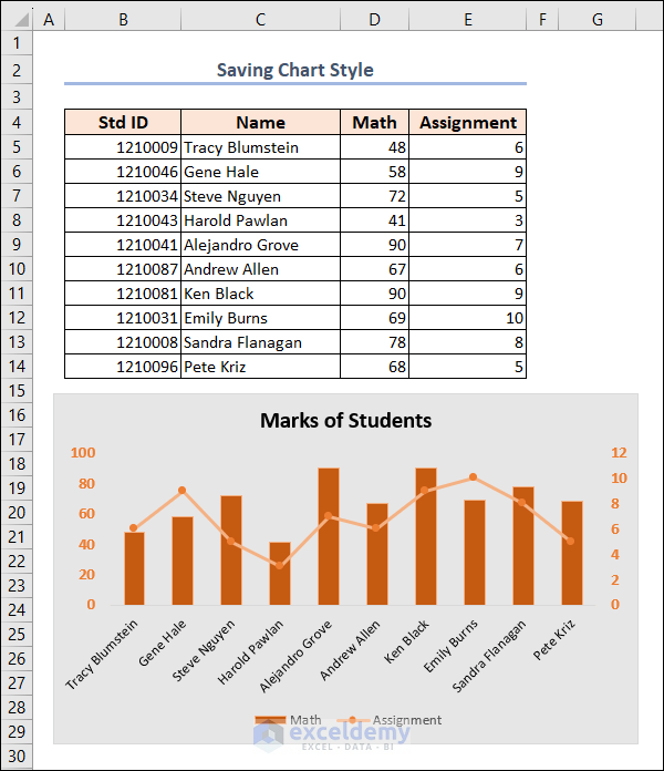
In order to progress further in our article, we are assuming a scenario where we are using a Mathematics Marksheet of Students. This dataset includes the Std ID, Name, Marks, and Assignment scores under columns B, C, D, and E respectively.
Now, we’ll utilize this dataset to show how to save chart style in Excel through detailed steps. So, let’s explore them one by one.
Not to mention, here, we have used the Microsoft Excel 365 version; you may use any other version according to your convenience. Please leave a comment if any part of this article does not work in your version.
Step 1: Inspect Dataset
Before starting the procedure, it’s important to look closely at the data. By doing this, you can make sure the information is correct and find any unusual things or mistakes. Checking the dataset helps you understand what’s in it, like different types of information and any missing data. It also helps you decide how to make the chart look, so it shows the data accurately and gives the right message. Taking the time to review and check the dataset makes the chart more reliable and useful.
Step 2: Create a Combo Chart
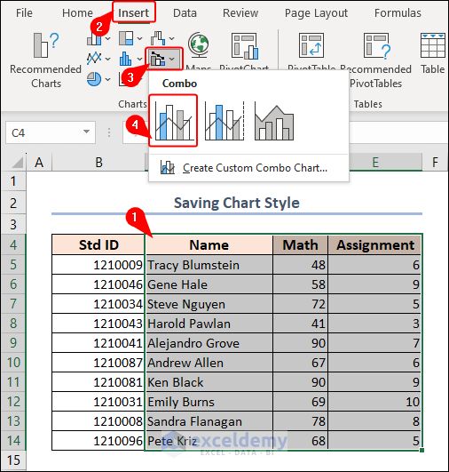
Now, we’ll create a Combo Chart from this dataset. Excel’s Charts group provides a range of chart types. In particular, many charting tools enable users to visualize complex data in straightforward, graphical forms.
- First, select the dataset (e.g. C4:E14) and navigate to the Insert tab.
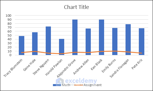
- Then, click on Insert Combo Chart on the Charts group of commands>> Clustered Column – Line.
As a result, you will see the output graph in the below image.
- Now, click on the chart and you will see two extra tabs on the Ribbon.
- Here, click on the Chart Design tab >> Change Chart Type on Type.
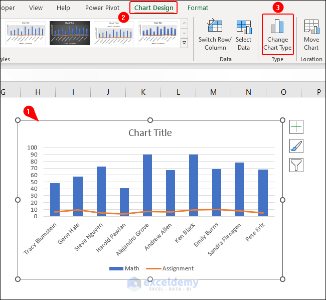
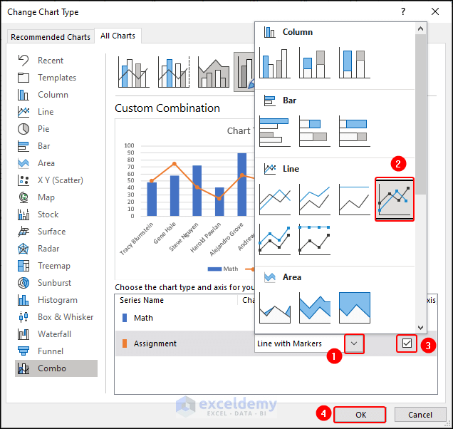
Immediately, it’ll open the Change Chart Type dialog box.
- Click on the drop-down arrow of the Chart Type of the Assignment series.
- Also, check the box of Secondary Axis for this series and click OK.
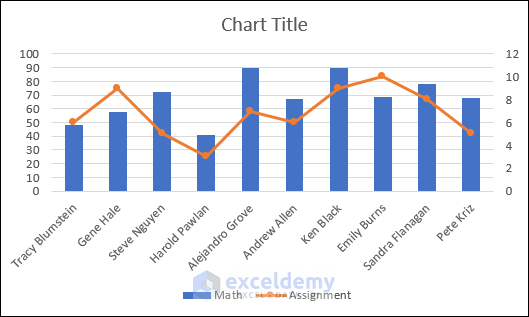
Take a look at the end result. Our Combo Chart is ready now.
Step 3: Format Chart Style as Per Your Preference
Once you’ve inserted a chart, you might want to change certain default parts to make a beautiful and attention-grabbing graph. The newer versions of Microsoft Excel have made several improvements to the chart functions and have included new ways to reach the options for formatting the chart.
- You can change the Chart Title to a relatable one. It’ll help to get insight into the graph quickly.

- Also, you may edit the font size and color on the axis.

- Additionally, we changed the Fill Color of data columns and lines.

- Besides, we altered the color of the whole plot area of the chart.

After all the modifications, the chart looks like the following.
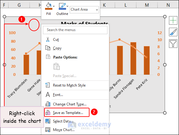
Step 4: Save Chart as Template
Here comes the part to save this chart style as a new template in Excel.
- Right-click on the chart and click on Save as Template on the context menu.
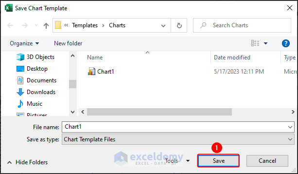
In the Save Chart Template window, you can see that your chart will be saved as a template file and usable for future purposes. By default, it’s saved in the Template folder.
- Just click on Save.
To save the chart style in Excel, our work is completed. We successfully saved the template file on our PC.
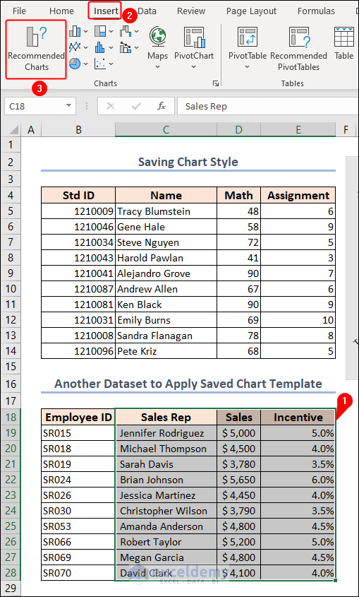
Step 5: Use Saved Template in Another Dataset
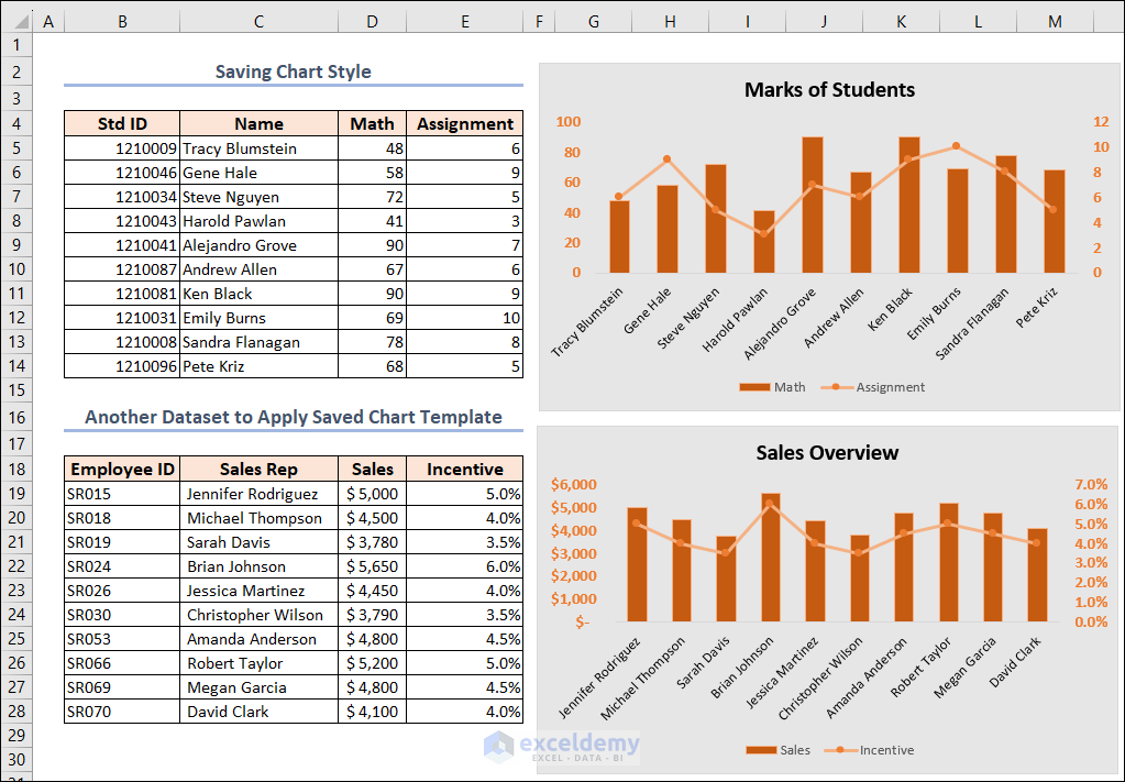
Now, we can apply our saved chart style in another dataset anywhere in any workbook in Excel. This is the advantage of saving charts as templates.
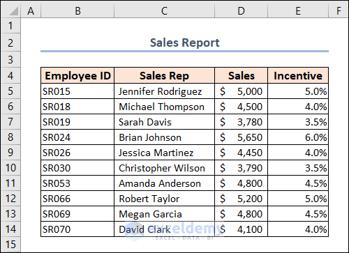
We have another dataset regarding Sales Report in our hands. This dataset includes Employee ID, Sales Rep, Sales, and Incentive under columns B, C, D, and E respectively.
- Now, select data in the C18:E28 range.
- Then, click on Insert >> Recommended Charts on the Charts group.
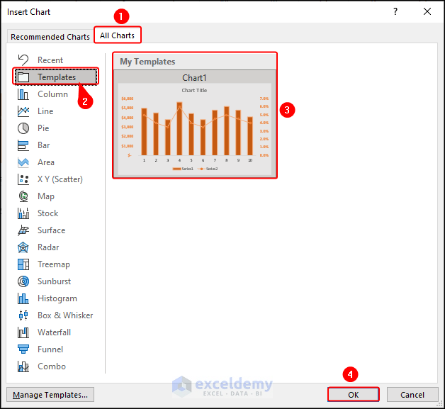
It’ll open the Insert Chart window.
- Go to the All Charts tab and click on the Templates option.
- Then, click on the saved template named Chart1 and click OK.
Behold, the result is as follows. We successfully inserted the same style chart for another dataset in Excel.

How to Reset to Match Excel Chart Style to Document Theme
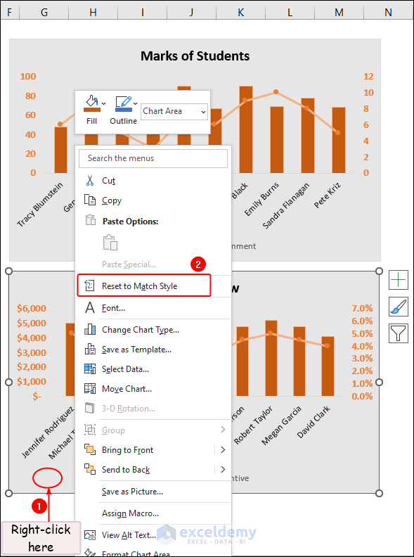
Here, both charts are in the same style and format. But, we can change the style to the theme of this document again. We’ll show this for the 2nd chart in the following image.
- First, right-click on the chart which you want to reset to match the style.
- Then, select the Reset to Match Style option on the context menu.
Eureka! We have arrived at the result.

How to Add or Delete Saved Chart Template in Excel
You can also delete any saved template in Excel. Also, you can add templates without creating them in Excel yourself. You can import them from other locations on the PC and use them in your work.
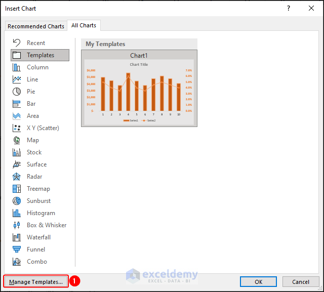
- First, open the Insert Chart window.
- Then, click on the Manage Templates… option at the bottom.
Here, select the template and press the DELETE key on the keyboard.
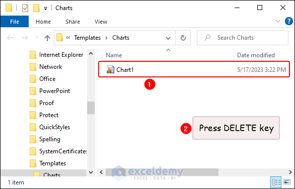
Now, you cannot find this template and cannot use this in your projects.
How to Set as Default Chart Style in Excel
Excel’s default chart saves a significant amount of time. You can create a chart in Excel effortlessly with a single keystroke whenever you require a graph urgently or simply wish to quickly examine specific trends in your data. You have to press ALT + F1 on the keyboard to do that.
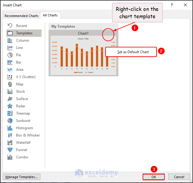
Let’s assume you want to change the default chart style so that you can insert relevant charts according to your projects. For this purpose, you want to set the newly created template as the default chart.
- In the Insert Chart window, right-click on the Chart1 template which you want to set as default.
- Click on the Set as Default Chart option and click OK.
How to Copy Chart Style and Paste to Another Chart in Excel
Imagine this scenario: You put in a great amount of effort to format a chart. Then I realized that there are additional charts that need formatting. Performing the same formatting repeatedly on all the charts becomes a monotonous and boring task. It also becomes a matter of distress.
In this case, you can copy the chart style and paste it to another chart in Excel.
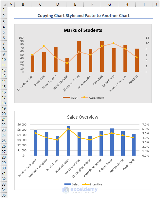
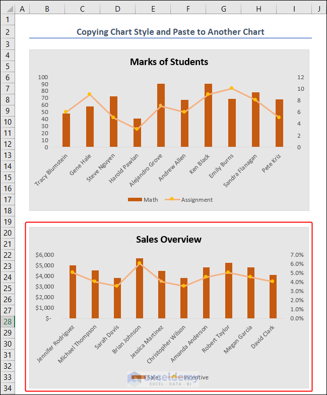
In the first chart, we applied some formatting and made the chart Marks of Students different from the basic theme. Now, we want to apply this formatting to the chart (Sales Overview) below it.
- Click on the chart from which you want to copy the formatting and press CTRL + C on your keyboard.
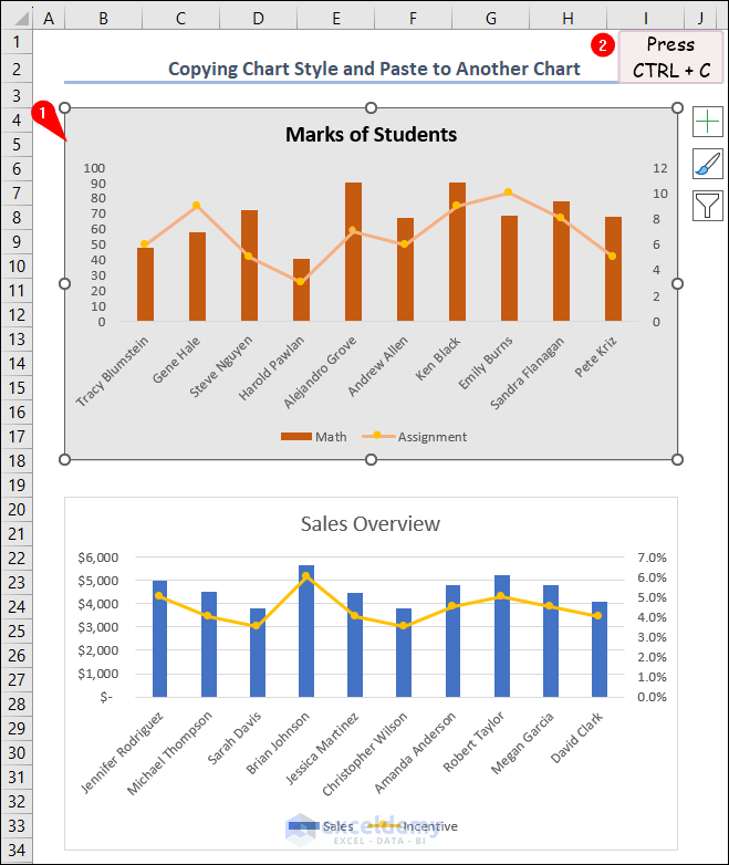
- Then, select the 2nd chart where you want to apply the formatting.
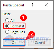
- Next, go to the Home tab >> Paste >> Paste Special.
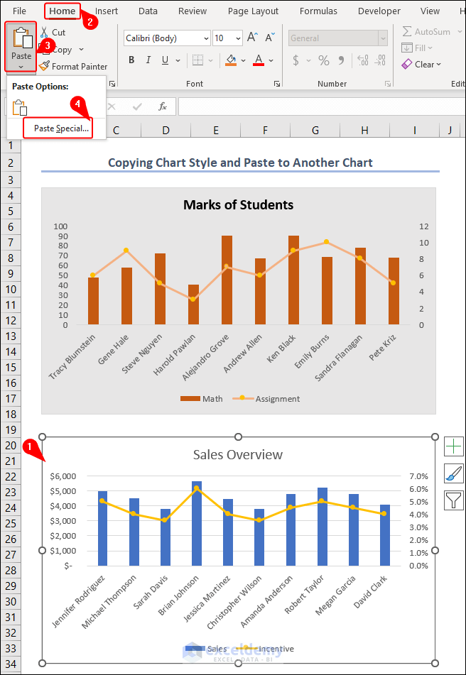
- In the Paste Special dialog box, click on the Formats option under the Paste section and click OK.
This is the final outcome of this process.
Things to Remember
- Before saving a chart style, make sure you have the chart you want to save the style from.
- Adjust the chart elements, such as colors, fonts, borders, and labels, to achieve the desired appearance.
- Assign a descriptive name to the chart style to easily identify it later.
- If you want to share your customized or saved chart styles with others, you can export them as templates (.xltx or .xlt). Others can then import the template to access your chart styles.
Frequently Asked Questions
1. Can I use a saved chart style in other Excel workbooks?
Yes, you can use the saved chart styles in other Excel workbooks by selecting Templates or Chart Templates when creating a new chart.
2. Will the saved chart styles be available in future Excel sessions?
Yes, the saved chart styles in Excel remain available for use in future sessions. They are stored in your default chart templates folder and can be accessed anytime you open Excel.
Download Practice Workbook
You may download the following Excel workbook for better understanding and practice it by yourself.
Conclusion
In conclusion, by saving a customized chart style, users can easily apply the same formatting to other charts, eliminating the need to manually repeat the formatting process. This not only saves valuable time but also ensures a professional appearance across all charts.
In this article, we’ve covered step-by-step procedures for how does Excel save chart style. We sincerely hope you enjoyed and learned a lot from this article. Whether it’s for personal use or professional presentations, using this feature in Excel proves to be a valuable tool for simplifying chart formatting tasks and improving overall productivity.
If you have any questions, comments, or recommendations, kindly leave them in the comment section below.
Related Articles
<< Go Back to Chart Style in Excel | Excel Charts | Learn Excel
Get FREE Advanced Excel Exercises with Solutions!
