Charts are essential tools to visualize data in Excel. When you start to work with an extensive dataset, you will need to visualize your data to present the dataset smartly. In this article, I am going to describe how to change chart style in Excel. At last, By following these steps, you will be able to present your data more attractively.
How to Change a Chart Style in Excel: Step-by-Step Procedure
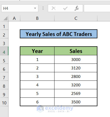
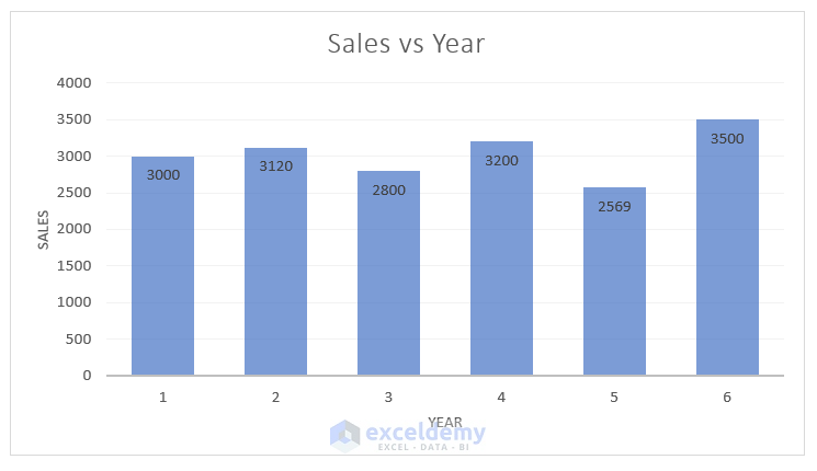
Let’s consider a dataset of Yearly Sales of ABC Traders. Here, this dataset consists of 2 columns. Moreover, the dataset is ranging from B4 to C10. Then you can see, that the two columns of the dataset B & C indicate Year and Sales respectively. Hence, with this dataset, I am going to show how to change chart style in Excel with the necessary steps and illustrations.
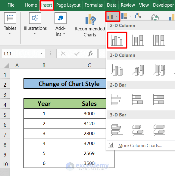
Step 1: Insert a Bar Chart from Chart Option
- First, select the Insert tab in your Toolbar.
- Then select the Bar Chart option. You will find a dropdown menu there.
- After that, select the first option of the 2D Column section.
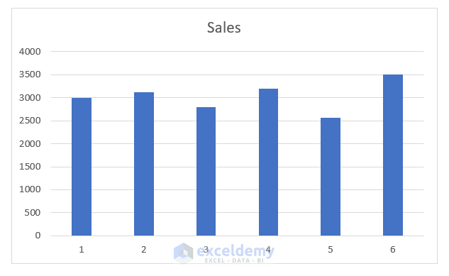
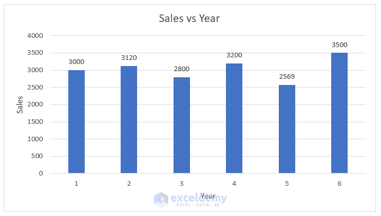
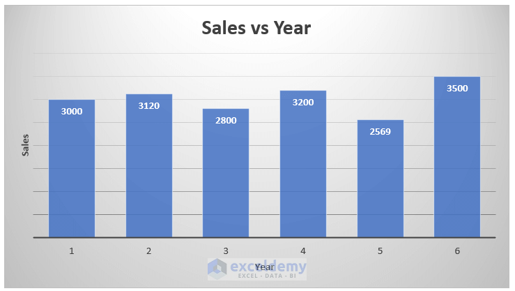
- Hence you will get the chart just like the one shown below.
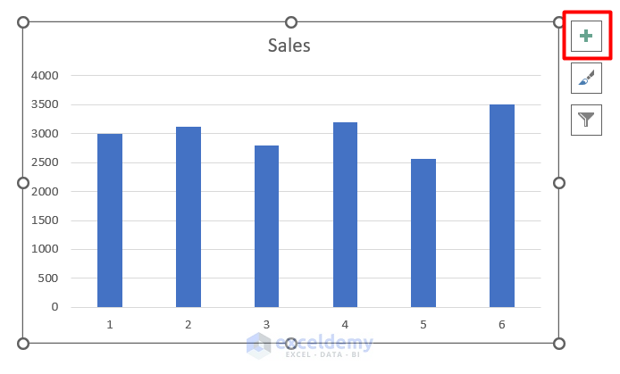
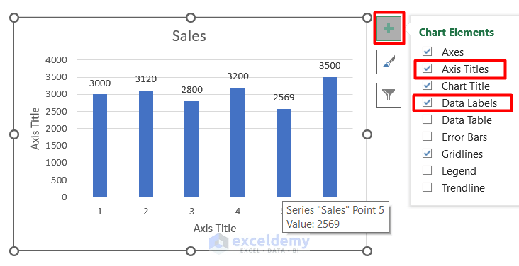
Step 2: Insert Axis Title and Data Labels in the Chart
- Select the chart first.
- Then, go to the top of the right side and select the Icon indicated in the next picture.
- After that, select the Axis Title & Data Label check boxes.
- As a result, you will find the chart just like the one mentioned below.
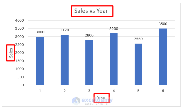
Step 3: Edit Chart Title & Axis Title
- First, double-click on the Chart title. Then Edit the title to Sales vs Year.
- Double-click to the X & Y axis title. Change the titles to Year and Sales respectively.
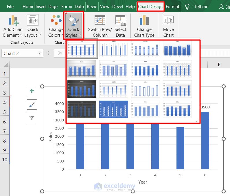
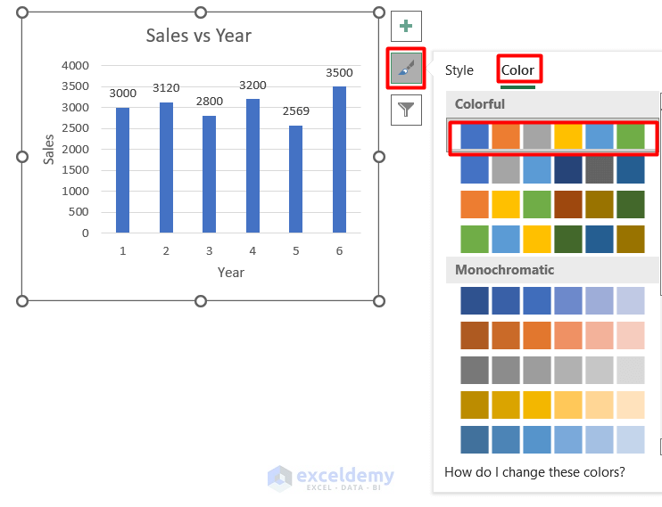
Step 4: Apply Chart Design Tab to Change Chart Style
- First, select the Chart first.
- After that go to the Chart Design Tab.
- However, select the Quick Styles option. Hence, you will find some themes in the chart. Select one of them.
- As a result, you will find the same option by selecting the Icon shown in the next picture.
- Hence, select the Styles option.
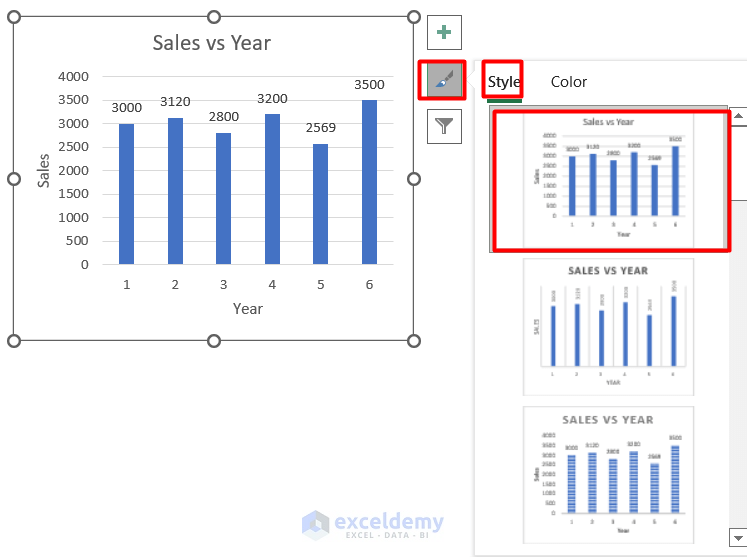
- At last, select the Color option to select a Color Palette for the columns.
Apply Different Chart Styles in Excel
In this part of this article, I will show different chart styles to make a quick edit. However, this will help you to change chart style in Excel smartly. This is a handy way. Here, from this portion of this article, you will get an extended knowledge of how to change chart style in Excel.
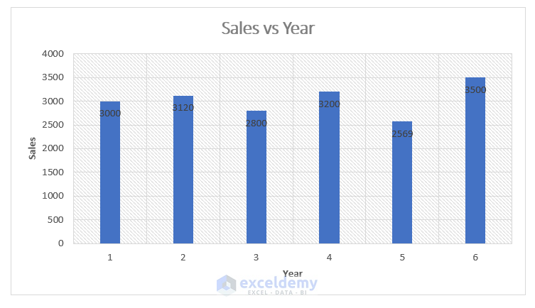
Style 1: Apply Gridlines Only
In this style, the chart has only horizontal gridlines.
Style 2: Show Datalabels Vertically
The chart shows vertical data labels in this style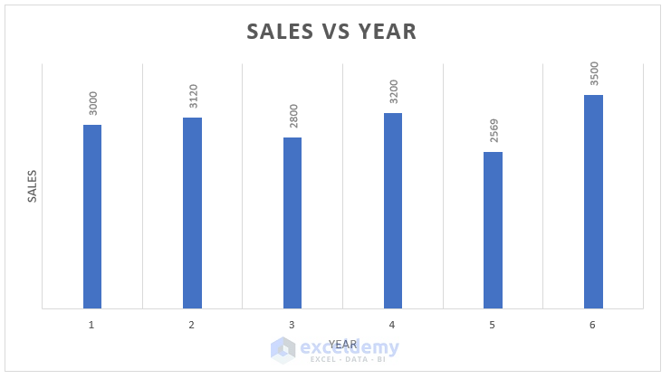
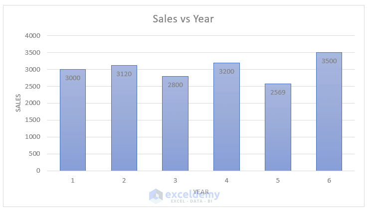
Style 3: Use Shaded Columns
The columns of this chart are shaded with colors.

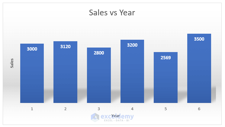
Style 4: Apply Thick Columns with Shadows
In this style, the columns of the chart become thick with a shadow.
Style 5: Apply Bars with Shaded Grey Background
The background of the chart becomes shaded with grey color in this style.
Step 6: Use Light Color in Columns
Columns are in light blue color in this style of chart.
Style 7: Use Light Gridlines
The horizontal gridlines are in light colors in this style.
Style 8: Apply Rectangular Gridlines with Shades
In this style of chart, vertical and horizontal gridlines are added.
Style 9: Select Black Background
The chart has a black background in this style.

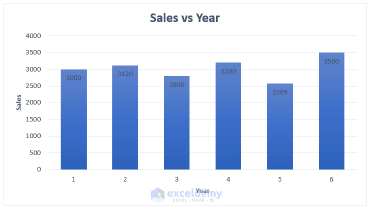
Style 10: Apply Shaded Columns
The columns become shaded in color near the x-axis in this style of chart.

Style 11: Apply Columns with No Fill
Columns do not have any fill in this style of chart.

Style 12: Apply More Horizontal Gridlines
Horizontal gridlines are added just like style 1 but more in numbers.

Style 13: Select No Fill Columns with Black Background
In this style, the chart columns have a black background as well as no fill in them.

Style 14: Apply Shaded Columns with Blue Backgrounds
Here, the chart has a blue background as well as shaded columns.

Style 15: Apply Increased Width Columns
In this style of chart, the column widths are increased to make the graph smarter.
Style 16: Apply Glowing Effects to the Columns
In this style of chart, columns are in glowing effects.

Things to Remember
- In this article, only the column charts are taken as an example. But, you need to follow the same procedures mentioned in the first part of this article to change chart style in Excel for other charts like Scattered Char, Pie Chart, etc.
Download Practice Workbook
Please download the workbook to practice yourself
Conclusion
I hope these steps will help you to know how to change chart style in Excel. As a result, I think you will find interest in this method. First read the article carefully. Then practice it on your PC. After that, if you have any kind of queries, feel free to ask me in the comment section.
Related Articles
<< Go Back to Chart Style in Excel | Excel Charts | Learn Excel
Get FREE Advanced Excel Exercises with Solutions!
