Overview of Trend Charts in Excel:

Method 1 – Using the FORECAST.LINEAR Function to Create a Trend Chart in Excel
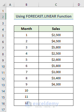
In this method, we’ll illustrate how to generate a trend chart in Excel utilizing the FORECAST.LINEAR function. This function provides future values along with a linear trendline. For demonstration purposes, we’ll utilize a dataset comprising months and their corresponding sales over a span of 9 months. After employing the FORECAST.LINEAR function, we’ll project future sales alongside a linear trendline. Let’s proceed through the steps below to create the trend chart:
Steps:
- Begin by creating a new column where we intend to predict future sales.
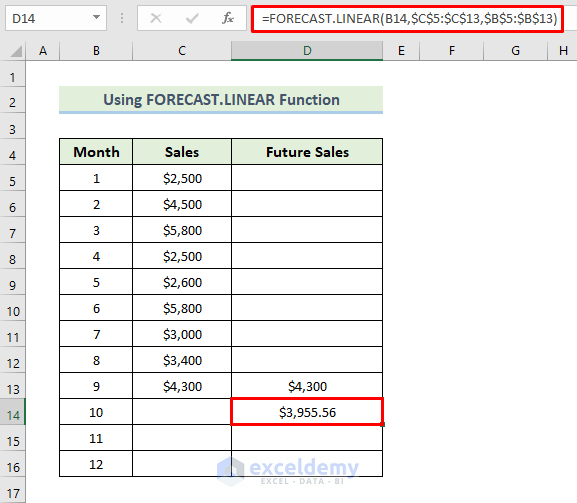
- Set the sales value for the ninth month into cell D9. Then, select cell D10.
- Enter the following formula:
=FORECAST.LINEAR(B14,$C$5:$C$13,$B$5:$B$13)
- Press Enter to apply the formula.
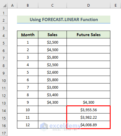
- Drag the Fill Handle icon to populate the remaining cells with the formula.
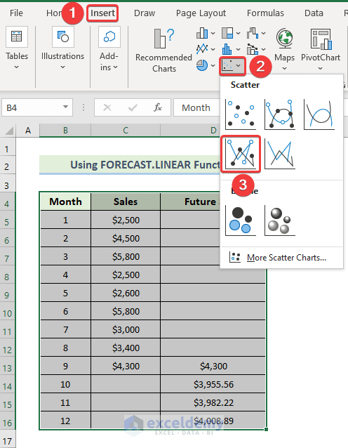
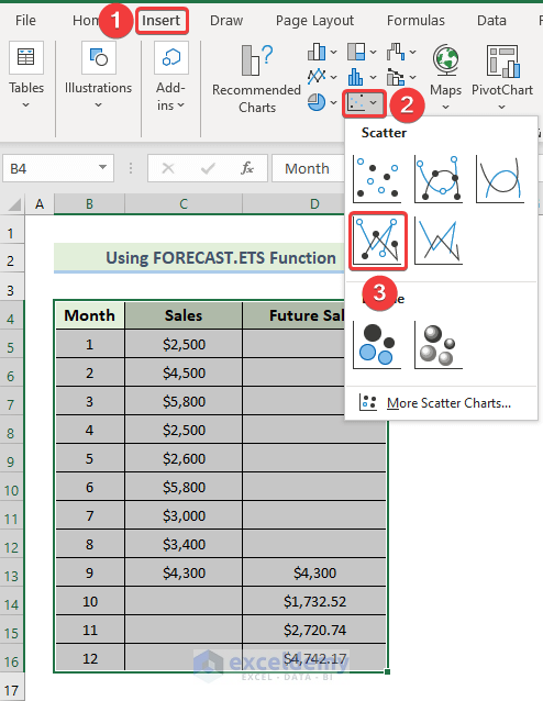
- Select the range of cells B4:D16.
- Navigate to the Insert tab in the ribbon.
- From the Charts group, choose Insert Scatter or Bubble chart.
- It will present various options. Select Scatter with Straight Lines and Markers.
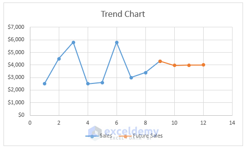
- The chart will be displayed as shown below.
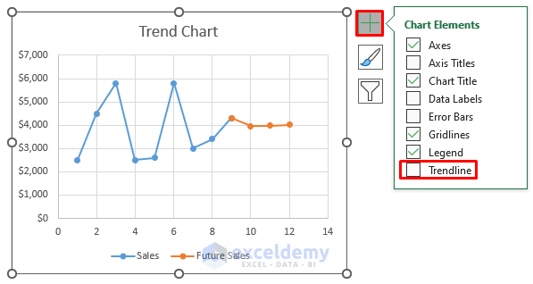
- Next, click on the Plus (+) icon located on the right side of the chart.
- Choose Trendline from the options.
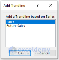
- The Add Trendline dialog box will appear.
- Select the Sales option from the Add a Trendline based on Series.
- Click on OK.
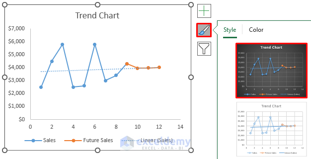
- This will generate a linear trendline.
- To alter the Chart Style, click on the Brush icon situated on the right side of the chart.
- Select any desired chart style.
- Finally, the resulting trend chart in Excel will be as follows.
Read More: How to Add Trendline in Excel Online
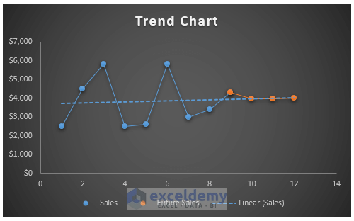
Method 2 – Utilizing the Excel FORECAST.ETS Function to Create a Trend Chart
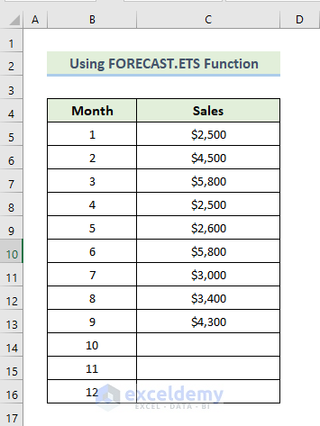
In this method, we’ll employ another swift and efficient approach to craft a trend chart in Excel using the FORECAST.ETS function. This function employs exponential triple smoothing to provide future values. For demonstration purposes, we’ll work with a dataset comprising months and their corresponding sales over a span of 9 months. The FORECAST.ETS function, coupled with exponential triple smoothing, will be utilized to project future sales. Let’s proceed through the steps below to create the trend chart:
Steps:
- Begin by creating a new column where we intend to predict future sales.
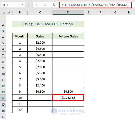
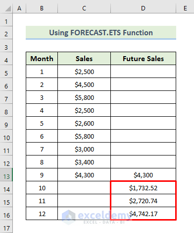
- Set the sales value for the ninth month into cell D9. Then, select cell D10.
- Enter the following formula:
=FORECAST.ETS(B14,$C$5:$C$13,$B$5:$B$13,1)
- Press Enter to apply the formula.
- Drag the Fill Handle icon to populate the remaining cells with the formula.
- Select the range of cells B4:D16.
- Navigate to the Insert tab in the ribbon.
- From the Charts group, choose Insert Scatter or Bubble chart.
- It will present various options. Select Scatter with Straight Lines and Markers.
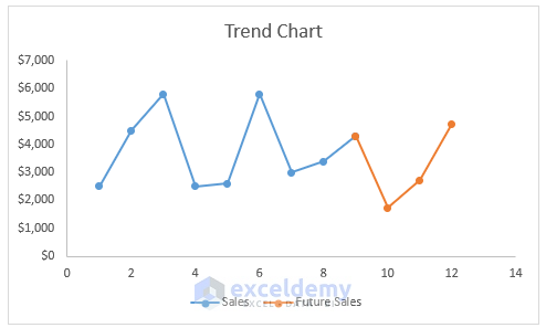
- The chart will be displayed as shown below.
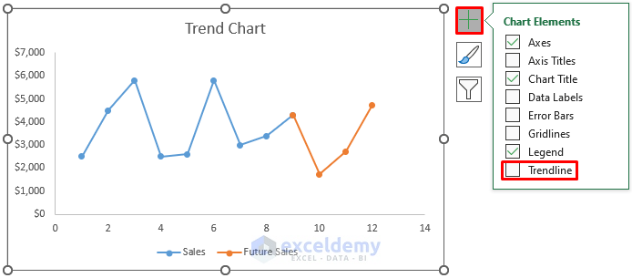
- Next, click on the Plus (+) icon located on the right side of the chart.
- Choose Trendline from the options.
- The Add Trendline dialog box will appear.
- Select the Sales option from the Add a Trendline based on Series.
- Click OK.

- This will generate a linear trendline.
- To alter the Chart Style, click on the Brush icon situated on the right side of the chart.
- Select any desired chart style.
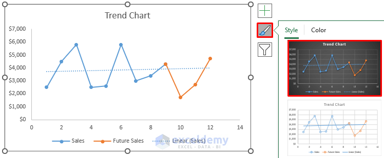
- Finally, the resulting trend chart in Excel will appear as follows.
Read More: How to Create Monthly Trend Chart in Excel
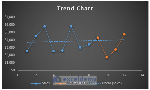
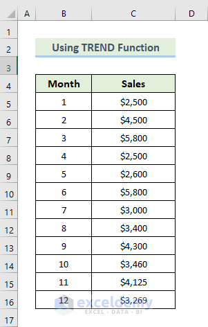
Method 3 – Utilizing the TREND Function to Create a Trend Chart
In this method, we’ll explore another technique to construct a trend chart in Excel using the TREND function, primarily designed to compute the linear trendline. By employing this formula, we’ll generate a trend chart based on the calculated trendline. For demonstration purposes, we’ll utilize a dataset comprising months and their corresponding sales. We’ll calculate the trend using the TREND function and then create a line chart with it. Let’s proceed through the steps below:
Steps:
- Begin by creating a new column named Future Sales.
- Select the range of cells D5 to D16.
- Enter the following formula into the formula box:
=TREND(C5:C16,B5:B16)
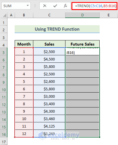
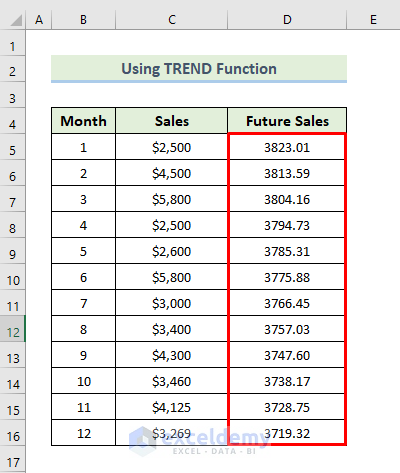
- As this is an array formula, to apply it, press Ctrl+Shift+Enter.
- This will generate the calculated trendline.
- Next, select the range of cells B4 to D16.
- Navigate to the Insert tab in the ribbon.
- From the Charts group, select Recommended Charts.
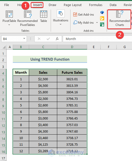
- The Insert Chart dialog box will appear.
- Choose Line chart from the options.
- Click OK.
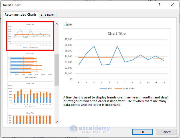
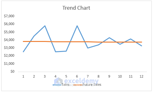
- As a result, the chart will be generated.
- To modify the Chart Style, click on the Brush icon situated on the right side of the chart.
- Select any desired chart style.
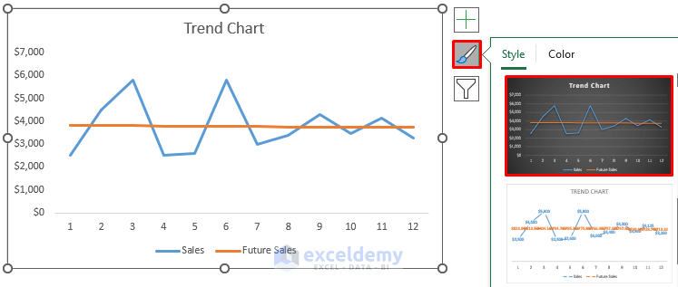
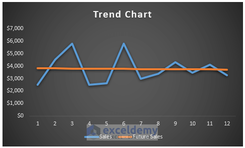
- Finally, the resulting trend chart in Excel will appear as follows.
Method 4 – Utilizing Line Chart with Excel Shapes to Create a Trend Chart
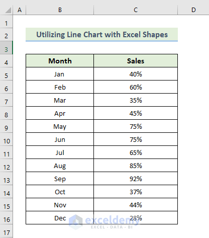
In this method, we’ll explore another technique to construct a trend chart in Excel by employing a line chart with Excel shapes. Essentially, we’ll create upward, downward, and equal trend charts. For demonstration purposes, we’ll use a dataset comprising several months and their sales percentages to observe how sales percentages behave over 12 months. Let’s walk through the steps to create the trend chart:
Steps:
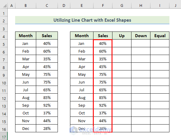
- Begin by creating new columns with random values, intended for chart modification.
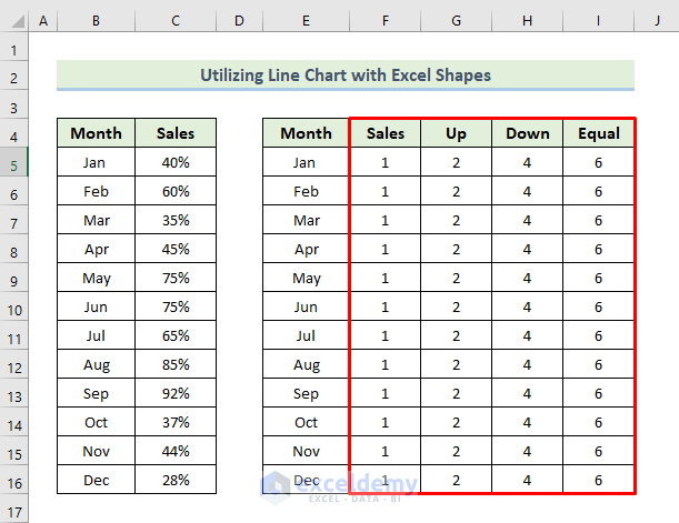
- Select the range of cells E4 to I16.
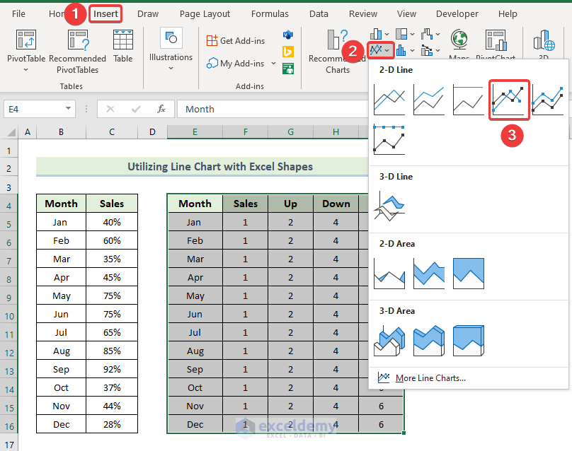
- Navigate to the Insert tab in the ribbon.
- From the Charts group, select the Insert Line or Area Chart drop-down option.
- Choose the Line with Markers chart option.
- This will generate the initial chart.
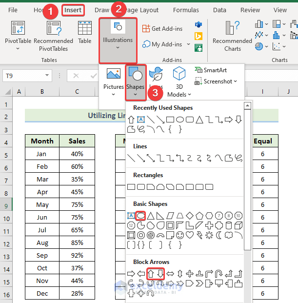
- Next, create shapes for up, down, and equal sales percentages.
- Go to the Insert tab in the ribbon.
- Select the Illustrations drop-down option.
- From the Shapes drop-down option, choose the up arrow for sales up, the down arrow for sales down, and the oval sign for equal sales.
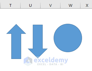
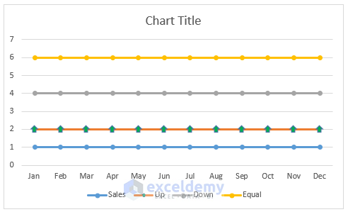
- It will give us the following results.
- Modify the size and fill color of each shape as per preference.
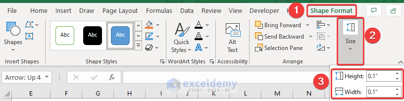
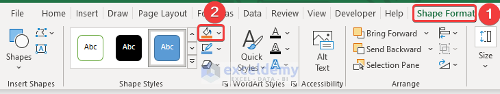
- Select any shape, and it will open up the Shape Format tab in the ribbon.
- Navigate to the Shape Format tab in the ribbon.
- Then, from the Size group, change the size of the shape.
- Return to the Shape Format tab in the ribbon
- From the Shape Style group, select Shape Fill and change the color of the shapes.
- Copy each shape as needed and align them with the respective data points on the chart.
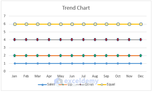
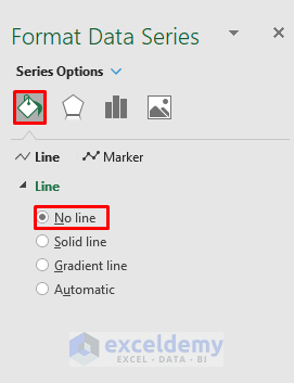
- Remove the line from the Up, Down, and Equal series by selecting each line, opening the Format Data Series dialog box, and choosing No Line from the Line section.
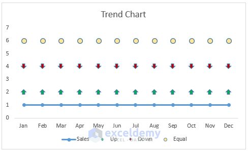
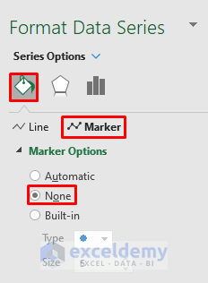
- Remove the markers from the Sales series by double-clicking on the sales line with markers, opening the Format Data Series dialog box, and selecting None from the Marker Options section.
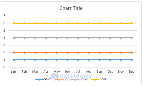
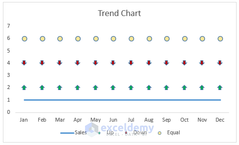
- It will give us the following result.
- Adjust column F by setting its value equal to column C.
- Delete the values of columns G, H, and I.
- Apply formulas using the IF and NA functions to determine up, down, and equal sales percentages for each month.
- In the first month, we increase the sales percentage. Capture 40% in cell G5.
- For the other 11 months, we will apply some conditions.
- Select cell G6.
- Write down the following formula :
=IF(F6>F5,F6,NA())
- Then, press Enter to apply the formula.
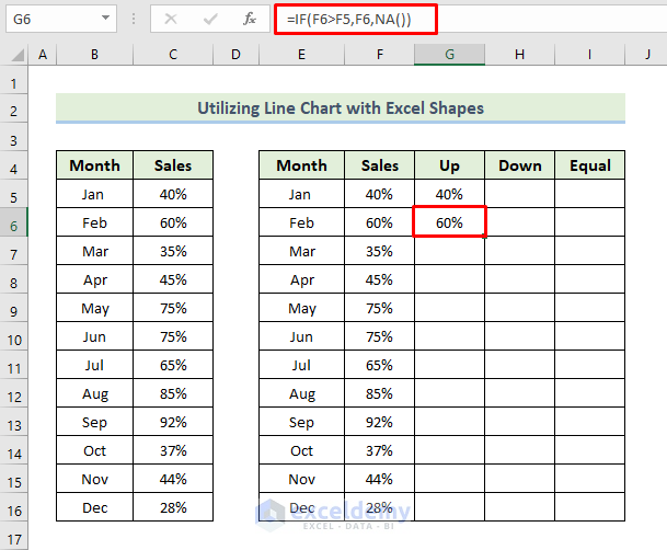
- After that, drag the Fill Handle icon to fill the other cells with the formula.
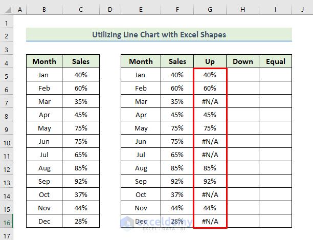
- As we set the first month as increased sales, the down sales fields will be blank.
- Select cell H6.
- Write down the following formula.
=IF(F6<F5,F6,NA())
- Press Enter to apply the formula.
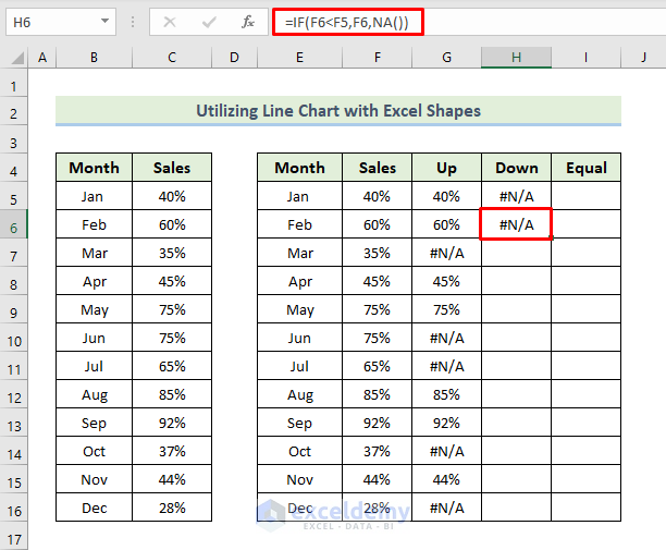
- After that, drag the Fill Handle icon to fill the other cells with the formula.
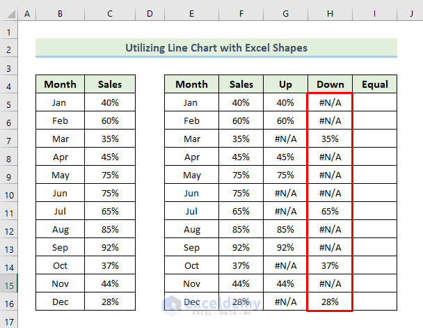
- As we set the first month as increased sales, the equal sales fields will be blank.
- Select cell I6.
- Write down the following formula.
=IF(F6=F5,F6,NA())
- Press Enter to apply the formula.
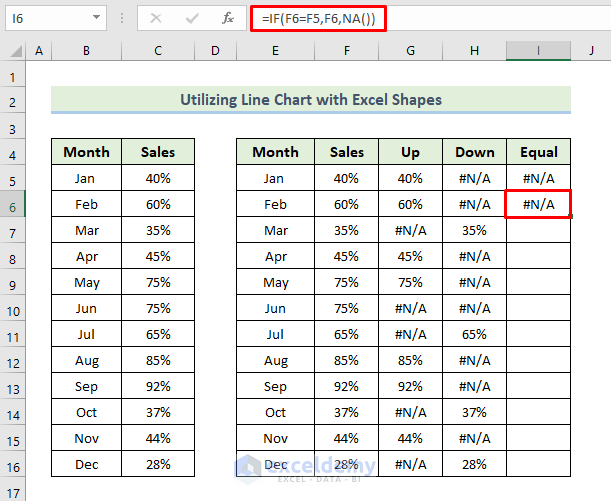
- After that, drag the Fill Handle icon to fill the other cells with the formula.
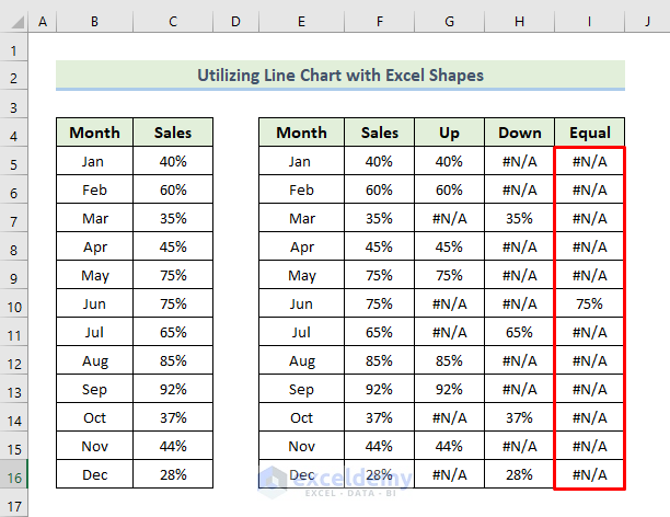
- It will give us the following solution in the chart.
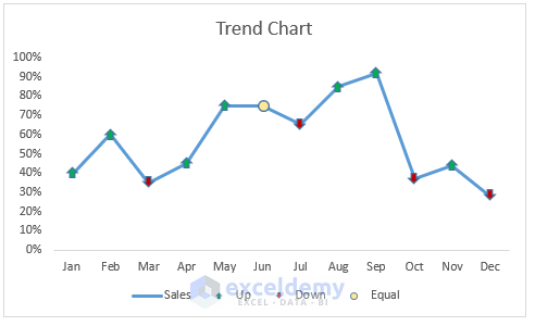
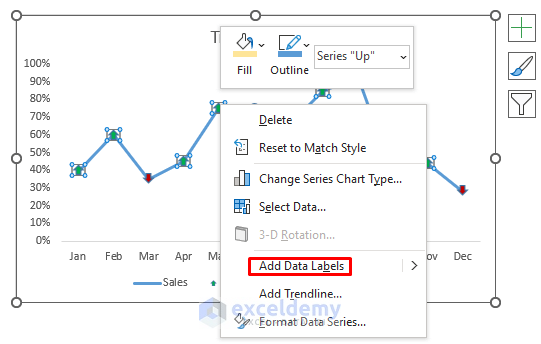
- Customize the chart based on preference, such as adding data labels.
- You can now customize the chart based on your preference.
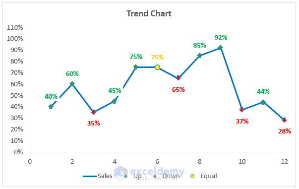
The resulting trend chart in Excel will reflect the sales trends over the 12-month period.
How Does the Formula Work?
- IF(F6>F5,F6,NA()): Returns the sales value of the current month if it is higher than the previous month, otherwise returns NA.
- IF(F6<F5,F6,NA()): Returns the sales value of the current month if it is lower than the previous month, otherwise returns NA.
- IF(F6=F5,F6,NA()): Returns the sales value of the current month if it is equal to the previous month, otherwise returns NA.
Download Practice Workbook
You can download the practice workbook from here:
Related Articles
<< Go Back To Add a Trendline in Excel | Trendline in Excel | Excel Charts | Learn Excel
Get FREE Advanced Excel Exercises with Solutions!
