We use Excel Charts for the visual representation of data. It is easier to get an idea of some from a chart rather than a dataset. We form this chart using the data. But sometimes we need to add new data to the data set. It means the dataset may expand from time to time. In this article, we will explain how to expand chart data range in Excel.
How to Expand Chart Data Range in Excel: 5 Suitable Methods
We will explain 5 methods to expand the chart data range in Excel. Follow the below methods.
1. Expand Chart Data from Chart Design Options
We have a dataset of the name and salaries of some employees of an organization and a corresponding chart for the data.
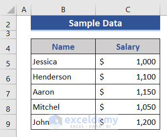
The chart is as follows.

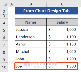
- Now, we add a new row to the dataset.
Now apply the following steps to add the row data to the chart.
📌 Steps:
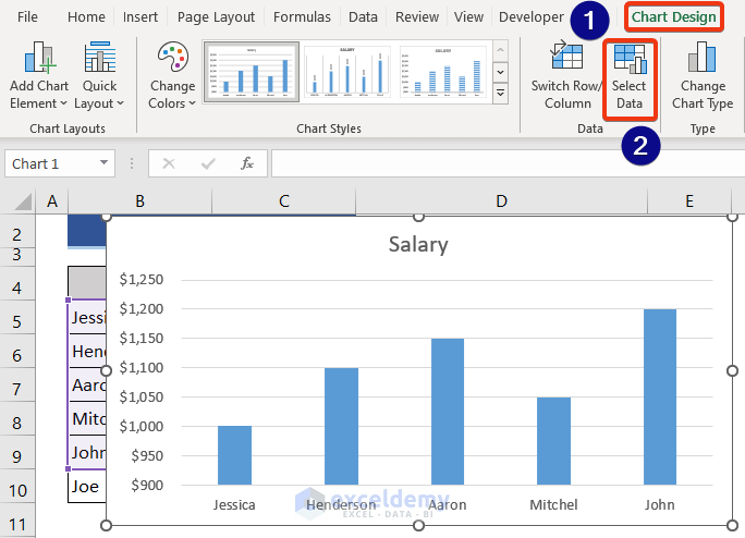
- Click on the Chart. The Chart Design shows now.
- Click on the Select Data option from the Data group.
- Now, the Select Data Source window appears.
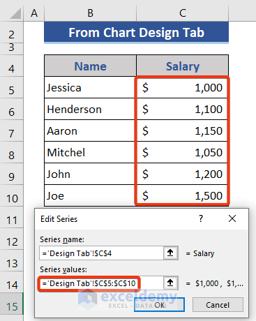
- Select the Salary option and press the Edit button.
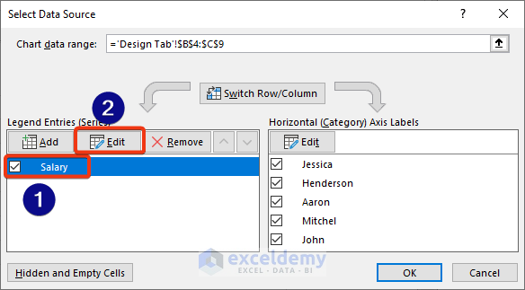
- Then, change the range of the Series values box and press OK.
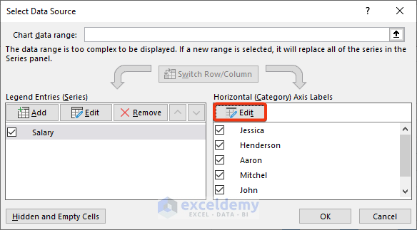
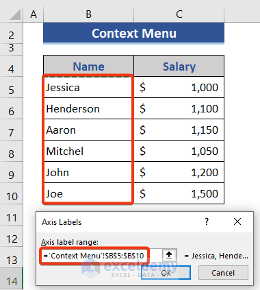
- Now, go to the Horizontal Axis Labels section.
- Click on the Edit option.
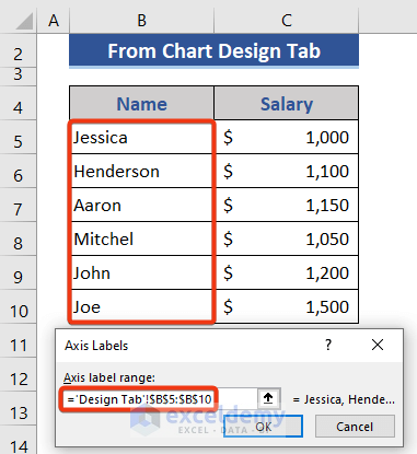
- In the Axis label range, the box changes the range from the dataset.
- Again, press OK.
- Finally, look at the dataset.
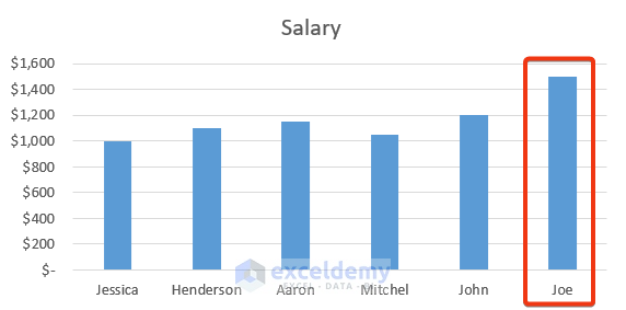 The chart has been extended with the new data.
Read More: Selecting Data in Different Columns for an Excel Chart
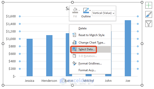
2. Expand Chart Data Range from Right-Click Context Menu
In this section, we will select an option from the Context Menu to expand the data range of the chart.
📌 Steps:
- Click on the Chart first.
- Then, press the right button of the mouse.
- Choose Select Data from the Context Menu.
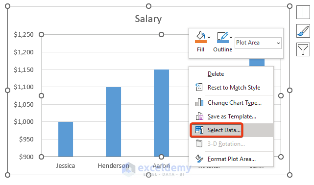
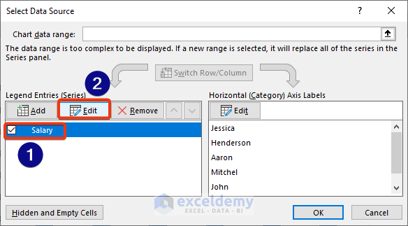
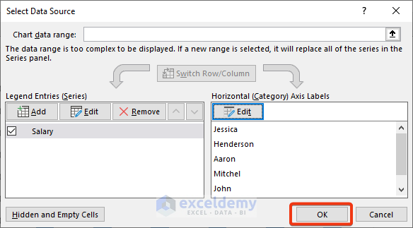
- The Select Data Source options appear now.
- After that, choose Salary and press the Edit button.
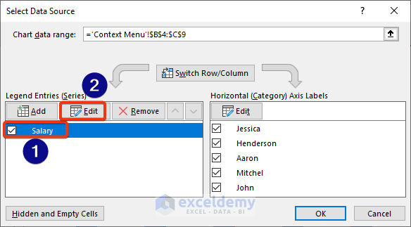
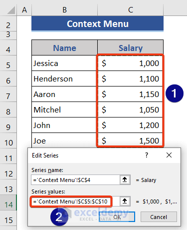
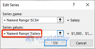
- The Edit Series window appears.
- Go to the Series values box and modify the range.
- Finally, press OK.
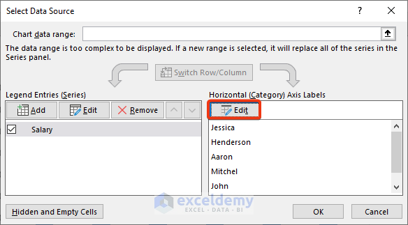
- Again, go back to the Select Data Source window.
- Select the Edit option of the Horizontal Axis Labels section.
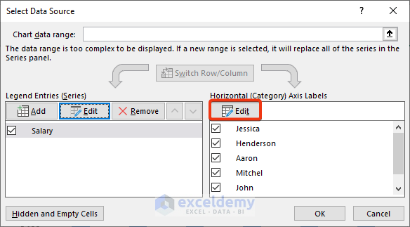
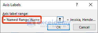
- Axis Labels window comes now.
- Modify the Axis Label range. Go to the box and select the range from the dataset.
- Again, press OK.
- Look at the chart.

The data range of the chart has expanded successfully.
Read More: How to Add Data Table in an Excel Chart
3. Use Mouse Pointer to Expand Data Range
This is the easiest way to expand the data range of the chart. Just one step to expand the data range.
📌 Steps:
- Click on the chart first.
- Note, look data range in the editable mode.
- Place the cursor on the dataset.
- Now, move the cursor downwards.
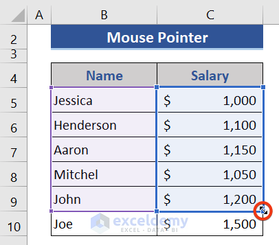
- Look at the dataset now.
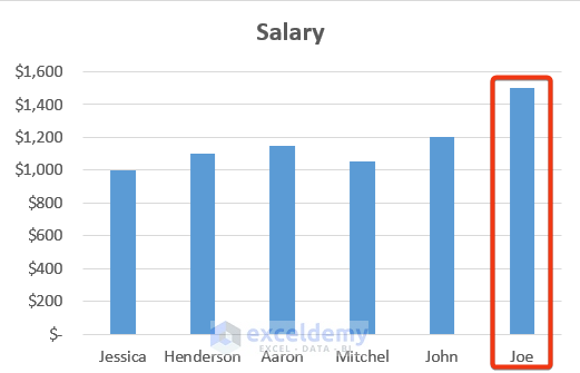 The expanded data is reflected on the chart.
Read More: How to Add Data to an Existing Chart in Excel
4. Utilize Excel Table Command
The previous methods were static processes. We need to expand the chart manually. But there is some dynamic way to expand the charts. Excel Table is one of them. Just expand the Excel Table, and the chart will expand automatically.
📌 Steps:
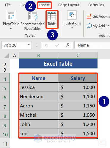
- First, we will form an Excel Table.
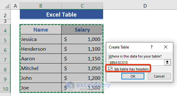
- Select Range B4:C10.
- Go to the Insert tab.
- After that, click on the Table option.
- Create Table window appears.
- Check My Table has headers option at this window.
- Then, press OK.
- Excel Table has formed successfully.
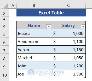
- Now, we will form the chart using this table.
- Select the whole table.
- Again, go to the Insert tab.
- Choose the 2-D Column from the menu.
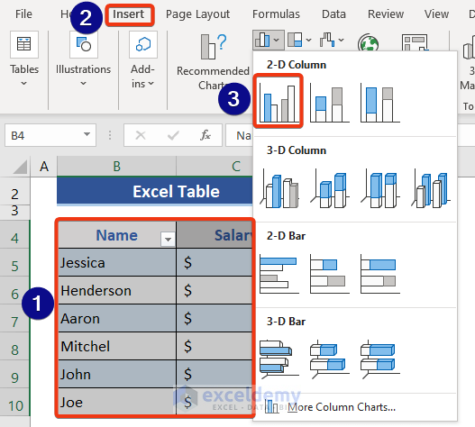
- We can see a chart has been created successfully.

- Now, we will expand the table.
- We copy-paste or directly write data below the last cell of the table.
- Have a look at the dataset.
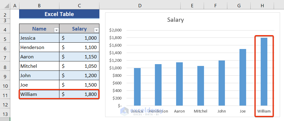 We can see new data is shown in the chart.
Read More: How to Format Data Table in Excel Chart
5. Set a Dynamic Formula with Named Range to Each Data Column
In this section, we will use a dynamic named range to expand the chart data range in Excel. We will apply a formula based on the OFFSET and COUNTA functions for the named range.
📌 Steps:
- We need to define the name range for each data column.
- Click on Cell B4.
- Go to the Formulas tab.
- Choose the Define Name option.
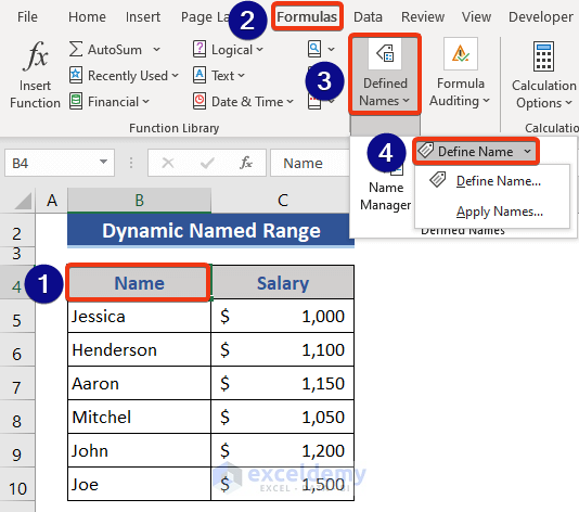
- The New Name window appears.
- Put a name in the Name box.
- Select the worksheet from the Scope dropdown.
- Insert a formula on the Refers to field.
=OFFSET('Named Range'!$B$5,0,0,COUNTA('Named Range'!$B:$B)-1)
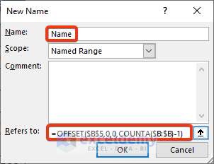
- Finally, press OK.
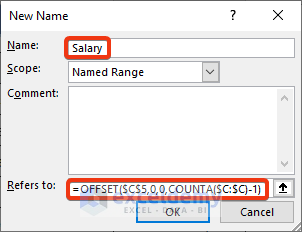
- Repeat this process for the second column.
- Named as Salary and put the formula below.
=OFFSET('Named Range'!$C$5,0,0,COUNTA('Named Range'!$C:$C)-1)
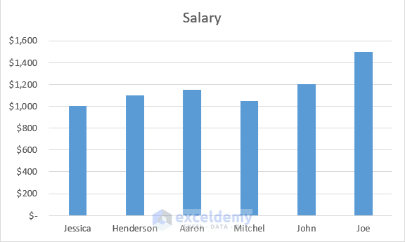
- This is our chart that has already been formed using the process shown in method 1.
- We will use apply the named range here and make it dynamic.
- Click on the chart.
- Press the right button of the mouse.
- Choose the Select Data option from the Context Menu.
- Select Data Source window appears.
- Select Salary and then click on the Edit button.
- Edit Series window appears.
- Change the Series value reference. Put the named range reference here.
- We back to the Select Data Source window.
- Press the Edit option of the Horizontal Axis Labels option.
- Modify the Axis label range window.
- Finally, press OK.
- Again, press OK.
- Now, add data to the bottom of the dataset.
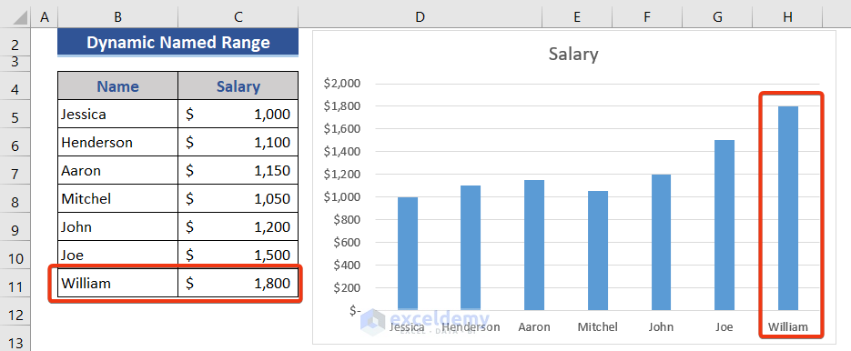
As a result, a new column appears in the chart.
Download this practice workbook to exercise while you are reading this article.
Conclusion
In this article, we described 5 methods to expand the chart data range in Excel. I hope this will satisfy your needs. Please give your suggestions in the comment box if you have any.
Related Articles
- How to Add Data Points to an Existing Graph in Excel
- How to Create Excel Chart Using Data Range Based on Cell Value
- How to Get Data Points from a Graph in Excel
- Excel VBA: Get Source Data Range from a Chart
<< Go Back to Edit Chart Data | Excel Chart Data | Excel Charts | Learn Excel
Get FREE Advanced Excel Exercises with Solutions!
