You have come to the right place if you are looking for the answer or some unique tips to create a descriptive statistics table in Excel. There are some easy steps to create a descriptive statistics table in Excel. This article will walk you through each and every step with appropriate examples. As a result, you can use them easily for your purpose. Let’s move on to the article’s main discussion.
What Is a Descriptive Statistics Table?
While dealing with a large dataset, we need some summary of that including mean, standard deviation, median, kurtosis, etc. We can calculate these things by using individual formulas but this is time-consuming and difficult. Descriptive statistics is a complete package of these calculations and in Excel, we have an in-built option to calculate descriptive statistics of a dataset with a click only. In this table, one can find any necessary summary relevant to the dataset.
Steps to Create a Descriptive Statistics Table in Excel
In this section, I will show you the quick and easy steps to create a descriptive statistics table in Excel on the Windows operating system. This article contains detailed explanations with clear illustrations for everything. I have used the Microsoft 365 version here. However, you may use any other version depending on your availability. Please leave a comment if any part of this article does not work in your version.
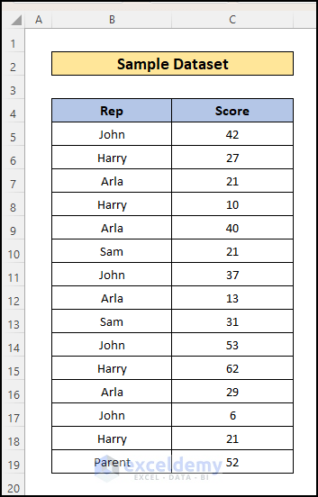
📌 Step 1: Prepare Dataset
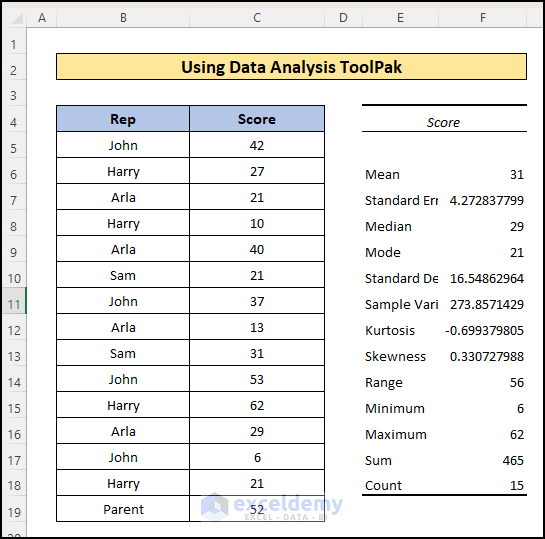
First, create a dataset for which you want to create a descriptive statistics table. Here, I have created a dataset of exam scores of individual students. And on this dataset, I will create a descriptive analysis table.
📌 Step 2: Enable Data Analysis ToolPak
Before creating a descriptive analysis table using the Data Analysis ToolPak, you have to check if there is a Data analysis Toolpak existing in the Data tab or not. If you don’t find the Data Analysis ToolPak then follow the below steps to add this to the top ribbon.
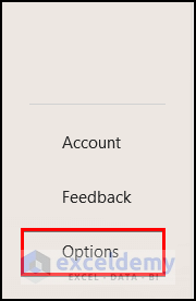
- Open an Excel Workbook and go to File tab >> Options.
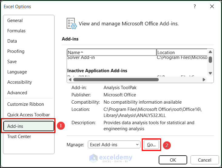
- Then, there will appear a pop-up window named Excel Options.
- Here, click on the Add–ins and select the “Go” button.
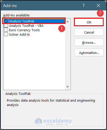
- Then, another new pop-up window will appear named “Add-ins”.
- Mark the box for “Analysis ToolPak” and press OK.
- After that, if you go to the Data tab in the top ribbon, you will see a menu named “Data Analysis” existing.
📌 Final Step: Use the Descriptive Analysis Option in Data Analysis ToolPak
Here, I will show you how to use the Descriptive Statistics feature in Excel.
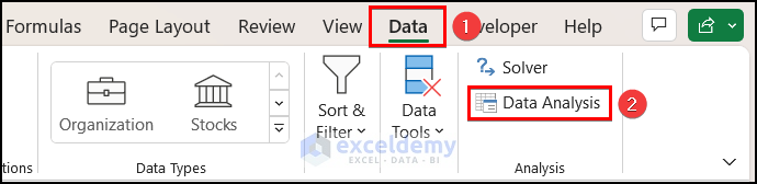
- Firstly, from the Data tab >> click on the Data Analysis option.
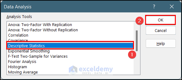
- At this time, a dialog box named Data Analysis will appear.
- Now, select Descriptive Statistics and then Click on the OK button.
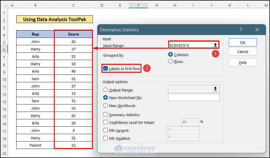
- After that, a new dialog box named Descriptive Statistics will appear.
- Then, select the data range in the Input Range box for which you want to do the descriptive statistics. Here, I have selected the range C4:C19.
- After that, mark the “Labels in first row” option.
- Following this, choose the cell in the Output Range: box where you want to see the result. Here, I have chosen the D4 cell.
- Then, you must mark the Summary statistics option.
- Finally, press OK to get the result.
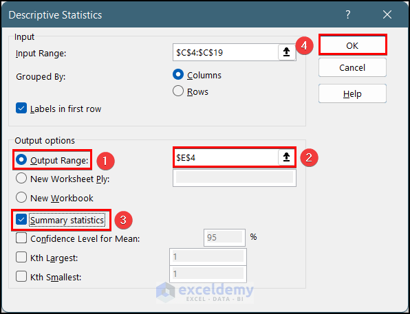
- Now, you will get the Descriptive Analysis table based on the selected dataset.
Read More: Descriptive Statistics – Input Range Contains Non-Numeric Data
How to Create a Descriptive Statistics Table for Multiple Columns in Excel
Also, sometimes you may need to create a descriptive statistics table for multiple columns in Excel. You have to follow similar steps for this, still, I am showing you how you can do this. For this, follow the steps below:
📌 Steps:
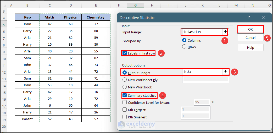
- First, I have created a dataset containing exam scores of 3 subjects and I want to create a descriptive analysis table for comparing the results.

- Similarly, before, go to the Data tab >> Data Analysis option >> Descriptive Statistics.
- Here, in the Descriptive Statistics window, select the input range C4:E9 that contains the exam score cells and the heading cells.
- Then, mark the box saying “Labels in first row”.
- After that, select cell G4 as the output range.
- Also, mark the box saying Summary Statistics and press the OK button.
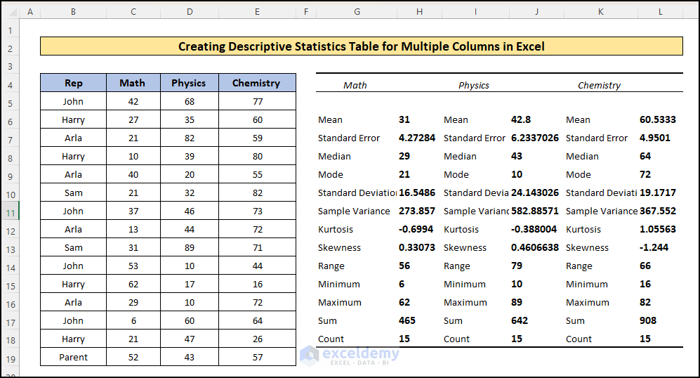
- As a result, you will see there will create a table showing the descriptive statistics for each subject individually.
Read More: How to Get Summary Statistics in Excel
How to Interpret Descriptive Statistics Table in Excel
In Descriptive Statistics, you will find certain parameters. Here, I am describing all the parameters of it.
- Mean: This is the average value of the selected data range. This is calculated by dividing the sum of the observations by the number of observations.
- Standard Deviation: This value represents the average difference between the values and the mean value. It is actually the square root of the variance value.
- Median: This value denotes that half the value of the observations is above this value and the remaining half is below.
- Mode: This value represents the most frequently occurring value in the selected data range.
- Sample Variation: It is the average value of squared differences from the mean value. The higher the sample variation value is, the variability of the dataset will be higher.
- Kurtosis: This value defines the comparison of the dataset with a normal distribution curve. It shows whether the peak of the curve is taller or smaller and whether the tail is thicker or thinner than the curve of normal distribution. There can be three interpretations of the kurtosis value:
- Ku = 0: It means the curve is similar to the normal distribution.
- Ku > 0: It means the curve has a higher peak and a thinner tail than the normal distribution.
- Ku < 0: It means the curve has a shorter peak and a thicker tail than the normal distribution.
- Skewness: It denotes whether the distribution of the data is symmetrical or not. There can happier three cases:
- Skew = 0: The curve is symmetrical on both sides.
- Skew > 0: The curve is inclined to the right side. This is called Right-skewed Data.
- Skew < 0: The curve is inclined to the left side. This is called Left-skewed Data.
- Range: It is the difference between the maximum and the minimum value of the selected dataset.
- Maximum & Minimum: This value denotes where your dataset starts and where it ends. It will help you to find out whether there is an error value in the dataset or not.
- Sum: It is the total sum of the values of the selected dataset.
- Count: This value shows the total number of observations that you selected for analysis.
Download Practice Workbook
You can download the practice workbook from here:
Conclusion
In this article, you have found how to create a descriptive statistics table in Excel. I hope you found this article helpful. Please leave comments, suggestions, or queries if you have any in the comment section below.
<< Go Back to Excel Descriptive Statistics | Excel for Statistics | Learn Excel
Get FREE Advanced Excel Exercises with Solutions!
