What Is ANOVA Analysis?
ANOVA is a numerical method used to evaluate the variance observed within a dataset by dividing it into two sections: 1) Systematic factors and 2) Random factors
The Formula is:
F= MSE / MST
F = Anova coefficient
MST = Mean sum of squares due to treatment
MSE = Mean sum of squares due to error
Anova can be single factor and two factors:
- In two factors Anova, there are multiple dependent variables.
- Single-factor Anova calculates the effect of a single factor on a single variable.
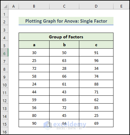
Example 1 – Plotting a Graph for ANOVA: Single Factor
Steps:
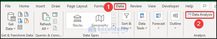
- Go to the Data tab.
- Select Data Analysis.
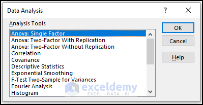
- In the Data Analysis window, select Anova: Single Factor.
- Click Ok.
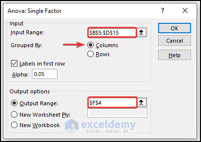
- In the Anova: Single Factor window, enter the cells in Input Range.
- Check “Labels in First Row”.
- In Output Range, enter the data range to display the calculated data. (You can also show the output in a new worksheet by selecting New Worksheet Ply or in a new workbook by selecting New Workbook.)
- Click OK.
The Anova outcomes are displayed.
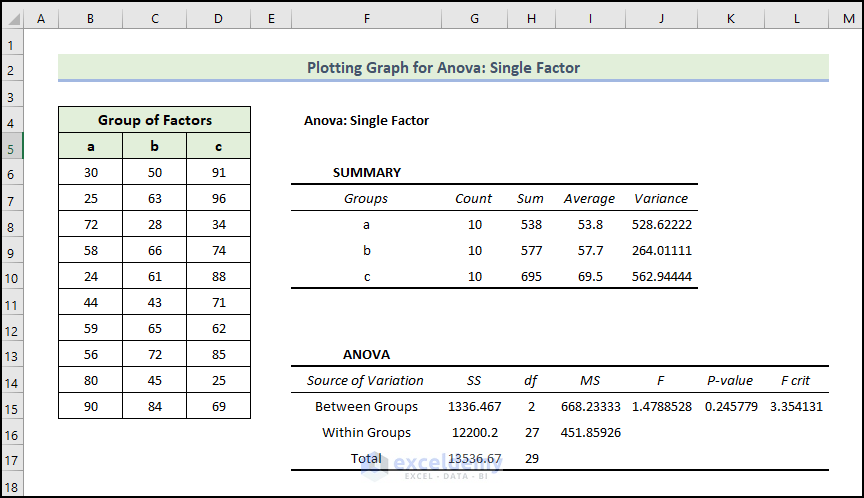
In the Summary table, you will find each group’s average and variances. The average level is 53.8 for Group a, but the variance is 528.6 which is lower than other Group c. In the group, members are less valuable.
The Anova results are not that significant as you are calculating the variances only. P-values interpret the relation between the columns and the values are greater than 0.05, which is not statistically significant. There isn’t a relation between the columns.
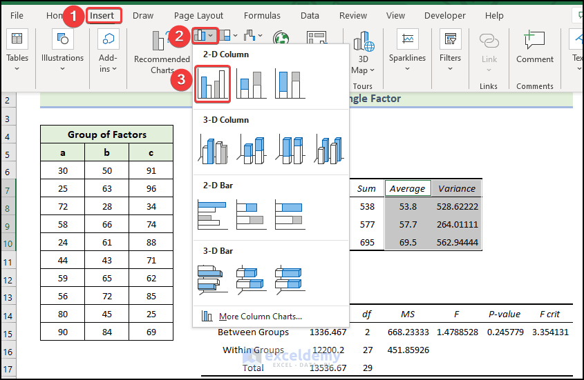
To insert a Clustered Column:
- Select the cell range as shown below.
- In the Insert tab, click Insert Column or Bar Chart in Charts.
- Choose Clustered Column.
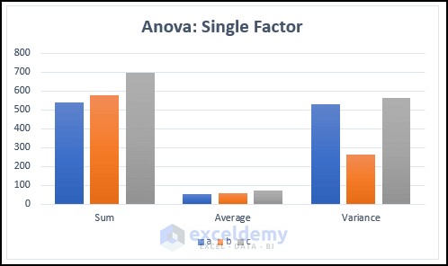
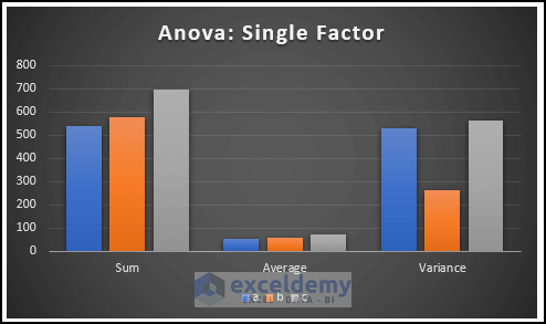
The following clustered column chart is displayed. You can see the difference between the sum, average, and variance values in the different groups.
- To modify the chart style, select Chart Design and choose Style 8 in Chart Styles.
- You can also right-click the chart, select Chart Styles and choose a style.
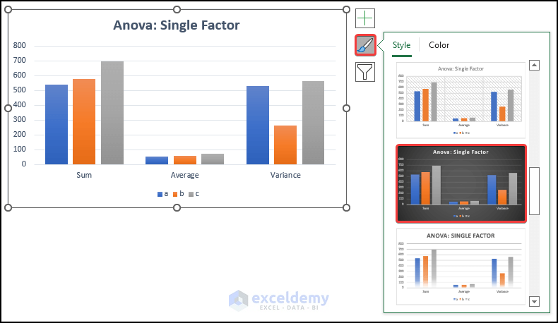
This is the Anova graph.
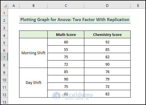
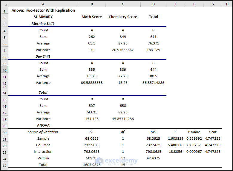
Example 2 – Plotting a Graph for ANOVA: Two Factors with Replication
You have data about different exam scores. There are two shifts in that school. One in the morning and the other in the morning and afternoon: day shift, here.
To find a relation between the shifts and students’ marks, perform a two-factor with replication ANOVA analysis:
Steps:
- Go to the Data tab.
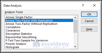
- Select Data Analysis.
- In the Data Analysis window, select Anova: Two-Factor With Replication.
- Click OK.
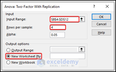
- Select the data range in Input Range.
- Enter 4 in Rows per sample (there are 4 rows per shift).
- In Output Range, enter the data range to display the calculated data. You can also show the output in a new worksheet by selecting New Worksheet Ply or in a new workbook by selecting New Workbook.
- Click OK.
The Anova outcomes are displayed.
The first tables show the summary of shifts. The average score in the Morning shift in Math is 65.5 but in the Day shift is 83.75. In the Chemistry exam, the average score in the Morning shift is 87 but in the Day shift is 77.5.
Variance is very high. 91 in the morning shift in the Math exam.
You can summarize the interactions and individual effects in the Anova part: the P-value of Columns is 0.037 which is statistically significant. There is an effect of the shifts on students’ performance. But the value is close to the alpha value of 0.05, so the effect is less significant.
The P-value of interactions is 0.000967 which is much less than the alpha value. It is statistically significant and the effect of the shifts on both exams is very high.
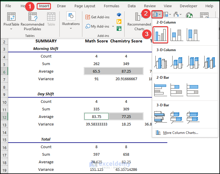
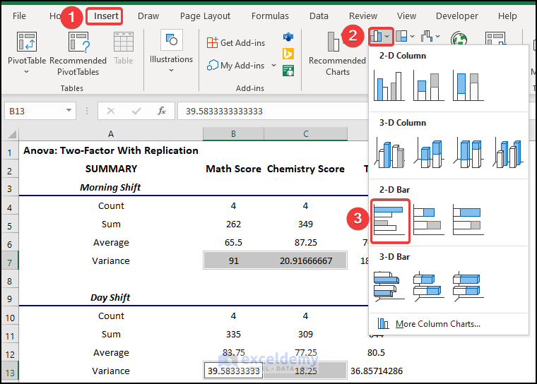
To insert a Clustered Column:
- Select the cell range as shown below.
- In the Insert tab, click Insert Column or Bar Chart in Charts.
- Choose Clustered Column.
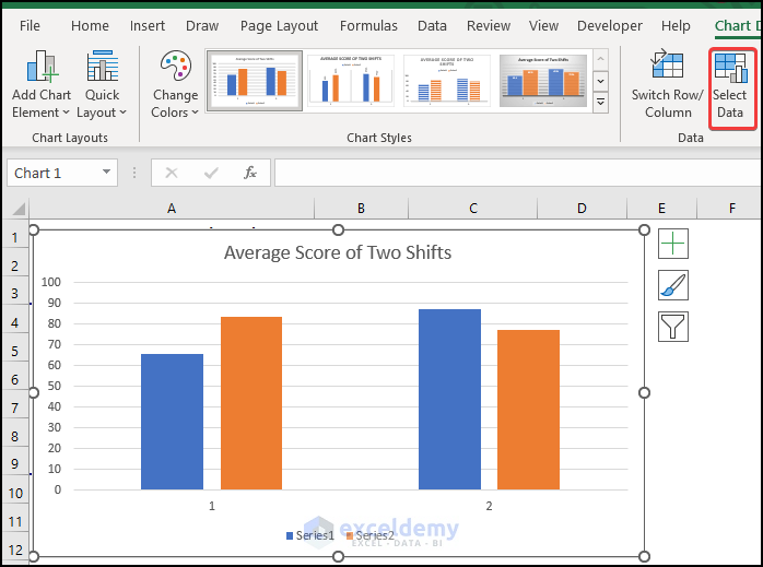
- The following clustered column chart is displayed. To modify the chart, click it and choose Select Data in the Data tab.
- In the Select Data Source window, select Series1 and click Edit.
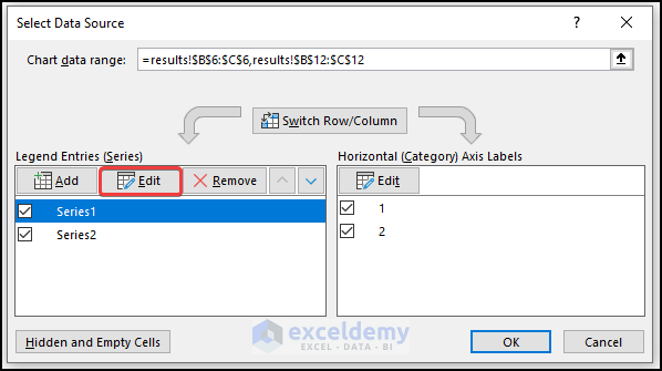
- In the Edit Series window, enter the series name.
- Click OK.
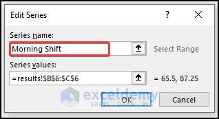
- Rename Series2.
- To modify the chart style, select Chart Design and choose Style 8 in Chart Styles.
- You can also right-click the chart, select Chart Styles, and choose a style.
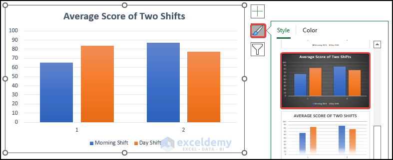
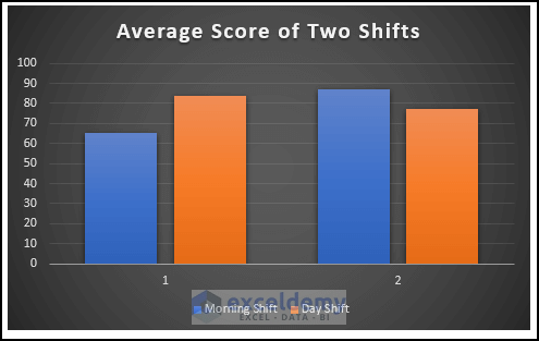
The chart displays the average score of the two shits. Axis 1 indicates the average math score in the two shifts, and axis 2 indicates the average chemistry score.
To insert a clustered bar for the variance of scores:
- Select the cell range as shown below.
- In the Insert tab, click Insert Column or Bar Chart in Charts.
- Choose Clustered Column.
The following chart is displayed.
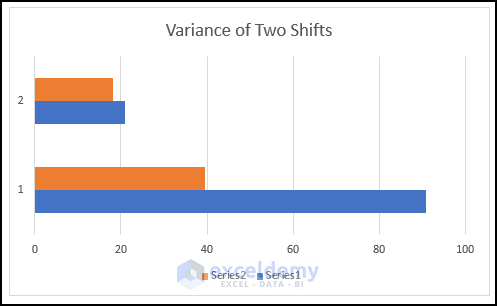
- Modify it following the steps above to see the chart for the variance of the two shifts. Axis 1 indicates the variance of the math scores in the two shifts, and axis 2 indicates the variance of the chemistry score.
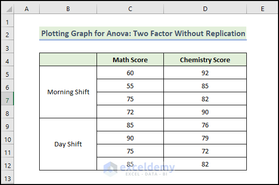
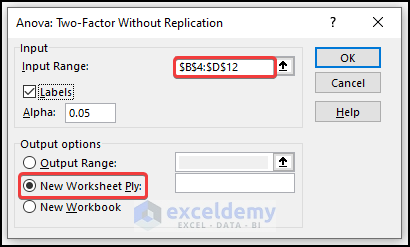
Method 3 – Plotting a Graph for ANOVA: Two Factor Without Replication
You have data about different exam scores. There are two shifts in that school. One in the morning and the other in the morning and afternoon: day shift, here.
To find a relation between the two shifts and students’ marks:
Steps:
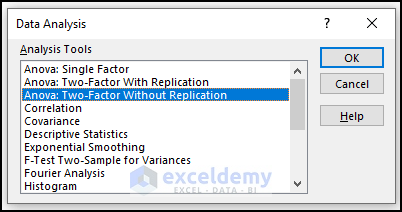
- Go to the Data tab.
- Select Data Analysis.
- In the Data Analysis window, select Anova: Two-Factor Without Replication.
- Click OK.
- Select the data range in Input Range.
- In Output Range, enter the data range to display the calculated data. You can also show the output in a new worksheet by selecting New Worksheet Ply or in a new workbook by selecting New Workbook.
- Check Labels.
- Click OK.
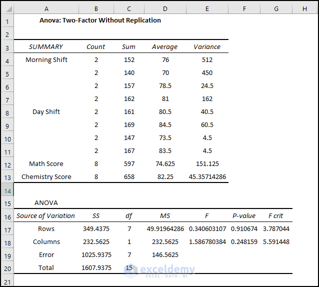
A new worksheet is created: you will see the two-way Anova result as shown below.
The average score in the Morning shift in Math is 65.5, but in the Day shift it is 83.75. In the Chemistry exam, the average score in the Morning shift is 87, but in the Day shift is 77.5.
The P-value of Columns is 0.24 which is statistically significant. There is an effect of shifts on students’ performance in the exam. The value is close to the alpha value of 0.05, so the effect is less significant.
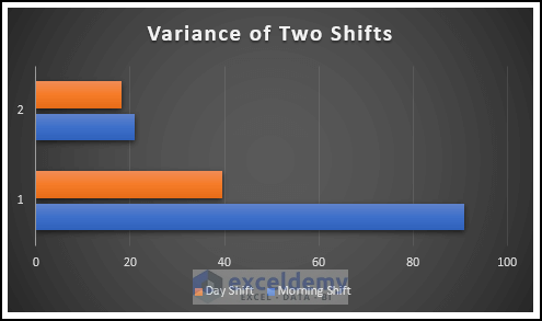
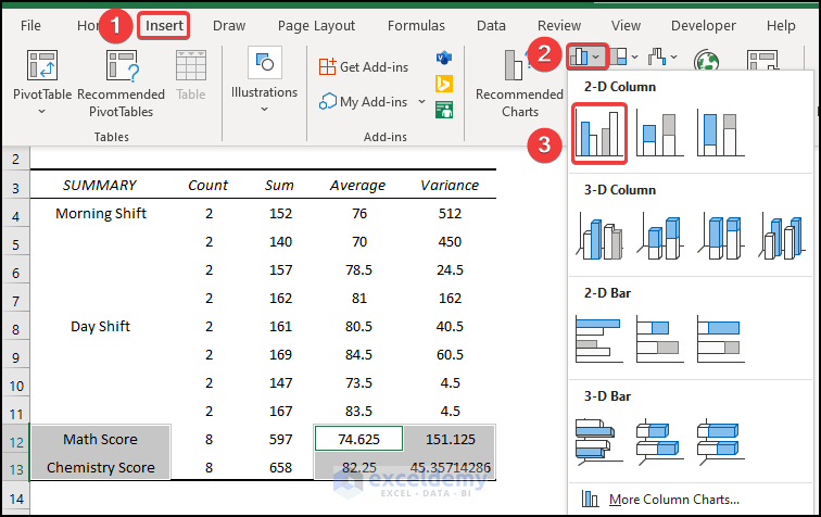
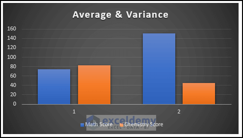
To insert a clustered bar for the variance of scores:
- Select the cell range as shown below.
- In the Insert tab, click Insert Column or Bar Chart in Charts.
- Choose Clustered Column.
- To modify the chart style, select Chart Design and choose Style 8 in Chart Styles.
- You can also right-click the chart, select Chart Styles, and choose a style.
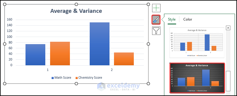
- Modify it following the steps above to see the chart of the average and variance of the two shifts. Axis 1 indicates the average of the math and chemistry scores, and axis 2 indicates the variance of the math and chemistry scores.
Download the Practice Workbook
Related Articles
- Nested ANOVA in Excel
- How to Interpret ANOVA Results in Excel
- How to Make an ANOVA Table in Excel
- How to Calculate P Value in Excel ANOVA
- How to Perform Regression in Excel and Interpretation of ANOVA
<< Go Back to Anova in Excel | Excel for Statistics | Learn Excel
Get FREE Advanced Excel Exercises with Solutions!
