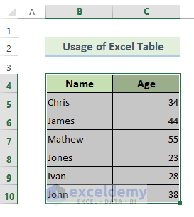
Method 1 – Use an Excel Table to Create a Dynamic Chart Range in Excel
- Select the whole dataset.
- Press Ctrl + T keys.
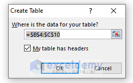
A dialog box named Create Table will appear. In the dialog box, the table range is already there.
- Check My table has headers.
- Hit OK.
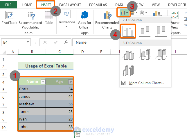
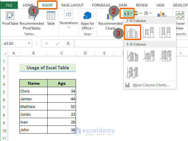
- Go to the INSERT tab from the main ribbon.
- Click Insert Column Chart.
- Select 2-D Column chart.
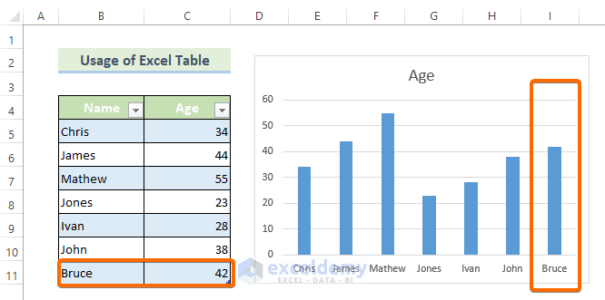
Excel has created a column chart based on your Excel table data like this:
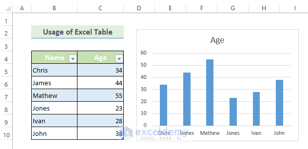
- We have inserted a new record. We inserted Bruce in the Name column and 42 in the Age column. These newly added records in the source data have already been added to the column chart.
Read More: How to Dynamically Change Excel Chart Data
Method 2 – Create a Dynamic Chart Range in Excel Using the OFFSET and COUNTIF Function
Step 1 – Creating Dynamic Named Ranges
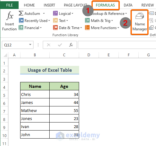
- Go to the FORMULAS tab from the main ribbon.
- Select Name Manager.
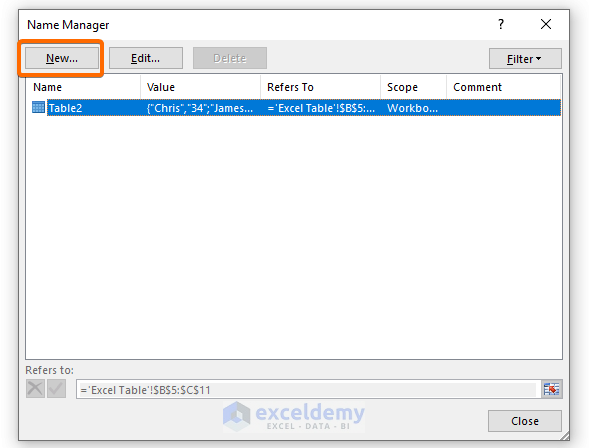
- Click on New in the Name Manager dialog box.
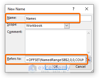
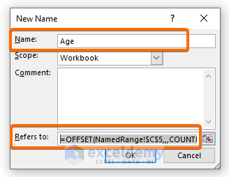
- Insert Names in the Name bar.
- Enter the following formula in the Refers to box.
=OFFSET(NamedRange!$B$2,0,0,COUNTA(NamedRange!$B:$B)-1,1)- Hit the OK command.
- Hit the New command in the Name Manager dialog box again.
- Insert Age in the Name box and the following formula in the Refers to box.
=OFFSET(NamedRange!$A$2,0,0,COUNTA(NamedRange!$A:$A)-1,1)- Hit the OK command.
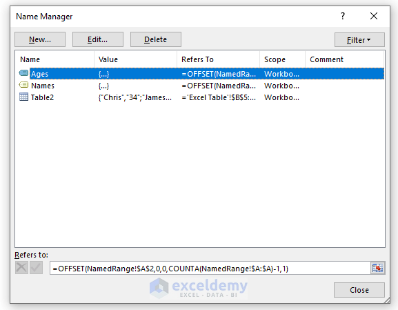
The Name Manager dialog box will look like this:
Step 2 – Creating a Chart Using Dynamic Named Ranges
- Go to the INSERT tab.
- Select Insert Column Chart.
- Choose the first 2-D column chart.
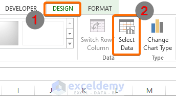
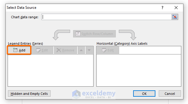
- Go to the DESIGN tab and click on Select Data.
- A dialog box called Select Data Source will open. Click the Add option under the Legend Entries (Series).
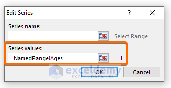
- Enter the following formula in the Series values box in the Edit Series dialog box.
=NamedRange!Ages- Hit OK.
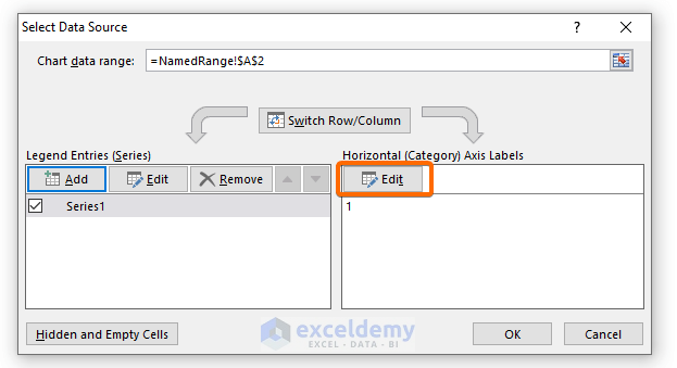
- Go back to the Select Data Source dialog box.
- Hit the Edit command under Horizontal (Category) Axis Labels.
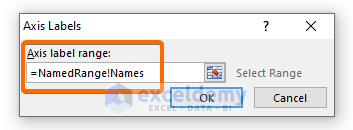
- Another dialog box called Axis Labels will appear. Insert the following formula in the Axis label range box.
=NamedRange!Names- Hit OK.
Read More: How to Create Chart with Dynamic Date Range in Excel
Download the Practice Workbook
Related Articles
- How to Create a Dynamic Chart in Excel Using VBA
- How to Make Dynamic Charts in Excel
- How to Create Min Max and Average Chart in Excel
- How to Create Dynamic Excel Charts with Drop-Down List
- How to Create Dynamic Charts in Excel Using Data Filters
- How to Create Dynamic Chart with Multiple Series in Excel
<< Go Back to Dynamic Excel Charts | Excel Charts | Learn Excel
Get FREE Advanced Excel Exercises with Solutions!

Hi Mrinmoy – Hope you are doing well !!
I wanted to check if we can create the dynamic range when we have multiple rows and multiple column For Example:
Jan-22 Feb-22 Mar-22 Apr-22 May-22 Jun-22 Jul-22
x1 9 9 1 1 5 1 3
x2 5 3 2 8 8 7 9
x3 3 8 9 7 3 4 7
above is the data and we will be getting new month column each month but for the graphs we only need to display the last 3 months
According to your requirements, you wanted to display the last 3 months’ data by a graph. You can follow the following procedure where I have tried to give you a simple solution that will help you display the last 3months’ data by graphical representation..
Create a new column, input the following formula in the 1st cell of that column and AutoFill till the cell you need. This additional column will define with numerical value the last 3 rows containing data.
=IF(AND(D4>0,ISBLANK(D5)),1,IF(B5=1,2,IF(B5=2,3,””)))
Next, create a Pivot Table with Months as Filters, Last 3 Months as Axis, and Sum of Product 1, Sum of Product 2, and Sum of Product 3 as Values.
Now, choose your preferred graphical representation format to display the last 3 months’ data.
Note: Don’t forget to refresh the Pivot Table after inserting the new month’s data. Otherwise, the graph won’t get updated. Alternatively, you can use Auto Update Pivot Table to lessen your hustle.