This is an overview:
Download Practice Workbook
Download the practice workbook.
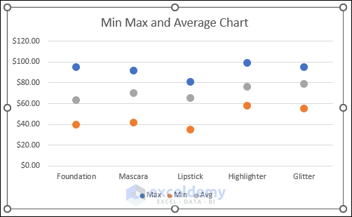
What Is a Min Max Average Chart?
A Min-Max-Average chart, also known as a range chart or error bar chart, is a graphical representation of data that displays three key values: the minimum, maximum, and average.
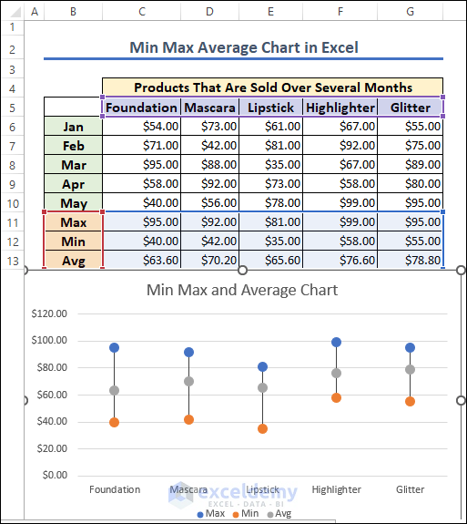
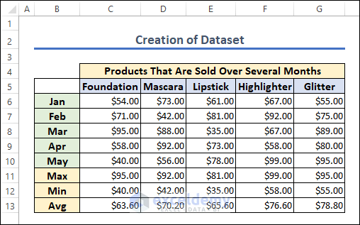
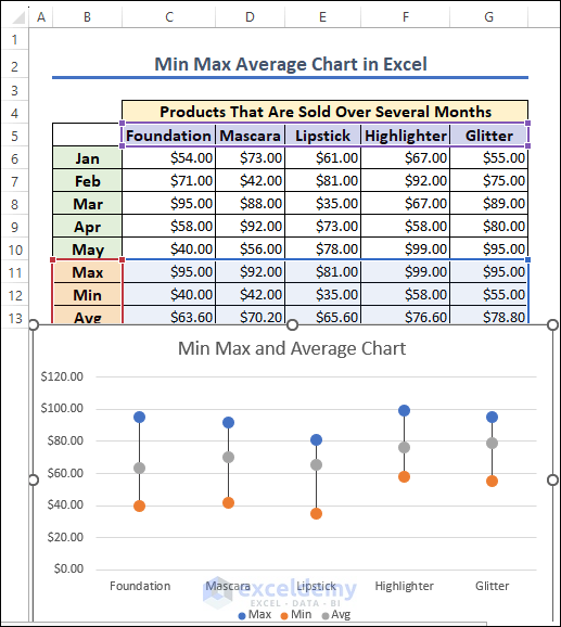
Step 1 – Create a Dataset
This is the sample dataset.
Step 2 – Insert a Line Chart
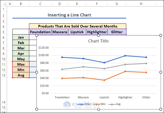
- Select B5:G5 and B11:G13.
- Go to the Insert tab >> Charts >> Insert Line or Area Charts >> 2-D Line with markers.
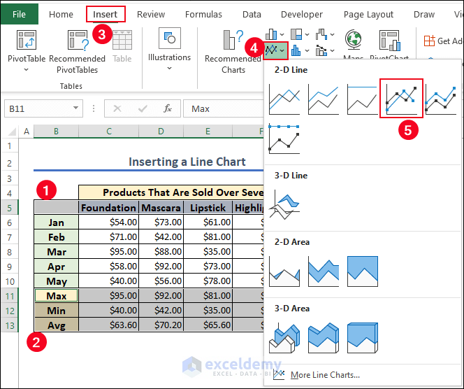
A line chart will be displayed.
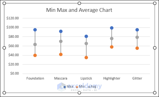
Step 3 – Formatting the Line Chart
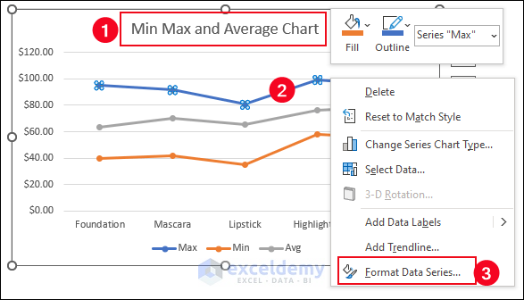
- Name the chart: “Min Max and Average Chart”.
- Right-click any portion of the Max line chart >> Choose Format Data Series.
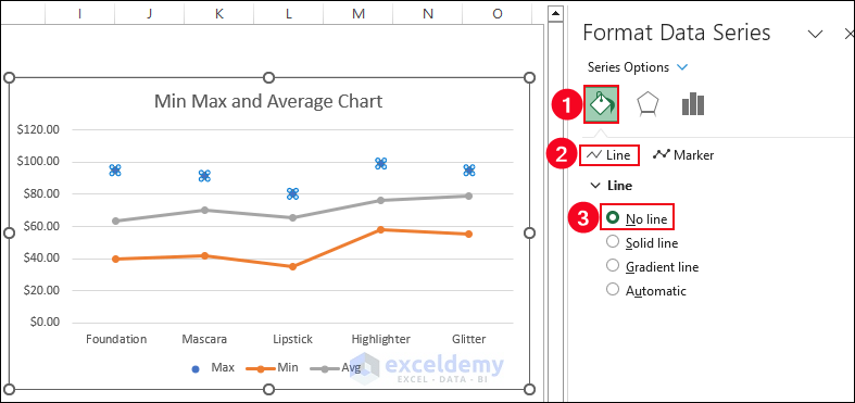
- Choose Fill & Line >> Select No line in Line.
- Choose marker size 8 in Built-in Marker Options.
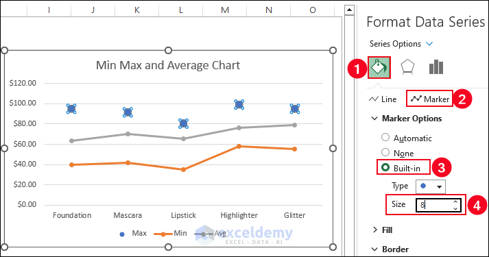
- Remove the lines and change the marker size for min and average.
Step 4 – Inserting Min Max and Average Vertical Line
- Select any marker point of the min max and average chart >> Go to Chart Design.
- Choose Add Chart Element >> Select High-Low Lines in Line.
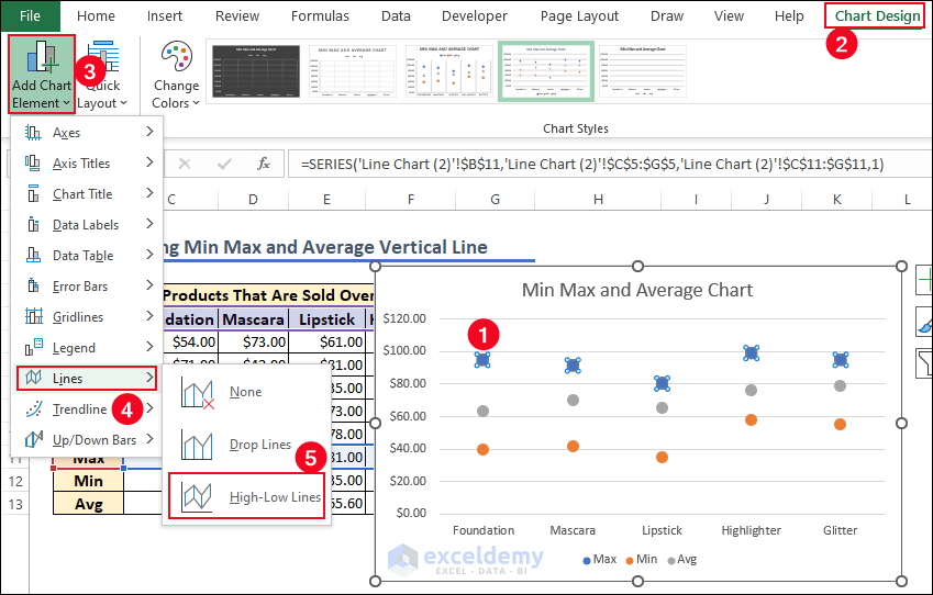
This is the output.
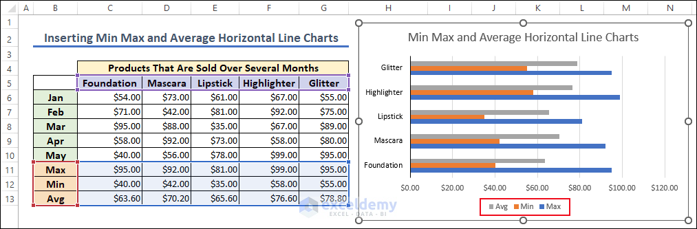
How to Make a Horizontal Max Min Average Chart in Excel
- Select the data range >> Go to the Insert tab >> Charts >> Insert Column or Bar Chart >> 2-D Bar.
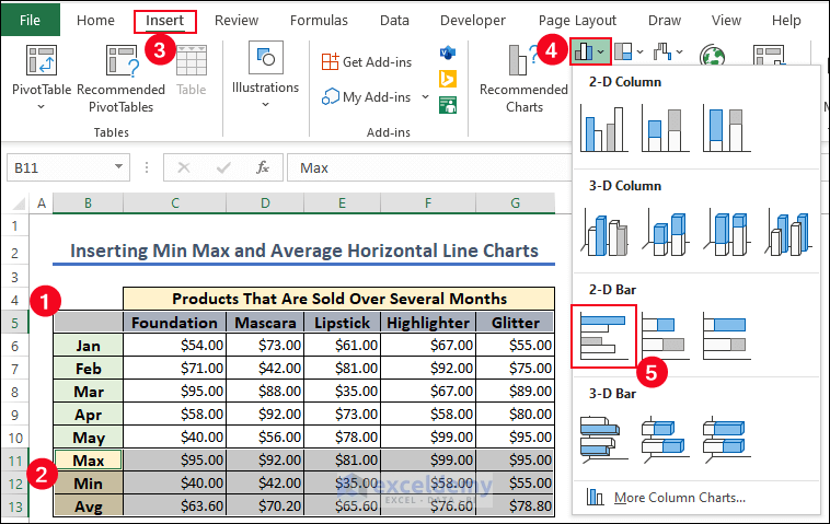
A horizontal Max Min Average 2-D Bar chart is displayed.
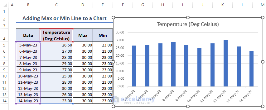
How to Add a Max or Min Line to a Chart in Excel
A 2-D Column chart will be displayed.
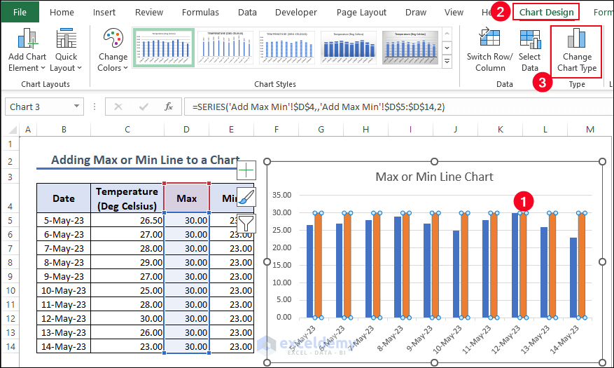
- Right-click the chart area and choose “Select Data”.
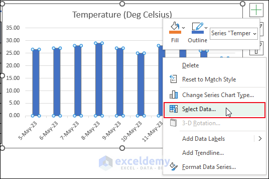
- In the “Select Data Source” dialog box, select Legend Entries (Series) and click Add.
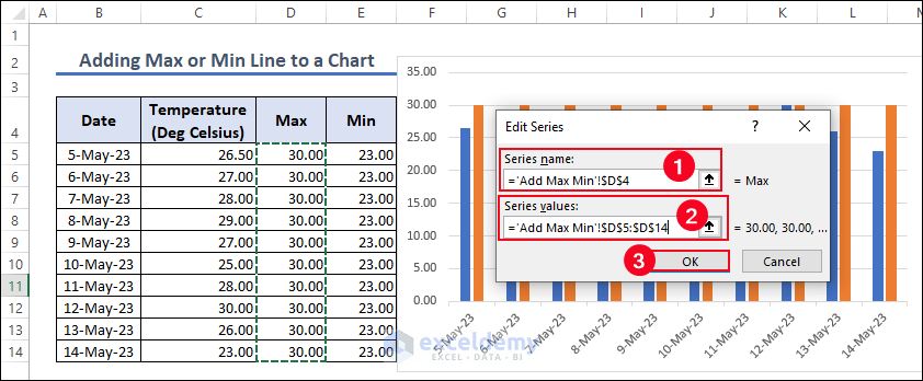
- In Edit Series, enter Series name and Series values.
- Click OK.
The Max 2-D column chart will be displayed.
- Select any Column in the chart.
- In Chart Design >> Choose Change Chart Type in Type.
- In the Change Chart Type dialog box >> All Charts >> Combo >> Stacked Line >> OK.
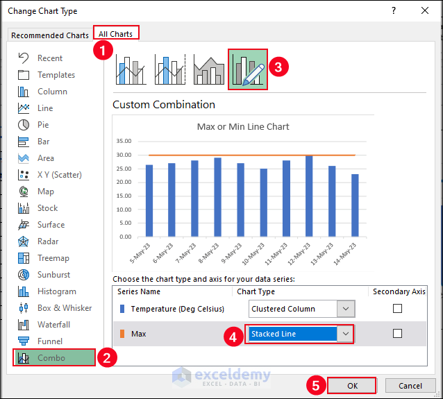
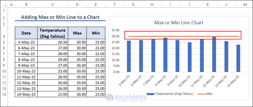
The Max line is added to the 2-D Column chart.
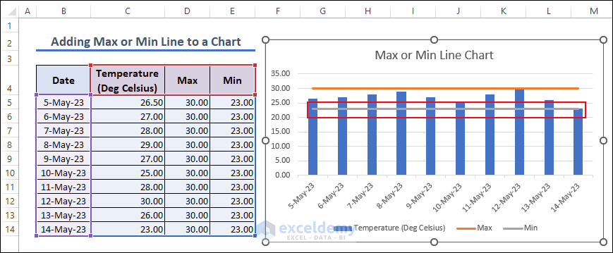
- Follow the same procedure to add a Min Line.
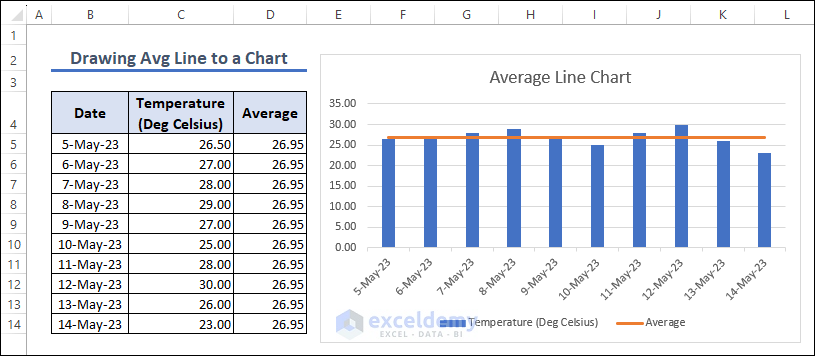
How to create an Average Line in Excel Graph
- Create an Average line in an Excel graph.
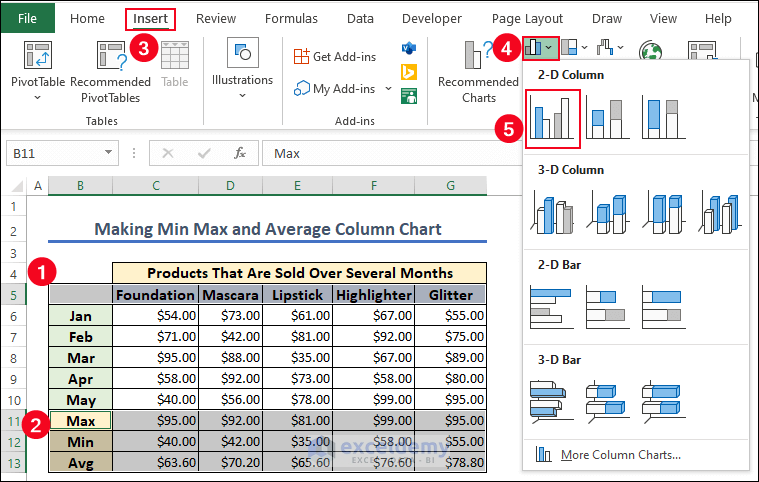
How to Make Min Max and Average Column Charts in Excel
- Select B5:G5 and B11:G13.
- Go to:
Insert >> Charts >> Insert Column or Bar Charts >> Clustered Column
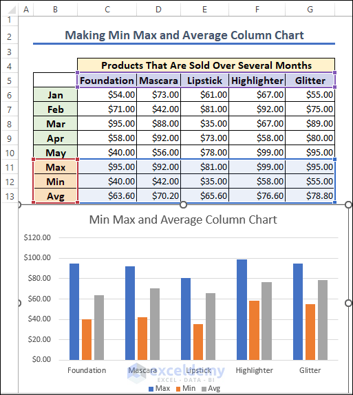
The min max and average clustered column chart is displayed.
- Format the chart.
Frequently Asked Questions
1. Can I update the data in the chart automatically?
Answer: Yes, if your chart is linked to a data range, any changes you make will automatically be displayed in the chart.
2. Can I customize the appearance of the Min-Max-Average chart?
Answer: Yes, you can customize the appearance of the Min-Max-Average chart. You can change: title, axis labels, data labels, colors, line styles, and marker styles. Right-click chart elements to access the formatting options.
3. How can I add a trendline to the Min-Max-Average chart?
Answer: To add a trendline, right-click any data series in the chart and select “Add Trendline.” Choose a trendline type (linear, exponential, etc.).
Get FREE Advanced Excel Exercises with Solutions!


Just awesome . I’ve never read this type of article
Dear Saiful Amin,
You are most welcome.
Regards
ExcelDemy