In this tutorial, you’ll be presented with eight challenging Excel chart exercises to enhance your skills. To approach these problems effectively, you should have at least an intermediate level of knowledge in Excel. Additionally, familiarity with functions like UNIQUE and COUNTIF, as well as skills in inserting scroll bars, working with chart elements, creating pie charts, making line charts, and building bar charts, will be beneficial. Make sure you’re using the latest version of Excel (Microsoft 365) to solve all the exercises.
Problem Overview
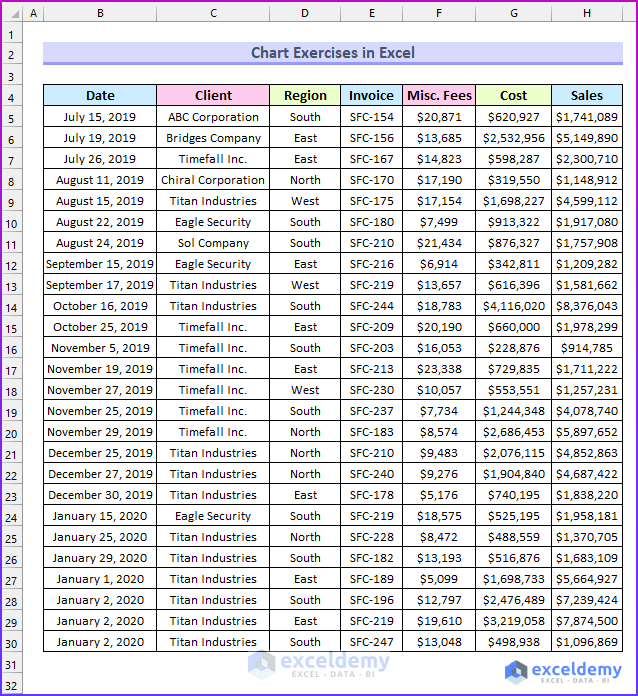
The eight exercises are based on a dataset with seven columns representing a company’s sales journal. The solutions for these exercises are provided in the Solution sheet of the Excel file.
- Exercise 01 – Adjust Gridline Color in Excel Charts
- Create a 3-D Column Chart using the Date and Sales columns.
- Display Primary Major Vertical Gridlines.
- Set the color of the Primary Major Horizontal Gridlines to Red.
- Solution: Adjust the Gridline Color in Excel Charts.
- Exercise 02 – Create a Combo Chart
- Combine the Date, Cost, and Sales columns to create a Combo Chart.
- Solution: Create a Combo Chart in Excel.
- Combine the Date, Cost, and Sales columns to create a Combo Chart.
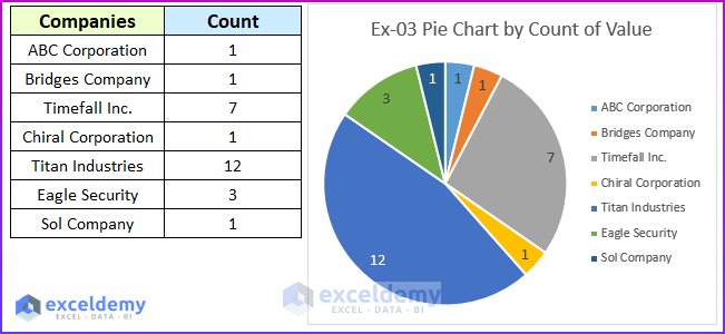
- Exercise 03 – Pie Chart by Count of Values
- Generate a pie chart by counting the values in the Client column.
- Solution: Pie Chart by count of Values.
- Generate a pie chart by counting the values in the Client column.
- Exercise 04 – Copy Chart in Excel without Linking Data
- Create a line chart using the Cost and Sales columns.
- Copy the chart and break the link between the data and the chart.
- Solution: Copy Chart in Excel Without Linking Data.
- Exercise 05 – Change Chart Style
- Create a 2D Clustered Bar chart using data from the Invoice and Cost columns.
- Add Axis Titles, Data Labels, and change the Chart Title.
- Apply “Style 12” to the chart.
- Solution: Change Chart Style.
- Exercise 06 – Scroll Bar in Chart
- Create a scrollable bar chart in Excel using the Date and Sales columns.
- Solution: Add Scroll Bar in Excel Chart.
- Create a scrollable bar chart in Excel using the Date and Sales columns.
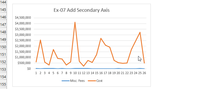
- Exercise 07 – Add Secondary Axis to Chart
- Build a line chart using data from the Cost and Misc. Fees columns.
- Plot the Misc. Fees data on a secondary axis.
- Solution: Add Secondary Axis in Excel Chart.
-
- The following animated image shows the option to move the Misc. Fees on the Secondary Axis.
- Exercise 08 – Millions on Data Labels
- Copy the Invoice and Sales columns.
- Change the format of the Sales column.
- Insert a chart to display the data.
- Solution: Use Millions in Data Labels.
This image shows the solution to exercise 3.
Download Practice Workbook
You can download the practice workbook from here:
Get FREE Advanced Excel Exercises with Solutions!
