Download Practice Workbook
You can download the practice workbook here.
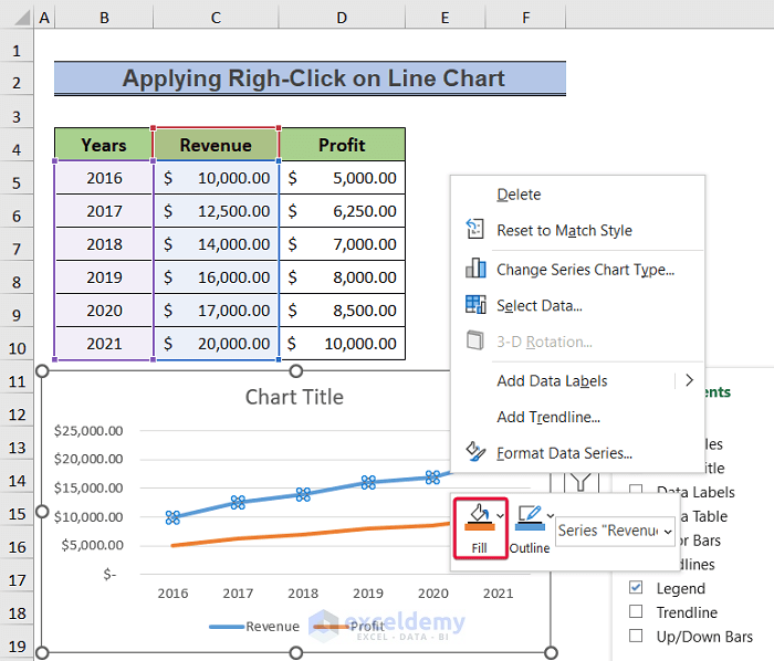
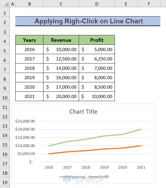
Method 1 – Applying Righ-Click on Line Chart
Steps:
- Right-click on one of the lines.
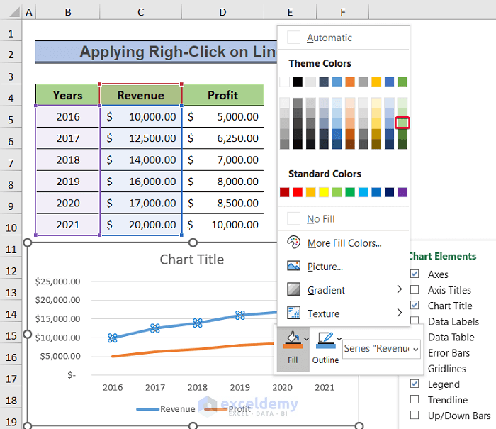
- Click on the Fill option.
- Select a color.
- From the options, select Outline.
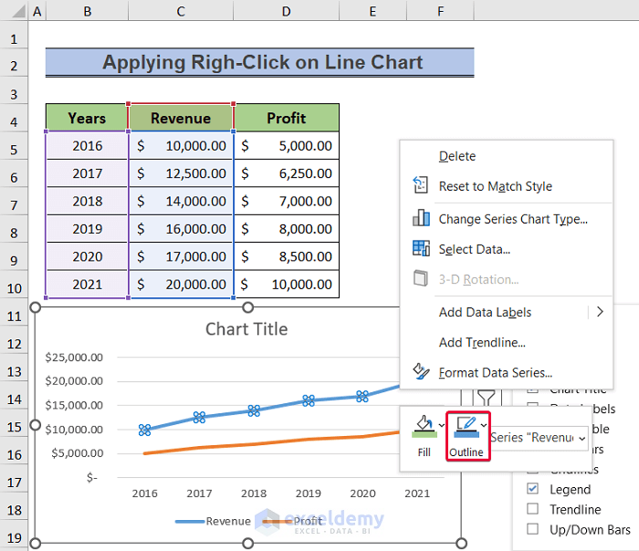
- Select the same color.
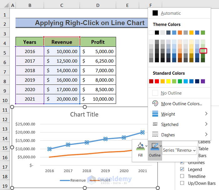
- The line color will change.
Read More: How to Apply Multiple Colors in Excel Chart Background (3 Ways)
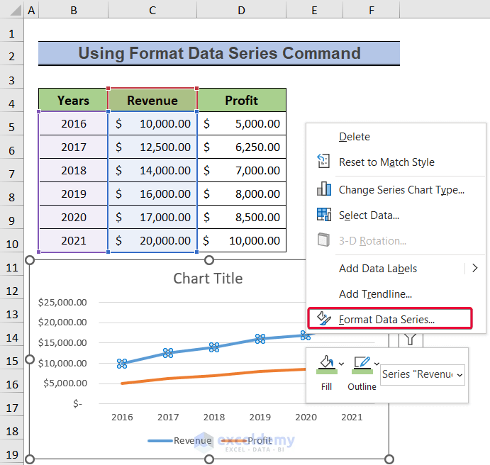
Method 2 – Using Format Data Series Command
Steps:
- Right-click on one of the line charts.
- From the options, select the Format Data Series command.
- We will have a command panel to the right.
- From the command panel, tick the Solid Line option.
- Click on the Color option.
- From the drop-down options, select a color for the line.
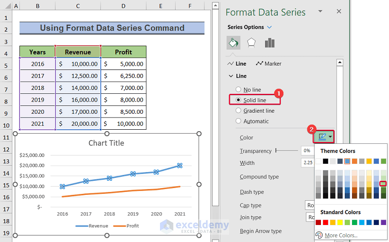
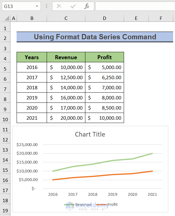
- The color of the line will change.
Read More: How to Copy Chart Without Source Data and Retain Formatting in Excel
Similar Readings
- How to Keep Excel Chart Colors Consistent (3 Simple Ways)
- How to Copy Chart in Excel Without Linking Data (with Easy Steps)
- How to Add Horizontal Bands in Excel Charts (with Easy Steps)
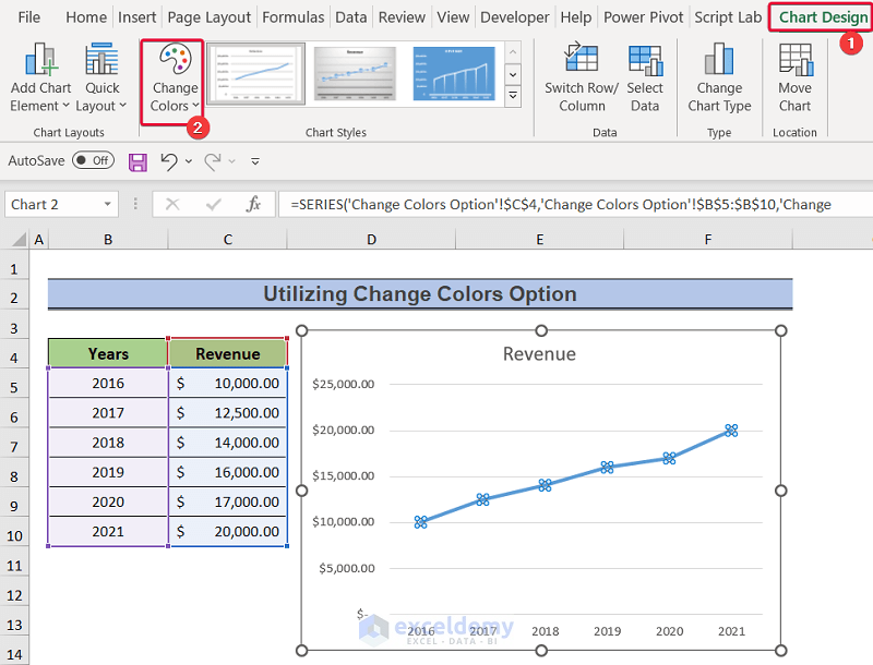
Method 3 – Utilizing Change Colors Option
Steps:
- Select the line on the chart.
- Go to the Chart Design tab.
- Select the Change Colors option.
- Select any color palette from the available options.
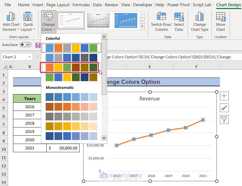
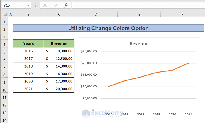
- The color of the line will change.
How to Add Dotted Line in Excel Graph
Steps:
- Right-click on a line on the chart.
- From the available options, select the Format Data Series command.
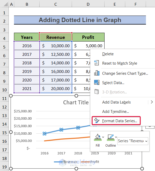
- Select the Fill & Line option.
- Select the Dash Line option.
- From the drop-down menu, select any of the dashed lines.
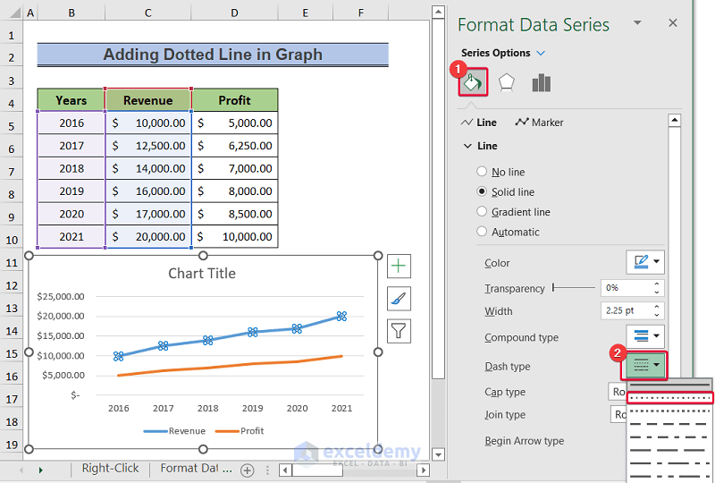
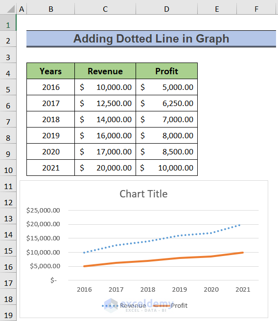
- A dotted line will be plotted in the chart.
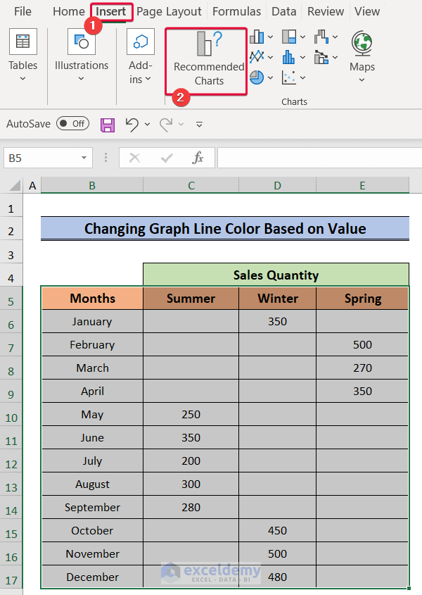
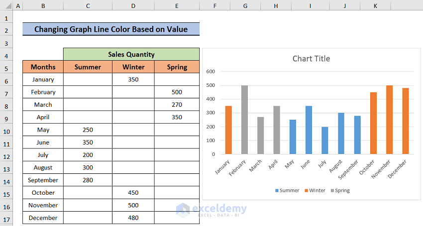
Changing Graph Line Color Based on Value in Excel
Steps:
- Select the dataset.
- Go to the Insert tab.
- From the Charts option, select the Recommended Charts command.
- In the Insert chart dialogue box, select the Stacked Column chart.
- Click OK.
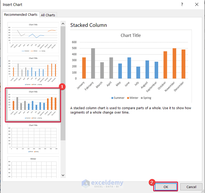
- We will get a chart where values of a particular season have a particular color.
Read More: How to Change Chart Color Based on Value in Excel (2 Methods)
Related Articles
- How to Make Excel Graphs Look Professional (15 Useful Tips)
- How to Change the Chart Style to Style 8 (2 Easy Methods)
- [Solved:] Vary Colors by Point Is Not Available in Excel
- How to Change Series Color in Excel Chart (5 Quick Ways)

