Method 1 – Using Copy Paste Feature to Keep Excel Chart Colors Consistent
Steps:
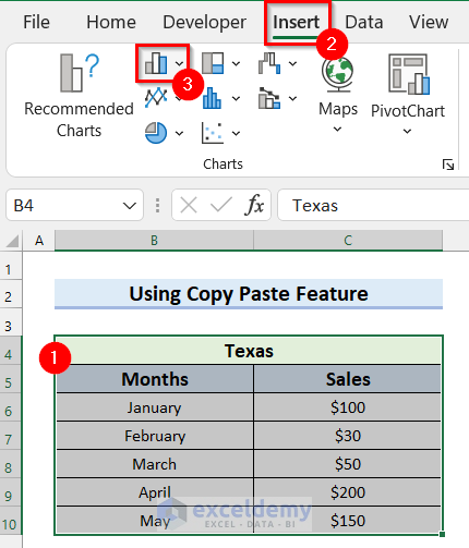
- Select the data range for the chart.
- Go to the Insert tab.
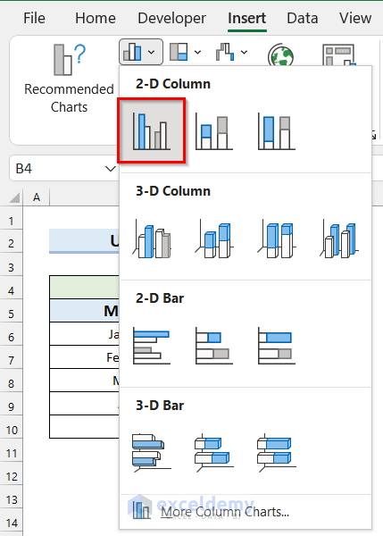
- Select the chart you want. Selected Column or Bar Chart.
A drop-down menu will appear.
- Select the chart type you want. We selected the Clustered Column Chart.
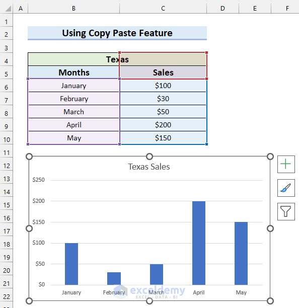
A Clustered Column Chart has been inserted for your selected data.
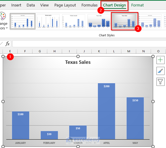
Now, I will change the Chart Style for the chart.
- Select the Chart.
- Go to the Chart Design tab.
- Select the style you want. We selected the marked style for my chart.
Change the color of the columns to give the chart more meaning.
- Double-click on a column to select the column. We selected the first column of the cell.
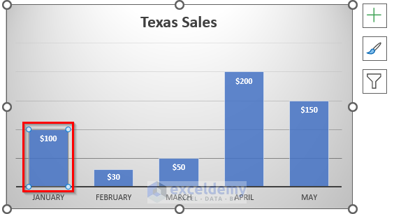
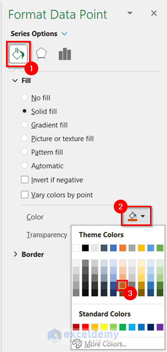
Format Data Point will appear on the right side of the screen.
- Select the Fill & Line tab.
- Select the drop-down option for Color.
- Select the color you want for that column.
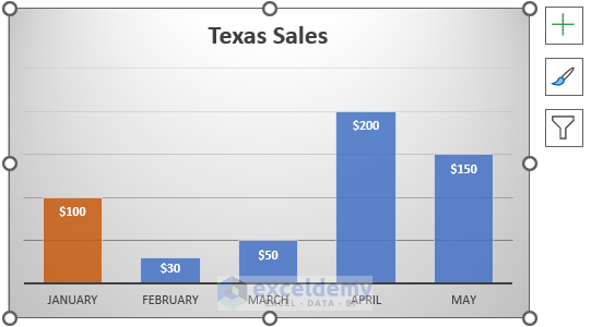
You will see the color of that column is changed to your selected column.
- Change the color of other columns of the chart in the same way.
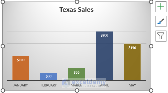
You can see my final chart.
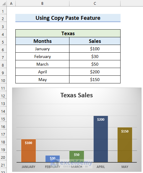
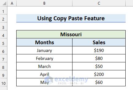
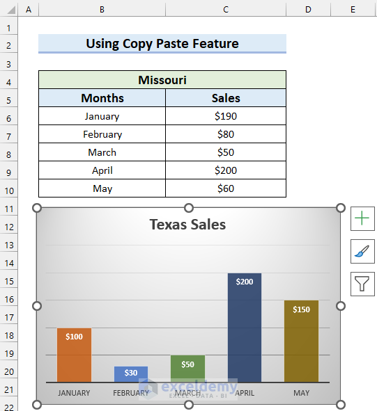
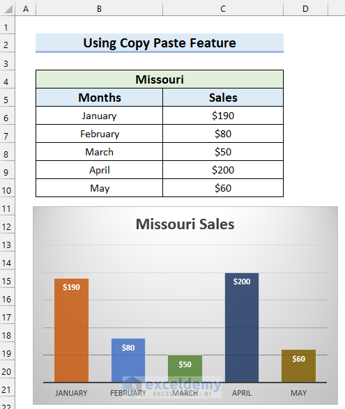
Insert the same chart for the Sales for Missouri and keep the chart colors consistent in Excel.
- Select the chart you inserted before.
- Copy the chart by pressing CTRL+C on your keyboard. CTRL+C is the keyboard shortcut for the copy feature.
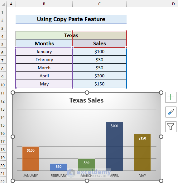
- Select the cell where you want to insert the chart. We selected cell B12.
- Press CTRL+V to paste the chart you copied before.
You will see the chart is copied with color and formatting.
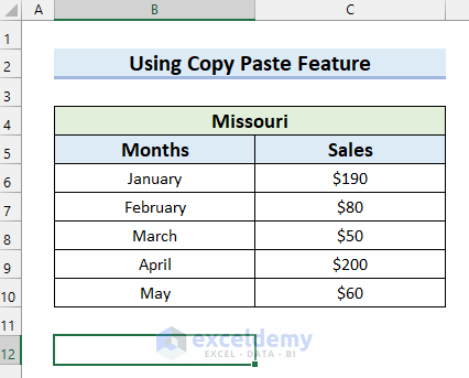
Select the data for this chart.
- Right-click on the chart.
- Select Select Data.
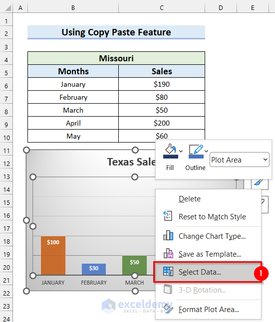
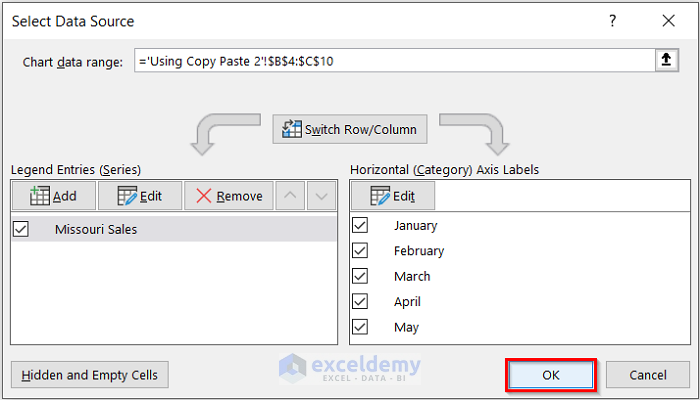
A dialog box named Select Data Source will appear.
- Click on the marked button to select the Chart data range.
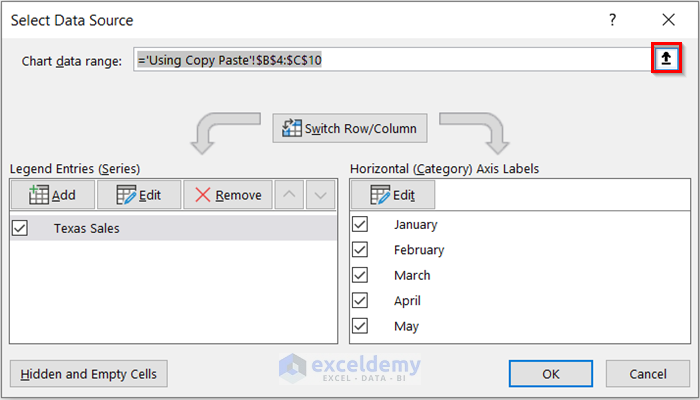
- Select the data range you want for this chart.
- Select the marked button to add the data range to your Select Data Source dialog box.
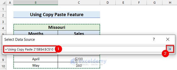
The data range is added to the dialog box.
- Select OK.
See that I have inserted an Excel chart for my dataset and kept the chart colors consistent.
Method 2 – Use of Save as Template Command
Steps:
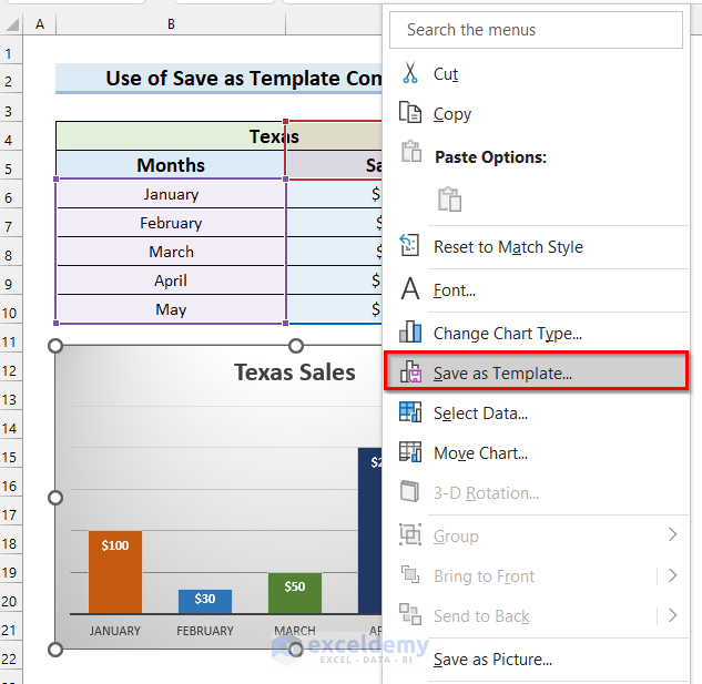
- Right-click on the chart.
- Select Save as Template.
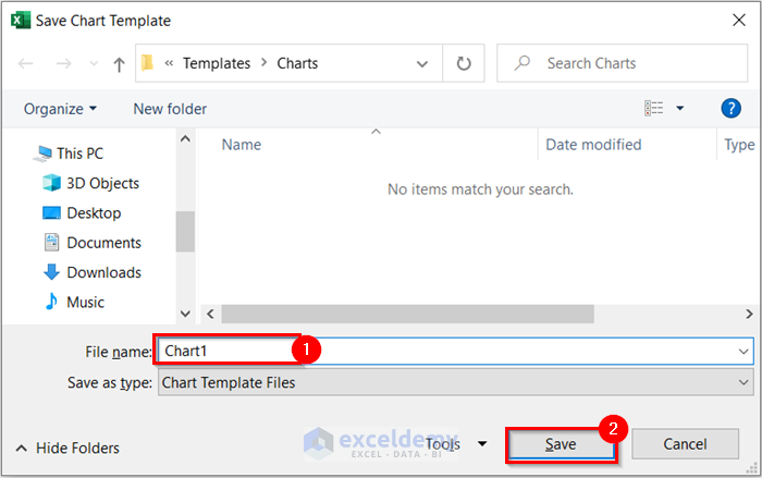
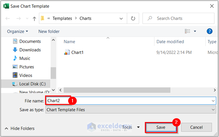
The Save Chart Template dialog box will appear.
- Write the File name. Here, I wrote mine as Chart1.
- Select Save.
The template will be saved and you will be able to use this template.
Insert this same chart for a new dataset and keep the color consistent.
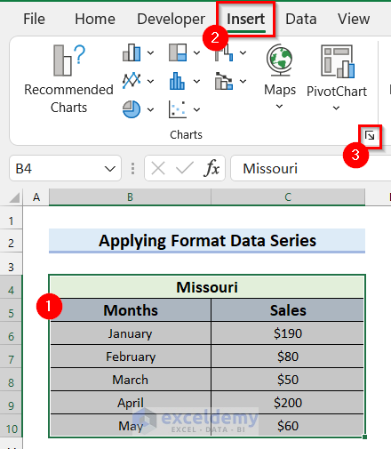
- Select the data range for the chart.
- Go to the Insert tab.
- Click on the marked button from the Charts group.

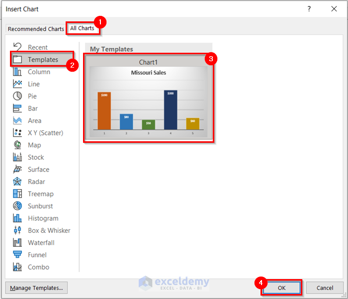
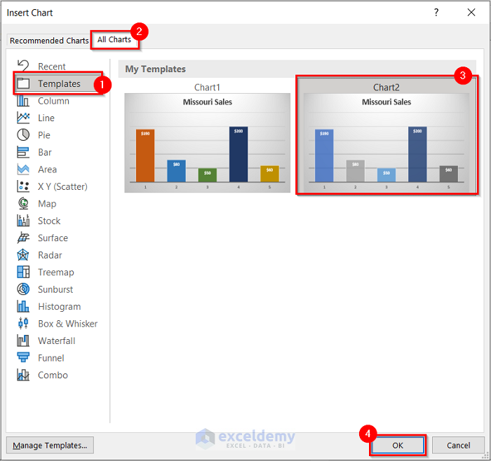
Insert Chart dialog box will appear.
- Go to the All Charts tab.
- Select Templates.
- Select the Template you created before.
- Select OK.
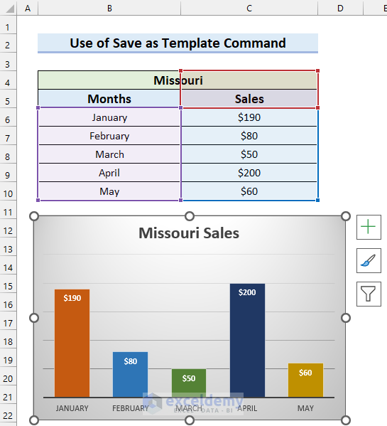
You will see that you have inserted an Excel chart and kept chart colors consistent.
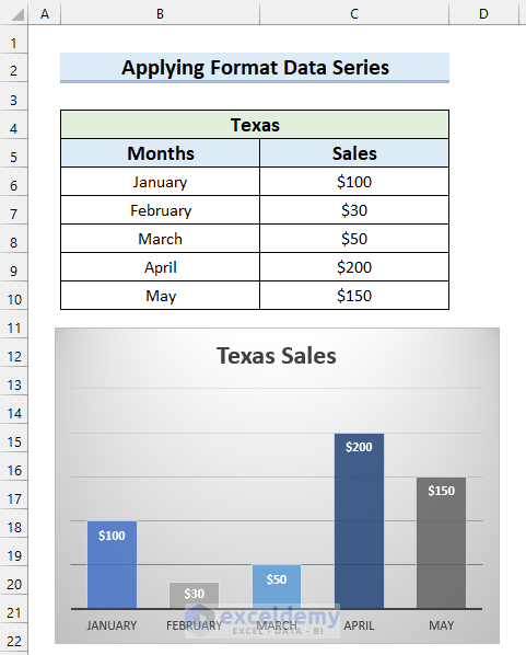
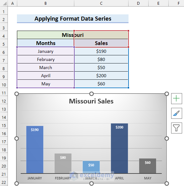
Method 3 – Applying Format Data Series Option to Keep Excel Chart Colors Consistent
Steps:
- Insert a chart and then format it by following the steps from Method-01.
- Right-click on any Column of the chart.
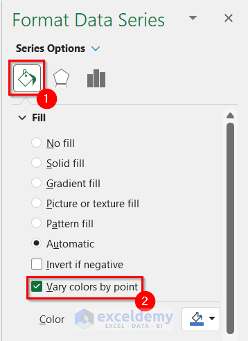
- Select Format Data Series.
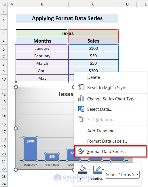
The Format Data Series will appear on the right side of the screen.
- Select the Fill & Line tab.
- Check the Vary colors by point option.
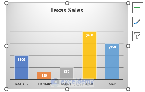
You will see the color of every column has changed and this gives the chart a better view and more meaning.
Change the color of the chart.
- Select the chart.
- Go to the Chart Design tab.
- Select Change Colors.
Here, a drop-down menu will appear.
- Select the color palette you want for your chart. We selected the marked color palette.
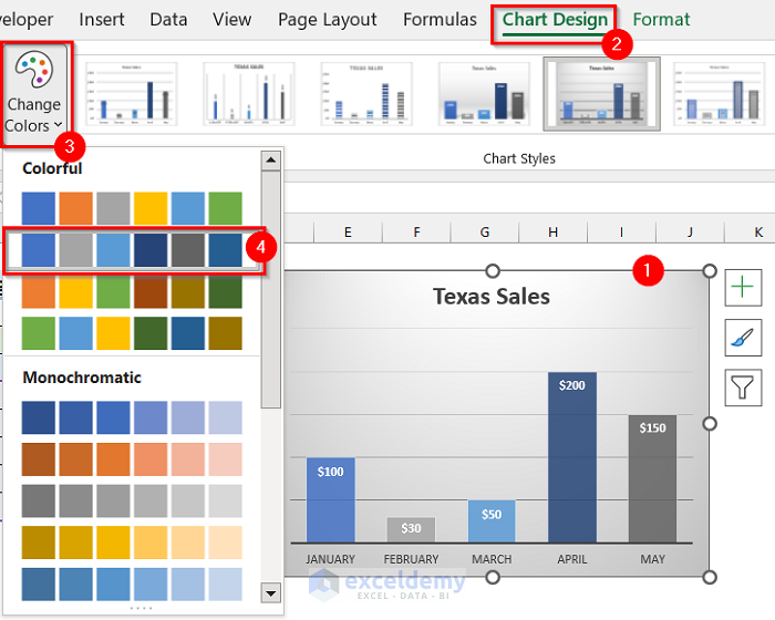
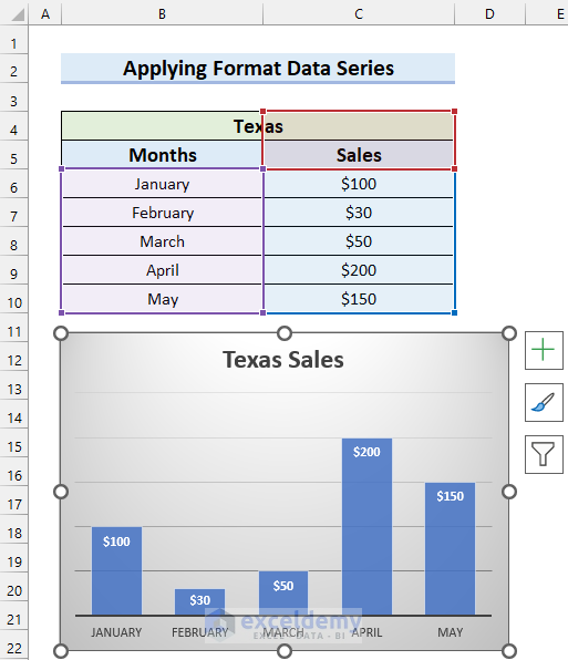
In the following picture, you can see my final chart.
Save this theme so that I can use this theme to keep chart colors consistent.
- Right-click on the chart.
- Select Save as Template.
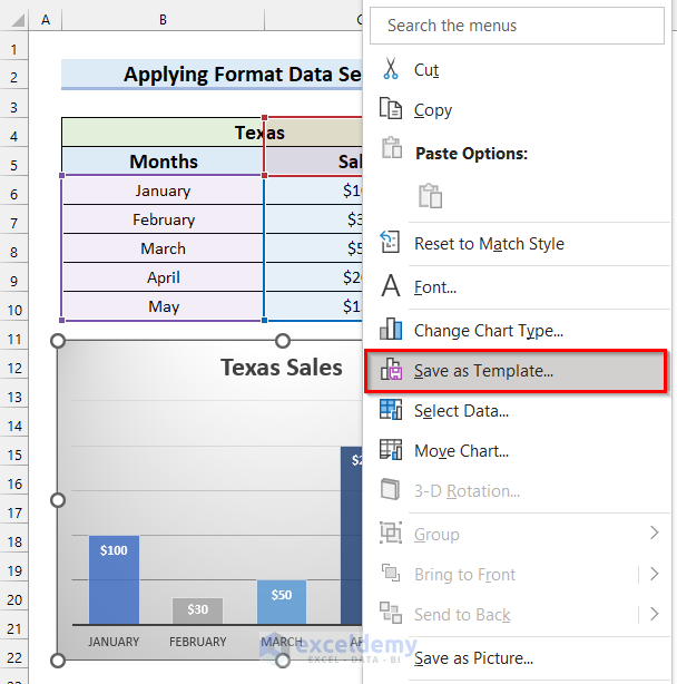
Save Chart Template dialog box will appear.
- Write the File name. Here, I wrote mine as Chart2.
- Select Save.
The template will be saved, and you will be able to use this template.
Insert this same chart for a new dataset and keep the color consistent.
- Select the data range for the chart.
- Go to the Insert tab.
- Click on the marked button from the Charts group.
The Insert Chart dialog box will appear.
- Go to the All Charts tab.
- Select Templates.
- Select the Template you created before.
- Select OK.
You will see that you have inserted an Excel chart and kept the chart color consistent.
Download Practice Workbook
Related Articles
- How to Make Excel Graphs Look Professional (15 Useful Tips)
- [Solved:] Vary Colors by Point Is Not Available in Excel
- How to Change the Chart Style to Style 8 (2 Easy Methods)

