Step-by-Step Procedures to Add Horizontal Bands in Excel Charts
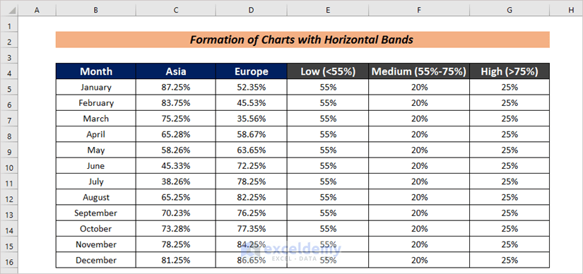
Step 1 – Create an Organized Dataset
- The first task is to have an organized dataset. We have arranged the consumer satisfaction of a product in Asia and Europe in different months throughout the year in Month, Asia and Europe.
- In this dataset, we have set 3 standards. Satisfaction value less than 55% will be considered as Low, between 55%-75% as Medium and more than 75% as High.
Step 2 – Generate an Excel Chart with Horizontal Bands
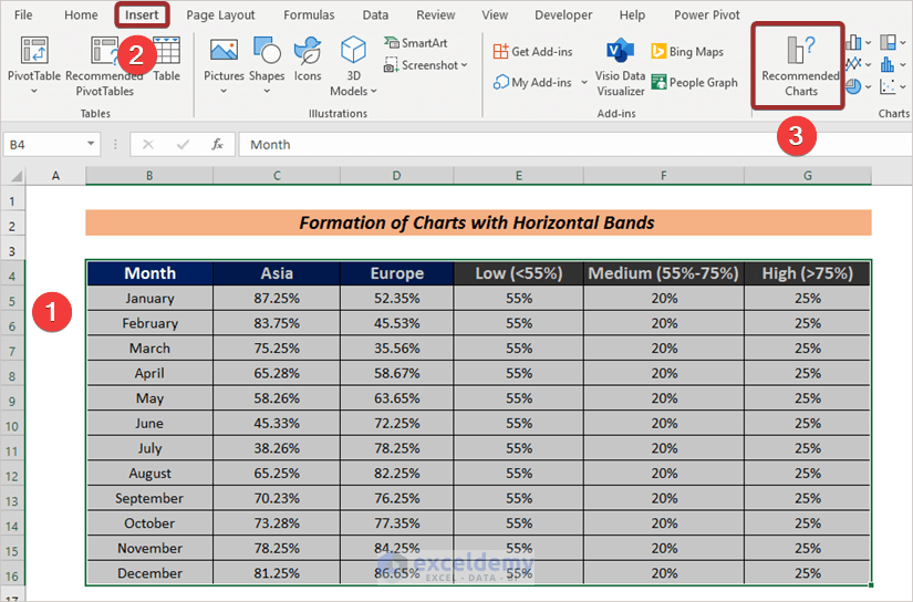
- Select the entire dataset.
- Go to Insert.
- From the ribbon, click on Recommended Charts.
In the Insert Chart wizard,
- Go to the All Charts
- Select Clustered Column – Line from the Combo options.
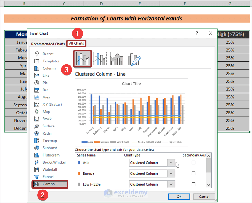
- Set series from Chart Type to define chart lines and bands.
We have set the value in the Asia and Europe columns as chart lines. To do this, click on the Chart Type drop-down from Asia and select Line with Markers.
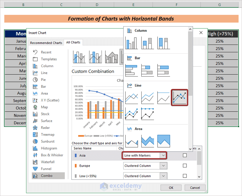
Follow the same procedure for Europe to show as a line chart.
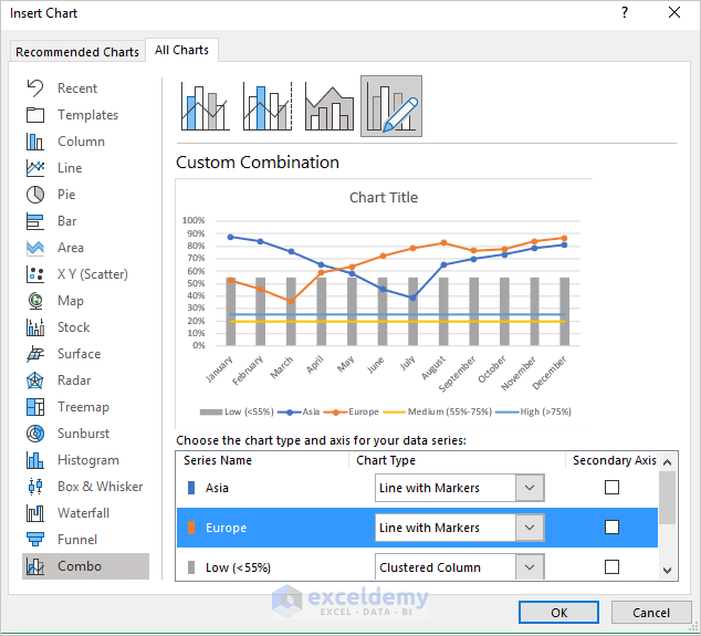
To define Low as a band, we have selected the Stacked column option from the Chart Type drop-down.
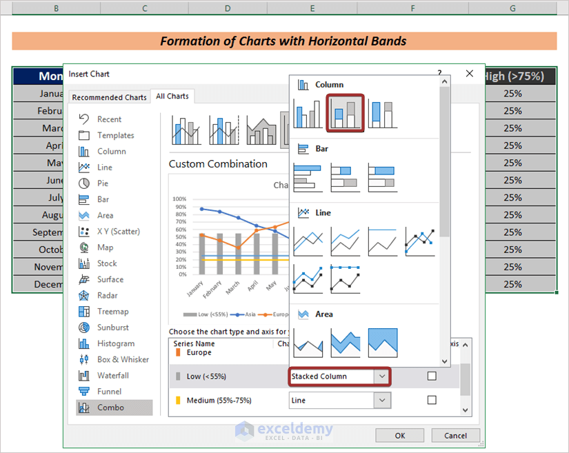
We have defined Medium and High as bands.
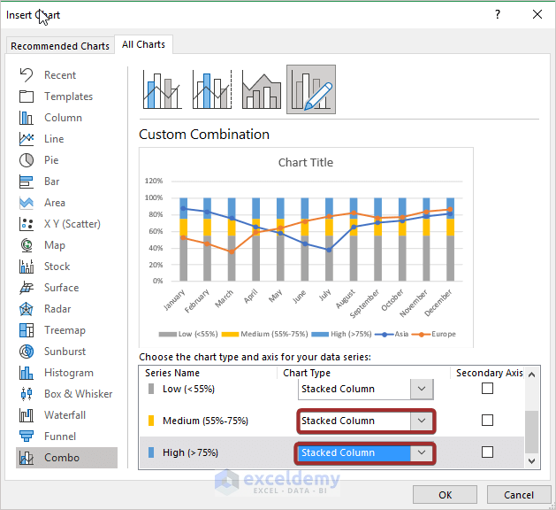
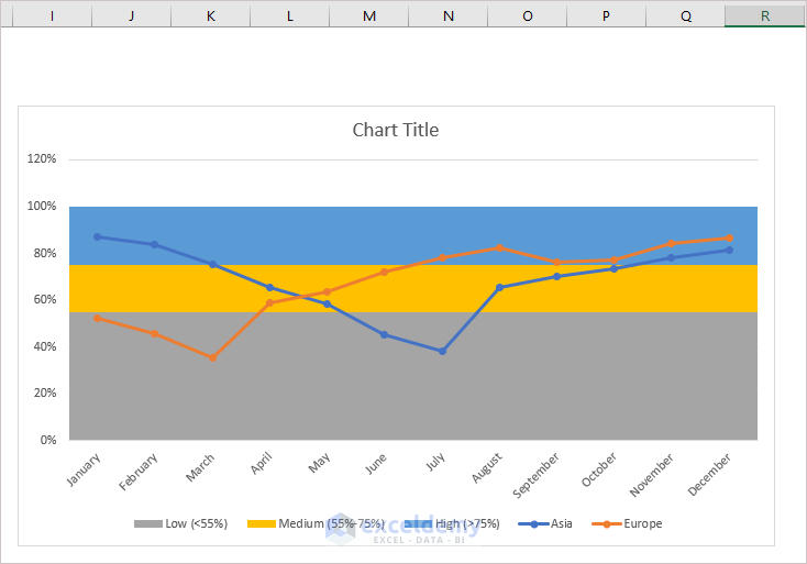
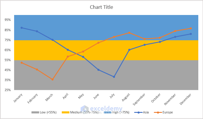
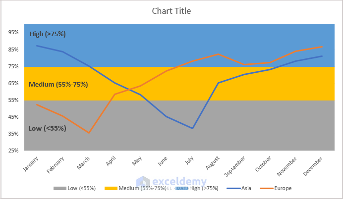
We have set an Excel chart with three horizontal bands.
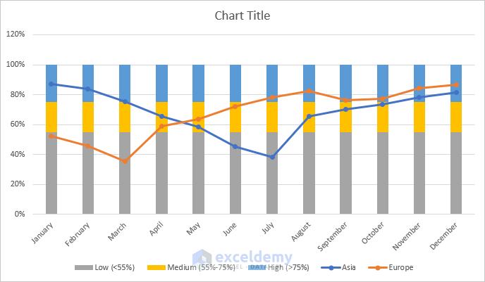
Remove the space between the bands.
- Place the cursor on the horizontal bands and right-click on the mouse.
- Choose Format Data Series…
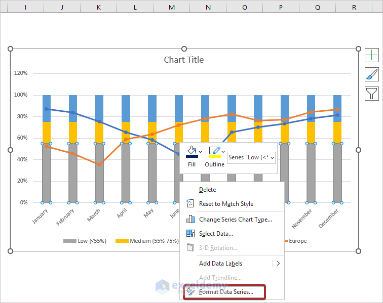
- Click on the Series Data tab.
- Input the Gap Width as 0%.
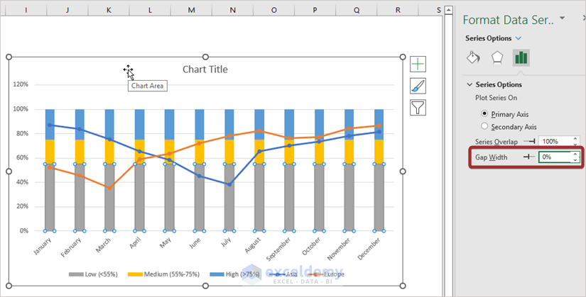
The result will be displayed as shown in the following image.
Step 3 – Modify Excel Charts with Horizontal Bands
You can set the axis value based on your maximum and minimum limits. For this:
- Click on the Vertical (Value) Axis.
- Click on Series Data.
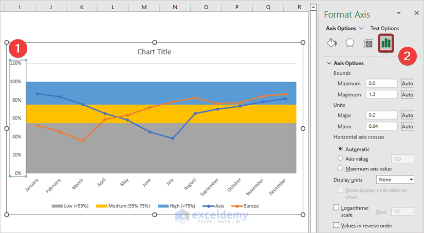
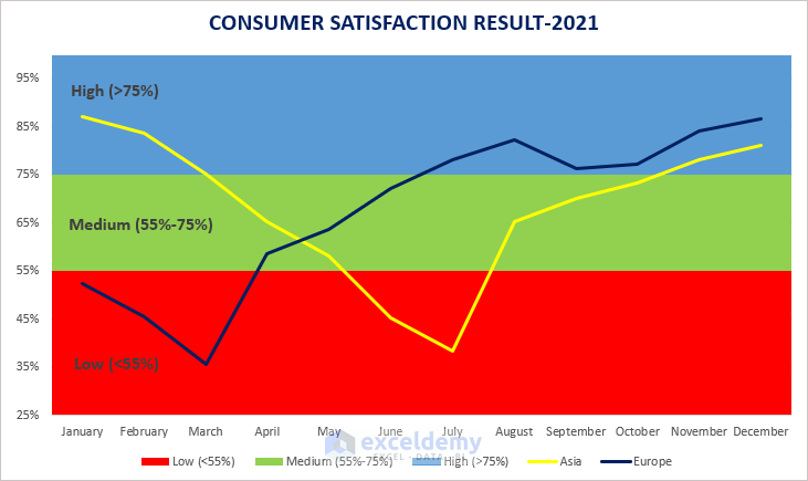
- Set the maximum and minimum range. For our chart, we have set 25 as Minimum and 0 as Maximum.
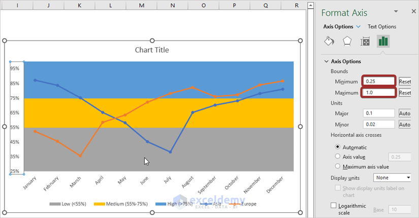
We can customize the vertical limit.
In order to set band labels:
- Right-click on a certain band.
- Go to Add Data Label from the Add Data Label option.
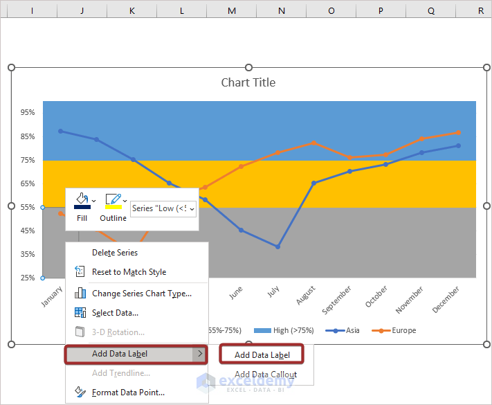
- Enter the band name.
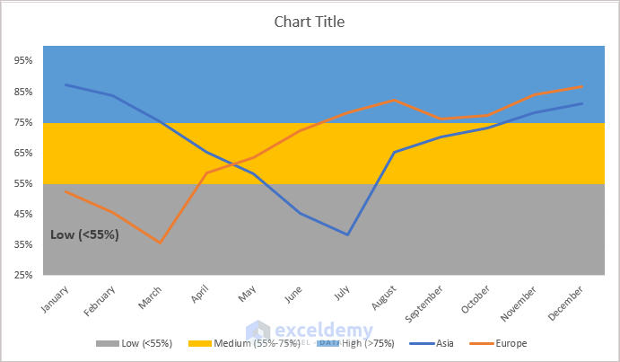
- You can name the other bands with the same procedure.
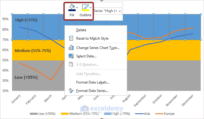
In order to customize the band color, right-click on the mouse and select color from Fill and Outline.
You can customize your chart based on your choice.
Read More: How to Change the Chart Style to Style 8
Download Practice Workbook
Related Articles
- How to Copy Chart Without Source Data and Retain Formatting in Excel
- How to Copy Chart in Excel Without Linking Data
- [Solved:] Vary Colors by Point Is Not Available in Excel

