Method 1- Using Chart Options
- Select Data:
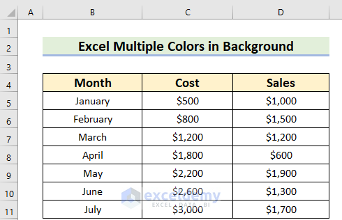
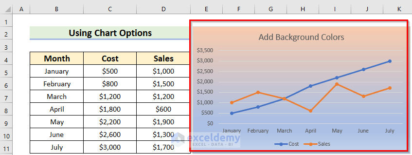
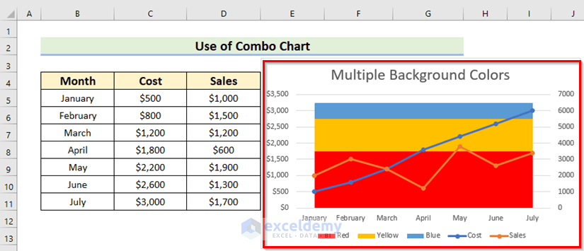
- Select the data you want to visualize in your chart. For example, let’s say we have a dataset with three columns: Month, Cost, and Sales. I’ve chosen the range B4:D11.
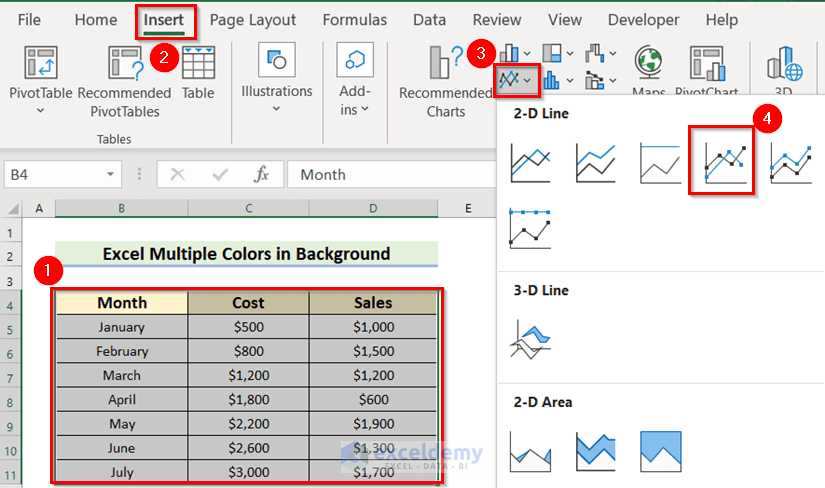
- Insert Chart:
- Go to the Insert tab in Excel.
- From the Charts group, select 2-D Line and then choose Line with Markers.
- Customize the chart features as needed.
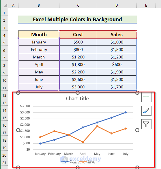
As a result, you will see an Excel chart with White background.
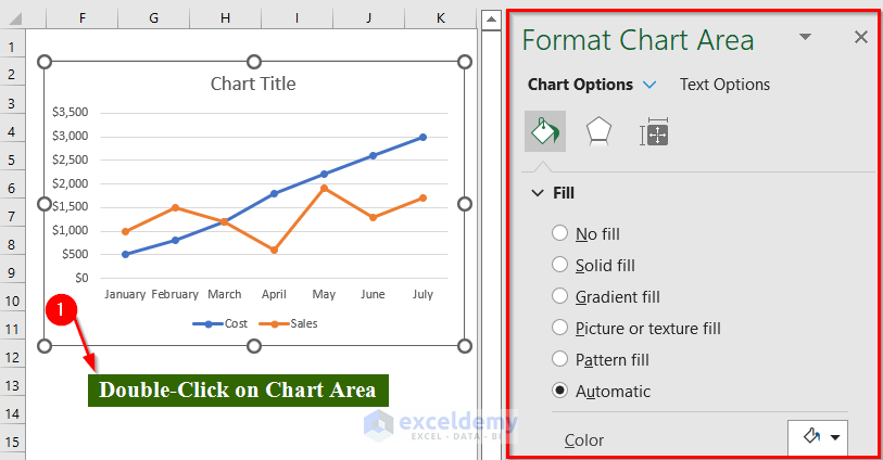
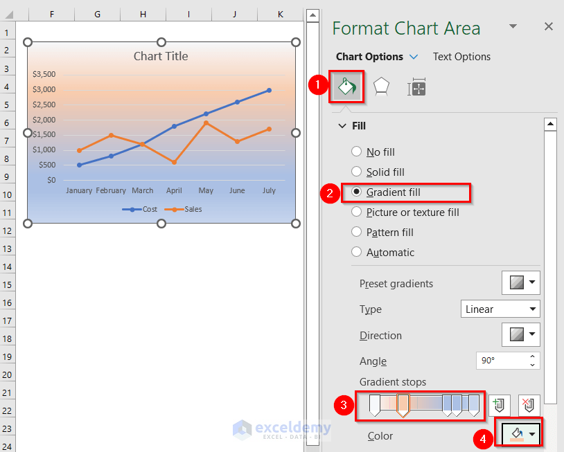
- Color the Background:
- Double-click on the chart area.
- In the Format Chart Area window (located at the right corner of the Excel sheet), navigate to Chart Options.
-
- Under Fill & Line, choose Gradient Fill.
- Adjust the gradient stops and select your preferred colors.
Your chart will now have a background with multiple colors.
Method 2 – Creating Threshold Lines
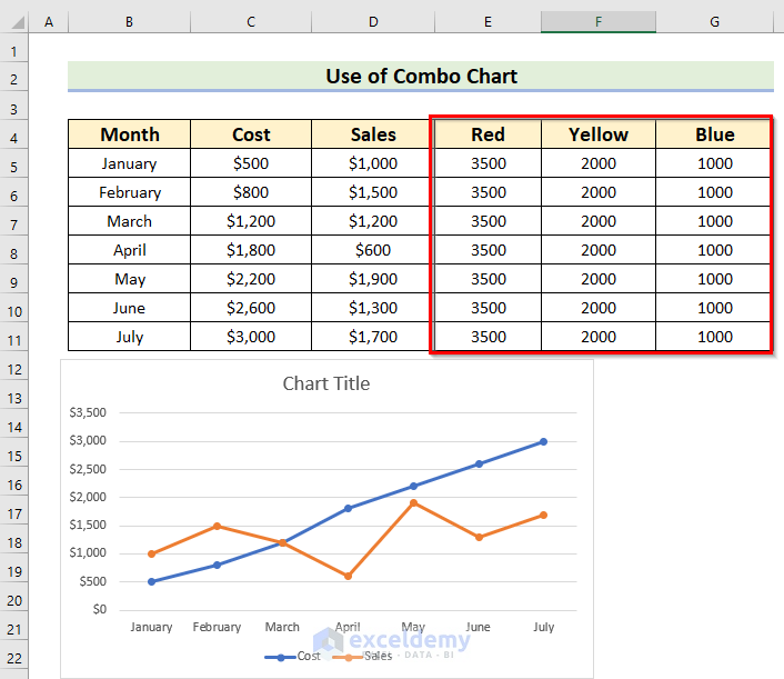
- Threshold Values:
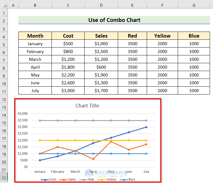
- Next to your chart data, write down threshold values based on the highest data point. These thresholds will determine the color range for your background.
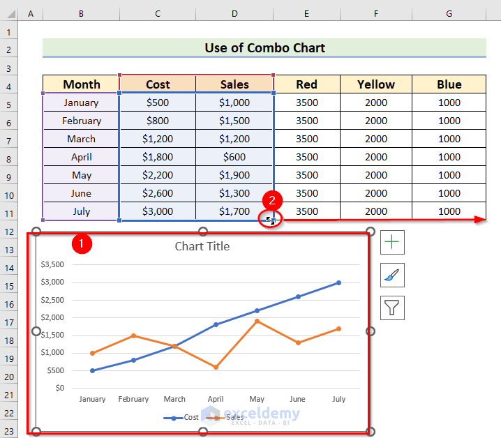
- Select the Chart:
- Highlight the chart.
- Drag Data Range:
- Drag the selected data range up to your color series. This will create additional lines on your chart.
As a result, you will see the following chart with your color series.
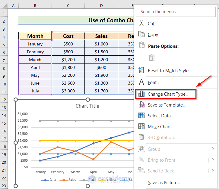
- Change Chart Type:
- Right-click on the chart and choose Change Chart Type from the Context Menu.
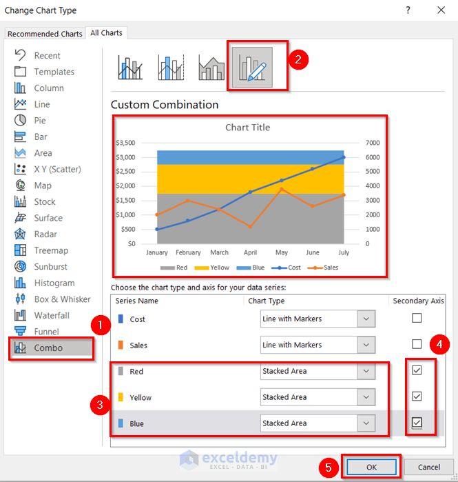
- In the Change Chart Type window, select Custom Combination from the Combo chart options. A Combo chart combines two or more chart types.
- Change the color series chart type to Stacked Area and mark the secondary axis.
- Press OK.
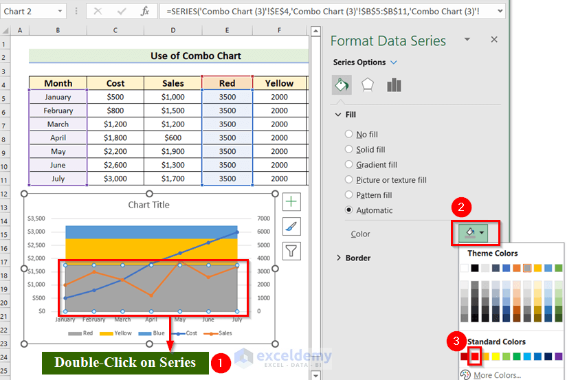
- Customize Colors:
- Double-click on the data series for colors.
- In the Format Data Series window, go to Fill & Line.
- Choose your preferred colors for each stacked area.
Similar Readings
- Change Chart Color Based on Value in Excel (2 Methods)
- How to Change the Chart Style to Style 8 (2 Easy Methods)
- How to Make Excel Graphs Look Professional (15 Useful Tips)
Method 3 – Applying Series Options
In this method, we’ll explore how to create an Excel chart with a background featuring multiple colors using series options. Follow the steps below:
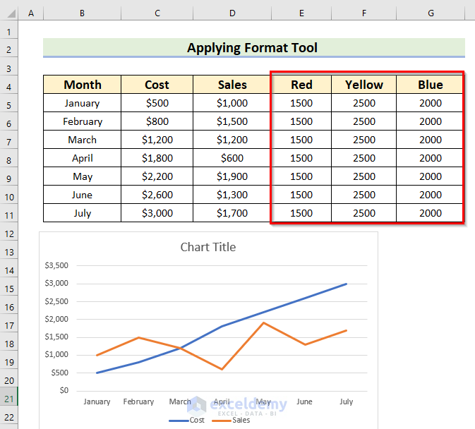
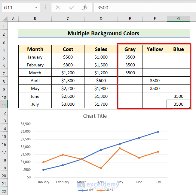
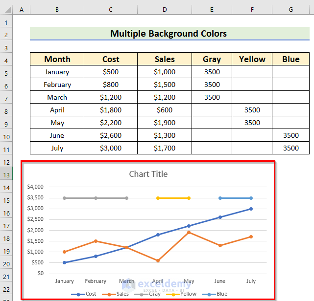
- Threshold Values:
- Write down the threshold values next to your chart data. These values should correspond to the highest data points. Keep the color range within the maximum value of your data.
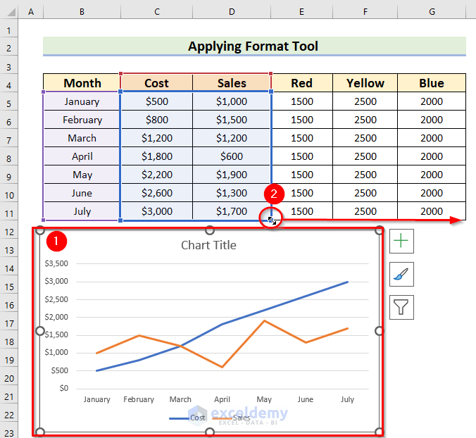
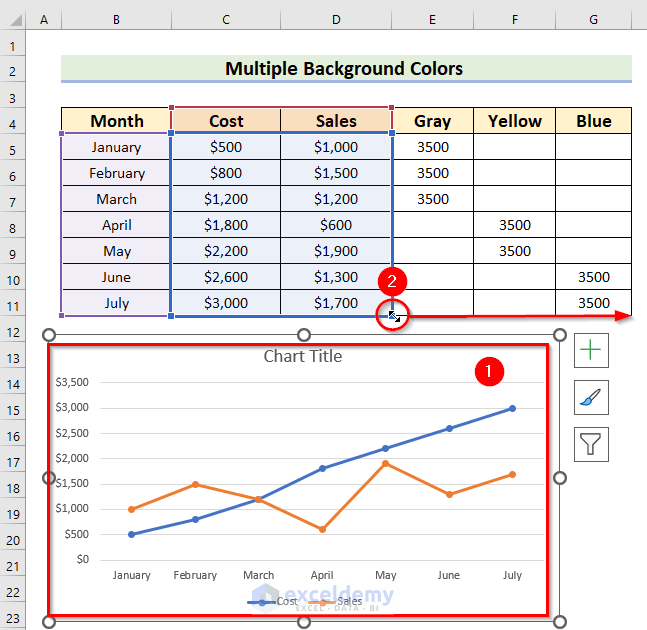
- Select the Chart:
- Click on your chart to select it.
- Include Color Series:
- Drag the selected data range up to include your color series in the chart.
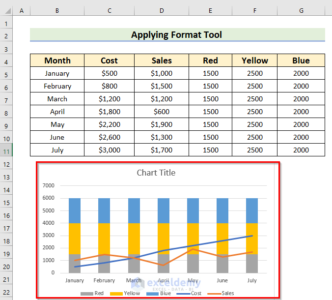
Your chart will now display the color series.
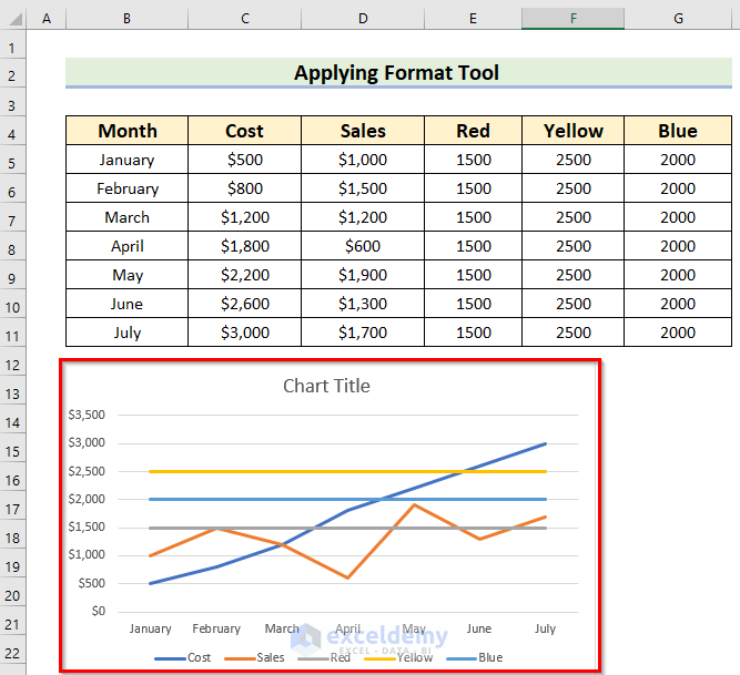
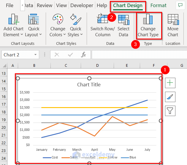
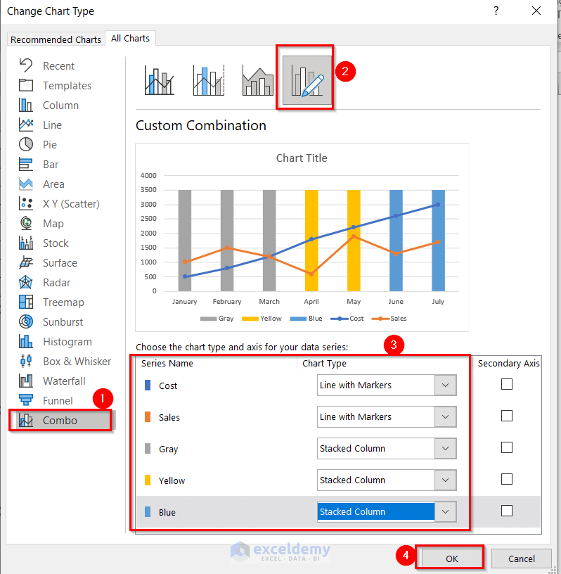
- Change Chart Type:
- After selecting the chart, two additional contextual tabs will appear: Chart Design and Format.
- From the Chart Design tab, choose Change Chart Type.
-
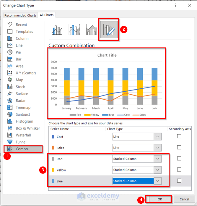
- In the Change Chart Type window, select Custom Combination from the Combo chart options. A Combo chart combines two or more chart types.
- Change the color series chart type to Stacked Column. You’ll see a preview immediately.
- Press OK.
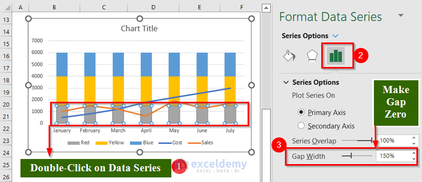
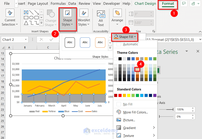
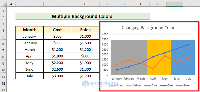
- Customize Colors:
- Double-click on the data series for colors.
- In the Format Data Series window, go to Series Options.
- Set the Gap Width to 0.
-
- Navigate to the Format tab and choose a light color for the shape fill.
-
- Repeat this process for other data series to achieve the desired color combination.
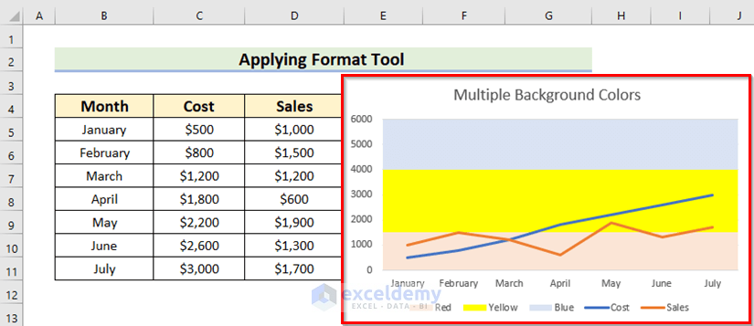
You will get the following chart with multiple colors in the background.
Read More: How to Change Series Color in Excel Chart (5 Quick Ways)
Charts with Multiple Colors at Vertical Positions in Background
Let’s create an Excel chart with a vertical color combination in the background. Follow these steps:
- Threshold Values:
- Write down the threshold values next to your chart data. These values should correspond to the highest data points. Keep the color range within the maximum value of your data.
- Select the Chart:
- Click on your chart to select it.
- Include Color Series:
- Drag the selected data range up to include your color series in the chart.
Your chart will now display the color series.
- Change Chart Type:
- To open the Change Chart Type window, follow the method-3 steps.
- From the Combo chart options, select Custom Combination. A Combo chart combines two or more chart types.
- Change the color series chart type to Stacked Column. You’ll see a preview immediately.
- Press OK.
- Customize Colors:
- Double-click on the data series for colors.
- In the Format Data Series window, go to Series Options.
- Set the Gap Width to 0.
- Navigate to the Format tab and choose a light color for the shape fill.
- Repeat this process for other data series to achieve the desired vertical color combination.
You will see the following chart with a vertical color combination in the background.
Read More: How to Keep Excel Chart Colors Consistent (3 Simple Ways)
Practice Section
Use the workbook to practice the methods on your own.
Download Practice Workbook
You can download the practice workbook from here:
Related Articles
- How to Add Horizontal Bands in Excel Charts (with Easy Steps)
- How to Copy Chart Without Source Data and Retain Formatting in Excel
- [Solved:] Vary Colors by Point Is Not Available in Excel
- How to Copy Chart in Excel Without Linking Data (with Easy Steps)


Multiple Colors at Vertical Positions example helped, thank you!
Hello,
You are welcome.
Regards
ExcelDemy