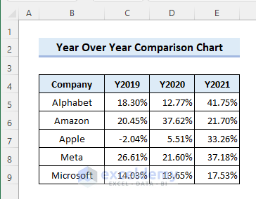
Consider the following dataset. It contains the annual growth of five U.S.-based companies. The letter Y before the years is used so that Excel considers them as headers and not part of another data row. Follow the methods below to create the year over year comparison chart using the dataset.
Method 1 – Year Over Year Comparison with a Line Chart
Steps
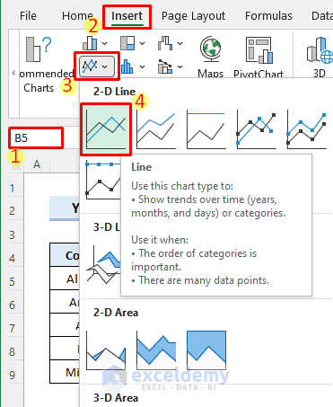
- Select a cell within the dataset so that Excel can detect the range to insert the Line Chart.
- Select Insert Line or Area Chart in the Insert tab, choose 2-D Line, then pick Line.
- You will get a chart. You can click on the Chart Title to rename it.
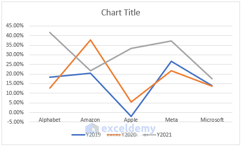
- The chart is showing the trend of growth of each year for the companies, which is confusing.
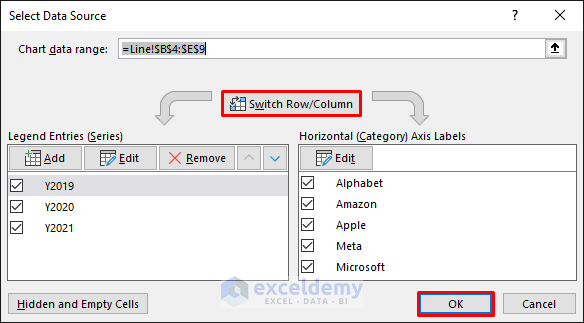
- Right-click on the chart and click on Select Data.
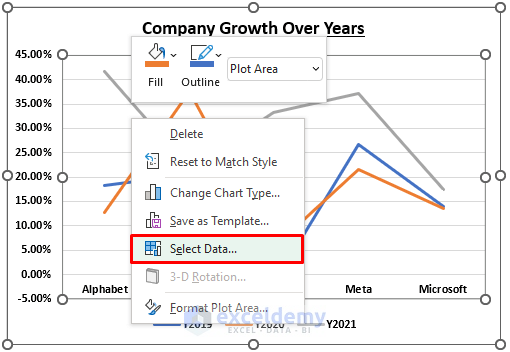
- Click on Switch Row/Column and select OK.
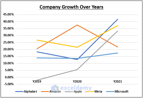
- The chart will look as follows.
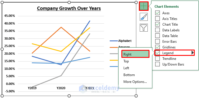
- Move the Legend in the Chart Elements tab.
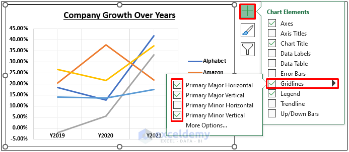
- You can add or remove gridlines from the chart by clicking on the Gridlines checkbox.
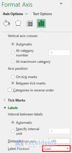
- The horizontal axis is not aligned correctly. Right-click on the axis and click on Format Axis.
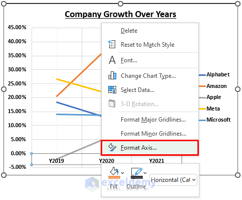
- Select the Label Position to Low from the Format Axis pane.
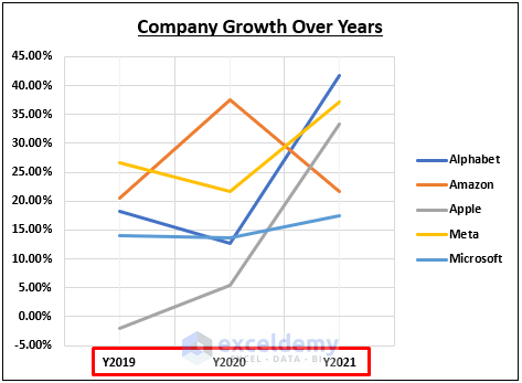
- The axis will be adjusted as follows.
Read More: How to Create Quarterly Comparison Chart in Excel
Method 2 – Year Over Year Comparison with a Column Chart
Steps:
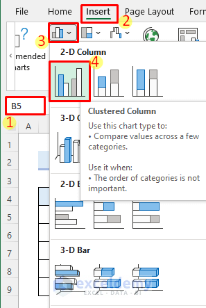
- Click anywhere in the dataset or select the entire dataset.
- Go to the Insert tab, select Insert Column or Bar Chart, choose 2-D Column, and pick Clustered Column.
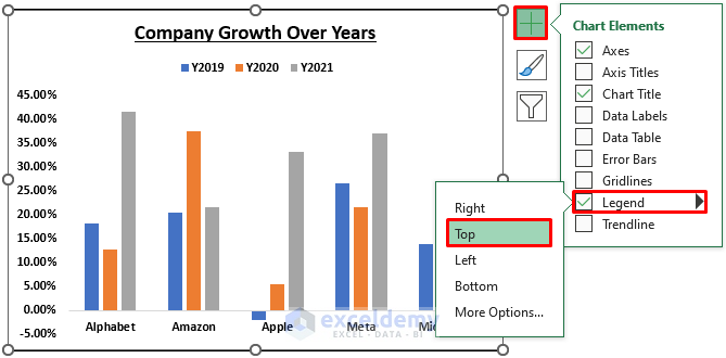
- The column chart will be inserted. Click on the Chart Title to edit it.
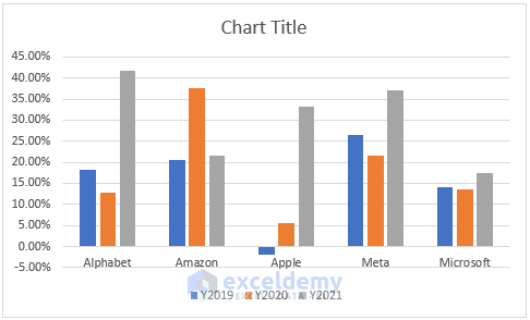
- Click on the Chart Elements menu and select Legend, then pick Top.
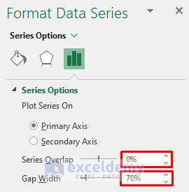
- Select any column in the chart and click on Format Data Series.
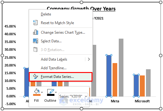
- Put the Series Overlap as 0% and change the Gap Width to 70% from the Format Data Series pane.
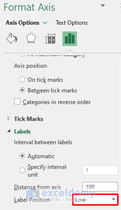
- Right-click on the horizontal axis and select Format Axis.
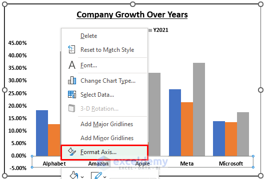
- Change the Label Position to Low from the Format Axis pane.
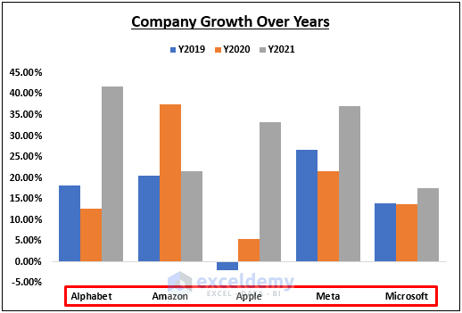
- You will see the following result.
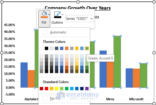
- You can right-click on any column and pick a Fill color for the corresponding data series.
Read More: Side-by-Side Comparison Chart in Excel
Method 3 – Year Over Year Comparison with a Bar Chart
Steps
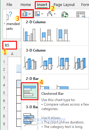
- Select the dataset.
- Go to Insert Column or Bar Chart, select 2-D Bar, and pick a Clustered Bar.
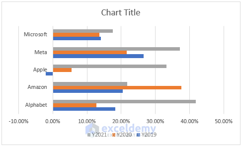
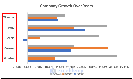
- You will get the following result. You can change the Chart Title by clicking on it.
- Right-click on the vertical axis and select Format Axis.
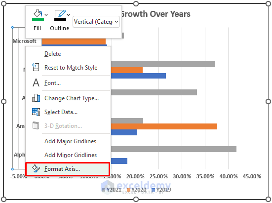
- Change the Label Position to Low from the Format Axis pane.
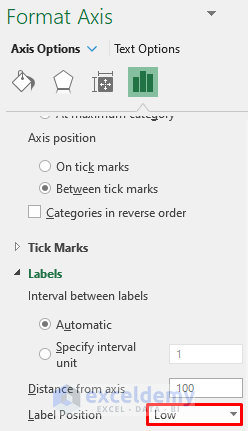
- The axis will be aligned properly.
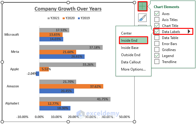
- Check the Data Labels checkbox from the Chart Elements menu.
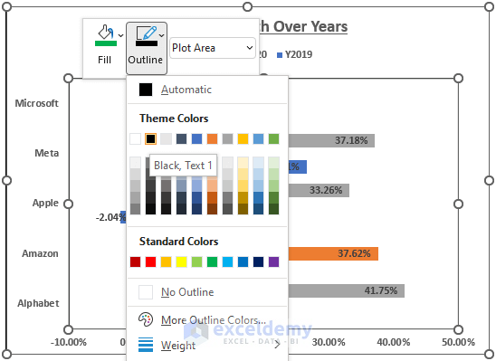
- Right-click on the plot area and choose an outline color.
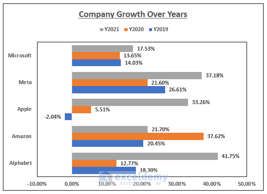
- The chart will look as follows.
Read More: How to Create Month-to-Month Comparison Chart in Excel
Method 4 – Year Over Year Comparison with a Pivot Chart
Steps
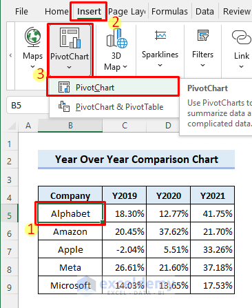
- Click anywhere in the dataset.
- Select Insert and choose PivotChart.
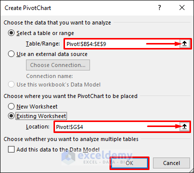
- Enter the location where you want to insert the chart and click OK.
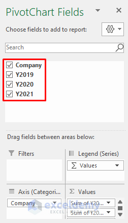
- A blank PivotTable and a blank PivotChart will be inserted. Check the checkboxes for all fields in the PivotChart Fields pane.
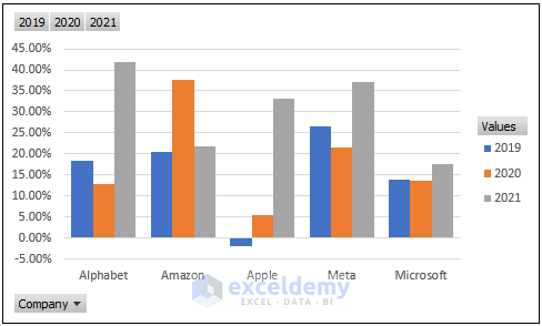
- Change some formatting in the PivotTable and the PivotChart. You will get something like the following result.
Read More: How to Create Weekly Comparison Chart in Excel
Things to Remember
- You must click on the charts to access the editing tools.
- Make sure to format the years properly so that Excel considers them as headings.
Download the Practice Workbook
You can download the practice workbook from the download button below.
Related Articles
<< Go Back to Comparison Chart in Excel | Excel Charts | Learn Excel
Get FREE Advanced Excel Exercises with Solutions!
