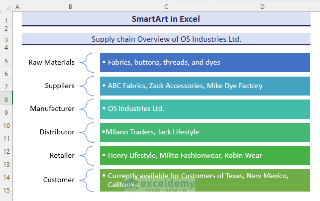
OS Industries Ltd manufactures Men’s Shirts and sells in Texas, California, and New Mexico. The supply chain is showcased below with SmartArt.
 xtalign=”left”]
[/wpsm_box]
xtalign=”left”]
[/wpsm_box]
What Is a SmartArt Graphic?
SmartArt is available in MS Word and PowerPoint, as well. It allows you to create diagrams, charts, layouts, or other visual elements.
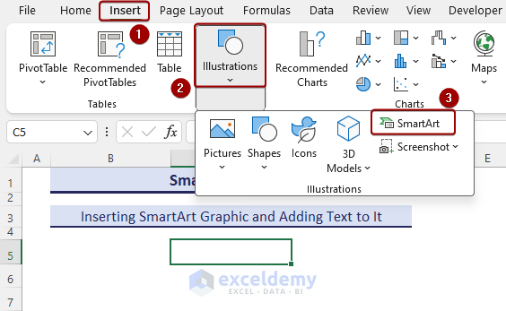
How to Insert a SmartArt Graphic and Add Text to It
- To display the SmartArt command, go to Insert => Illustrations => SmartArt.
- Select All => Vertical Process => OK.
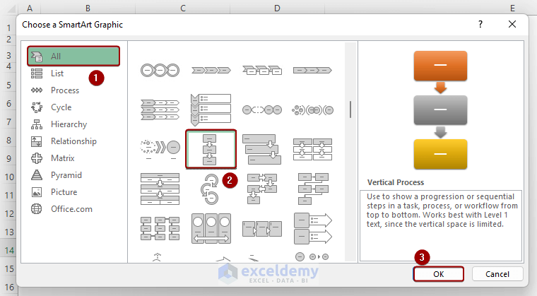
The Vertical Process SmartArt Graphic is displayed.
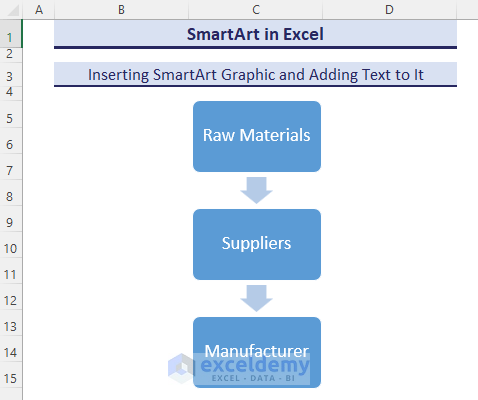
- Enter Raw Materials in the first shape:
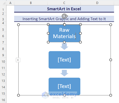
- Edit Suppliers and Manufacturer in the 2nd and 3rd shapes.
This is the output.
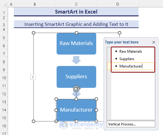
How to Use the Text Pane
- Click the Arrow button in the Vertical Process SmartArt to display the Text Pane.
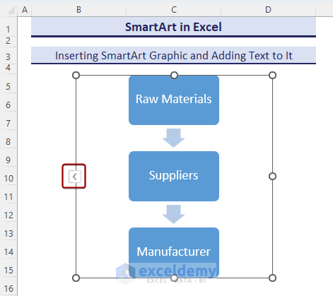
The Text Pane updates automatically based on the text entered in the shapes.
How to Format SmartArt Graphics in Excel
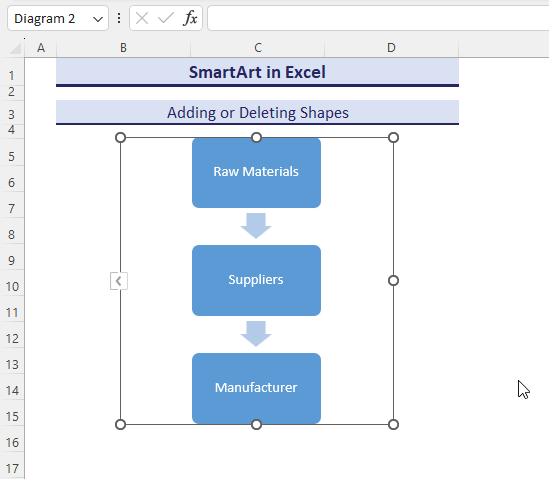
1. Add or Delete Shapes in Excel SmartArt Graphic
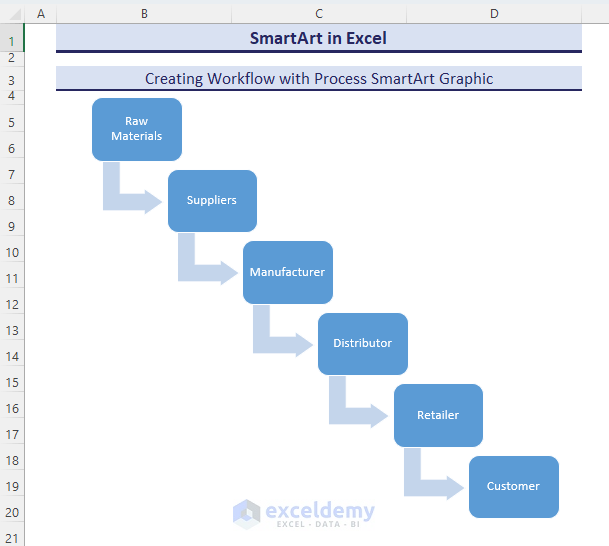
To see the supply chain of a product:
- Add “Distributor”, “Retailer” and “Customer” in the Text Pane of the Vertical Process SmartArt.
- New shapes will automatically be inserted.
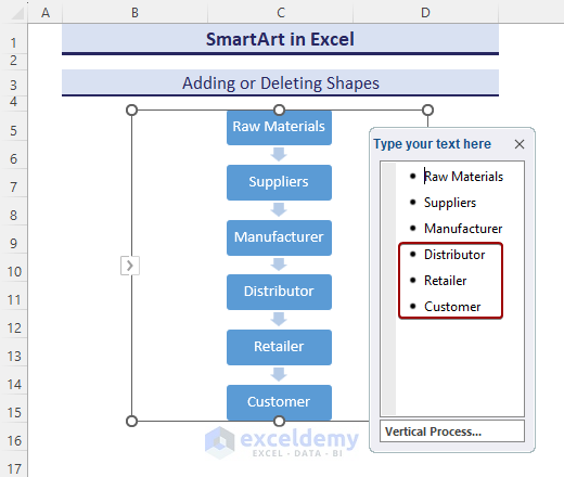
Observe the GIF:
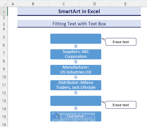
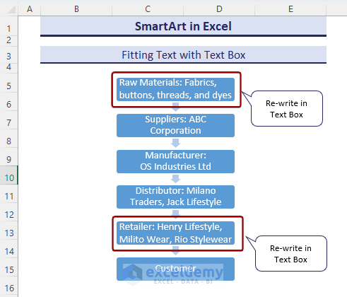
2. Fit Your Text
- Use a Text Box instead of a shape to fit text.
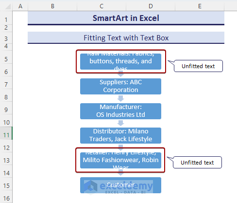
- The shape text of 1st and 5th shapes was deleted.
- To insert a Text Box shape, select Insert => Illustrations => Shapes => Text Box.
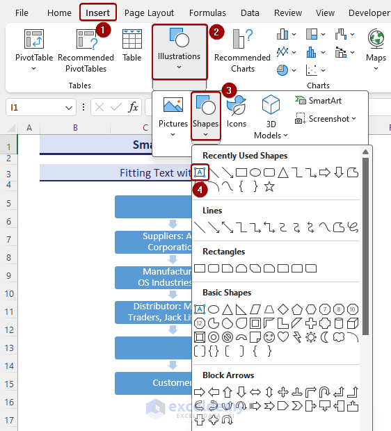
- Enter the text in the Text Box and place it over the SmartArt shape.
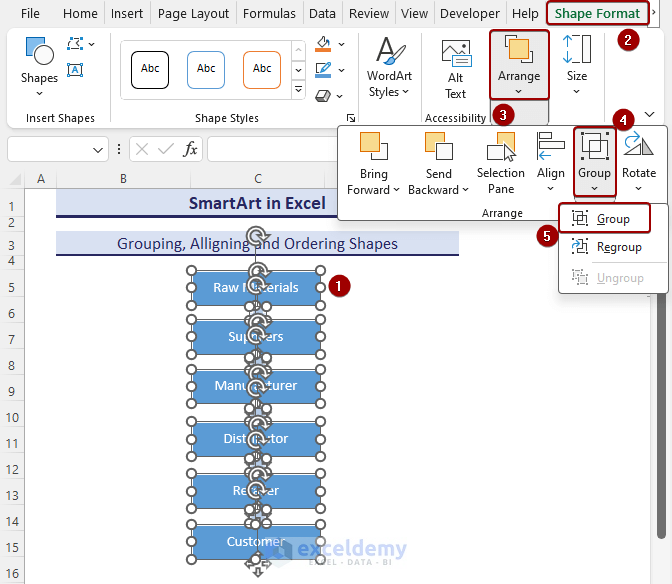
3. Use Multiple Shapes (group, align)
- Select shapes one by one by pressing Ctrl and Left-Clicking .
- Go to Shape Format => Arrange => Align=> Align Center.
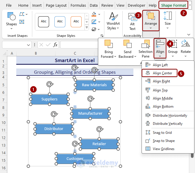
- If shapes are ungrouped, go to Shape Format => Arrange => Group => Group.
Shapes are center-aligned and grouped.
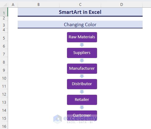
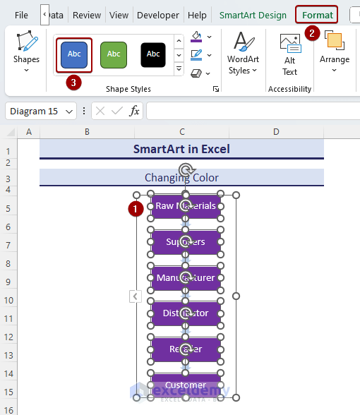
4. Change the Color of SmartArt Graphic in Excel
- Select Format => Shape Fill => Purple (color box).
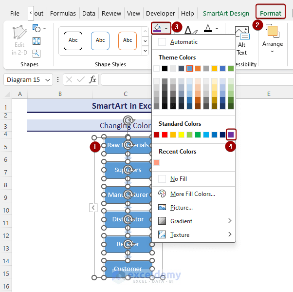 You will see purple-colored shapes.
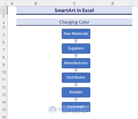
5. Apply Styles to SmartArt Graphic
Change the Purple-colored shapes to Blue, Accent 5.
- Click Format => Shape Styles => Color Fill-Blue, Accent 5.
This is the output.
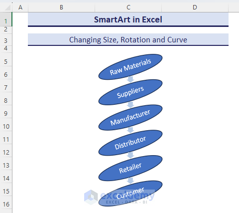
6. Change the Size, Rotation and Curve of SmartArt Graphic
- Select all rectangular shapes by pressing the Ctrl key and selecting them one by one.
- To choose the Oval shape, click Format => Change Shape => Oval (Icon).
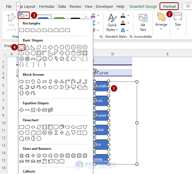
Rectangular shapes are converted into Oval shapes.
- Click Rotate and drag.
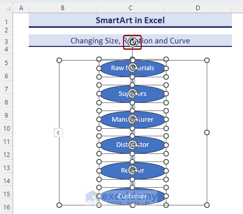
This is the output.
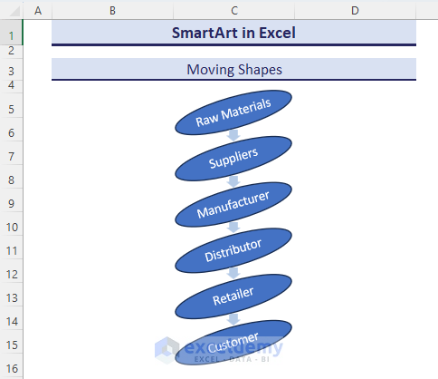
7. Move Shapes in an Excel SmartArt Graphic
There is a mistake in the workflow: the Customer is placed before the Retailer. To move the shapes:
- Select Customer.
- Click SmartArt Design => Move Down.
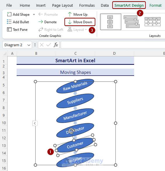
- The correct sequence is displayed: Raw Materials > Suppliers > Manufacturer > Distributor > Retailer > Customer.
What Are the Different Types of SmartArt Graphics Available in Excel & How to Use Them?
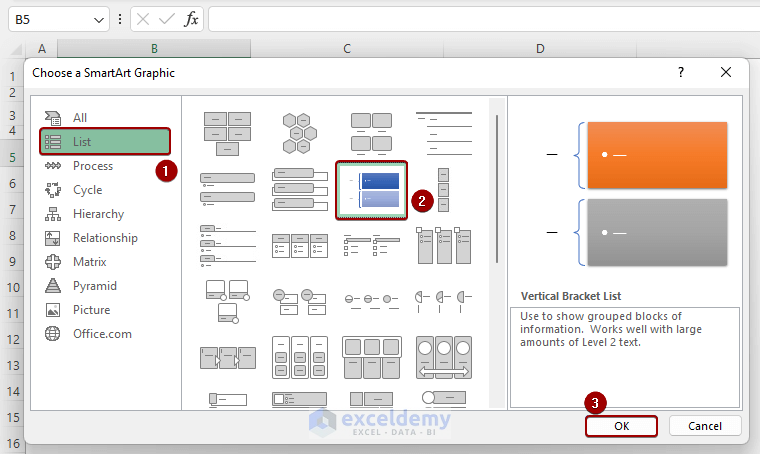
i) List SmartArt Graphic
The List SmartArt type can be used for basic sequence or hierarchical lists.
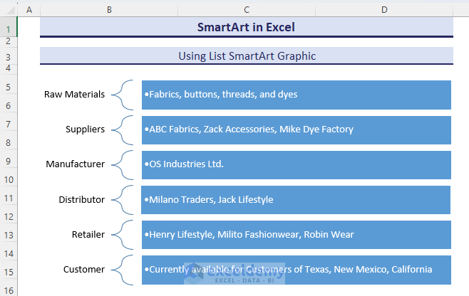
Create a flow chart of the supply chain management with details:
- Select List => Vertical Bracket List => OK.
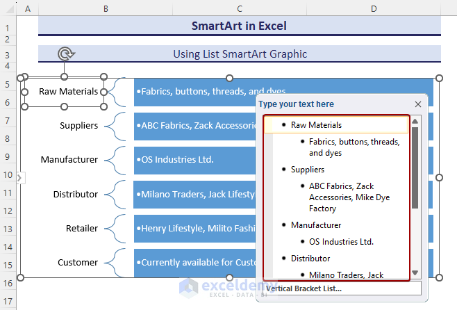
- Click the Arrow button in the Vertical Bracket List.
- In the Text Pane, edit the texts.
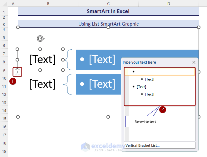
- Enter data.
This is the output.
ii) Process SmartArt Graphic
The Process SmartArt Graphic explains a series of steps, workflow, or stages.
How to Create a Workflow Chart with a Process Map Chart
- Select Process => Step Down Process => OK.
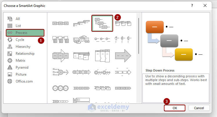
This is the output.
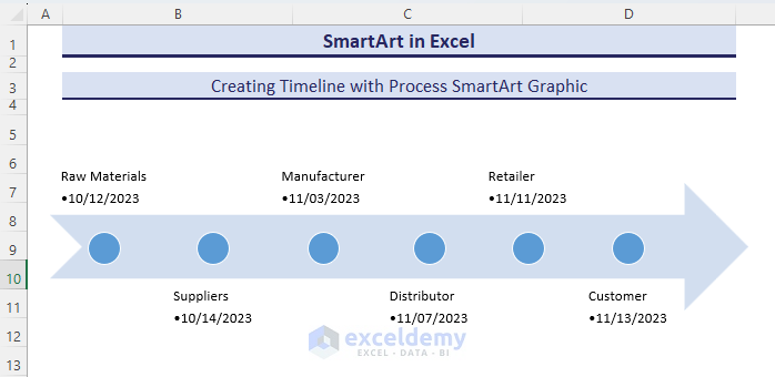
How to Develop a Timeline with a Process Map Chart
- Select Process => Basic Timeline => OK.
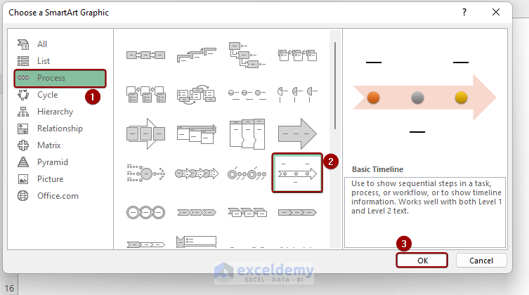
This is the output.
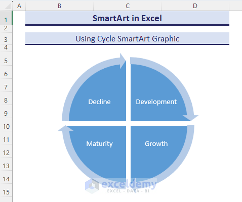
iii) Cycle SmartArt Graphic
The Cycle SmartArt represents a procedure with repetitions.
To showcase the stages of the business cycle or product life cycle:
- Select Cycle => Segmented Cycle => OK.
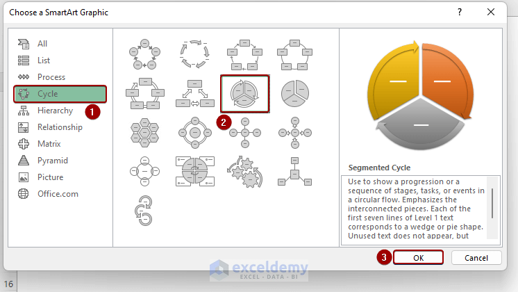
This is the output.
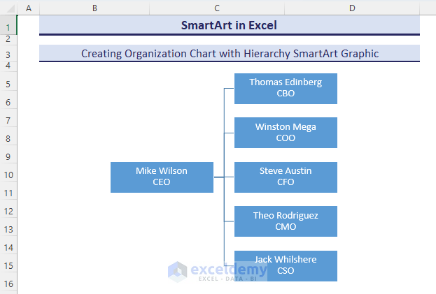
iv) Hierarchy SmartArt Graphic
The Hierarchy SmartArt graphic explains the relationship in a hierarchical structure.
How to Create Organizational Charts with Hierarchy
To showcase the top management:
- Select Hierarchy => Horizontal Organization Chart => OK.
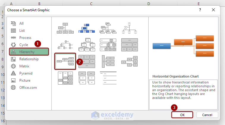
This is the output.
Read More: Hierarchy in Excel
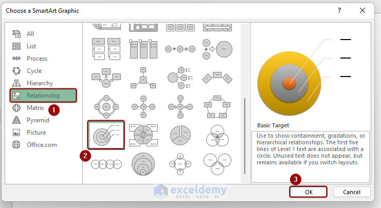
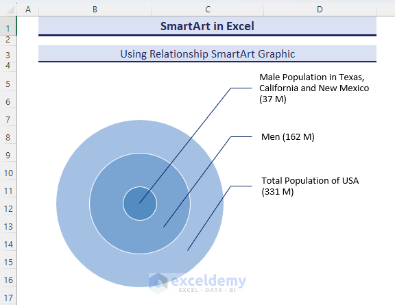
v) Relationship SmartArt Graphic
The Relationship SmartArt displays relationships and connections among entities or elements.
The Total Population in the USA is 331 Million. 162 Million are men. The Male population in Texas, California, and New Mexico is 37 Million: they are the target customer of OS Industries Ltd.
- Select Relationship => Basic Target => OK.
This is the output.
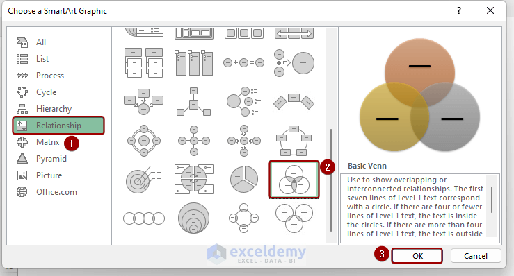
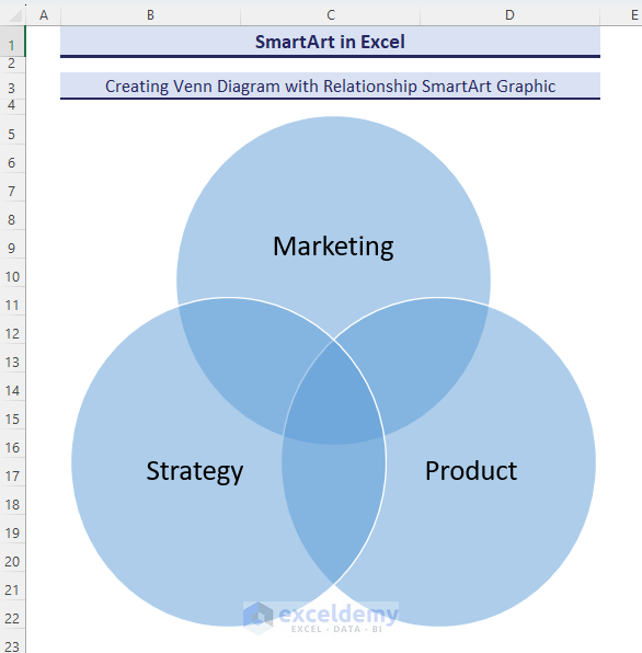
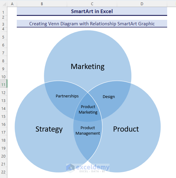
How to Create a Venn Diagram with Relation SmartArt Graphic
- Select Relationship => Basic Venn => OK.
This is the output.
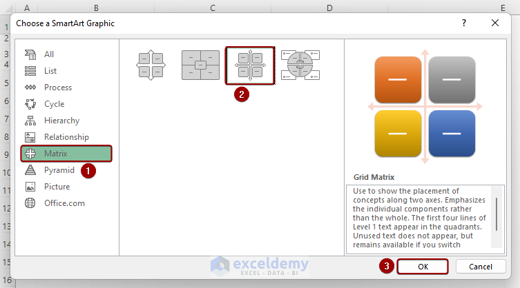
vi) Matrix SmartArt Graphic
OS Industries Ltd. is launching a new product. Considering the Ansoff Growth Matrix:
- Select Matrix => Grid Matrix => OK.
This is the output.
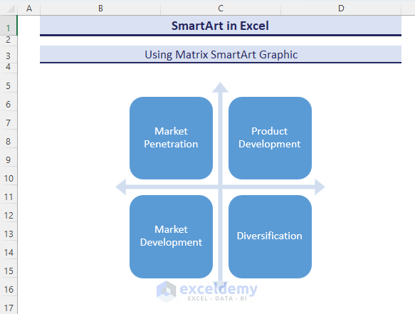
- Additional information was provided:
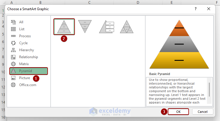
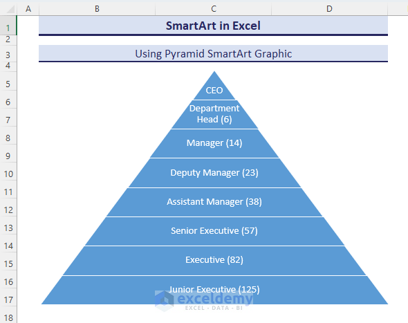
vii) Pyramid SmartArt Graphic
Show the company hierarchical employee structure.
- Select Pyramid => Basic Pyramid => OK.
This is the output.
viii) Picture SmartArt Graphic
To see how the Customer gets the product from the Manufacturer:
- Click Insert => Illustrations => SmartArt.
- Select Picture => Radical Picture List => OK.
- Edit the text in the Text Pane.
- Insert images from the local drive.
What Are the Advanced Applications of SmartArt Graphic in Excel?
How to Use SmartArt To Present Financial Highlights
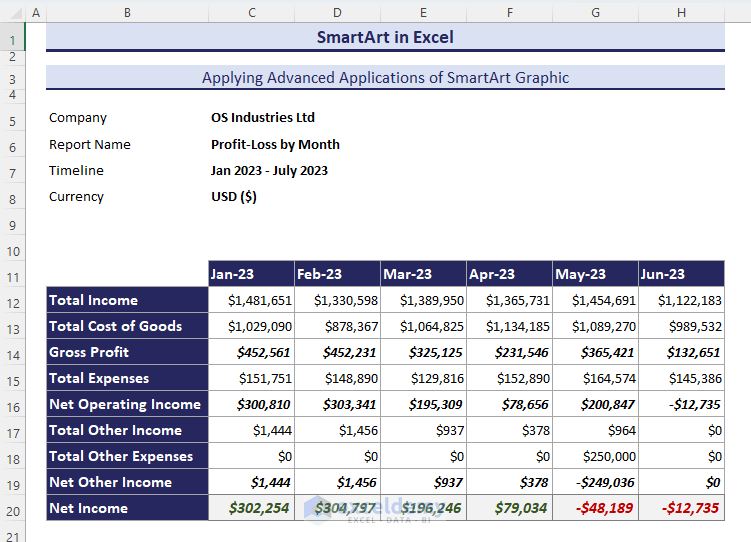
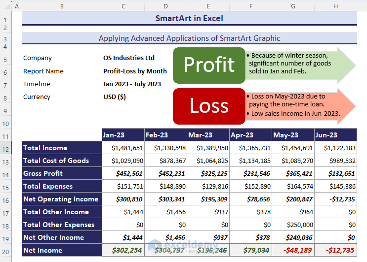
The image below showcases financial data of OS Industries Ltd from January-2023 to July-2023.
To display financial highlights with a SmartArt graphic.
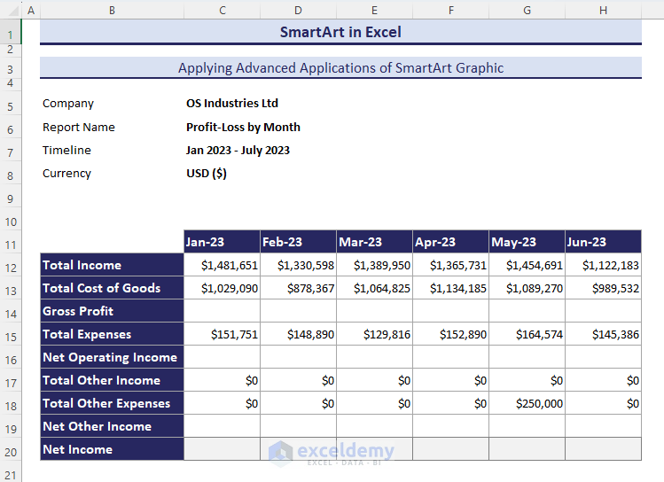
- Determine the “Gross Profit”, “Net Operating Income”, “Net Other Income” and “Net Income”.
Add the SmartArt graphic.
- Go to Insert => Illustrations => SmartArt.
- The Choose a SmartArt Graphic dialog box appears.
- Select List => Vertical Arrow List => OK.
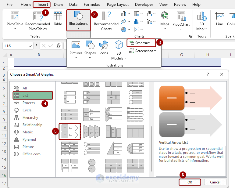
- Add data and edit the Vertical Arrow List.
The output showcases financial highlights.
What Are the Advantages of Using Excel SmartArt Graphic?
- Visual Representation: Presenting information in an organized and structured manner.
- Effective Communication: Enhancing readability.
- Fluent Storytelling: Illustrating step-by-step process.
- Professional Look: Professional and visually appealing appearance.
- Focus on Key Points: Highlighting trends and patterns and drawing attention to key points.
- Consistency Across Documents: Creating a connective and recognizable visual identity.
- Customization Options: Customizing colors, styles, and layouts.
- Time Saver: Ready-made layout.
Best Practices
- Make It Simple
- Select Relevent SmartArt
- Use Consistent Formatting
- Choosing Color
- Use Images
- Consistency Across Worksheets
Download Practice Workbook
SmartArt in Excel: Knowledge Hub
<< Go Back to Learn Excel
Get FREE Advanced Excel Exercises with Solutions!
