Pivot table is used for filtering one or multiple types of specific data from a table containing many data in Excel. And venn diagram shows how one type of data is related to another in a specific relative factor. You must know the process to create venn diagram in Excel. But if you need to introduce venn diagram from a Pivot table in Excel, you are welcome. In this tutorial, I will show you how to create venn viagram from Pivot table in Excel. At the end of the article, you will be able to do this task by yourself.
How to Create Venn Diagram from Pivot Table in Excel: Step by Step
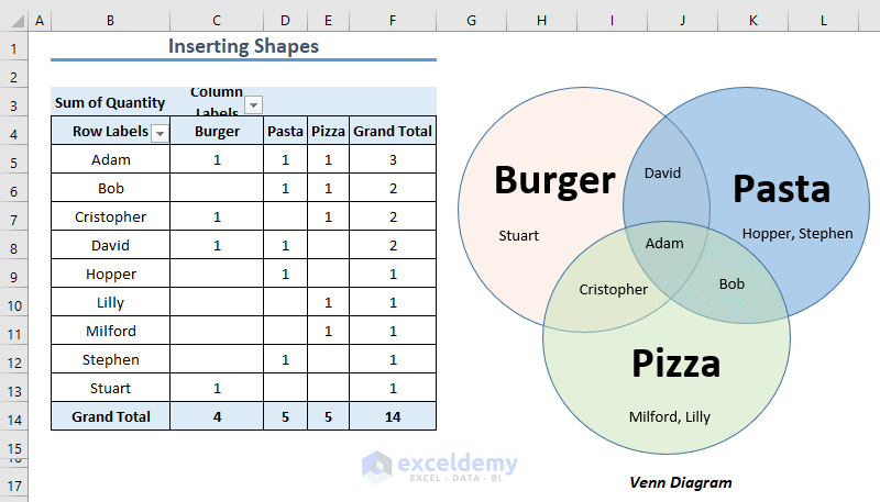
Let’s say, we have got a dataset of some customers consuming 3 different types of food items (i.e. Burger, Pasta, Pizza). Here, some of the customers tried only 1 type of food item, some tried 2 and some even tried all the 3 items together.
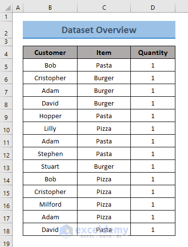
From this dataset, we want to create a Venn Diagram. In the diagram, the figures will denote the food items (i.e. Burger, Pasta, Pizza) and we will show the relationship between the Customers and their consumed Items.
At first, we will try to create a Pivot Table from this data table where customers and their consumed total Food items will be shown. Using this pivot table, later we will create a venn diagram. So, we need to perform two tasks for this purpose.
⏩ Step 1: Create Pivot Table in Excel
Utilize your dataset to create a pivot table. Proceed as below to implement this.
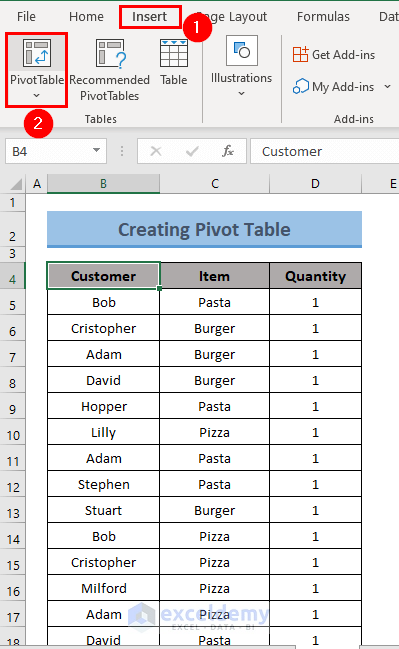
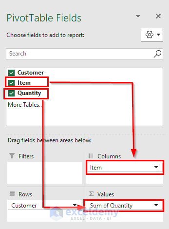
- First of all, select a random cell in your dataset> go to the Insert tab> click on PivotTable.
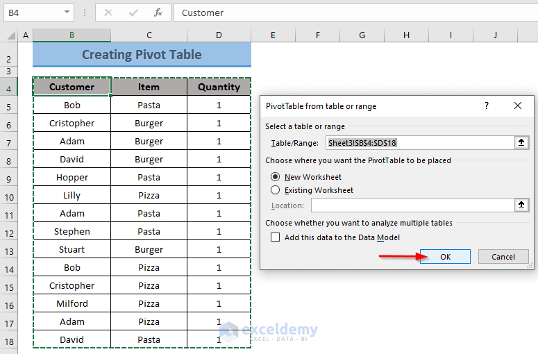
- Then, a dialog box named PivotTable from Table or range will appear on the worksheet.
- Here, in the Table/Range field, the dialog box will show the range of data that will hold the PivotTable. Remember that you just selected one single cell in your data range, but Excel has recognized all the data ranges for creating PivotTable.
- Now, choose where you want to place the PivotTable (New/Existing Worksheet) in the relevant field and click OK.
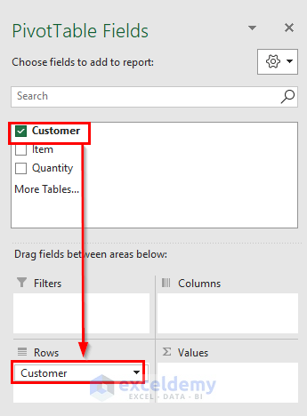
- Now, Excel will show PivotTable Fields at the right corner of the worksheet window.
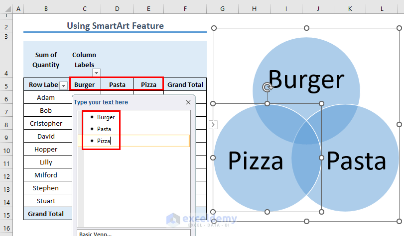
- In the fields, the header of the data table will appear. Our dataset includes 3 columns with header Customer, Item, Quantity.
- Drag the field to the relevant areas. Drag the relevant field to the relevant areas depending on which you want to create the pivot table. In our case, I want to place Customer in the row, so I dragged this field to the Rows Area.
- Similarly, place Item to Columns area and Quantity to Values area.
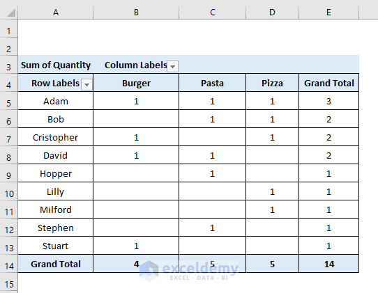
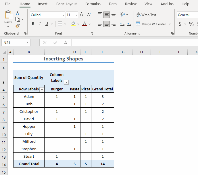
- As a result, you will see that data have organized themselves to create PivotTable. Customer names have been placed in Rows and Items have been placed in Columns to count the Quantity as per Customer and Item.
So, now we have created our Pivot Table. Let’s move on to how we can utilize it to create a Venn Diagram.
Read More: How to Add SmartArt Graphics in Excel
⏩ Step 2: Create Venn Diagram from the Pivot Table
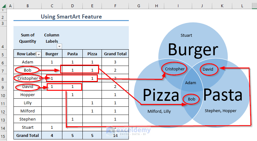
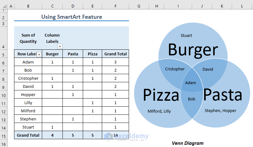
The Pivot Table that we have created has two Grand Total fields. The Grand Total field located at the rightmost column denotes the total number of items absorbed by a specific Customer. And the Grand Total portion located at the bottom of the table denotes the total number of customers who absorbed a specific item.
So, if we want to find a customer who has absorbed all the 3 items (i.e. common in each item), we need to look at the rightmost Grand Total column.
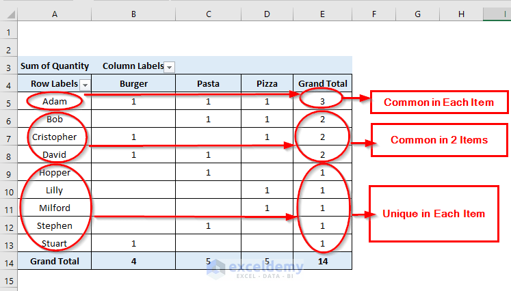
Notice that the value shown in the rightmost Grand Total column has a specific meaning:
- 3 => The person has absorbed all the 3 items
- 2 => The person has absorbed 2 items
- 1 => The person has absorbed only item
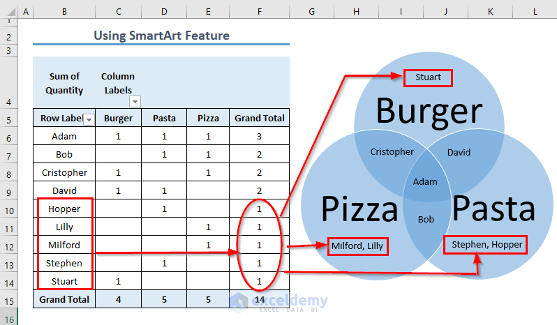
So as per our concerning dataset, Adam =>is common in each item, Bob, Cristopher, David =>are common in 2 items, Hopper, Lilly, Milford, Stephen, Stuart => are unique in each item.
So, if you want to create a venn diagram from the Pivot Table created, there are two distinct methods available. Follow any of them.
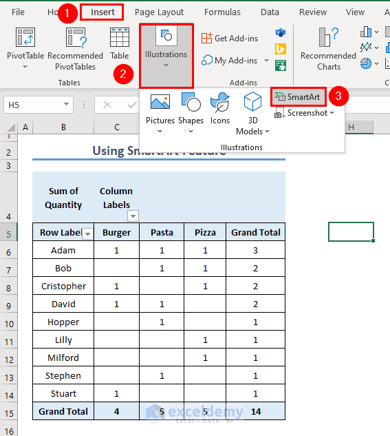
Method 1: Using SmartArt Feature
You can apply the SmartArt feature of Excel for creating relational shapes in Excel. Forming this shape will help to create the Venn Diagram.
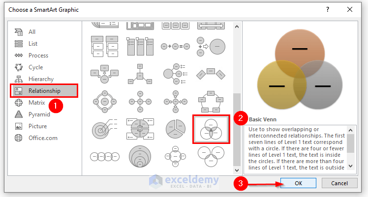
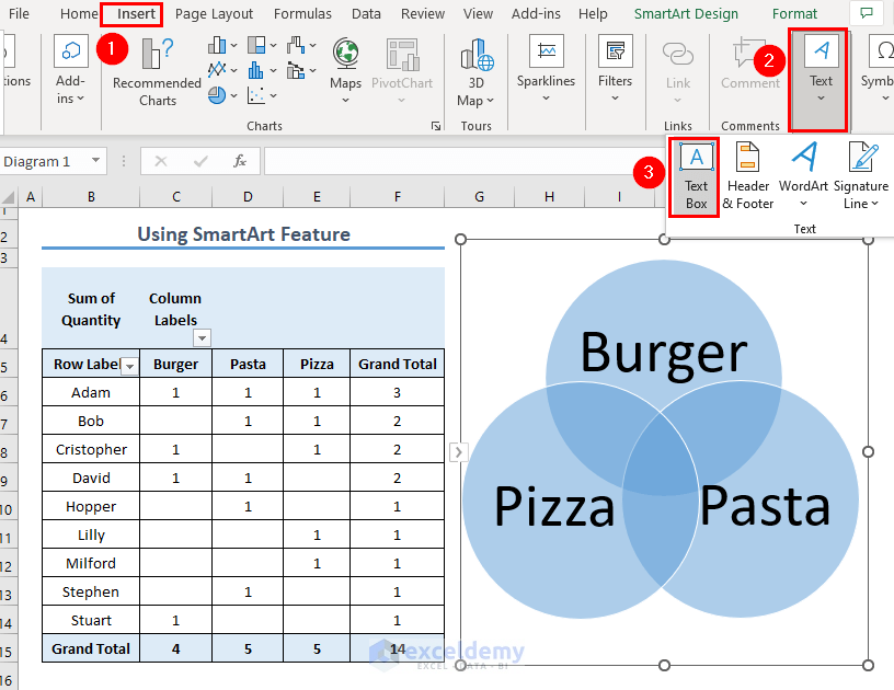
- Firstly, go to the Insert tab> click Illustration group> select SmartArt icon.
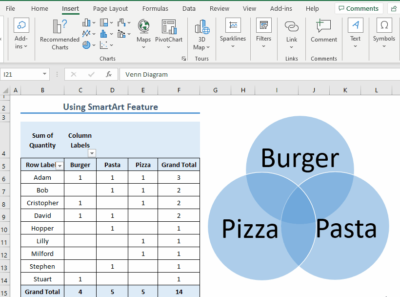
- Then, a dialog box named Choose a SmartArt Graphic will appear in the Excel window. From the menu list, click Relationship group> select basic venn from the shapes available> click OK. Our dataset has 3 different types of food items and we want to show the relationship on the basis of food items. And basic venn has 3 circles overlapping with one another. So, we have chosen this type. However, you can add circles to your diagram.
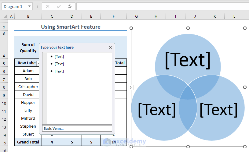
- Now, the shapes of Basic Venn as well as a command box with the heading Type your text here will appear in the Excel sheet. If you press ENTER in that command box, fields in that box as well as shapes will be increased.
- After that, the text in the command box field on the basis of which you want to show the relationship (i.e. Burger).
- As soon as you type text in the field, your shape will hold the text in it as well.
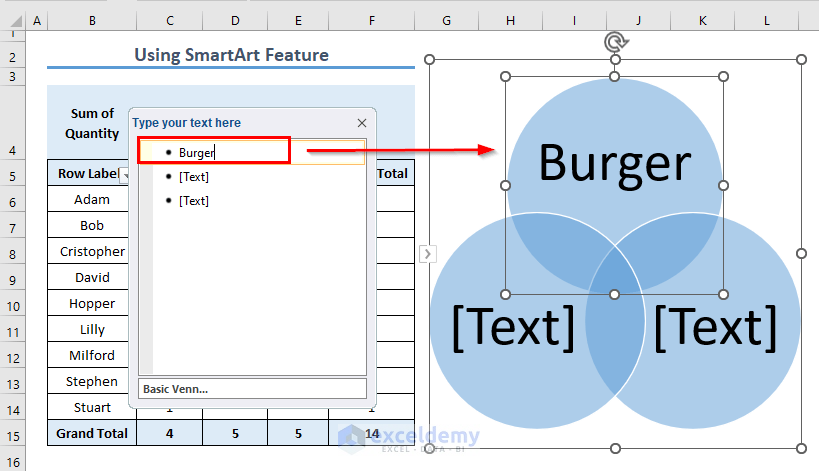
- So, fill the text field to make headings in the shapes of Basic Venn.
- Now, it’s time to show the relationship between the shapes. Go to the Insert tab> click the dropdown of the Text menu> click Text Box.
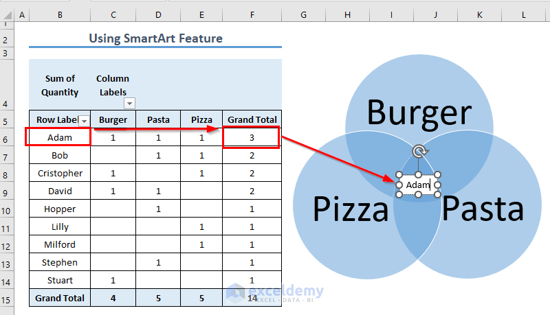
- Now, insert the Text Box at the intersectional region of the shape as shown in the GIF below.
- After inserting the Text Box, type text in it. From the Pivot Table that we have created, we can see that only one customer (i.e. Mike) has tried all the 3 items. So, this customer (i.e. Mike) will be put in the intersectional region of the 3 shapes describing 3 food items.
- Then, right-click on the mouse to format the shape of the text box.
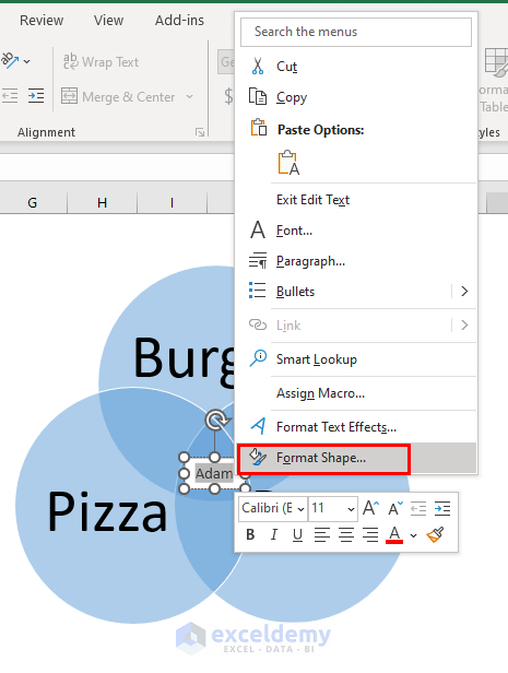
- Clicking the Format Shape option will introduce the Format Shape dialog box at the right corner of the Excel sheet. Choose No fill and No line.
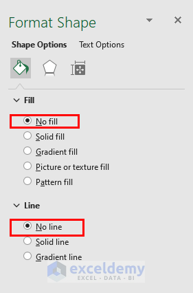
- Hence, the fill color of the text will match the color of shapes. Now, input relevant data to the intersection of two shapes in the same procedure.
- Next, assign the unique data (i.e. Hopper, Lilly, Milford, Stephen, Stuart) to the shapes.
- Finally, you’re done. Your Venn Diagram has been created from the Pivot Table.
Read More: How to Make a Venn Diagram in Excel
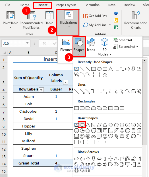
Method 2: Inserting Shapes
Another method is available for creating venn diagram in Excel. This method is a little bit manual and time-consuming. You have to insert shapes manually for this.
💬 Steps:
- First, go to the Insert tab> select Illustration> click Shapes> choose a circular type of shape (i.e. Oval).
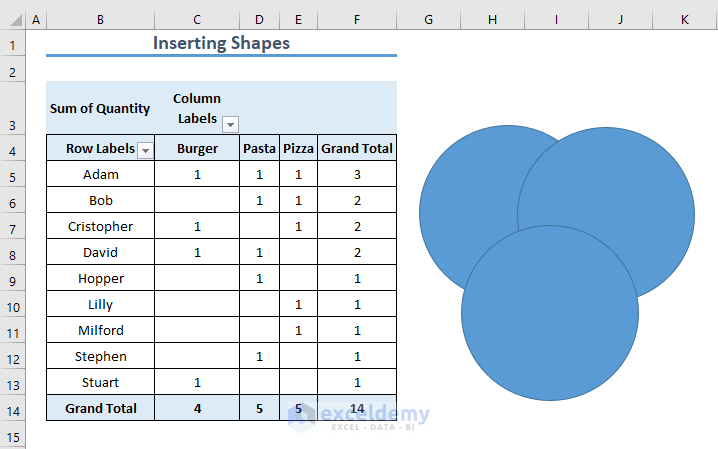
- Then, draw the shape as described in the GIF below.
- Now, copy the shapes and paste one on another like below.
- The intersectional area can’t be seen here because of the thick region. Right-click on the shapes and click Format Shape to change the format of the shapes.
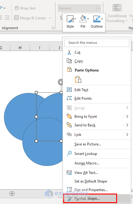
- From the Format Shape dialog box, increase the transparency and see the change in the shape.
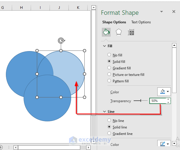
- Similarly, change the fill color and transparency of the other shapes.

- Now, follow these steps of Method 1 to insert the Text Box.
- Then, put the relational data between the intersectional and non-intersectional regions of the shapes and create your Venn Diagram.
Download Practice Workbook
You can download the practice book from the link below.
Conclusion
In this article, I have tried to show you some methods to create Venn Diagram from Pivot Table in Excel. I hope this article has shed some light on your way. If you have better methods, questions, or feedback regarding this article, please don’t forget to share them in the comment box. You can also visit our website for more related articles.
Stay connected. Happy Excel!
<< Go Back to SmartArt in Excel | Learn Excel
Get FREE Advanced Excel Exercises with Solutions!
