What Is Hierarchy?
- Hierarchical Chart:
- The term hierarchy has a dual meaning. First, it refers to a specific type of chart used to visualize hierarchical structures, such as organizational charts. These charts help represent relationships within an organization or other structured systems.
- Structured Data Arrangement:
- Beyond charts, hierarchy also denotes a structured arrangement of data. In this context, items are organized into levels or categories based on their relationships. For example, you might organize data by department, region, or product category.
- Excel and Hierarchies:
- Excel leverages hierarchies in conjunction with pivot tables and Power Pivot. These features allow you to analyze and summarize data hierarchically, making it easier to understand complex relationships and make informed decisions.
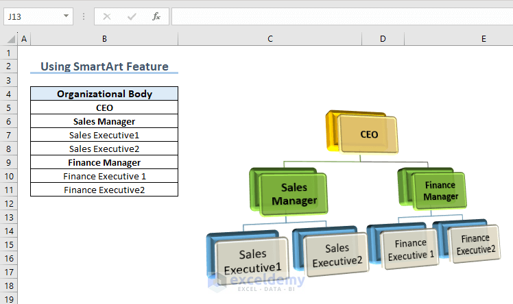
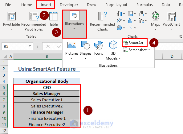
Method 1 – Using SmartArt Feature
- Select Your Raw Data:
- Highlight the range of cells that you want to include in your hierarchy. For example, let’s say your data is in cells B5 to B11.
- Insert SmartArt:
- Click on the Insert tab in Excel.
- Navigate to Illustrations and choose SmartArt.
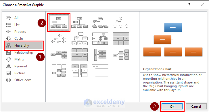
-
- In the dialog box that appears, select Hierarchy.
- Choose a hierarchy style that suits your needs and press OK.
- Customize the Hierarchy:
- Click on the arrow sign within the SmartArt graphic.
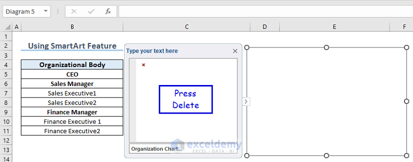
- Place the cursor inside the hierarchy chart and press CTRL+A to select all default text.
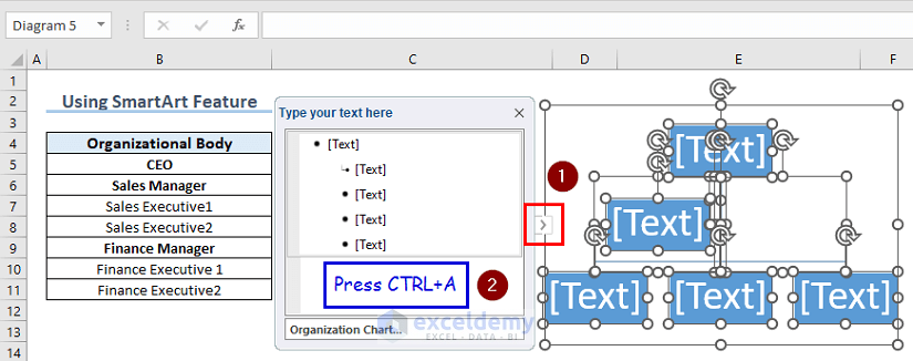
-
- Press Delete to remove the default text.
- Organize the Hierarchy:
- Copy the range B5:B11 (your raw data) and paste it onto the SmartArt graphic.
- Arrange the hierarchy by placing managers below the CEO. Select each manager individually and press Tab once for each.
- For executives, press Tab twice for each of them.
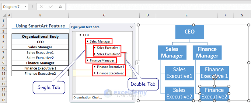
-
- If you need a more detailed organogram, repeat the process by pressing Tab thrice or more for additional levels below executives.
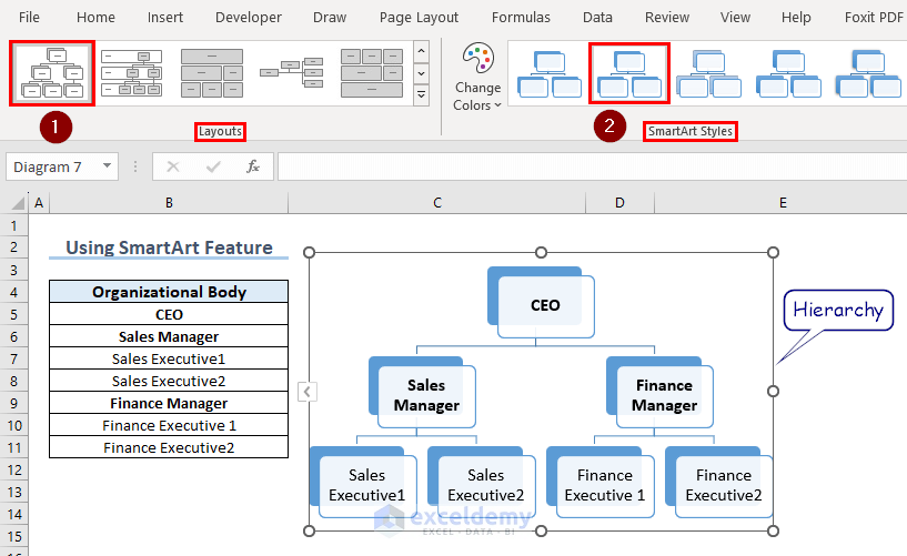
- Customize Appearance:
- Choose a layout from the available options.
- Select a style from SmartArt Styles to give your hierarchy a customized look.
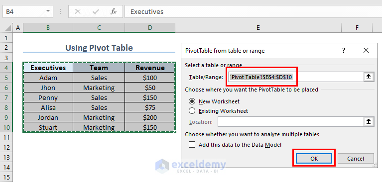
Method 2 – Using Pivot Table
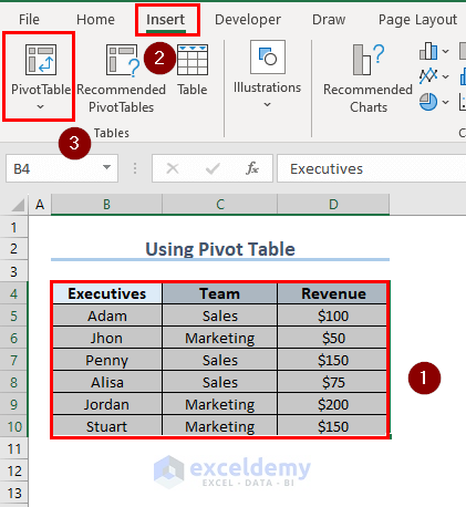
- Select Your Data Range:
- Highlight the range B4:D10 (or any relevant data).
- Insert a Pivot Table:
- Click on the Insert tab.
- Choose Pivot Table.
-
- In the dialog box, ensure that the Add this data to the Data Model option is checked and press OK.
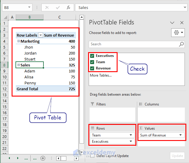
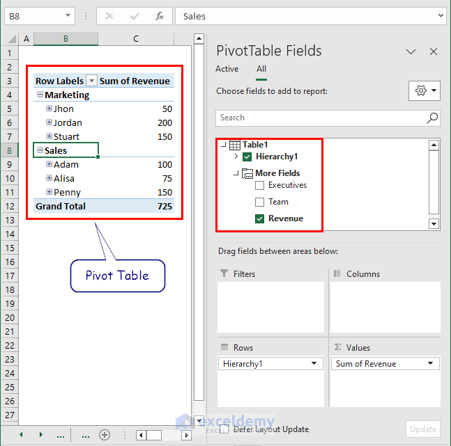
- Configure the Pivot Table:
- A new worksheet will be created.
- Under PivotTable Fields, check the table attributes you want to include. For example, select Team and Executives as rows, and Revenue as the Sum of Revenue.
Read More: Create Hierarchy in Excel Pivot Table
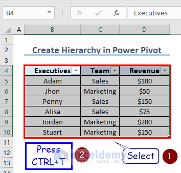
Method 3 – Using Power Pivot
- Create an Excel Table:
- Select the range B4:D10 and press CTRL+T to turn it into an Excel table.
- Add to Data Model:
- Select the newly created table.
- Click on Power Pivot (if available) and choose Add to Data Model.
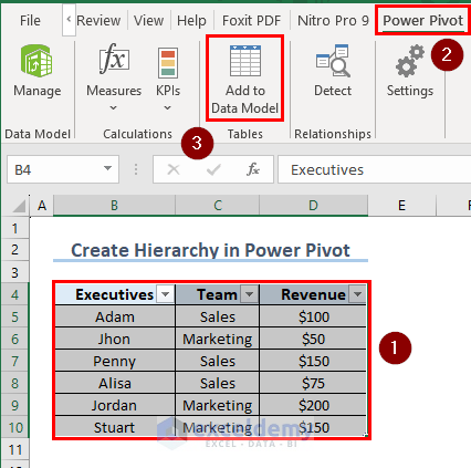
Note: If Power Pivot is not visible, manually add the Power Pivot tab to your Excel Ribbon.
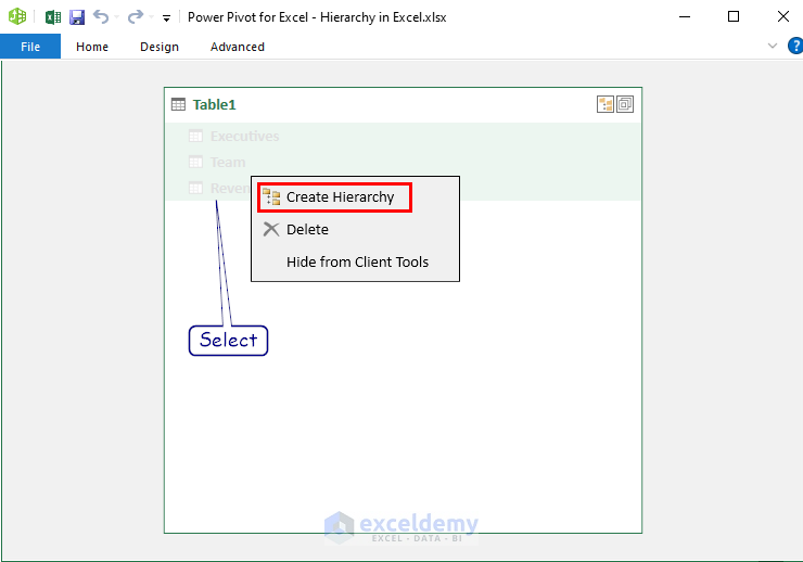
- Create a Hierarchy:
- In the Power Pivot window, select the three columns under the table name.
- Right-click and choose Create Hierarchy.
- Generate a Pivot Table:
- Click on Home and select PivotTable.
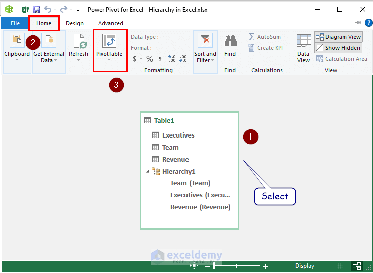
-
- In the new worksheet, check Hierarchy1 under Table1 and also select Revenue under More Fields.
Read More: Create Hierarchy in Excel
How to Customize SmartArt Hierarchy in Excel
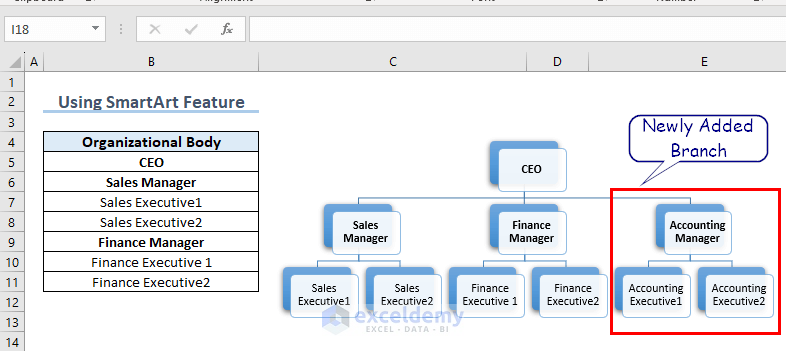
Example 1 – Adding or Deleting Boxes
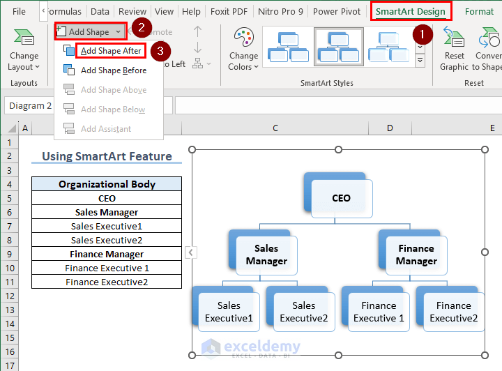
- Adding Extra Boxes:
- To add extra boxes to your existing SmartArt hierarchy:
- Click on the box after which you want to add the new box(es).
- Navigate to the SmartArt Design tab.
- Click on Add Shape and choose Add Shape After.
- To add extra boxes to your existing SmartArt hierarchy:
-
-
- By following this method, you can create additional hierarchy branches with attributes.
-
- Deleting Boxes:
- To delete a box:
- Select the box you want to remove.
- Press the Delete key on your keyboard.
- The box is gone.
- To delete a box:
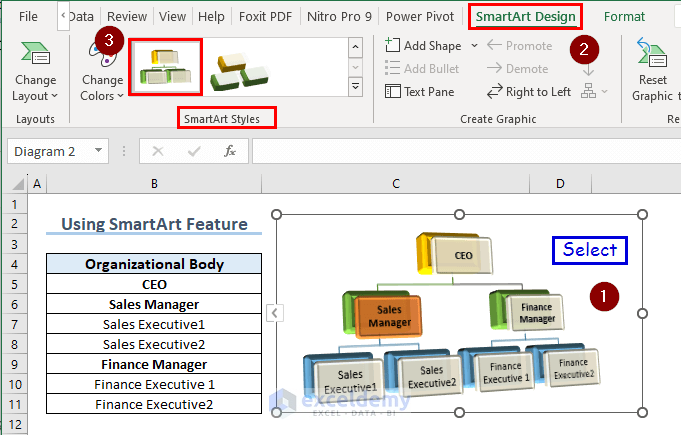
Example 2 – Changing Colors or Hierarchy Styles
- Changing Hierarchy Style:
- To modify the current hierarchy style:
- Select the entire hierarchy flowchart.
- Go to the SmartArt Design tab.
- From the SmartArt Styles group, choose a style that suits your preference.
- To modify the current hierarchy style:
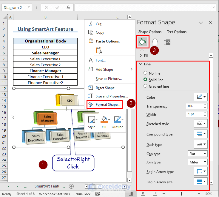
- Customizing Colors:
- To change colors for specific objects (boxes or flowchart lines):
- Right-click on the object.
- Select Format Shape.
- Under Fill & Line, explore customization options such as color, transparency, and width.
- Use these options to tweak the appearance of your hierarchy flowchart.
- To change colors for specific objects (boxes or flowchart lines):
Different Features in Excel Power Pivot Hierarchy
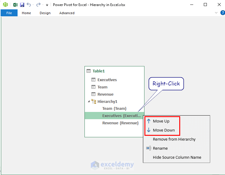
- Changing Hierarchy Order:
- If you’ve created a hierarchy using Excel’s Power Pivot feature:
- Right-click on the element you want to reposition.
- Choose Move Up or Move Down to adjust the hierarchy order.
- If you’ve created a hierarchy using Excel’s Power Pivot feature:
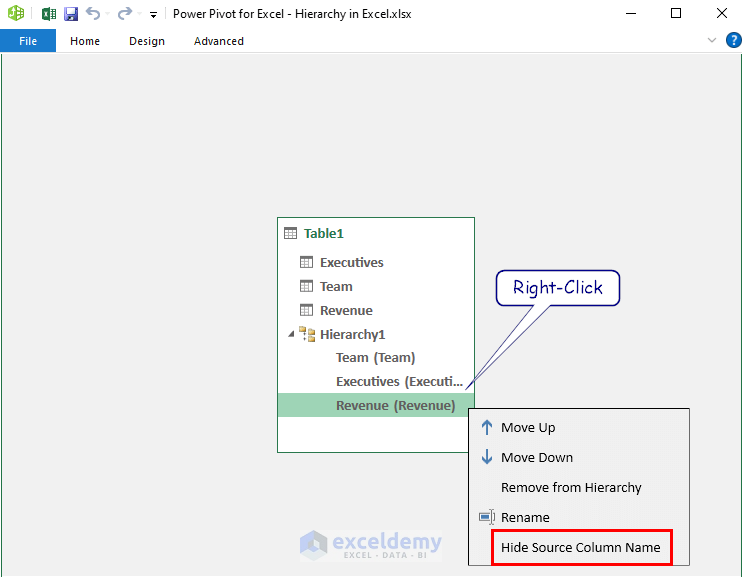
Hiding or Showing Source Column Names in Hierarchy
- By default, source column names appear in brackets next to each column name.
- To hide them:
- Right-click on any column.
- Select Hide Source Column Name.
- Repeat for other columns.
- To hide them:
-
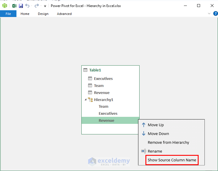
- To show them again:
- Right-click on any hidden column.
- Select Show Source Column Name.
- To show them again:
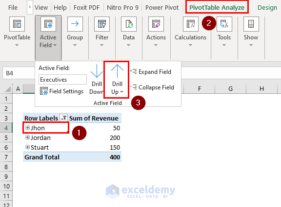
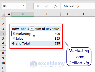
Drill Up and Drill Down in Hierarchy
Suppose you want to focus on specific attributes within a hierarchy Pivot Table:
- To drill down:
- Select the desired row.
- Click on PivotTable Analyze >> Drill Down under the Active Field group.
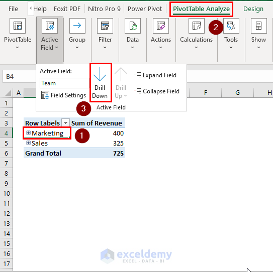
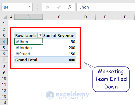
The Marketing Team is now drilled down.
- To drill up:
- Select the first attribute in the drilled-down list.
- Click on PivotTable Analyze and select Drill Up.
The Marketing Team is now drilled up as before.
Things to Remember
- Arrange data logically within each level for easier navigation and analysis.
- Update hierarchies as your data changes (additions, modifications, removals) to maintain accuracy.
Frequently Asked Questions
- How do I add a hierarchy slicer in Excel?
- Select Your Data:
- Highlight the range of cells that contains your data, including the headers.
- Insert a Slicer:
- Go to the “Insert” tab in the Excel ribbon.
- In the “Filters” group, click on the “Slicer” button.
- In the “Insert Slicers” dialog box:
- Select the column that represents the top-level of your hierarchy (e.g., department or category).
- Click on the “OK” button.
- A slicer box will be added to your worksheet, which you can resize and reposition as needed.
- Create the Hierarchy:
- Right-click on the slicer.
- Choose “Slicer Settings.”
- In the “Slicer Settings” dialog box:
- Click on the “Report Connections” button.
- Check the boxes for the columns that represent the lower levels of your hierarchy (e.g., subcategories or regions).
- Click on the “OK” button.
- Filter and Navigate:
- Your hierarchy slicer is now ready!
- Use it to filter and navigate through your data by selecting different levels of the hierarchy.
- Creating a Hierarchy Tree (Treemap) in Excel:
- Select Your Data:
- Highlight the relevant data range.
- Insert a Treemap Chart:
- Go to the “Insert” tab.
- Choose “Hierarchy Chart” and then select “Treemap.”
- Alternatively, you can use Recommended Charts:
- Go to “Insert” >> “Recommended Charts” >> “All Charts.”
- Look for the treemap chart option.
- Customize the Treemap:
- The treemap chart will display your hierarchy.
- You can further customize it by adjusting labels, colors, and other formatting options.
Download Practice Book
You can download the practice workbook from here:
Hierarchy in Excel: Knowledge Hub
- How to Create Multi Level Hierarchy in Excel
- Make Hierarchy Chart in Excel
- Create Date Hierarchy in Excel Pivot Table
- Create a Hierarchy of the State City and Zip Code
- How to Add Row Hierarchy in Excel
<< Go Back to SmartArt in Excel | Learn Excel
Get FREE Advanced Excel Exercises with Solutions!
