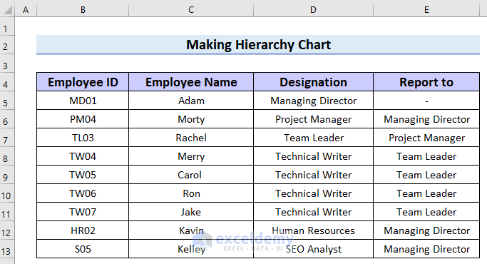
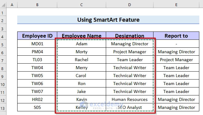
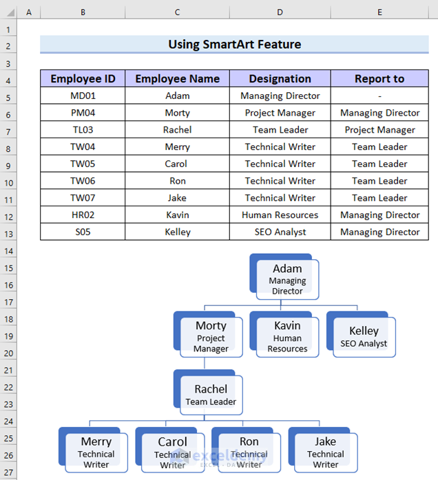
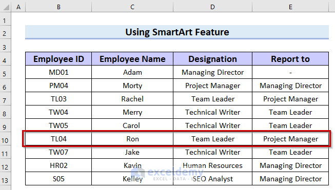
We’ll use the following dataset to show how to make a hierarchy chart. This dataset contains employee information.
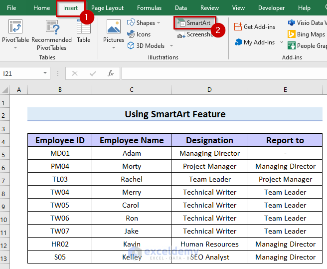
Method 1 – Using the SmartArt Feature to Make a Hierarchy Chart in Excel
Step 1 – Inserting the Hierarchy Chart
- Go to the Insert tab.
- Select SmartArt.
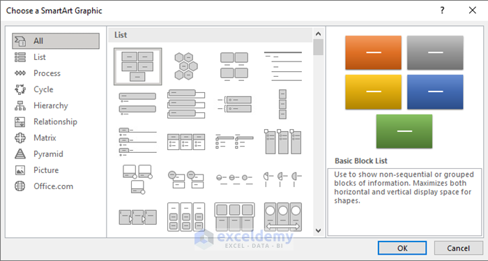
- You will see a dialog box named Choose a SmartArt Graphic.
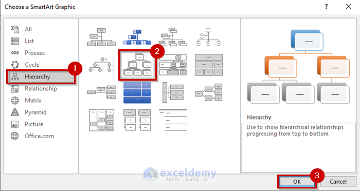
- Select the Hierarchy tab.
- Choose the option you like. We chose Hierarchy.
- Select OK.
- You will see your hierarchy chart inserted into your Excel sheet.

Read More: How to Use SmartArt Hierarchy in Excel
Step 2 – Adding Text from a List
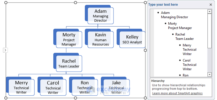
- Select the left arrow button in the following picture to open the text panel.

- The text panel will appear.
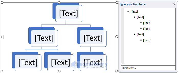
- Select the data range you want to show in your hierarchy chart.
- Press Ctrl + C to copy the data.
- Paste that data into the text panel by pressing Ctrl + V.
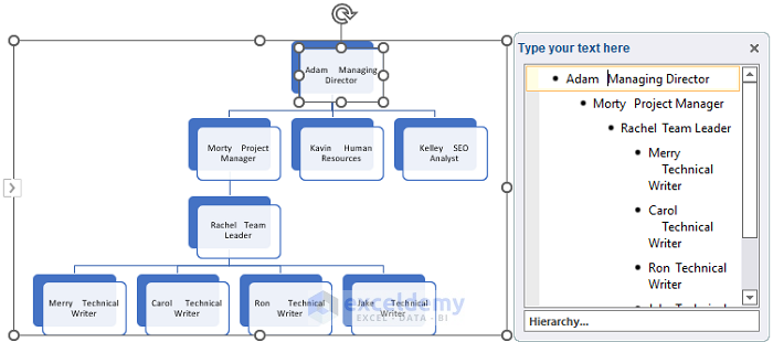
- All the values are shown in a single line.
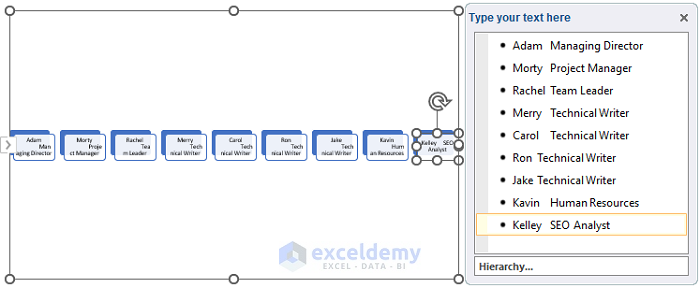
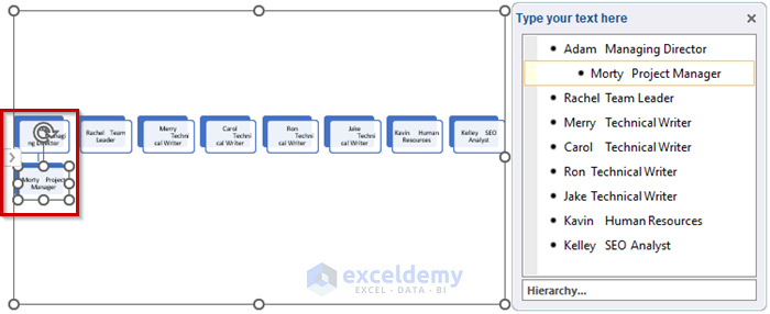
- Select the text where you want to add the level. We selected Morty who is the Project Manager.
- Press Tab once because Morty works under Adam who is the Managing Director.
- Morty’s position is now showing under Adam.
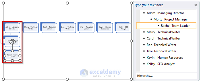
- Press Tab twice for Rachel because she works under Morty and Morty works under Adam.
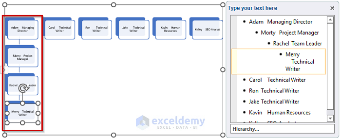
- Press Tab three times for Marry who works under Rachel.
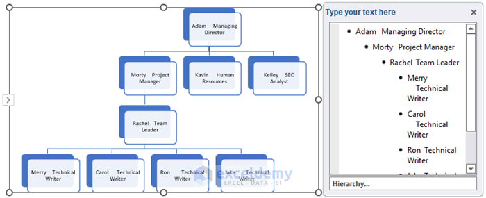
- Repeat the process for other employees to create the hierarchy chart.
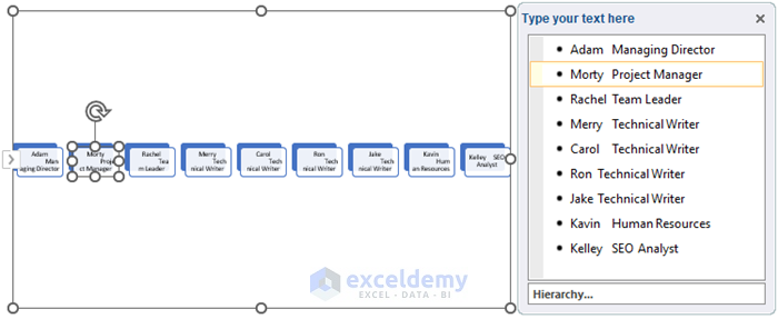
- The Name and the Designation are shown in the same line. We will fix that.
- Put the mouse cursor before the Designation.
- Press Shift + Enter.
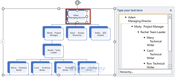
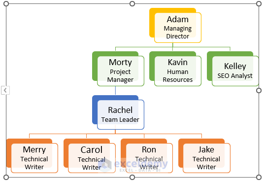
- Repeat for all the employees and the hierarchy chart looks like this.
- Select the data for which you want to change the font size. We selected Adam.
- Select the font size you want. We selected 14.
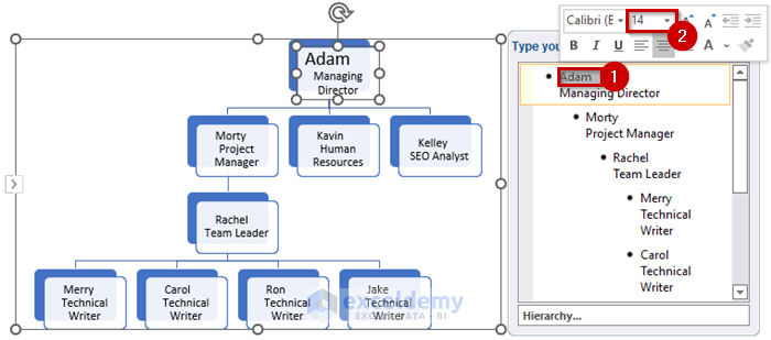
- Change the font size of the entire hierarchy chart.
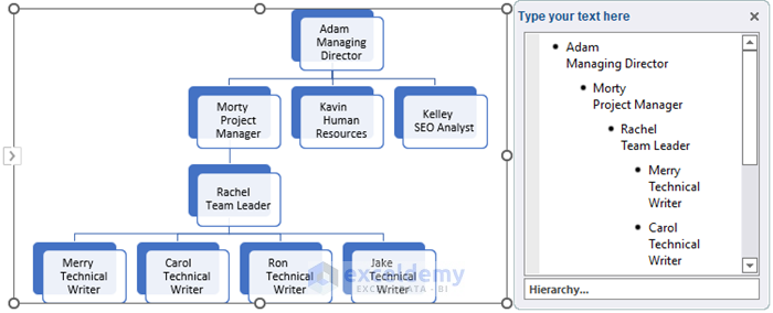
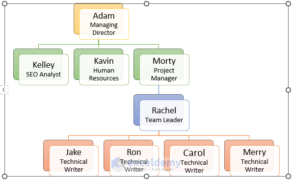
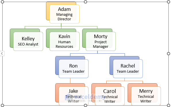
- Here’s the sample chart based on the dataset.
Step 3 – Formatting the Hierarchy Chart in Excel
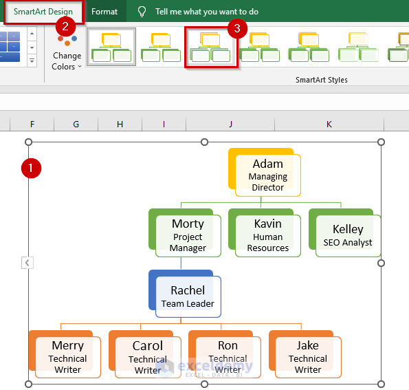
- Select the hierarchy chart.
- Go to the SmartArt tab.
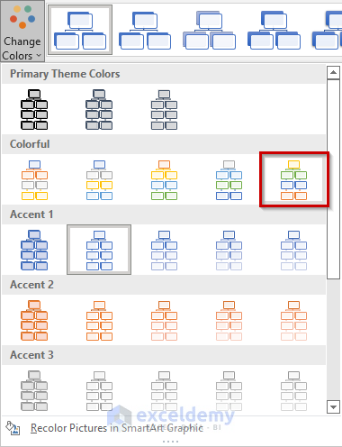
- Select Choose Colors.
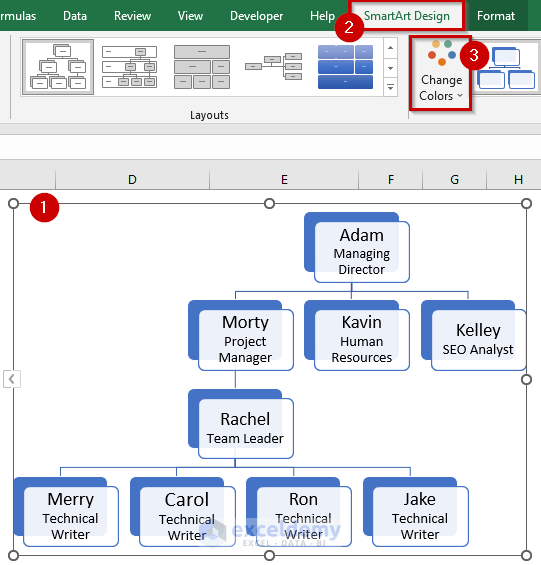
- A drop-down menu will appear.
- Select the color you want for your chart. We selected the fifth option from the Colorful Range.
- The color of the chart has changed to the selected color.
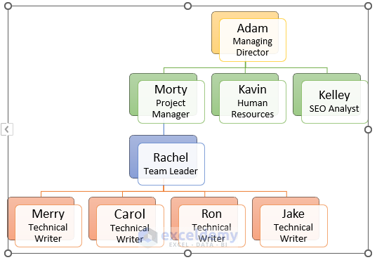
After that, I will change the style of the chart.
- Select the hierarchy chart.
- Go to the SmartArt tab.
- Select the style you want for the hierarchy chart. We selected the Subtle Effect.
- You can see the chart style has changed to the selected chart style.
Step 4 – Rearranging the Order of the Nodes
- Select the hierarchy chart.
- Go to the SmartArt tab.
- Select Right to Left.
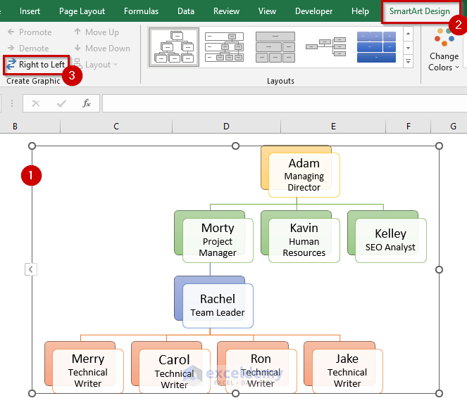
- The nodes are rearranged in the hierarchy chart.
Step 5 – Adding Promotion or Demotion
Ron got a promotion and is now a Team Leader. He will report to the Project Manager and Jake will be working in his team.
Let’s see how you update this info in your hierarchy chart.
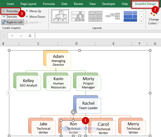
- Select the box in your hierarchy chart that carries the information of the employee who got promoted. We selected the box for Ron.
- Go to the SmartArt tab.
- Select Promote.
- Ron is now working under the Project Manager in the hierarchy chart, but his designation is still the same as before which is Technical Writer.
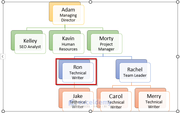
- Change the designation manually.
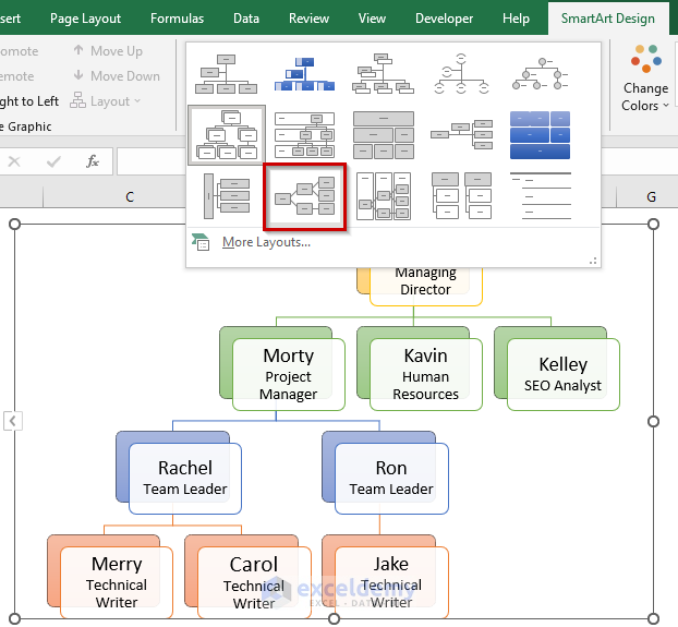
Step 6 – Changing the Layout of the Hierarchy Chart in Excel
- Select the hierarchy chart.
- Go to the SmartArt tab.
- Select the anchor button from Layouts to get all the available Layouts.
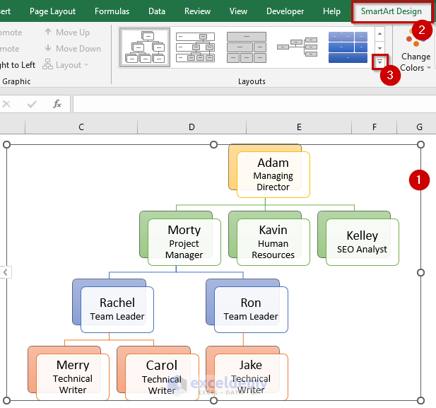
- Select the layout you like. We selected the Horizontal Hierarchy.
- The Layout of the hierarchy chart changed to Horizontal Hierarchy.

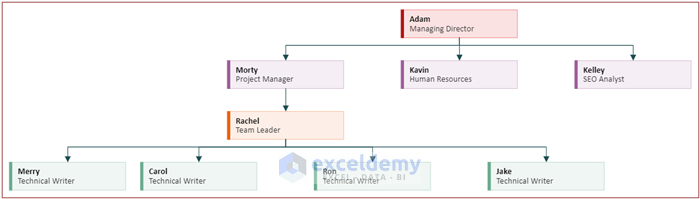
- Here’s the end result.

Method 2 – Using Excel Add-ins to Make a Hierarchy Chart
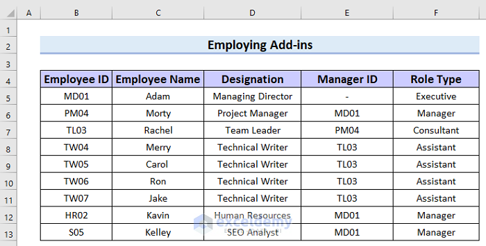
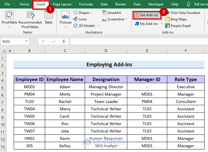
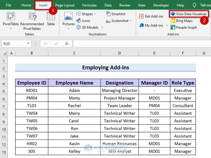
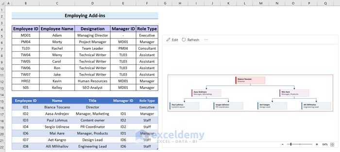
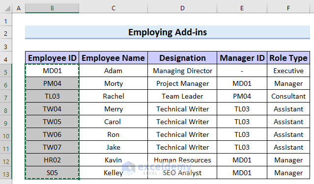
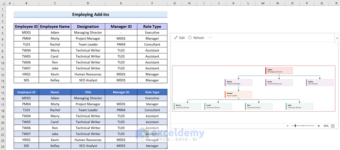
We will use the following dataset, which contains Employee ID, Employee Name, Designation, Manager ID, and Role Type.
Step 1 – Adding the Visio Data Visualizer
- Go to the Insert tab.
- Select Get Add-ins.
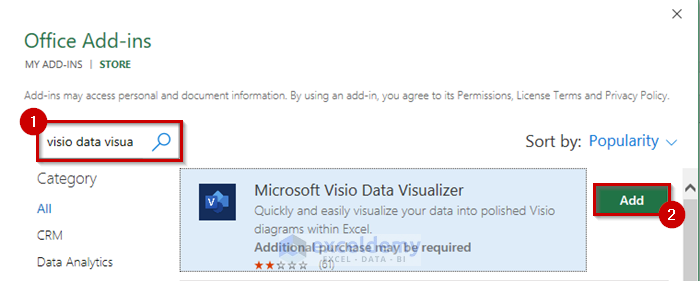
- The Office Add-ins window will open.
- Search for Visio Data Visualizer.
- Select Add.
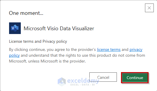
- Another window will appear.
- Select Continue.
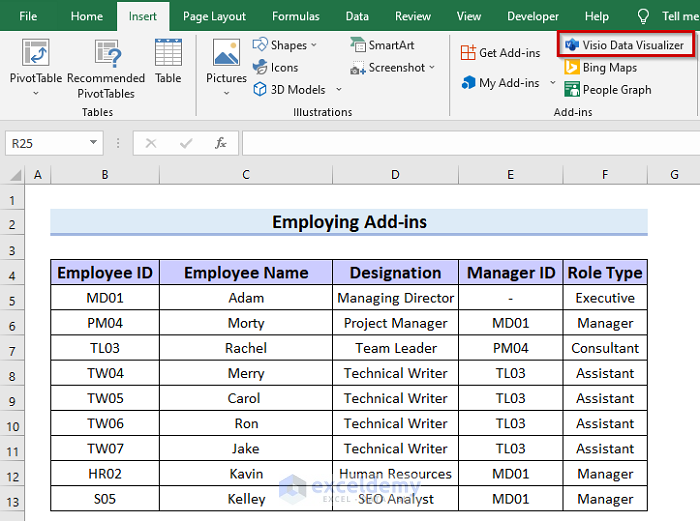
- You will get Visio Data Visualizer added to your Add-ins.
Step 2 – Inserting the Hierarchy Chart
- Go to the Insert tab.
- Select Visio Data Visualizer.
- The Data Visualizer window will appear.
- Select Continue without signing in (Preview).
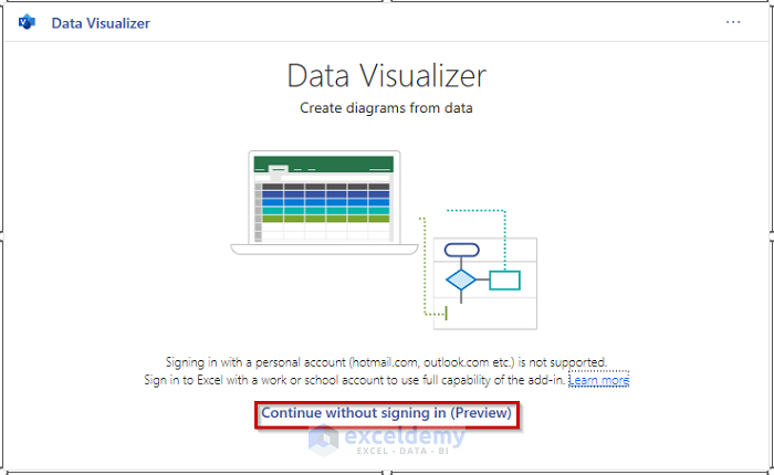
- The Data Visualizer will open.
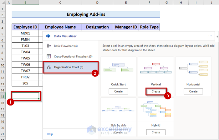
- Select the cell where you want your chart. We selected the cell B15.
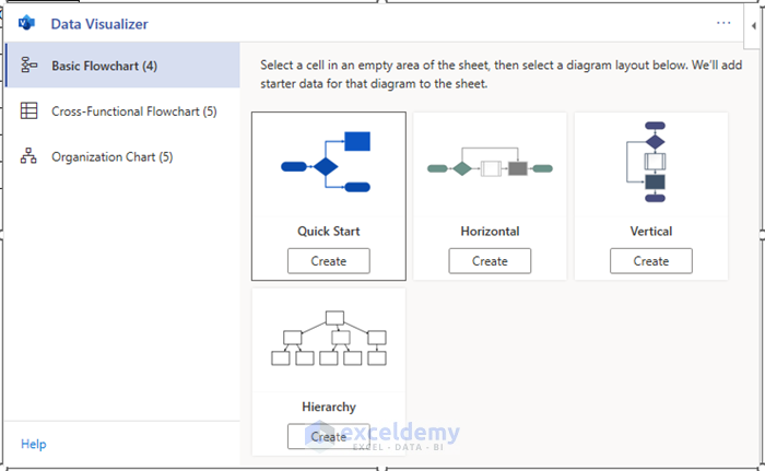
- Select Organization Chart.
- Select Create under the layout you want. We selected Vertical.
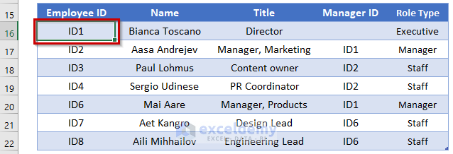
- You will see the hierarchy chart template inserted along with its data table.
Step 3 – Updating Information
- Select the column you want to copy.
- Press Ctrl + C to copy the data.
- Select the first cell of the column where you want to insert that data. We selected the first cell of the column named Employee ID.
- Press Ctrl + V to paste the column.
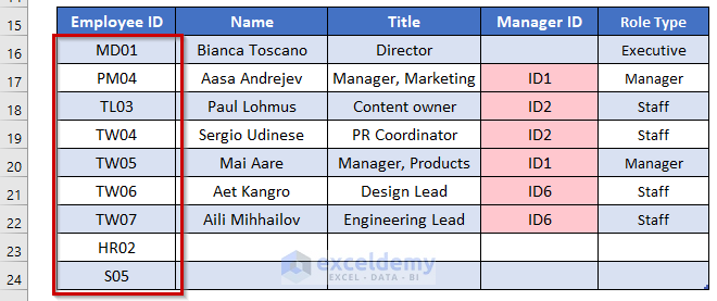
- Insert all the employee information into the template table.
- Select Refresh in the hierarchy chart to update it.
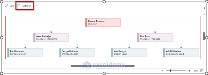
- Here’s the created hierarchy chart.
- And here’s the complete overview of the tables.
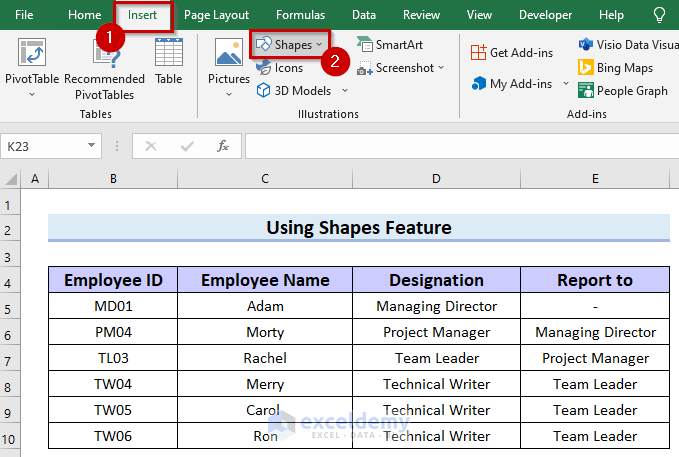
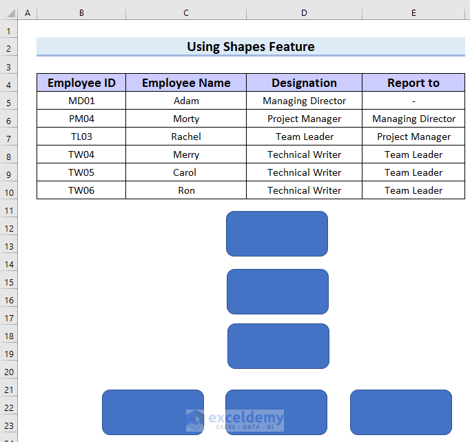
Method 3 – Using the Shapes Feature to Make a Hierarchy Chart in Excel
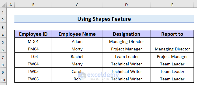
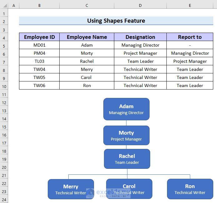
We will use the following dataset.
Steps:
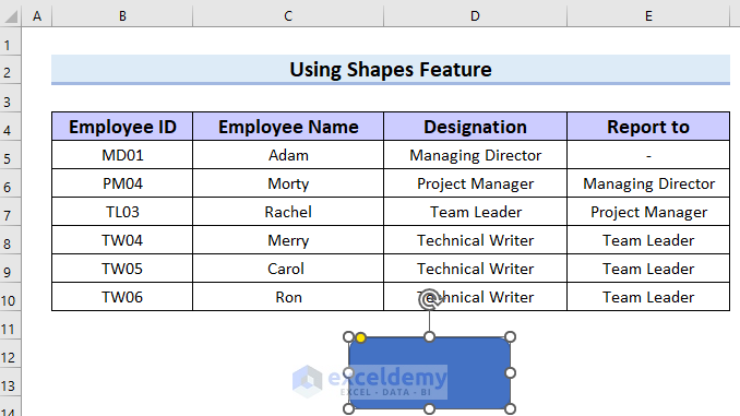
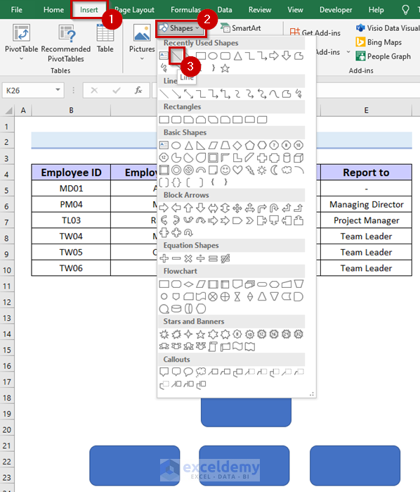
- Go to the Insert tab.
- Select Stapes.
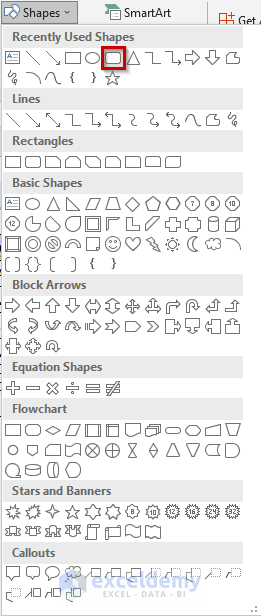
- A drop-down menu will appear.
- Select any box shape you like. We selected the Rectangle: Round Corner.
- Click where you want the box, and it will be inserted into your Excel sheet.
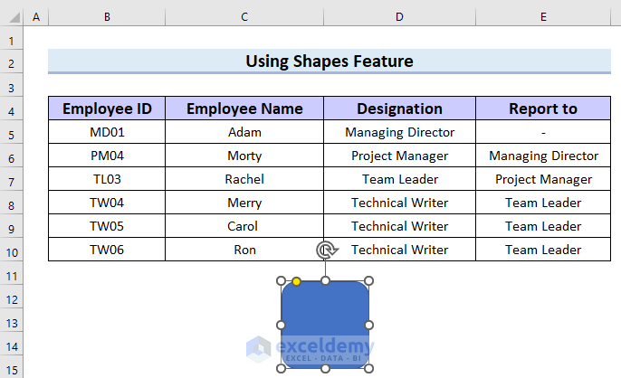
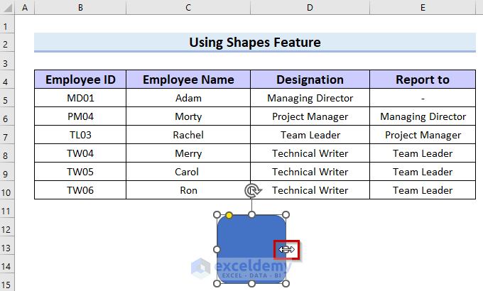
- You can resize the box by dragging the corners or sides.
- Copy the box by pressing Ctrl + C.
- Select a location cell.
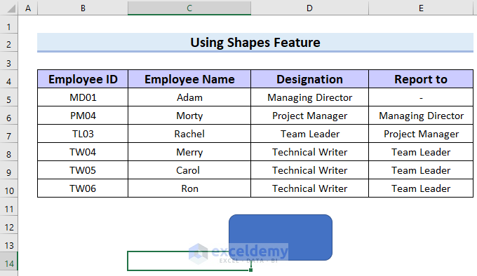
- Press Ctrl + V to paste.
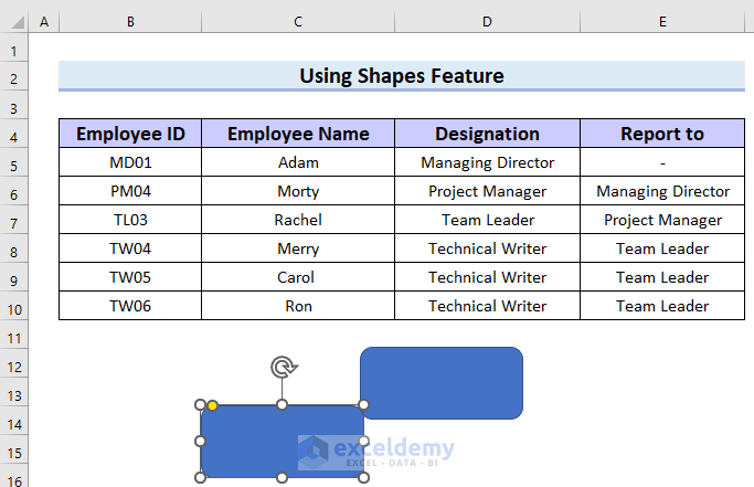
- We have copied 4 more boxes because we have 6 employees in total.
- Rearrange the boxes to make levels.
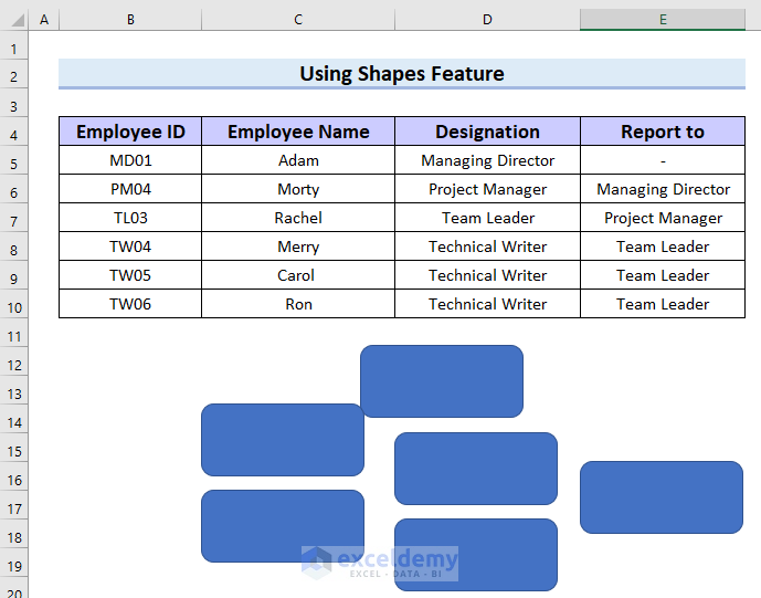
- Go to the Insert tab.
- Select Shapes.
- Select Line.
- Connect the first two boxes with the Line.
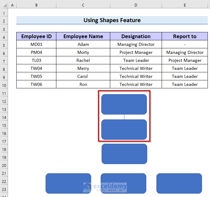
- Connect all the boxes in the same way.
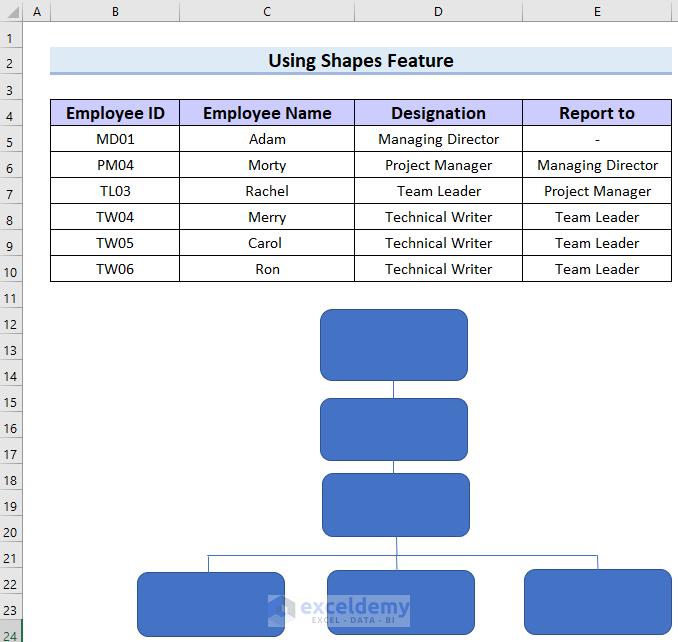
- Type the name and designation the way you want to show them in your hierarchy chart. We have typed the Name and Designation in the first box. Use the font options from the ribbon if needed.
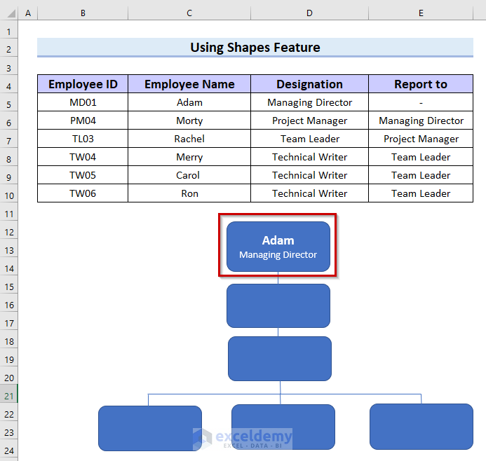
- Here’s the result after filling in all the boxes.
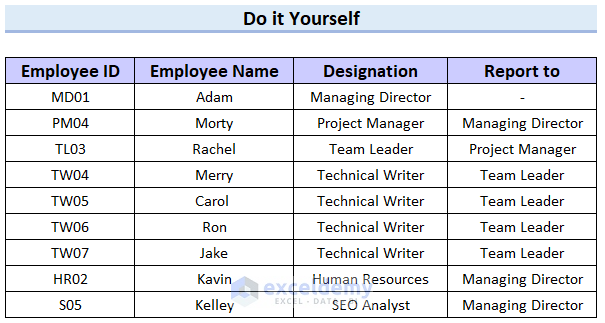
Practice Section
We have provided a practice sheet for you to practice how to make a hierarchy chart in Excel.
Download the Practice Workbook
Related Articles
- How to Create Hierarchy in Excel Pivot Table
- Create Date Hierarchy in Excel Pivot Table
- How to Create a Hierarchy of the State City and Zip Code in Excel
- How to Add Row Hierarchy in Excel
- How to Create Multi Level Hierarchy in Excel
- How to Create Hierarchy in Excel
<< Go Back to Hierarchy in Excel | SmartArt in Excel | Learn Excel
Get FREE Advanced Excel Exercises with Solutions!
