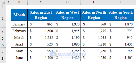
This sample dataset showcases the Monthly Sales of a company in Different Regions.
Method 1 – Using the Select Data Source Feature to Select Data for a Chart in Excel
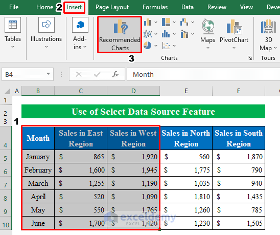
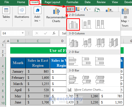
Step 1:
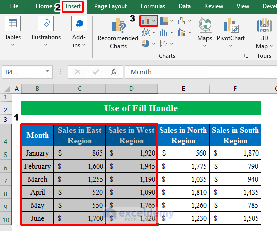
- Create a chart by selecting cells from the table. Here, B4:D10.
- In Insert, click Recommended Charts.
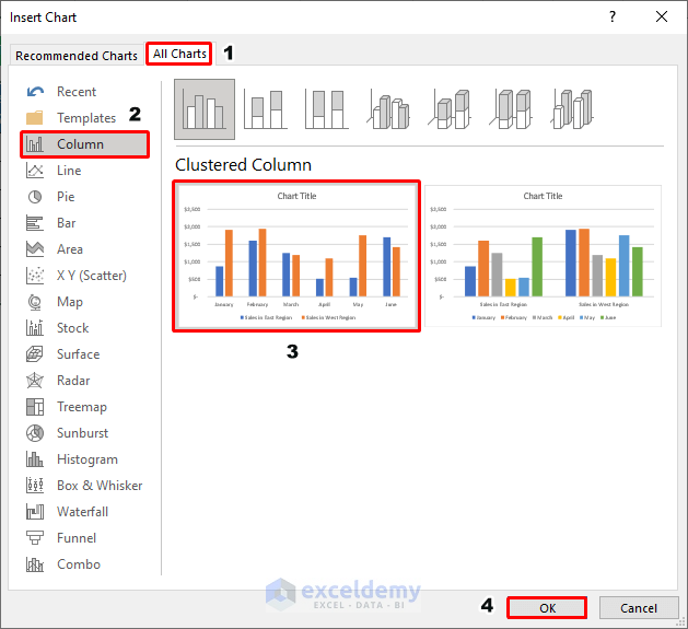
- In the Insert Chart window, go to All Charts > Column > Clustered Column.
- Click OK.
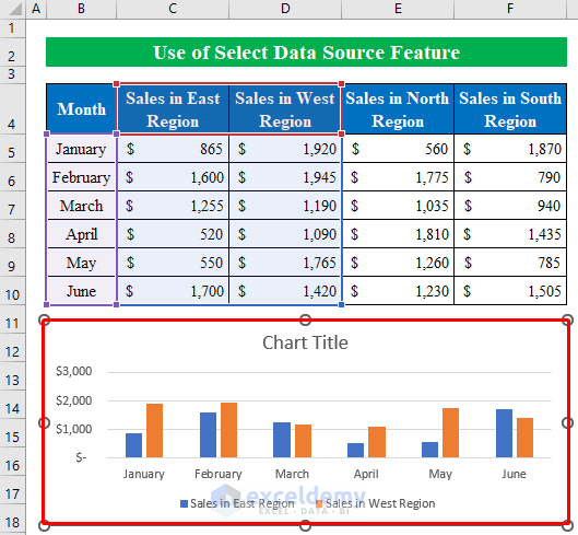
The chart displays the selected values.
Step 2:
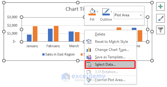
- To add data to the chart, select the chart and right-click.
- Choose Select Data.
- In the Select Data Source window, choose Add.
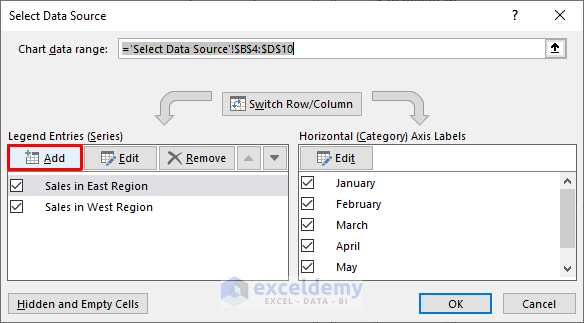
- Place the cursor over Series name and click E4 (Sales in North Region).
- In Series values select sales data from the worksheet.
- Click OK.
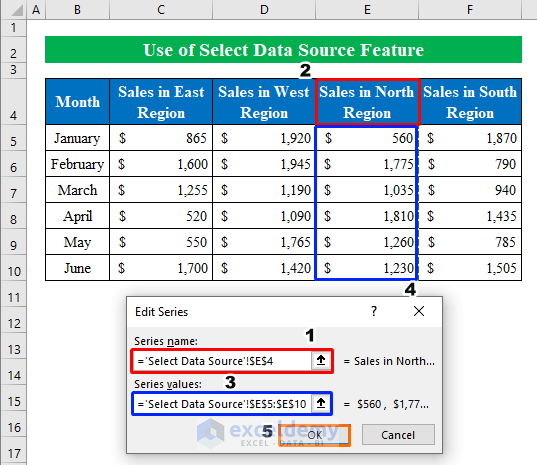
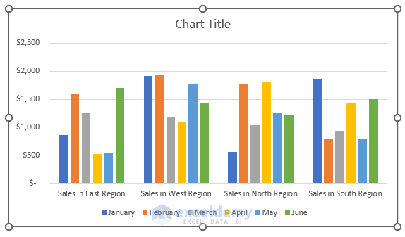
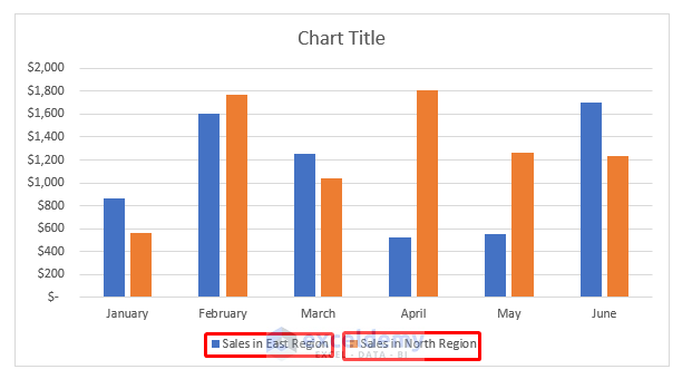
Sales in North Region will be added to the chart.
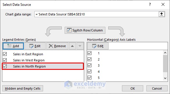
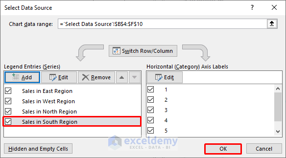
- Follow the same steps to add sales value for Sales in South Region.
- Click OK.
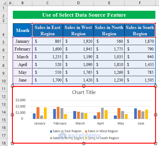
This is the output.
Step 3:
To change the chart style by switching data to a different position:
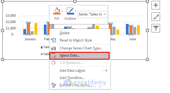
- Select the chart and right-click.
- Choose Select Data.
- In Select Data Source, click Switch Row/Column.
- Click OK.
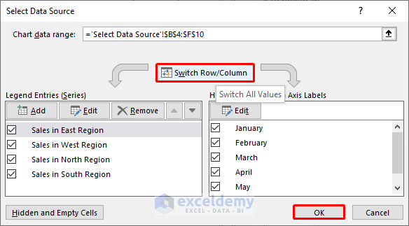
This is the output.
Read More: How to Expand Chart Data Range in Excel
Method 2 – Drag the Fill Handle to Select Data for a Chart
2.1. Adjacent Data
Steps:
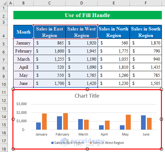
- Select B4:D10.
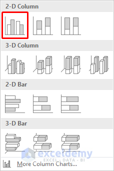
- In Insert, choose Chart.
- Select a 2-D column from the drop-down menu.
The chart displays Sales in East Region and Sales in West Region.
Step 2:
- To select additional data for the chart, drag the “fill handle” in the data table.
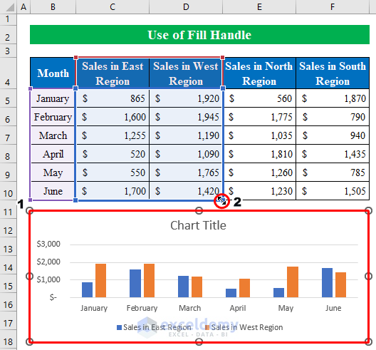
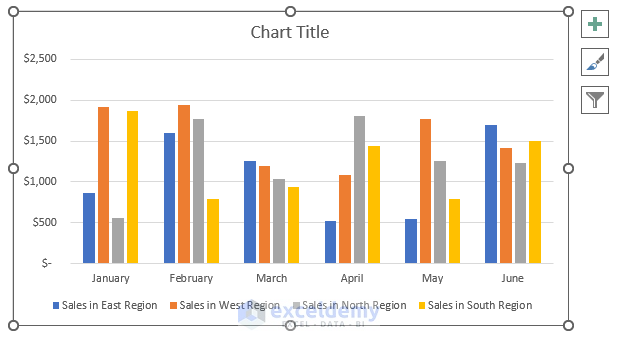
All data will be selected from the dataset and displayed in the chart.
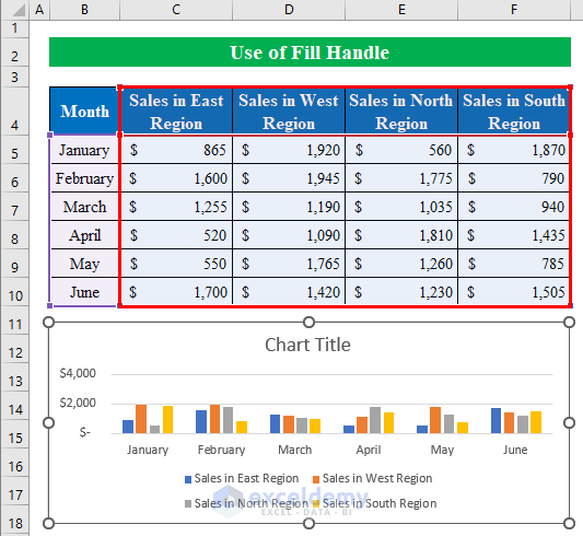
This is the output (applicable to adjacent cells).
2.2 Non-Adjacent Data
Steps:
- Select B4:C10 from the table.
- Press and hold Ctrl to choose the data you want to include in the chart. Here, E4:E10.
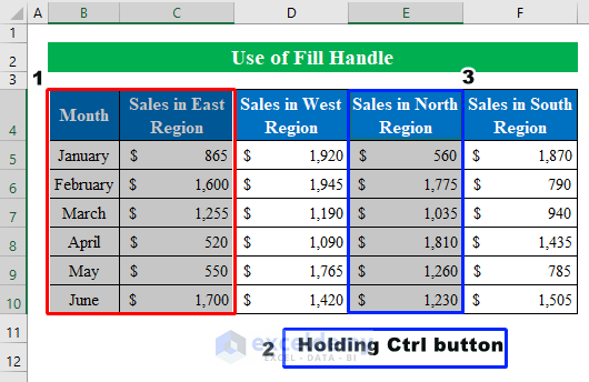
- In Insert, choose a 2-D column.
The chart containing non-adjacent data from the table is displayed.
Read More: Selecting Data in Different Columns for an Excel Chart
Things to Remember
- Chart Design on the ribbon can also be used to format the chart.
Download Practice Workbook
Download this practice workbook to exercise.
Related Articles
<< Go Back to Data for Excel Charts | Excel Charts | Learn Excel
Get FREE Advanced Excel Exercises with Solutions!
