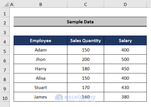
Consider the following dataset, which contains sales and salary information for several salespeople. We’ll use it to demonstrate how to create an Excel chart with multiple Y axes.
Method 1 – Manually Plotting a Graph in Excel with Multiple Y Axes
Steps:
- Select the dataset.
- Go to the Insert tab in the ribbon.
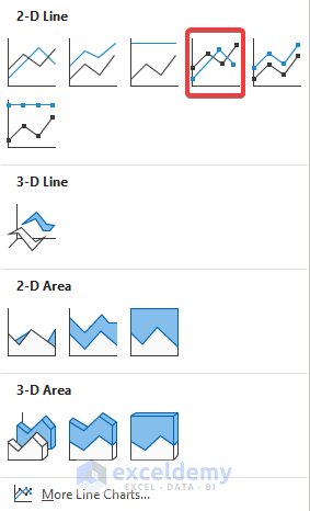
- From the Charts option, select Line or Area Chart.
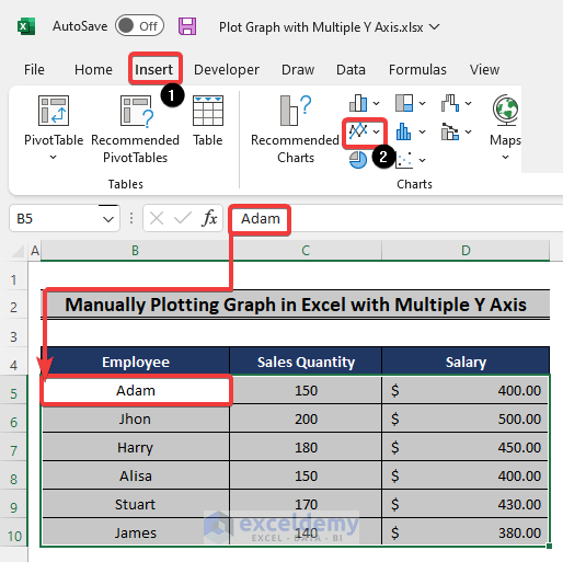
- Select any chart. We will use the Line with Markers chart.
- The data will be plotted.

- Double-click on one of the lines on the graph. All of the data points are plotted on the primary axis, using the same Y values for both sales quantity and salary.
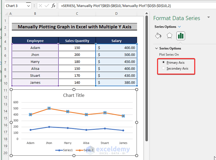
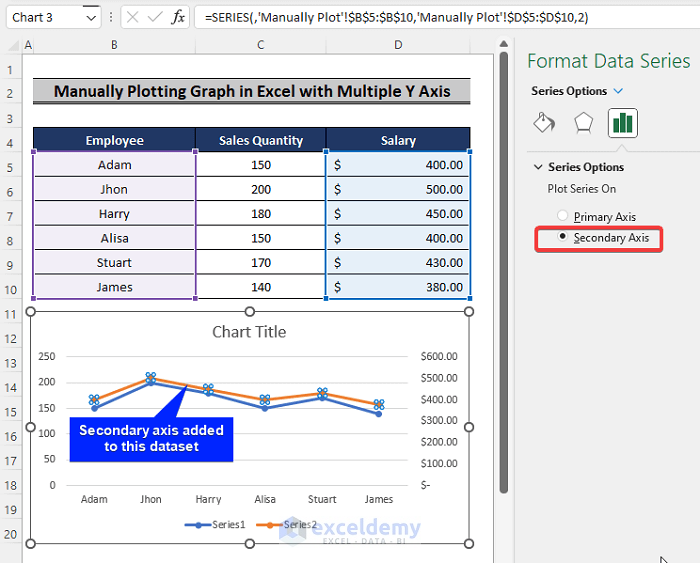
- Check the Secondary Axis box.
- The second axis is added to the graph.
Read More: How to Make an X-Y Graph in Excel
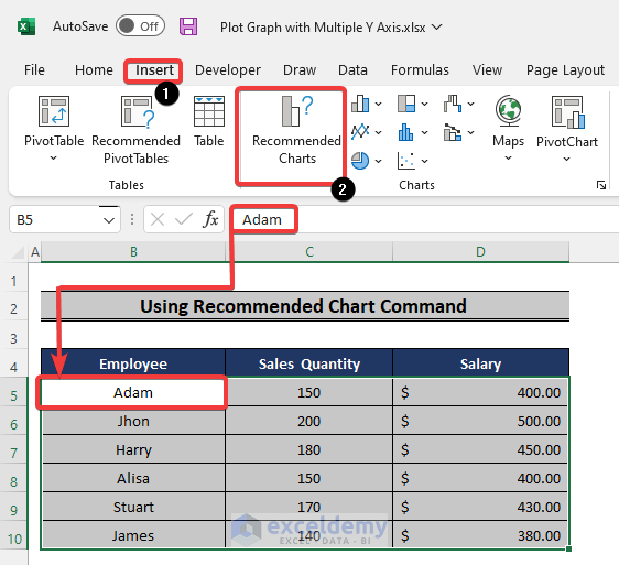
Method 2 – Using Recommended Charts
Steps:
- Select the dataset.
- Go to the Insert tab from the ribbon.
- Pick Recommended Charts.
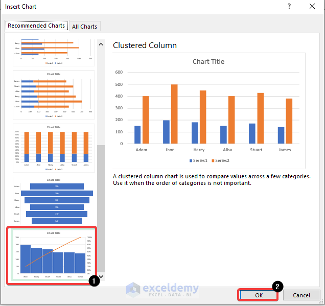
- The Insert Chart window will appear on the screen.
- Scroll down and select the chart with two vertical axes.
- Click OK.
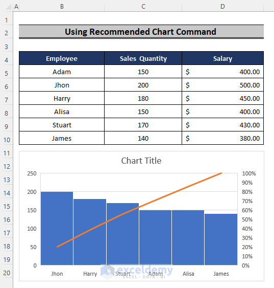
- Excel will plot the graph with two Y axes.
Read More: Create a Chart from Selected Range of Cells in Excel
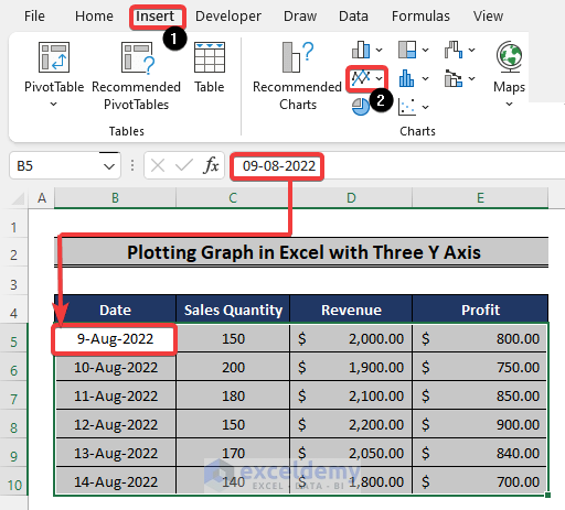
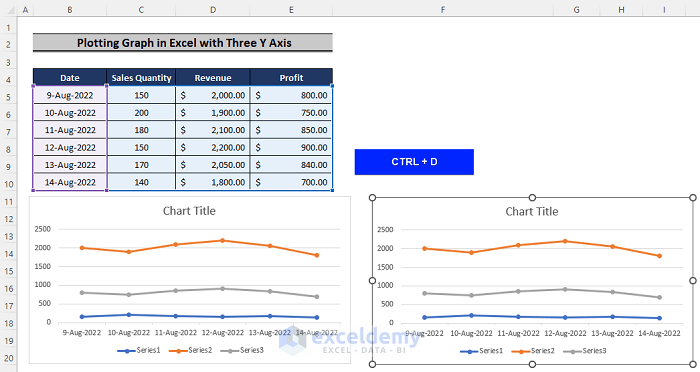
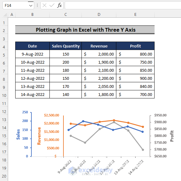
Method 3 – Plotting a Graph in Excel with Three Y-Axes
Steps:
- Choose the data.
- Go to the Insert tab in the ribbon.
- From the Charts section, select Line or Area Chart.
- From the chart options, select any chart suitable for your data. We opted for the Line with Markers chart.

- Press Ctrl + D to duplicate the plotted graph.
- Select any one of the data plots and delete it.
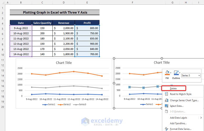
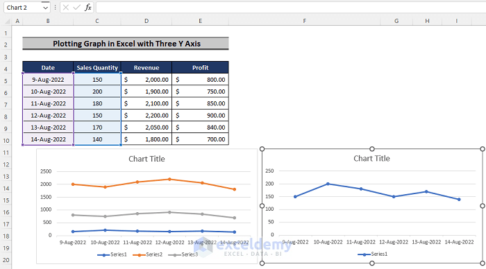
- Do the same for any of the remaining two, so you’re left with only one data series in one of the graphs.
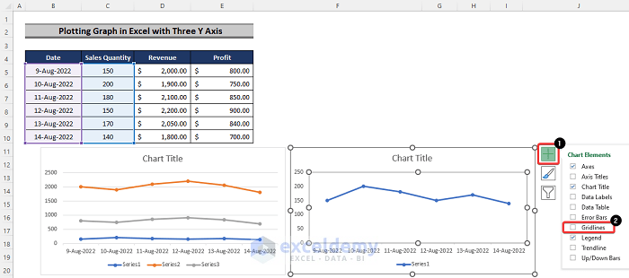
- Select the Plus sign beside the second graph.
- From the drop-down menu, uncheck the Gridlines box.
- Select the vertical axis to the left.
- Go to the Format tab in the ribbon.
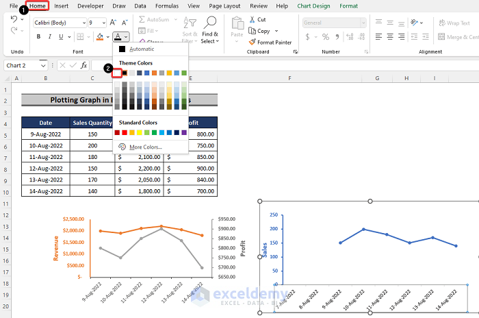
- From the Shape Outline option, color the axis the same as the color of the plot.
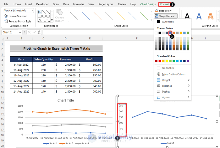
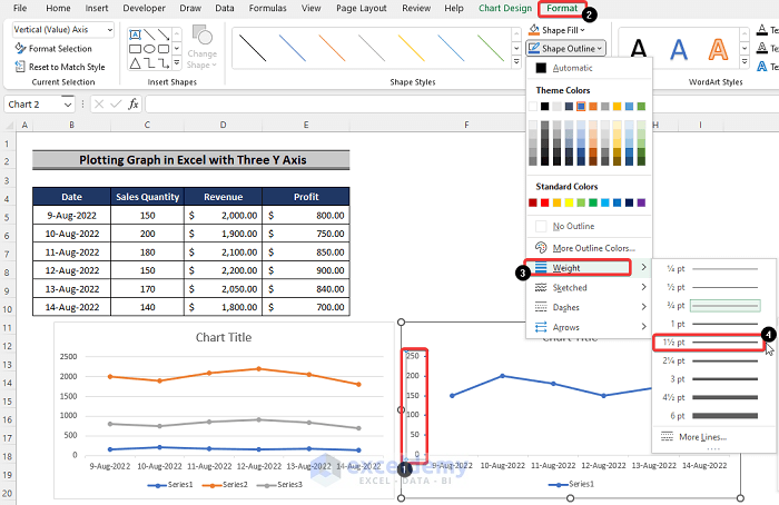
- Select the vertical axis.
- Change the weight of the vertical line. We set it to 1.5 pt.
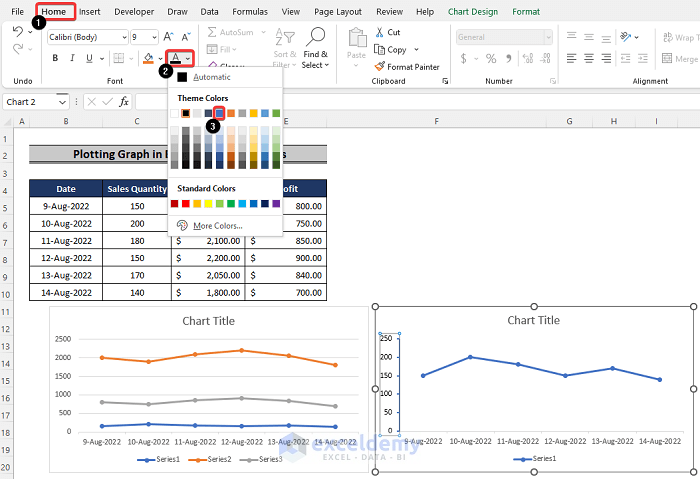
- Change the color of the font of the axis numbers to match the color of the data plot.
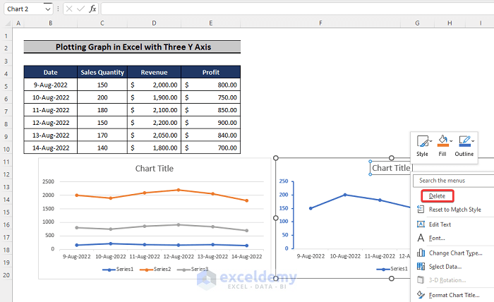
- Select the Chart Title and delete it.
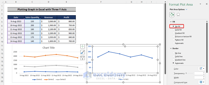
- Click on the entire graph.
- From the available options to the right of the screen, select No Fill.
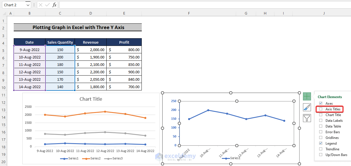
- Click on the Plus sign to the right of the graph.
- Check the Axis Title box.
- Format the axis title to match the color of the plot.
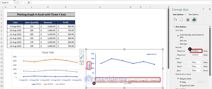
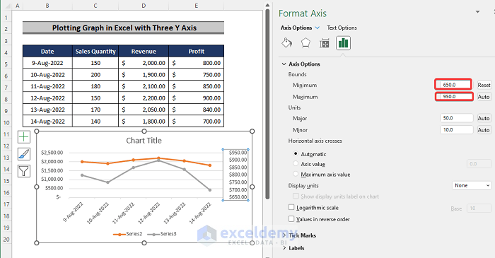
- Select the horizontal axis and reduce its minimum bounds.
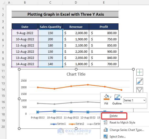
- Go to the first chart and delete the plot that is present in the second chart. In our case, it’s the Sales data plot, but you might’ve selected a different one.
- Double-click on any of the two remaining plots. The plot is on the primary axis.
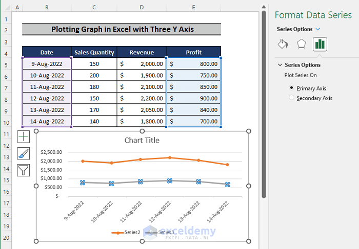
- Change the plot to be on a secondary axis.
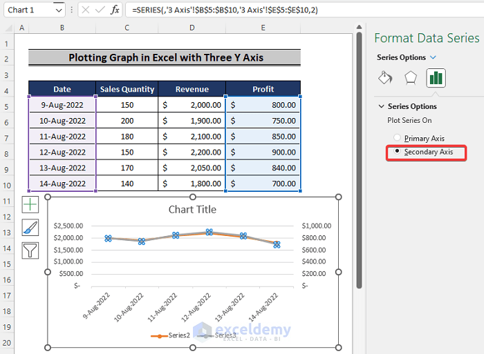
- If the two plots overlap, change the minimum and maximum bounds of any one of the plots.
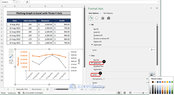
- Select the horizontal axis.
- Turn the axis into a solid line.
- You can also change the color of the axis to a bold color.
- Select the horizontal axis of the Sales chart.
- Change the color of the text to match it with the background color.
- Overlap the plots.
- The dataset is “plotted” with three vertical axes.
Read More: How to Make a Graph from a Table in Excel
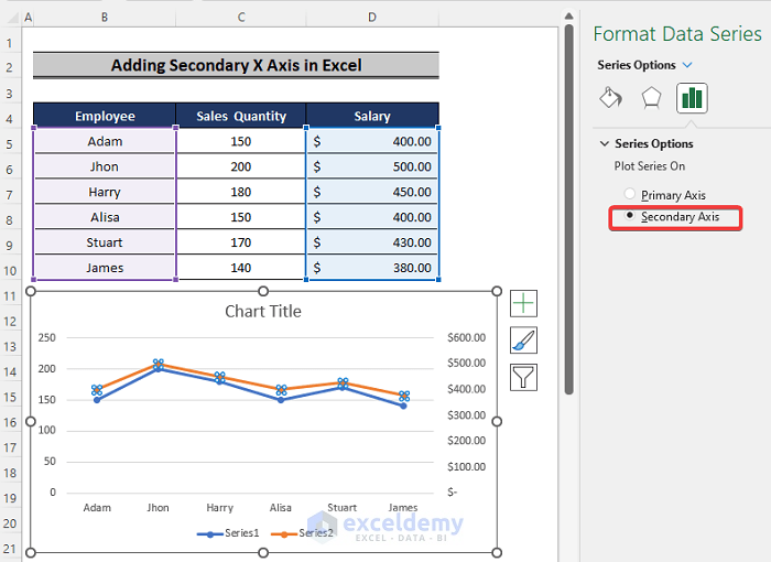
How to Add a Secondary X Axis in Excel
Steps:
- Select the data.
- Go to the Insert tab in the ribbon.
- From the Charts option, select Line or Area Chart.
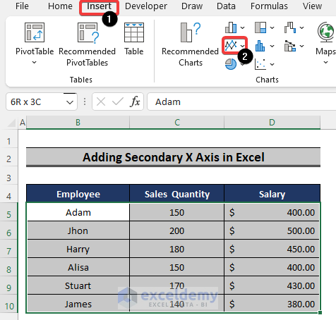
- From the chart options, select any chart desirable for your data. We will choose the Line with Markers chart.
- Double-click on one of the lines on the graph. The data points are plotted on the primary axis.
- Check the Secondary Axis box.
- Click on the Plus sign on the side of the graph.
- Click the arrow sign next to the Axes box.
- Check the Secondary Horizontal box.
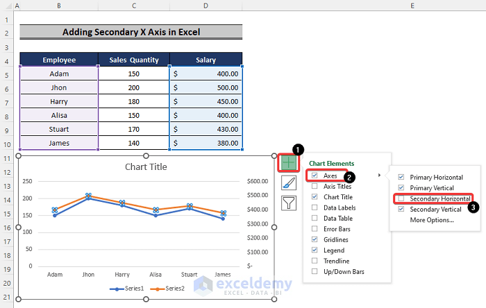
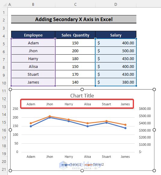
- You will get a second X axis.
Download the Practice Workbook
Related Articles
<< Go Back To How to Create a Chart in Excel | Excel Charts | Learn Excel
Get FREE Advanced Excel Exercises with Solutions!
