Method 1 – Convert Ratios to Decimal Values to Graph Ratios in Excel
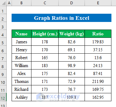
The dataset showcases Students’ Name, their Height, Weight, and Ratio of height and weight.
To graph the ratio:
Step 1:
Calculate the decimal value in the dataset.
- Select a cell to get the decimal value. Here, F5.
- Enter the formula
<span style="font-size: 14pt;"><strong>=C5/D5</strong></span>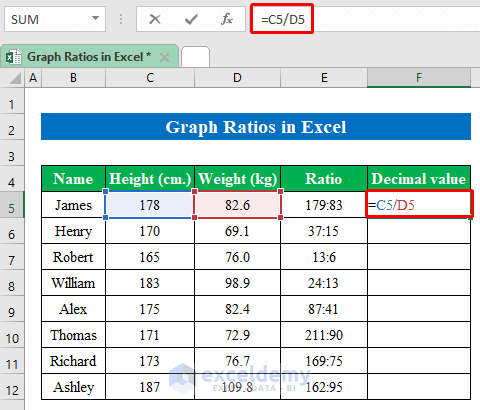
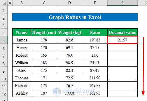
- Press Enter to get the value.
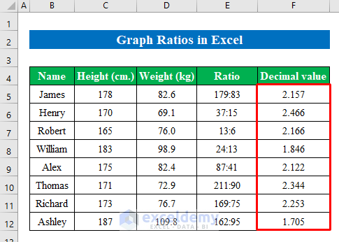
- Drag down the Fill Handle to see the result in the rest of the cells.
This is the output.
Step 2:
- Select the decimal values and go to “Insert”.
- Click “Bar column” and select “2-D Column”.
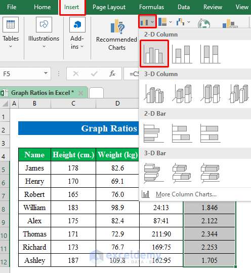
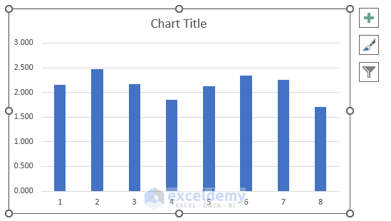
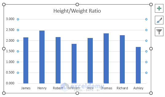
The graph is created.
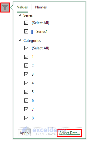
- Select the graph to edit it.
- Choose “Select Data”.
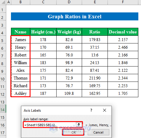
- In “Select Data Source”, select “Edit”.
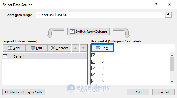
- In “Axis Labels”, select the range of names and click OK.
The graph shows the ratios in the dataset.
Read More: How to Calculate Ratio Percentage in Excel
Method 2 – Alter Constant Ratios to Decimal Values to Graph Ratios
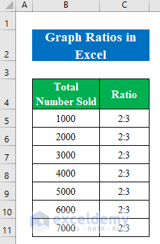
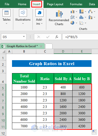
The dataset showcases the Total Number of Sold products and their Ratio.
To plot the graph, calculate the products sold by A & B.
Step 1:
- Select D5 and enter the formula.
<span style="font-size: 14pt;"><strong>=2*B5/5</strong></span>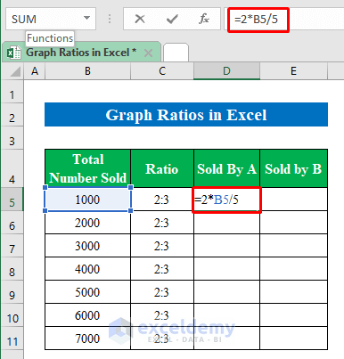
- Press Enter.
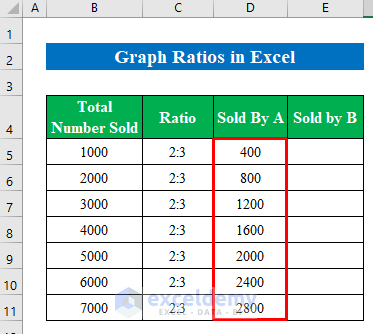
- Drag down the Fill Handle to see the result in the rest of the cells.
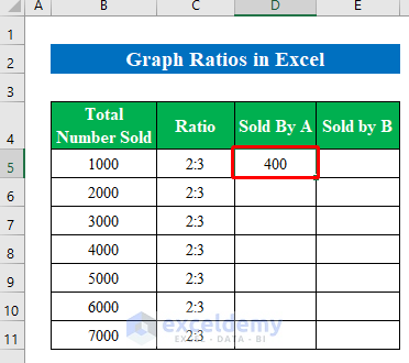
The values sold by A are displayed.
Calculate the products sold by B.
Step 2:
- Select E5 and enter the formula.
<span style="font-size: 14pt;"><strong>=3*B5/5</strong></span>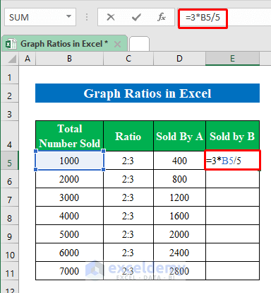
- Press Enter.
- Drag down the Fill Handle to see the result in the rest of the cells.
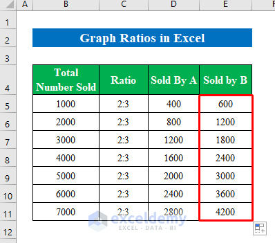
The output is displayed in E5:E11.
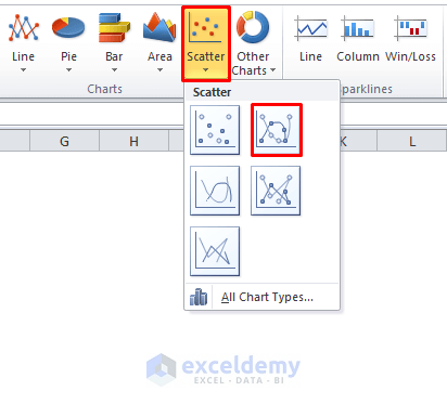
Step 3:
- Select D4:E11 to plot the graph.
- Click “Insert”.
- Select a linear chart.
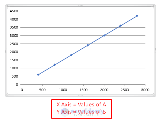
- The graph with the ratios is displayed in a linear chart.
Things to Remember
You can alter graph data in vertical and horizontal directions: After plotting the graph go to “Filter” and click “Switch Row/Column”.
Download Practice Workbook
Related Articles
- How to Use Interest Coverage Ratio Formula in Excel
- Debt Service Coverage Ratio Formula in Excel
- How to Do Ratio Analysis in Excel Sheet Format
- How to Convert Percentage to Ratio in Excel
<< Go Back to Ratio in Excel | Calculate in Excel | Learn Excel
Get FREE Advanced Excel Exercises with Solutions!
