Latest Posts From Md. Asaduzzaman

Sometimes, we have to deal with large datasets and we try to print the whole dataset on a single page in Microsoft Excel. For this purpose, we need to extend ...

Sometimes, we apply a formula in a cell and then repeat the same formula in every nth row in Microsoft Excel. Here n can be any integer like 1,2,3,4,... But ...

Sometimes, we apply a formula in a cell and then repeat the same formula to the entire column in Microsoft Excel. However repeating the same formula again and ...

Method 1 - Using an Excel Formula with Ampersand Operator 1.1 Without Formatting Steps: Select cell D5 and enter the following formula: =B5&" ...
![[Solved]: Leading Zero Not Showing in Excel (9 Possible Solutions)](https://www.exceldemy.com/wp-content/uploads/2022/07/leading-zero-not-showing-in-excel-2.png?v=1697109281)
Sometimes, we need to input a number with the leading zeroes for our dataset. However if the proper settings are not used, we can face difficulties in ...

Sometimes, we want to manage our data in a customized way and print them on different pages. For this reason, we insert page breaks between different rows and ...

Flashcard is a great way to learn something. In the physical flashcards, the problem is written on one side of the card and the solution on the other. In this ...

When using Microsoft Excel, sometimes we need to hide row and column headings to represent our dataset. This is a very basic Excel operation. Are you having ...

In our daily life, we have to deal with lots of data. Microsoft Excel is an excellent place to store those data. In order to store data or create a table, we ...
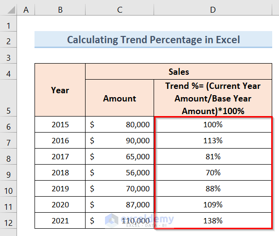
Trend Percentage represents the comparison of financial information like net sales, operating expenses, gross profit, inventory, cost of goods sold, etc. over ...

The Bubble Chart is a type of scatter plot chart that replaces data points with bubbles. It has horizontal and vertical axis like the scatter plot chart and ...

The 3D pie chart consists of a circle that is divided into segments, each representing a proportion of the share of each value in a dataset. The chart is very ...
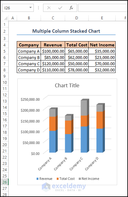
Example 1 - Create a Basic Stacked Column Chart in Excel Steps: Open the worksheet which contains the dataset. Select the required range of cells ...

In our daily life, we deal with lots of graphs and charts. Sometimes we feel the necessity of changing the axis titles of the graphs and charts according to ...

Method 1 - Create an Excel Scatter Plot Color by Group without Condition We will create three groups (A, B, and C) using the Number of Students and their ...
See Our Reviews at

