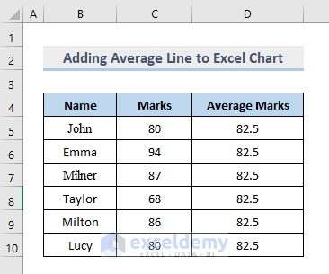
Step 1 – Prepare the Dataset
Assume you have the following class result table:
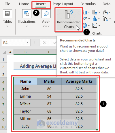
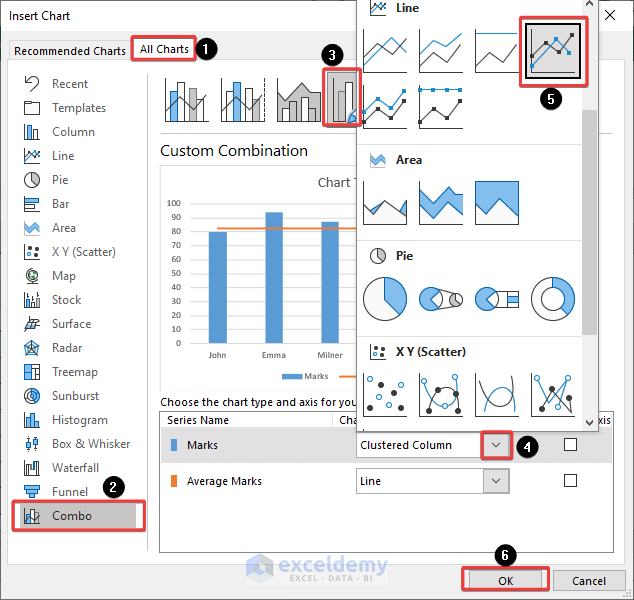
- Select the data range and go to Insert >> Recommended Charts.
Read More: How to Calculate VLOOKUP AVERAGE in Excel
Step 2 – Select a Chart Type
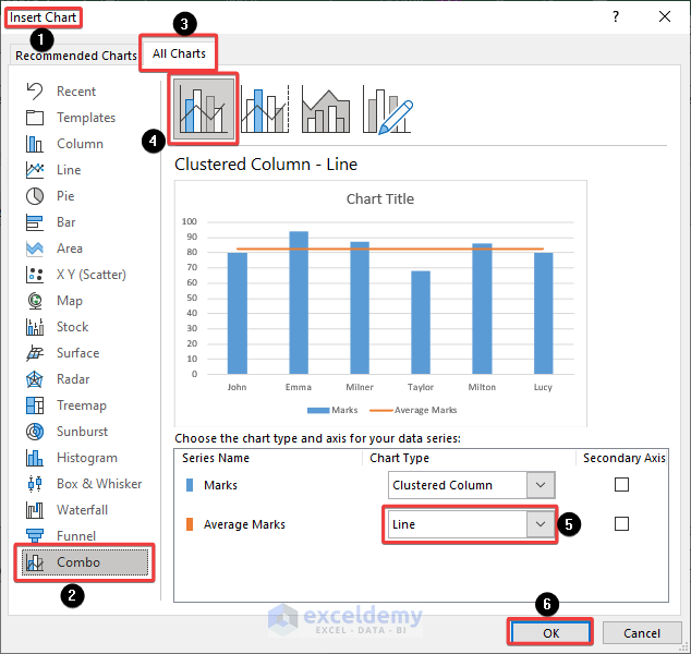
- Go to Combo >> All Charts >> Clustered Column-Line >> Average Marks >> Line >> OK.
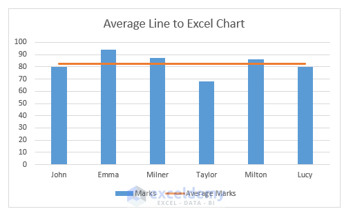
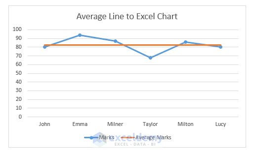
The Average Line is added to the chart:
Step 3 – Apply a Custom Combination
- Select Custom Combination.
- Select the Marks >> Clustered Column >>Line.
The line graph with the average will be displayed.
How to Add an Average Line in an Excel Pivot Chart
Steps:
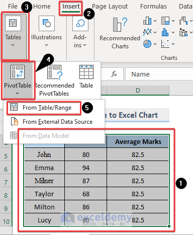
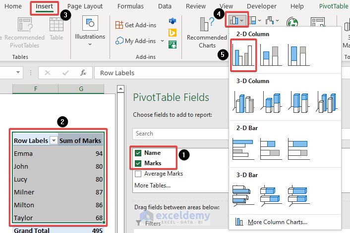
- Create a Pivot Table and a chart based on the table: go to Insert >> Table >> Pivot Table >> From Table/Range.
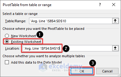
- Select Existing Worksheet and click OK.
- In PivotTable Fields check Name and Marks.
- Choose Insert >> 2-D Column.
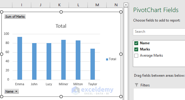
The Marks graph is displayed.
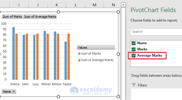
- In PivotTable Fields check Average Marks. A new column will be displayed in the chart.
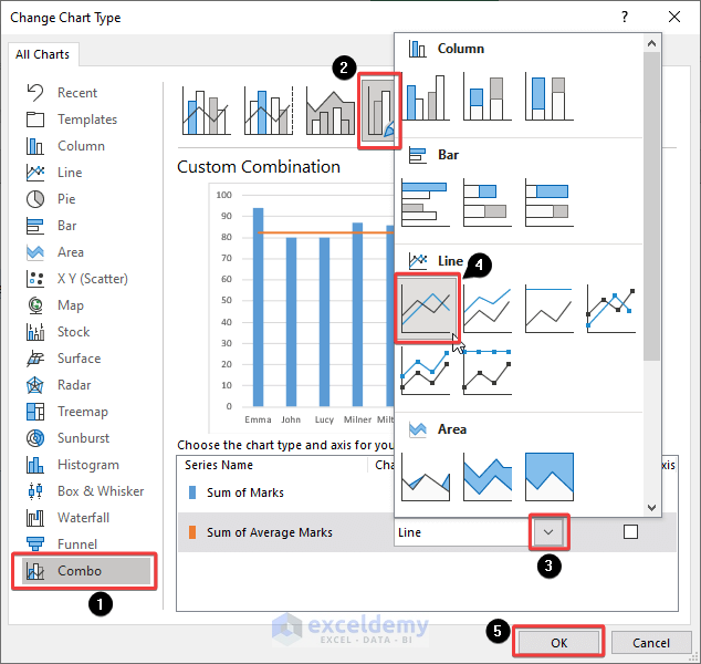
- To see the Average Marks as a horizontal line: right-click >> Change Chart Type.
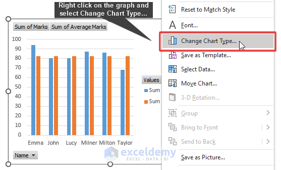
- Go to Combo >> Custom Combination >> Sum of Average Marks >> Line >> OK.
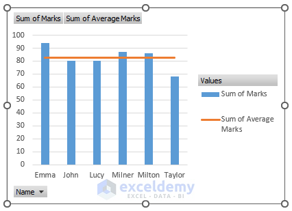
The average line is displayed in the marks charts.
Download Practice Workbook
Download the practice workbook.
Related Articles
- How to Find Average with OFFSET Function in Excel
- How to Average Values Greater Than Zero in Excel
- How to Calculate Average in Excel Excluding 0
- How to Use VBA Average Function in Excel
<< Go Back to Calculate Average in Excel | How to Calculate in Excel | Learn Excel
Get FREE Advanced Excel Exercises with Solutions!
