A salary comparison chart compares employee salaries across the various departments in an organization. Salaries are compared against survey data or the average wage for that role.
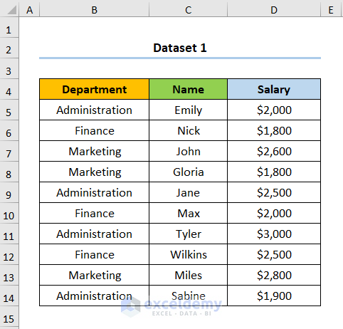
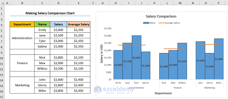
The sample dataset includes the employee Names, their Salaries, and Department.
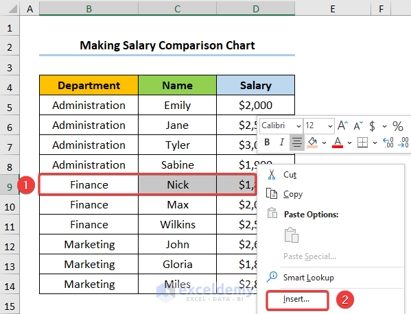
Step 1 – Preparing Dataset for Salary Comparison in Excel
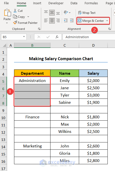
- Select the row as shown below the first department group.
- Right-click on the mouse and select the Insert option.
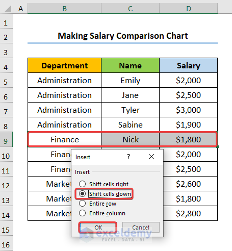
- In the dialog box, check the Shift cells down option.
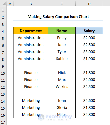
- Perform the same process for the other departments; the results should look like the picture below.
- Remove the duplicate names of the Departments.
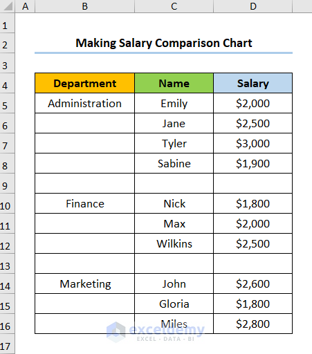
- Merge the cells with the same Department by selecting the cells and clicking the Merge & Center option in the Home tab.
Read More: How to Compare Two Sets of Data in Excel Chart
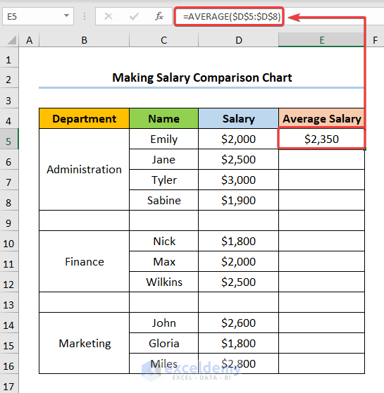
Step 2 – Calculating Average Salary for Salary Comparison in Excel
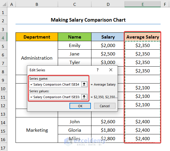
- Select the E5 cell and enter the formula given below.
=AVERAGE($D$5:$D$8)
The AVERAGE function is used to calculate the average wage of the employees in each Department. Here, $D$5:$D$8 is the range of the salaries of the employees of the Administration department.
Note: Make sure to provide an Absolute Cell Reference for the D5:D8 cells using the F4 key.
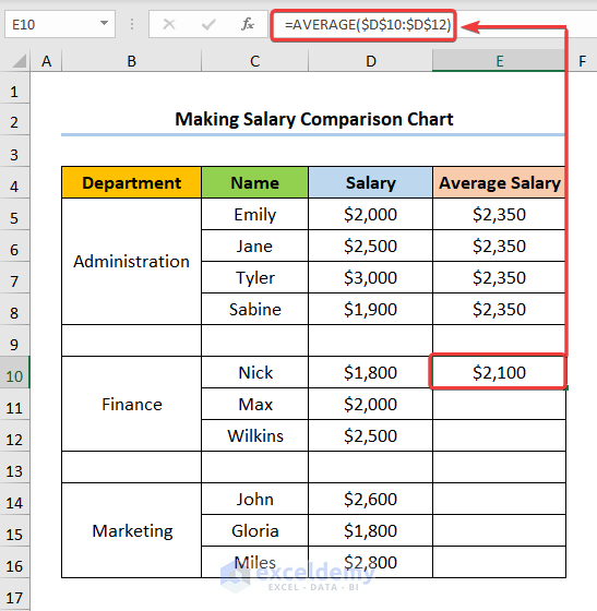
- Enter the formula in the E10 cell as shown below.
=AVERAGE($D$10:$D$12)
The cells $D$10:$D$12 refer to the salaries of the employees in the Finance department.
- Repeat the same procedure for the E14 cell.
=AVERAGE($D$14:$D$16)
The cells $D$14:$D$16 indicate the range of salaries of the employees in the Marketing department.
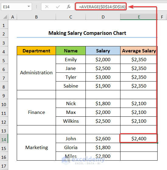
- The results should look like the following screenshot.

Read More: How to Make a Price Comparison Chart in Excel
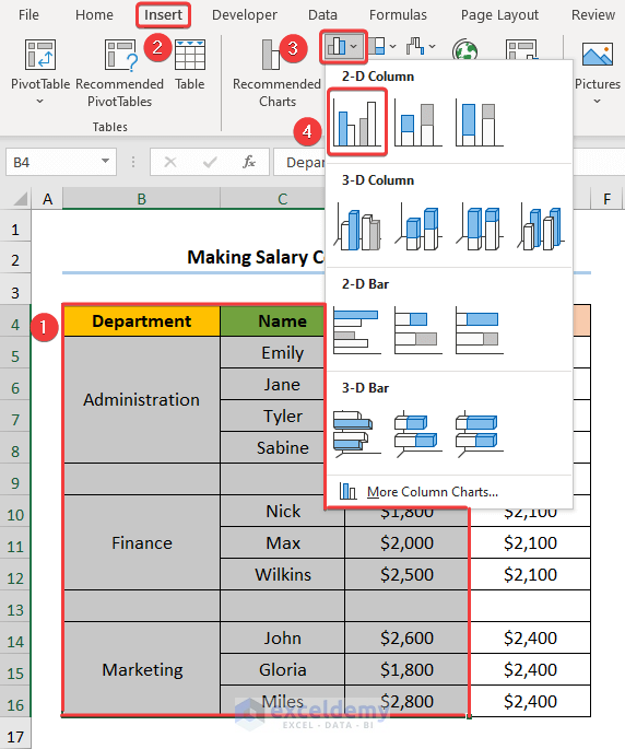
Step 3 – Inserting Column Chart to Make a Salary Comparison Chart in Excel
- Select the Department, Names, and Salary columns.
- Go to the Insert tab >> click the Insert Column or Bar Chart drop-down in the Charts section >> select the Clustered Column chart option.
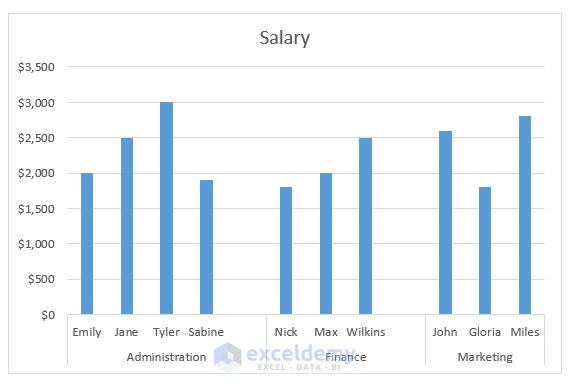
The results will be returned as a chart like this.
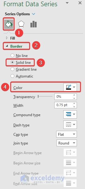
- Double-click on any of the bars to open the Format Data Series window.
- Adjust the Gap Width according to your preference. In this case, a Gap Width of 0% has been selected.
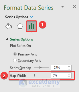
- Format the Border of the bars by choosing the Solid Line option with black Color.
Read More: How to Create a Budget vs Actual Chart in Excel
Step 4 – Inserting Line Chart to Show the Average Salary
- Select the chart and right-click on the mouse to go to the Select Data option.
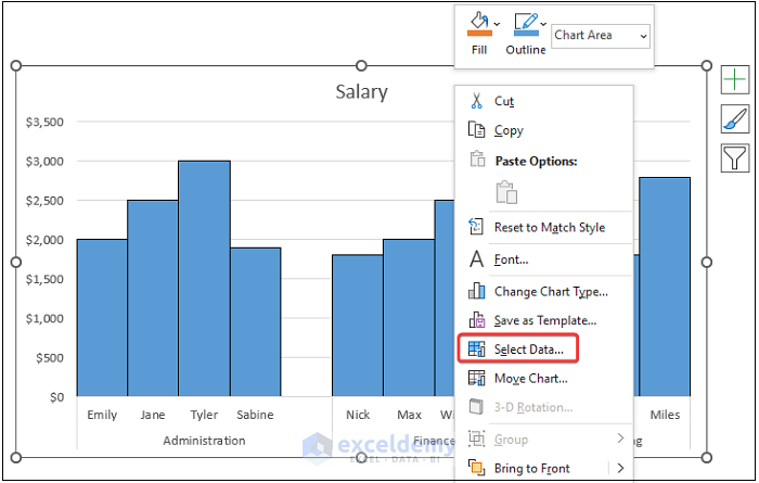
The Select Data Source dialog box appears.
- Select the Add button to add a new series to the chart.
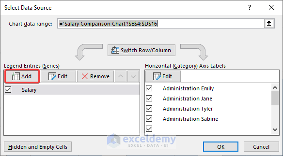
- In the Edit Series wizard, choose the Average Salary column as shown in the image below.
- This adds the Average Salaries as a Column Chart. However, we want it to be displayed as a Line Chart along with the Column Chart.
- Select the chart and right-click on the mouse to choose the Change Series Chart Type option.
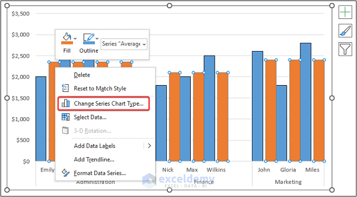
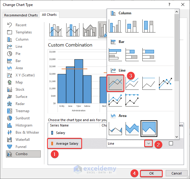
The Change Chart Type dialog box will open.
- Choose the Average Salary series >> click on the Dropdown symbol in the Chart Type portion >> select the 2-D Line option >> click OK.
You can format the chart using Chart Elements options.
- Add axes names with Axis Titles.
- Add the Data Labels to show the values in the chart.
- Insert the Legend option to show the two series.
- Disable the Gridlines to give the chart a clean look.
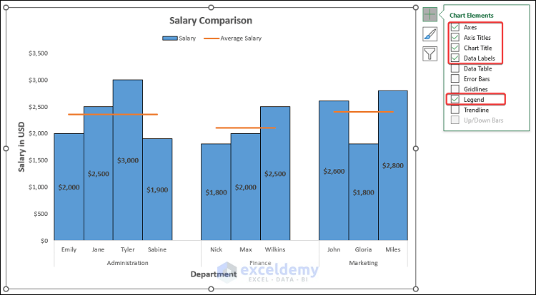
- The completed chart will look like the screenshot below.
Read More: How to Compare 3 Sets of Data in Excel Chart
Download Practice Workbook
You can download the practice workbook from the link below.
Related Articles
<< Go Back to Comparison Chart in Excel | Excel Charts | Learn Excel
Get FREE Advanced Excel Exercises with Solutions!
