Example 1 – Apply the Select Data Feature to Swap Axes
- Right-click on the chart area and choose “Select Data” from the list options.
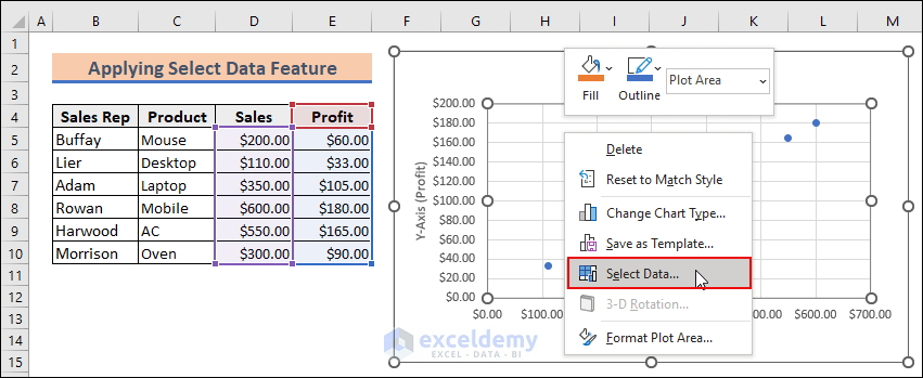
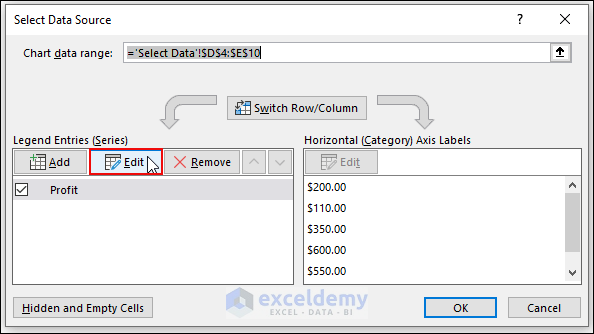
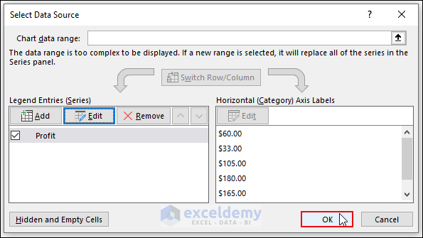
- The “Select Data Source” dialog box pops up.
- Under the Legend Entries (Series) menu, press the Edit option.
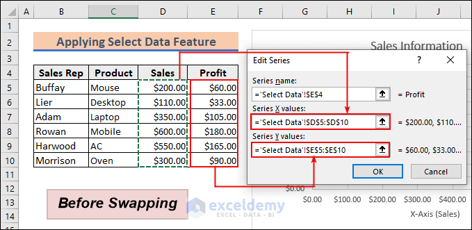
- The Edit Series dialog box will appear, showing the Sales data for the Series X values and Profit data for the Series Y values.
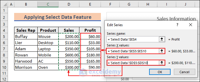
- Swap the values for both axes.
- Put the Profit data in the Series X values and Sales data in the Series Y values.
- Click OK.
- From the Select Data Source dialog box, press OK.
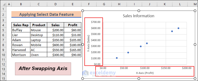
- You will see that the values in both chart axes have been swapped.
Notes:
You can swap axes in any type of chart like Bar chart, Pie Chart, Bubble chart etc.
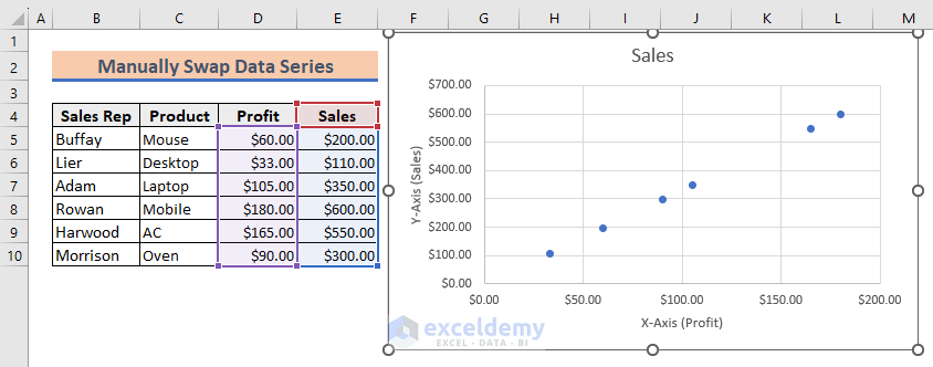
Example 2 – Manually Swap Data Series to Switch Axes in Excel
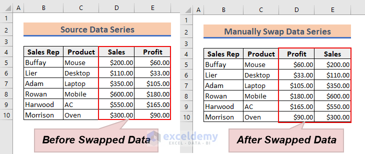
- Put the Sales data in the place of the Profit column and the Profit data in the place of the Sales column.
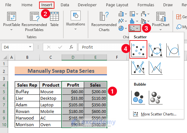
- Select the data range from D4 to E10. From your Insert tab, go to Charts → Inser Scatter or Bubble Chart → Scatter.
- Your chart will be regenerated by swapping the axes.
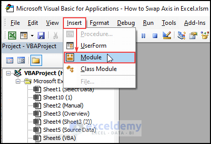
Example 3 – Run VBA Code to Swap Axes in Excel
- Press ALT + F11 to bring up the Visual Basic Application. You can also click on Visual Basic from the Developer tab.
- Select Insert and choose Module.
- Insert the following code in that Module and press the Run button or the F5 key to run the VBA code.
Sub swap_axis()
Dim Xsrs As Series
Set Mrng = ActiveSheet.Range("D5:E10")
With ActiveSheet.ChartObjects.Add(Left:=Mrng.Left, _
Width:=Mrng.Width, Top:=Mrng.Top, Height:=Mrng.Height)
	.Chart.ChartType = xlXYScatterLines
	'.Chart.SetSourceData Source:=Range("D5:D10,E5:E10")
	Set Xsrs = .Chart.SeriesCollection.NewSeries
	Xsrs.Name = "Sales vs Profit"
	Xsrs.XValues = Range("E5:E10")
	Xsrs.Values = Range("D5:D10")
End With
End Sub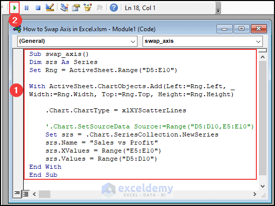
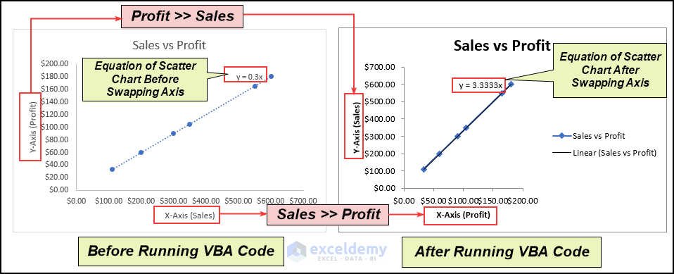
- You will be able to swap the X and Y-axes in Excel.
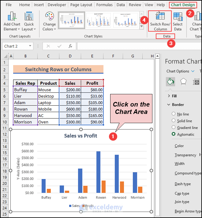
How to Switch Rows or Columns in Excel
- Click on the Chart area.
- Go to the Chart Design tab.
- Select the Switch Row/Column feature from the Data group.
- Here’s the result.
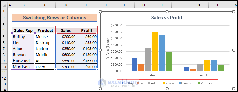
Note: This feature can be used for all charts except the Line chart with a single line.
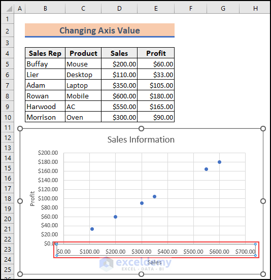
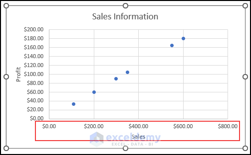
How to Change the Axis Values in Excel
- Click the Horizontal (Value) Axis.
- The Format Axis window pops up.
- Insert 0 in the Minimum Bounds box and 800 in the Maximum Bounds box.
- Set 200 as the Major units.
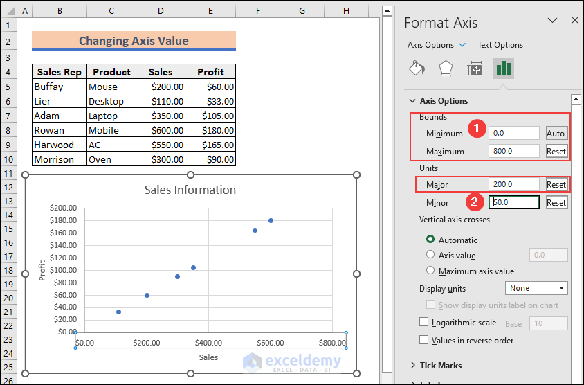
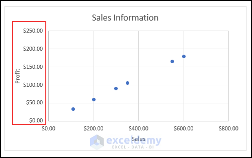
- Here’s the result.
- You can also change the Y-axis value in a similar manner.
Tips for Using a Chart with Swapped Axes in Excel
- When you swap the X and Y axis in your chart, the layout and presentation of the chart will change. Make sure you understand the new layout as it affects the visualization of data.
- After swapping the axes, the axes labels may need to be adjusted to ensure that they are accurate and clear.
- Swapping the axes in a stacked chart sometimes makes it more difficult to interpret the data. So, make sure to label stacked segments properly.
- In some cases, you may need to use a secondary axis for a better understanding of the data.
Things to Remember
- Swapping the X and Y axis in an Excel chart can be a useful way to display your data in a more understandable way.
- Swapping the axis can be helpful particularly when you have data that is better understood if the dependent and independent variables are switched.
- If you have a large amount of data that is difficult to display in the chart, swapping the horizontal axis to a vertical one can make it more reader-friendly.
- Excel provides many customization options for charts including changing chart types, putting axis titles, swapping axis, changing axis labels, etc.
- When swapping the axis, the labels and titles associated with the original axes will also swap positions. After swapping, double-check that the axis labels and titles are still correctly assigned to the appropriate axis.
- If your chart contains multiple series, swapping the axis will interchange the position of all the series. This can affect the visual representation and interpretation of the data. Take this into account and review the chart to ensure it still communicates the intended information accurately.
- Before swapping axes, ensure that the chart you have selected is suitable for representing your data. Consider the data types, relationships, and the message you want to convey. Swapping axes may not always be appropriate or visually effective for certain datasets.
- After swapping the axis, confirm that the order of the data series remains logical and follows the intended narrative or progression.
Download the Practice Workbook
Frequently Asked Questions
1. Does swapping the axis change the order of my data series?
Answer: Swapping the axis does not change the order of the data series by default. However, it is important to review the order of the data series after swapping to ensure it remains logical and follows the intended narrative or progression. Make any necessary adjustments if needed.
2. How can I adjust the formatting of the chart after swapping the axes?
Answer: After swapping the axis, you may need to make formatting adjustments to maintain the chart’s visual appeal and clarity. Use the various formatting options available in the Excel ribbon to resize the chart, adjust axis scales, modify gridlines, update data labels, or change the color scheme as needed.
3. Can I swap axes in all types of Excel charts?
Answer: Not all chart types in Excel support swapping axes. The most common chart types that allow axis swapping include column charts, bar charts, line charts, and area charts. Other specialized chart types may have limitations or different methods for swapping axes.
<< Go Back To Formatting Chart Elements in Excel | Excel Chart Elements | Excel Charts | Learn Excel
Get FREE Advanced Excel Exercises with Solutions!
