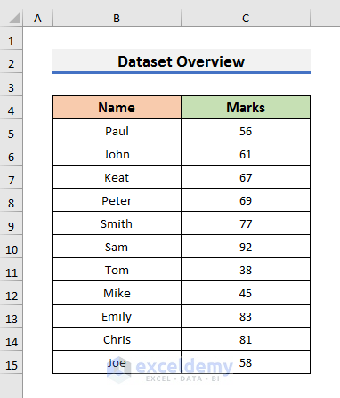
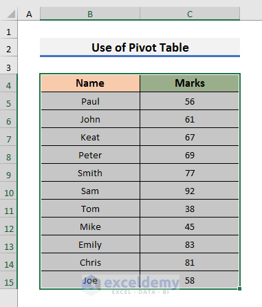
To explain how to plot frequency distributions, we will use a dataset containing information about some students’ Marks.
Method 1 – Plotting a Frequency Distribution in Excel with Histogram Chart
Steps:
- Select all cells of the dataset.
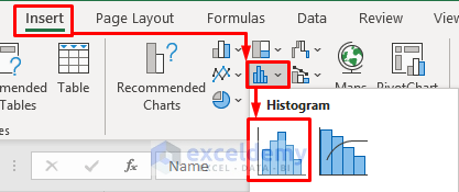
- Go to the Insert tab and select the Insert Static Chart icon. A drop-down menu will appear.
- Select Histogram.
- You will see a chart like the picture below.
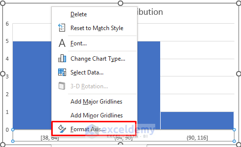
- Right–click on the values of the X-axis and select Format Axis from the Context Menu. It will open the Format Axis settings.
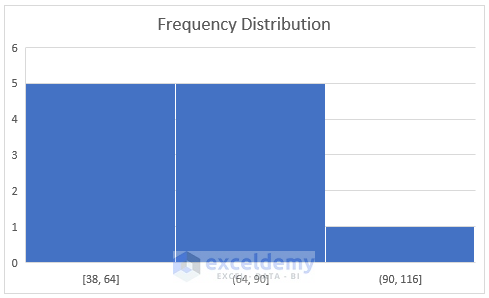
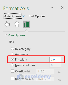
- In the Axis Options section, we set the Bin Width to 7. You choose the Bin Width according to your preferences. The Bin Width indicates the size of a group or interval.
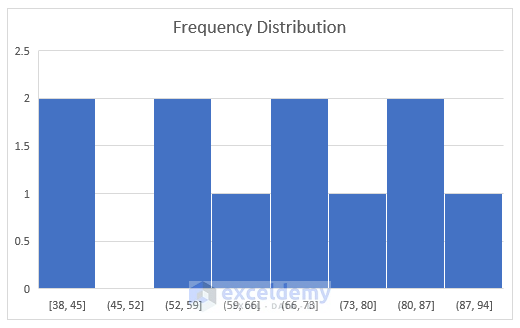
- You will see the plot of the frequency distribution like the picture below.
Method 2 – Applying Excel Formulas to Plot the Frequency Distribution in Excel
Case 2.1 – Using the FREQUENCY Function
Steps:
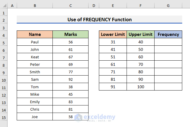
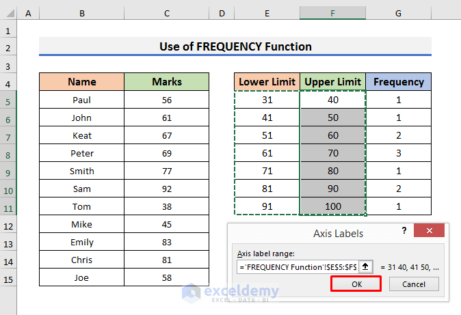
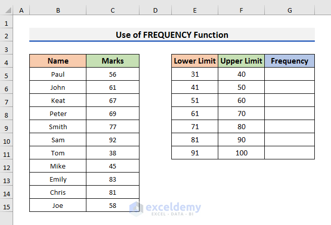
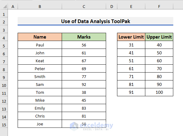
- Create a section for the groups. You need to write the Lower Limit and Upper Limit for each group. We grouped the dataset by 10 starting from 31.
- Select Cell G5 and insert the following formula:
=FREQUENCY(C5:C15,F5:F10)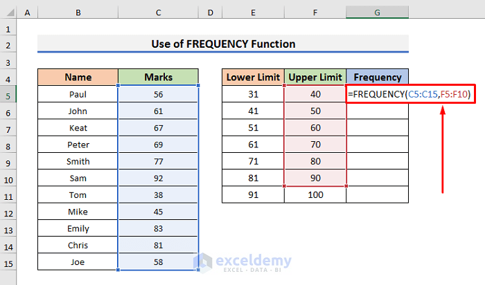
- Press Enter to see the result.
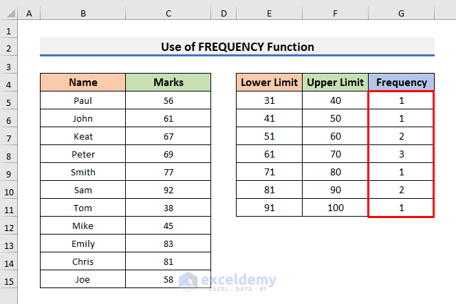
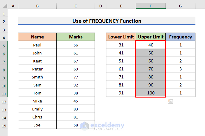
- Select the Upper Limits like the picture below.
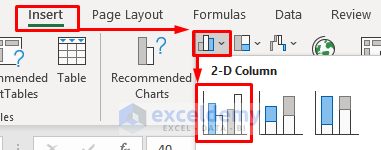
- Go to the Insert tab and select the Insert Column Chart icon. A drop-down menu will appear.
- Select Clustered Column from there.
- Right–click on the chart and click on Select Data from the Context Menu.
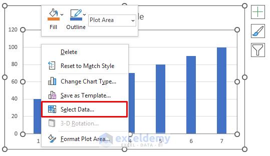
- In the Select Data Source window, select Frequency in the Legend Entries box and type =‘FREQUENCY Function’!$G$4:$G$11 in the Change data range box.
- You need to type the sheet name in place of the “FREQUENCY Function”.
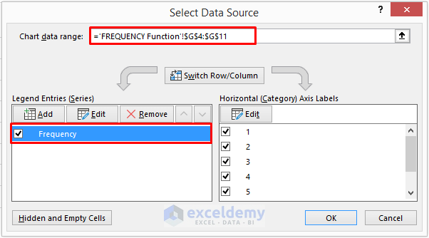
- Click on Edit in the Horizontal Axis Labels box. It will open the Axis Labels dialog box.
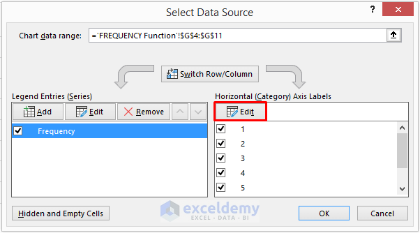
- Select the range E5:F11.
- Click OK to proceed.
- A chart will appear on the excel sheet.
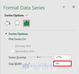
- Right–click on the chart and click on the Format Data Series option.
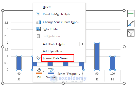
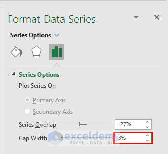
- In the Format Data Series section, set the Gap Width to 3%.
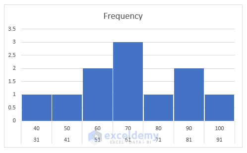
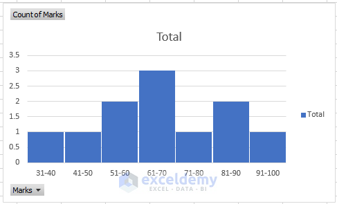
- You will see the plot of the frequency distribution.
Case 2.2 – Applying the COUNTIFS Function
Steps:
- Create a section for the Upper Limit, Lower Limit, and Frequency.
- Select Cell G5 and insert the formula given below:
=COUNTIFS($C$5:$C$15,">="&E5,$C$5:$C$15,"<="&F5)- Press Enter to see the result.
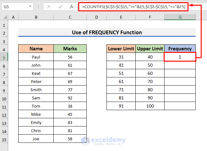
In this formula, the COUNTIFS function counts the occurrence of marks in the range C5:C15 when it’s greater than E5 and less than F5.
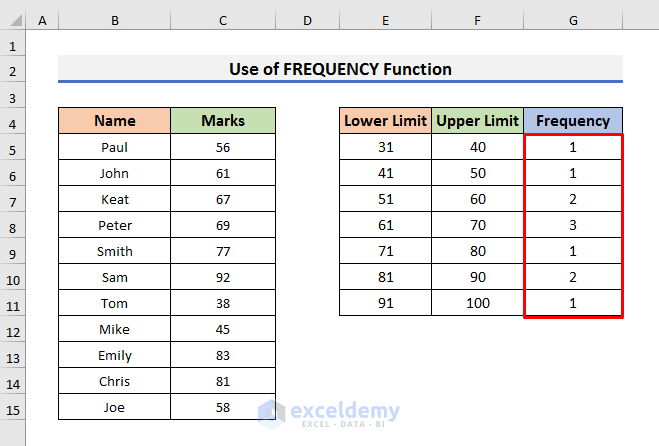
- Drag the Fill Handle down.
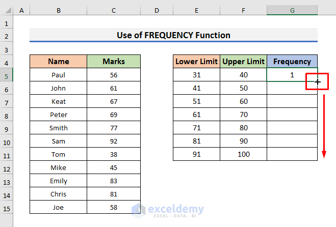
- You will find the frequency for each group.
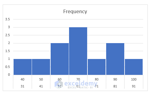
- Repeat the steps of the previous method to get a plot of frequency distribution like the below picture.
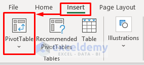
Method 3 – Inserting a Pivot Table to Plot the Frequency Distribution in Excel
Steps:
- Select all the cells of the dataset.
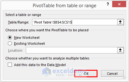
- Go to the Insert tab and click on the PivotTable option. A message box will pop up.
- Click OK to proceed.
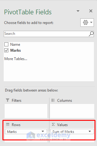
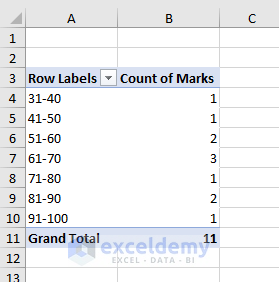
- In the Pivot Table Fields settings, select Marks and drag it into the Rows and Values box.
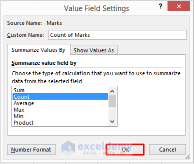
- Right–click on Sum of Marks and select Value Field Settings.
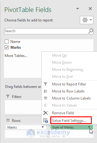
- In the Value Field Settings dialog box, select Count and click OK to proceed.
- Right–click on Cell A4 and select Group from the drop-down menu.
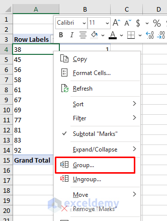
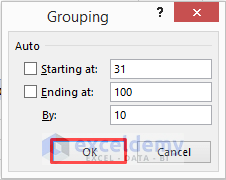
- Type the Starting point, Ending point, and Group By value. We wanted to group them by 10.
- Click OK to move forward.
- Click OK.
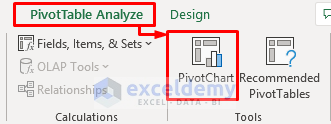
- Go to the PivotTable Analyze tab and select the PivotChart icon.
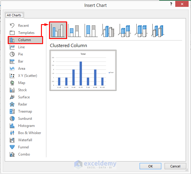
- In the Insert Chart window, select Column and click on Clustered Column icon.
- Click OK to see the graph.
- Right–click on the graph and select Format Data Series from the menu.
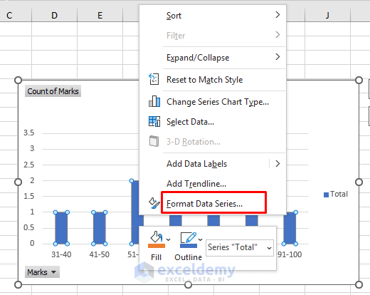
- In the Format Data Series section, set the Gap Width to 3%.
- The frequency distribution plot will look like the picture below.
Method 4. Plotting the Frequency Distribution with the Excel Data Analysis ToolPak
Let’s set the Lower and Upper limits for each “bin”.
Steps:
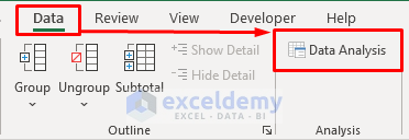
- Go to the Data tab and click on the Data Analysis option.
Note: If you don’t see the Data Analysis option, then you need to load the Data Analysis ToolPak. To load the Data Analysis Toolpak:
- Click on the File tab and then, select Options.
- In the Excel Options window, select Add-ins.
- Select Excel Add-ins in the Manage box and click on Go.
- In the Add-ins dialog box, check Analysis ToolPak and click OK to proceed.
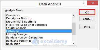
- Select Histogram in the Data Analysis box and click OK.
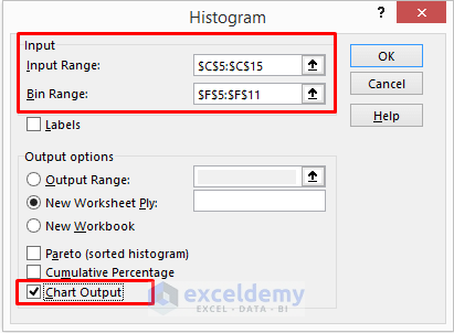
- In the Histogram window, insert $C$5:$C$15 in the Input Range box.
- Put $F$5:$F$11 in the Bin Range box.
- Check Chart Output and click OK to proceed.
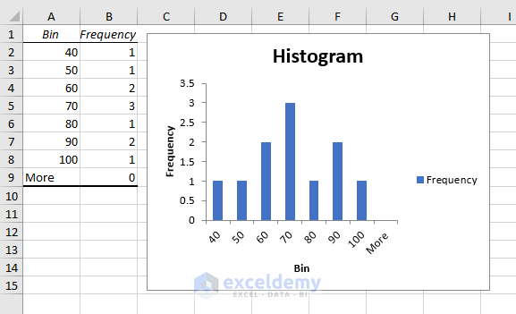
- You will see a histogram on a new worksheet like the below picture.
Read More: How to Create a Distribution Chart in Excel
Download the Practice Book
Related Articles
- How to Plot Normal Distribution in Excel
- Plot Normal Distribution in Excel with Mean and Standard Deviation
- How to Create a Probability Distribution Graph in Excel
- How to Plot Poisson Distribution in Excel
- How to Plot Weibull Distribution in Excel
- How to Plot Particle Size Distribution Curve in Excel
<< Go Back to Excel Distribution Chart | Excel Charts | Learn Excel
Get FREE Advanced Excel Exercises with Solutions!
